Things You're Just Supposed to Know

Most of the time, Long-Forgotten assumes that readers are already familiar with basic facts
about the Haunted Mansion. If you wanna keep up with the big boys, I suggest you check out
first of all the website, Doombuggies.com. After that, the best place to go is Jason Surrell's book,
The Haunted Mansion: Imagineering a Disney Classic (NY: Disney Editions; 2015). That's the
re-named third edition of The Haunted Mansion: From the Magic Kingdom to the Movies (NY:
Disney Editions, 2003; 2nd ed. 2009). Also essential reading is Jeff Baham's The Unauthorized
Story of Walt Disney's Haunted Mansion (USA: Theme Park Press, 2014; 2nd ed. 2016).

This site is not affiliated in any way with any Walt Disney company. It is an independent
fan site dedicated to critical examination and historical review of the Haunted Mansions.
All images that are © Disney are posted under commonly understood guidelines of Fair Use.

________
.

Saturday, April 5, 2014

Four Years? Owl Be Darned

.
Is it bloggiversary time already?  Wow, hard to believe, but this month marks four years of ruminations and revelations.  I have no idea how long this thing can continue. Blog frequency must needs grow more erratic, and more and more it will be a matter of new material coming to light or unexpected visitations by the Haunted Mansion Muse that determine when a new post will appear.  Yes, I know I said something like that last time, and the time before that, and still we have had about one post per month, but let's face it, a slowdown is inevitably inevitable.

Bloggiversaries are appropriate occasions to pause, to reflect.

.   Pause.

.   Reflect.

They're a time for sharing, for being with family. No, wait, that's Christmas.
Okay, enough with the pausing and reflecting.  Don't want to overdo it.

As always, I hate to disappoint readers who came here for some actual Mansionological content rather than narcissistic calendar waving, so I attach a lightweight mini-post on these occasions.  I figure the owls will do just fine.


The Owlallueia Chorus

Most of you are aware that there is a pair of owls perched overhead above the graveyard band.  Their history?  Well, there isn't really any "history" to report.  They went straight from Marc Davis's brain down through his pencil and eventually to the AA figures in the ride with little alteration. And they've always been there. And they've never changed in any way.  The only thing of note is the usual thing: Marc's creations were a little cartoony, but the final figures are realistic.


That's a fairly recent pic above.  These below are from 1969, but you'd never know it just by looking.


A gorgeous recent pic:

(pic by Loren Javier)

WDW, about 1973:


The 1990's:


You can compare those with Marc's concept artwork:


The scale model maquettes follow Davis closely, as usual:


They hoot like real owls, "in spooky harmony," according to the "Story and Song" souvenir record.

That's a Stretch

Something you may not have ever noticed is that the owls are animated in accordance with Marc's drawings.  They stretch out their necks when they hoot.  You never see this in the professional pictures officially published, because the figures have all been turned off for the photo shoots.


This Daddy B shot caught one of them in mid-stretch:

(pic by Brett Garrett)

Owls are Spooky

Duh.

It's not hard to see why people find owls a little creepy.  They have a more human-like face than other birds, they're active at night, and their familiar "whoo-oo" call sounds like a human vocalization.  They're ubiquitous in Halloween decor, of course, and the classic Silly Symphony, "The Skeleton Dance" (1929), begins with the scowl of an owl that looks a lot like our Mansion examples:


That's probably as deep as we need to go to account for the owls in the Haunted Mansion, so we could quit right here, but it might be fun to look back a little further, so why not?  If you have something more important to do and leave now, I understand.


Weird to the Wise

Both of the qualities we traditionally associate with the owl have impressive pedigrees.  The owl was the sacred bird of the Greek goddess Athena, associated with wisdom and learning, so apparently people have thought owls look intelligent for a long time.  The Romans, on the other hand, regarded the owl as a bad omen, so apparently people have also thought owls are eerie for a long time.

With regard to the brighter side, something you may not know is that the association with Athena made the owl a common figure on Greek coins minted in Athens.  These were widely disseminated over a lengthy period of time, and they were so popular that even non-Greek cultures copied the owl designs on their coins.
Here's a nice Athenian silver tetradrachm.


  The Athenian owl yet lives. This classic design is still
used on Greek coins and is also popular in jewelry.


Then there's the more sinister side.  According to our old friend Émile Grillot de Givry, the owl is one of three animals associated with witches since Medieval times (the others are cats and toads), and the Harry Potter series has ensured that knowledge of this triumvirate continues into our own day.  Demons take the form of these animals ("familiar spirits"), and you find artwork showing owls operating in this capacity, like this 19th century print by Ernst Seigneurgens.

"No no no! Stupid bird! That way, THAT way!"

But owls are also associated with the occult in more general ways. The twin associations (wise + spooky)
make the owl a natural mascot for people fascinated with the idea of esoteric knowledge.

1890's card game

Cosmopolitan Magazine, 1893 (hat tip Craig Conley)


The Raven and the Owl

There is a second variety of animatronic bird in the Mansion, of course, and at one point in the process Marc Davis was thinking about
presenting them together:


I guess Collin Campbell thought that there was only room for one bird species in this scene, and
he picked the raven.  In his rendition, Marc's owls have been banished, a rare departure by Mr.
Campbell from Davis's artwork.  In Collin's graveyard, the raven shares the arborial spotlight with no one.


But the end result was just the opposite, of course.  It was the raven who
was evicted, and the owls have the treetop stage all to themselves.


I'm sure this never crossed the Imagineers' minds, but ironically, to imagine a sort of rivalry between the raven and the owl would actually be appropriate. The raven is a relative newcomer to the pantheon of spooky, Halloween-y animals.  His inclusion is due to Edgar Allan Poe's famous poem, and if there is any doubt that this includes its appearance in the Haunted Mansion, recall that the raven escort was originally going to croak "Nevermore" all over the place.  What many people don't realize is that Poe ousted the owl to make room for his raven.  As we know, the owl is the sacred bird and constant companion of Athena.  She's also known as Pallas Athena (meaning "Athena of the city," i.e. Athens. Pallas = Greek polis, "city").  In Poe's poem, the raven perches on a "bust of Pallas" (i.e. Athena) and remains there throughout the poem, thus usurping the seat normally reserved for the owl.


In other words, the raven isn't just there, he's there instead of another bird.  Hm.  What means it that the venerable owl has been displaced in the poem by an insolent newcomer?  I don't want to get all English 101 on you, but I can think of two possible interpretations:

First, the poem makes much of the raven's shadow. The darkness of sorrow and uncertainty have blotted out the light of reason and knowledge. Athena stands for "wisdom, courage, inspiration, civilization, law and justice, just warfare, mathematics, strength, strategy, the arts, crafts, and skill."  With regard to all of that, the speaker in the poem is told in a single word, "nevermore."  Mournful reverie displaces rational thought, night extinguishes day, death has defeated life, et cetera.  For the speaker in the poem, the raven has indeed replaced the owl.

Second, we expect people to 'owl when they're ravin', but in the poem we've got a raven when we expect an owl.  See?  Ironic reversal.
Shut up, did I say the two interpretations were equally possible?  No.  Did I say they were equally profound?  No, madam, I did not.

from a sketch by Édouard Manet

Never more shameless a pun has been spun.
Mercifully, thankfully, now we are done.  

Moonlight Picnic

.
Updated Nov 2, 2019

Sometime back, I identified the royal playground scene in the graveyard as the Haunted Mansion tableau that has attracted the least interest. Scratch that.  It's only second to least.  The picnic couple next to the hearse tea party holds that dubious distinction.  It's not in any official synopsis of the ride that I have seen, it's not mentioned in the "Story and Song" narration, and you won't find it in any of the photos used for postcards, slides, souvenir guides, etc.

No love for picnicking ghosts.

For a long time I lumped them in with the tea party.  You have three couples interacting with each other over there.  Right to left: (1) the diminutive coffin occupant and his medieval conversation partner, (2) the coachman and lady, and (3) the picnic couple.  I just assumed that the picnickers were a third pair in the same group.


And why would anyone think otherwise?  There is even documentary support for the classification: a daily
checklist of animated effects used by ride operators refers to them as "T/PTY. MAN" and "T/PTY. LADY."


Notwithstanding this (semi)official document, I no longer think they belong to that group. The hearse tea party is exactly that, a tea party. They're drinking tea, with cups and saucers and a floating tea pot to make it as obvious as possible.  The picnic couple, however, are drinking wine, and I don't see anything suggesting that they arrived with the hearse.  They are a tiny tableau unto themselves. Officially, they are simply "Man at Table" and "Woman at Table."  Note that Marc Davis's concept artwork for the hearse tea party does not include them.


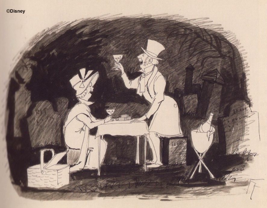
They are instead featured in a separate Davis sketch, first published in 2019:

MDIHOW 431

As usual, the scale model maquettes stick pretty close to the Davis sketches upon which they are based.


He's very well dressed and appears to be making fine progress through the champagne bottle. He's proposing a toast. "To us, my dear." He comes across as an extroverted, well-heeled, boozy, woozy ghost, yet another comical Davis drunk.  He's supposed to make you smile, and he does.

His female partner seems like an unassuming, cheerful type. She's got a nice spring bonnet with a gay pink bow. Appropriate clothing for an outing, nothing special. She's got her hair back, out of the way, sensibly enough for a picnic. One supposes that she's about his age, and that her hair is gray, but boost the color and we see that it still has some blonde in it.


She's of a mature age, but I get an impression of health and
vitality matching his.  Not bad for a dead person, you agree?

Overall, it looks like Marc Davis envisioned a sort of "Thurston Howell III and lady friend" tableau.  Naturally, such a man is going to dominate the scene.  He's bombastic and overbearing, but he's also jovial and harmless.  She's his happy companion, and to all appearance her contribution is not much more than that.


Heads Will Role Play

When some long forgotten maquettes of the band members came to light about a year ago, we traced the creative process that gave us the harpist, working from two sketches and two maquettes as well as what we already knew about the development of the band tableau.  You will recall that the discussion ended on a bittersweet note, since most of Marc Davis's meticulous attention to the character went for nothing.  In an economy move (time? money? manpower?), they just put an existing Pirate head onto the harpist's shoulders. Not all of the original Davis character was lost, however.  Owing to his height and positioning, the harpist still comes across as band leader, and owing to his quaint and curious, old-fashioned uniform and the whacked out music they're playing, he's still an amusing, mildly comic figure.


Ah, but when they made the same sort of economizing move with our male picnicker, alas, they gutted the scene.  Look at Marc's sketch and at the maquettes.  The man's face is 90% of the show, and I think this would still be true even if we could see her face.  But when they built the figure for the ride, he was stuck with a bland, serious countenance, lacking in individual personality. Sure, he's still dressed nicely, but not so much as to distinguish him from a lot of the other ghosts.  Why oh why did they choose this particular head? There are other Pirate heads with expressions not far from the one on the maquette.  Was the selection due to desperate hurry and current availability?  It better be a darn good excuse, whatever it was.

"To us, I guess. Whatever."


You could say that they had planned for a Dick Martin, but they settled for a Dan Rowan.

Here's a LINK for the L.I.N.K.'s among you (Laugh-in? No knowledge).

There's less to say about the woman's personality, since we can't see the maquette's face. For that matter, it isn't
easy to make out her face in the ride either, but once again Long-Forgotten rides to the rescue.  Let's take a look.


She too is sporting a standard-issue head, and she's got at least
one HM twin, back in the ballroom.  (The difference is all paint.)


Despite this, it seems to me that they were still able to preserve the
personality of the maquette pretty well, so far as it can be determined.

•       Youthful face            check
•      Happy mood             check
•      Cheerfully dressed    check
 
ride pic by maggotprince

In ride photos, the couple generally comes across as . . . subdued, shall we say?  Especially when
they're compared to what's going on all about them.  The picnic is not unpleasant, but it's a little dull.

(pic by K447)

What is that they're drinking, anyway?  Did they mistake the
ketchup bottle for the wine bottle?  Never picnic in the dark.
(pic by photomatt)

A Hit and a Miss

Since a pirate made off with the man's personality, the Imagineers had to find a way to inject some character into what was now a rather faceless tableau, so they apparently decided to reinvent the couple as veddy uppuh clawss Brits by means of their vocal soundtrack (which inspired an unofficial nickname, "The Duke and Dutchess").

The Picnickers


Okay, I admit that she's fun to listen to.  How can you not love the improvised "oh yes they do" at the end?  Hats off to Betty Wand. As for him, it sounds to me like Bill Lee is trying to pull off a Boris Karloff impression.  If so, it leaves something to be desired, but hey, it's certainly no worse than Dick Van Dyke's cockney.  I notice that his vocal sounds a lot less snooty than hers.  There's very little caricature in it.  You could just as easily argue that it's a mild, middle-of-the-road British accent, with no particular social pretensions projecting through it.

Overall, how successful was the reinvention?  In a word, meh.  There's a reason why no one ever talks about this tableau.  In their efforts here, I think the Imagineers scored one hit and one miss, but the hit was rather dull, and the miss was totally unnecessary and a damn shame.  As we have seen, there's a disconnect between the lively male maquette and his bland AA realization, but at least you can say that the vocal track seems to fit the ride figure.  It's humorless and lacking in personality, like him. I guess we have to call that a successful match, but big whoop.


Then there's the lady.  Like I said, despite her recycled head it seems to me that they preserved a nice continuity between the female maquette and her AA.  But then that achievement was inexplicably squandered by a poor vocal match.

By voicing her as they did, the Imagineers were apparently aiming for a comic effect along these lines:  A stuffy, self-important Grand Dame and her consort are seen enjoying a quaint old-fashioned picnic! How droll.  Even if you think the gag succeeds, it's still an awfully lame version of the same joke you see in King and Queen playing on a see-saw.  But I don't think it does succeed.  The lady looks nothing like what you would expect, based on the voice.  I don't see anything proud or snobbish or even comic about her.  Look at that unassuming smile, that perky little sunbonnet. She's got that quality the French call joie de vivre (although in this case we would more properly call it joie de mourir). Anyway, there's no irony here; she's exactly the type of gal who would really go for a picnic.  As amusing as the vocal track is by itself, I don't think it matches the figure.

(top right: Jeff Cook; bottom right: maggotprince)

So that's it.  Bummer.  But don't slash those wrists quite yet.  We've got a few
miscellaneous items to deal with, and after that Captain Negative promises to
come back to our overall evaluation and end the post on a more positive note.


A Loaf of Bread, a Jug of Wine, and Thou

I keep calling it a picnic.  It is.  In Marc's sketch, the picnic basket is conspicuously placed, as is the wine chiller.  In the actual ride, the chiller is there, and so is the basket, but it's been known to migrate over to the tea party.  I guess the teapot isn't the only thing that floats around.  

(pic by Brett Garrett)

Even without the basket, there's no doubt that it's supposed to be a picnic.  The tablecloth has that familiar checkered design
that says PICNIC as clearly as if it were written on it.  It doesn't show up in most photos, but you can see it in this picnic pic, Nick:


It's more obvious in this shot of the Tokyo tableau:

pic by Tom Bricker

Incidentally, the table is ALL there is.  Thanks to the HMH, we know that they're sitting on invisible chairs.  It's strictly a table tableau,
you might say.  (Well, some of you might.)  Anyway, they look constipated. One more reason to dislike the holiday overlay, I suppose.


Some of you may have another picnic nitpick:  the maquettes are drinking champagne, but the
ride gives them red wine, and yet it keeps the wine chiller.  Chilled red wine?  Quelle horreur!

You chill.  That looks like a champagne bottle poking out of the chiller, so the best course may be to imagine
that they're drinking pink champagne. It has a deep, unearthly glow, but that seems appropriate enough, oui?


Another problem solved.  How could you
sleep at night before this blog came along?


Armed and Loaded

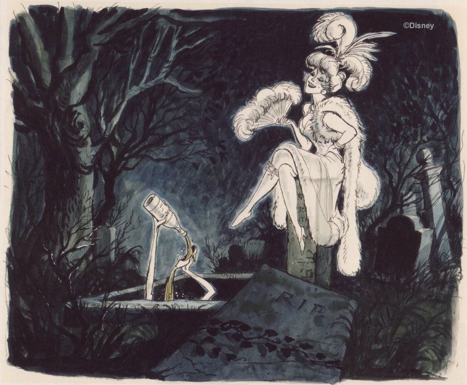
Speaking of wine, at Disneyland the party is being joined (crashed?) by the possessor of the arm coming out of a crypt in front of the couple and dangling a wine glass.  It's a great gag.  Everyone notices it; everyone likes it.  As usual, Dave De Caro has put up some excellent photos:


Striking as it is, that arm is only a leftover scrap from a much more ambitious idea Davis came up with.


Curiously enough, in Orlando the arm is a righty and holds a teacup.  It's been reassigned to the hearse tea party tableau,
in other words.  Tokyo takes it the next logical step and points their similarly becuppèd arm in the tea party direction.

pix: lostonpurpose (top left), CrimsonGypsy 1313 (top right). GRD (bottom right)

At Disneyland, good Ol' Blasty the pop-up ghost comes out of that very
same crypt.  Orlando and Tokyo have a regular stick-head popup there.

(pic by SilentDante)

Between him, the arm, and the bikers swooping around in the background, the poor
picnic couple is well and truly upstaged.  No wonder they inspire so little comment.

Unique

Okay, the picnic may not be the most exciting tableau in the ride, but it's not without a certain charm.  They're a couple entirely occupied with each other, having their own quiet party within the party.  There are examples elsewhere in the Haunted Mansion of coupled ghosts involved exclusively with each other, or nearly so.  There's the tipsy couple on the chandelier in the ballroom, the duelists, the opera singers, and you could make a case for the Bride and the Hat Box Ghost in the original attic.  But the picnic couple is different in that they are not very funny and certainly not scary.  The lack of humor as well as the utter lack of threat leave you with no alternative but to take them entirely on their own terms, and this is their one strong point.  They're a unique little island of tranquility, a romantic couple quietly enjoying each other's company even in the midst of all this pandemonium.  Kinda sweet, really.


Armor Gettin'

.
There is an old, unanswered question that will today be given a definitive answer, an unquiet spirit finally laid to rest after nearly half a century of restless haunting.  Don't misunderstand.  It's not what anyone would call an earthshaking discovery; frankly, it's more of an earth-yawned-rolled-over-and-went-back-to-sleep discovery.  But even though it's a minor mystery, it's a prominent mystery, so I suspect that a lot of you have wondered about it now and then, even if it isn't something that has kept you awake at night.  If it serves its purpose, this post performs the respectable if unheroic task of scratching a little itch you've always had.  Merry Christmas.

As it happens, solving this mystery only reveals another one.  In addition, the whole topic revolves around a familiar fixture found in most spooky old manor houses and haunted castles.  In fact, when it comes to haunted furnishings, that fixture is the cliché of all clichés, and yet it's rarely discussed.  So we will.  A little, anyway.


Suitable Suits

I am talking about that ubiquitous prop, your friend and mine, the suit of armor. With movies and TV shows, it seems like the cheaper the gothic horror story, the more likely it is that these guys are going to show up, since they're easily acquired from practically any prop house, probably don't cost much to rent, and they never fail to get the job done. If you're a set designer with a tight budget trying to create an old haunted house, one or two suits of armor are as indispensable as cobwebbing.

And when we go inside . . .

. . . it's just as I feared.

The 2003 Haunted Mansion movie wasn't low budget, so it went whole hog and gave us an entire armory, a suite of suits.  Set design is just about the only aspect of that film that everyone seems to agree was excellent, and the armory was no exception.  It was very menacing, very effective.

Nathan Schroeder's breathtaking concept art was the best thing about the entire movie, if you ask me.


Avoid a Void (especially if it carries a mace)

It isn't hard to explain why suits of armor are scary.  First of all, they're ancient and unfamiliar, from another time and place, and often they are holding wicked-looking weaponry.  Armor, after all, is supposed to look intimidating.  Second, they present you with a human-shaped vacuum that could easily be a hiding place for a prankster or a villain—you can't tell by looking.  Since you don't know for sure if anything is in there, when you see one your fight-or-flight instinct is automatically put on low level alert (otherwise known as the jitters).  Funny, but you can't help imagining them starting to move, however vague or backgrounded or foolish this anticipation might be. Third (and best of all in my book), despite any misgivings you may have, it is nevertheless presumed that suits of armor are likely to be empty, which is to say they contain nothing, they define a void, they create a something-that-isn't-there, and this "nothing" is in the shape of a human.  See?  You've practically molded for yourself a ghost, instantly and automatically!  With a suit of armor, it's all so easy that it's practically cheating.


Restraint

By including an armory, the Haunted Mansion movie actually made a radical departure from the attraction, which is surprisingly restrained in using this prop.  When Marc Davis did his concept artwork for the "Great Hall," he did put a pair of giant suits of armor at the entrance and another pair at the exit, but they were never used.

That didn't take long.  That's the fourth go-round for this artwork.

If you think about it, it would have been easy to put armor in both the changing portrait hall and in the limbo loading area at Disneyland or along the walls in the corridor and load area at WDW and Tokyo, and it wouldn't have looked half bad, but the Imagineers chose not to.  There are, of course, a few depictions of knights in armor—the Black Prince near the beginning and the Decapitated Knight near the end—and in the Disneyland Mansion there are a couple of suits in the background of the attic as random junk.  While we are at it, I suppose we should also mention the well-known experiment in 1985, when they put an actor in a suit of armor in the Corridor of Doors, frightening guests the easy way.


When yours truly saw him, he was like the above, unarmed, and he stayed well back from the buggies, mostly just striking poses.  That's because guests had reacted unpredictably and even violently at first, so the actor backed off and chilled out a bit.  Eventually they equipped him with a device like a garage-door opener so he could stop the ride whenever he saw guests engaged in chemical or zoological activity inappropriate to a Disney park.  For a short time at the beginning, he was armed with a huge axe, as in the concept art below.  One supposes that he could have put the kabosh on smokin' and pokin' just as efficiently with that, but legal issues and blah blah blah.


They discontinued this experiment after that one summer.


A Knight to Remember

But all of that is piddlesome trivia.  When most people speak of "the suit of armor in the Haunted Mansion," they mean the one standing to the right of the Endless Hallway.  He's really the only one that counts.  In true haunted house fashion, he's animated, just enough to cause a "what was that?" reaction.  Originally he was going to be on the left side, and one or the other of his arms was going to jiggle in conjunction with booming footsteps walking up and down the hallways, an effect never used (and discussed HERE).

(pix by Loren Javier, Old Grimm Guy, and of course Dave)

He was on display in the Disney Gallery in Disneyland during 2003, so there are lots of nice, clear photos of him in circulation.

(pic by Allen Huffmann)

How about an atmospheric 3D view, "magic eye" style as usual.

The WDW and Tokyo versions are not absolutely identical, but they are very similar.  What you've
got is a pretty standard-looking suit of armor except for that bizarre, bird-beaked helmet. Those
stars (or suns? flowers?? ) riveted to the sides are something I've seen before, but not on a helmet.

(hat tip CC)

Many Mansionites have wondered for a long time where on earth they got the
inspiration for that funny headgear.  Well, your days of wondering are over.


Armor for Albert

The Archbishop of Mainz from 1514-1545 was one Albrecht von Brandenburg (1490-1545).  He is mostly remembered today as an early foil to Martin Luther at the beginning of the Protestant Reformation.

Albrecht by Lucas Cranach the Elder

It was Albrecht who commissioned John Tetzel to sell indulgences for the Church. Famously, Tetzel went about this task in an exceptionally crass and mercantile manner ("when the coin in the coffer rings, the soul from purgatory springs").  This so infuriated Luther that he nailed his famous Ninety-Five Theses to a church door in Wittenberg.  Albrecht thought they looked a little heretical and forwarded them to the Pope, and bang, the Reformation had begun.  For a time Luther hoped that he might find an ally in the Archbishop, who was known for his broad education and generally liberal views, but in the end Albrecht came down firmly on the side of the Church and against Luther.

Anyway, in about 1526 Albrecht had a set of "costume armor" made (i.e. armor not for combat but for show).  Today it stands in the Kunsthistorisches Museum in Vienna.  One glance at the helmet (below right) and there is no doubt that we have found the model for
the one used in the Haunted Mansion (below left).

(pix by Allen Huffmann and by Fiona Moore at flickr)

(pic by Tomasz Wladarczyk at flickr)


So there it is.
Itch scratched.
Mystery solved.
Merry Christmas.
Good bye for now.


You're still here. You say you want
to see the rest of the armor? Why? It
was the helmet we were interested in,
and now you've seen it,  so we're done.
Don't you have some Christmas shopping
to do or something?    You shouldn't be
wasting the whole day on the Internet,
you know.   Now shoo, out with you.
Scoot. See you next time. Toodles.


Oh . . . all right.


Brace yourselves.


(pic by Jason Howse at flickr)

I tried to spare you, but oh no, you just had to look.  And what you've seen you can never unsee.  There
may be stupider looking suits of armor in existence, but there can't be many.  I feel like Ralphie's mom:

There.  I've said it.

Now that we've broached the subject, can you imagine what would have happened if they had copied the whole thing, not just the helmet?  I'll tell you what would have happened.  We would all be wasting time talking about an Endless Hallway with a Donald Duck chair on the left and what is obviously Donald Duck armor on the right.  We would wonder if we should start looking for "Hidden Donalds" around the Mansion.  And undoubtedly we would start finding them.  Someone would start a blog.


In fairness, the armor may not have looked quite so odd in Albrecht's day.  The "skirt" and the
Ronald McDonald shoes can be found elsewhere in the museum, although they're less extreme.

(right pic by cphoffmann42 at flickr)

But we're not in Albrecht's day, are we?  We're in our day, and in our day Albrecht's armor
looks simply ridiculous.  Maybe it would look better in a more haunted environment?


Okay, I guess not.  I wonder if Albrecht had an armored purse to complete the ensemble?

It's understandable that someone would take notice of this armor in a catalogue of photos in an old book somewhere.  No one can resist looking at a car wreck.  But why did they linger? Seriously, why did they spend the extra time and money duplicating this helmet when a standard issue could easily have been found in Disney prop storage somewhere?  I haven't a clue.


A New Mystery

So now the mystery is why they borrowed anything at all from this . . . thing.

I don't know who was responsible either.  Ken Anderson did a very cool sketch of a haunted suit of armor when he was working on the Haunted House in the 50's, but the armor itself is normal looking enough.


And even in his most surrealistic moments, Marc Davis gave us nothing but stereotypical armor in his artwork.


I wonder if Rolly Crump is responsible?  Was this his way of rebelling against the utilization of the hoariest cliché in the book? a way of turning it into something no one had ever seen before?  As we know, that was what he thought the Haunted Mansion should be: a place full of things no one had ever seen before.  Maybe.

Or is the helmet part of the Imagineers' efforts to emphasize the gryphon imagery in this part of the ride (discussed HERE and HERE)?  Maybe.


One thing we know for certain is that the helmet was like this from the very beginning.

( pic by Jeff Cook )

I note that they made the helmet look more masculine by flaring out the bottom into more of a bell shape, giving the look of a bull neck rather
than a bird neck.  In many other ways, however, the copy is quite slavish, like the careful duplication of the little  ~ shaped hole in the beak.

(pics by Old Grimm Guy and by Callie Giles at flickr)

Whatever the reason for it, I don't want to leave a false impression.  I actually do like the helmet.  The helmet's great.  It's intriguing, and
just as scary as any other kind.  The one place where the Mansion used the armor cliché, they gave it a mysterious twist, so I say good on 'em.

That's it for this outing, but make yourself nice and comfortable in this location, Forgottenistas, because we're going to be
exploring this room and the Corridor of Doors over the next couple of posts.  Some gooood stuff is comin' up, so stay tuned.

~~~~~~~~~~~~~~~~~~~~~~~~~~

Post Script:  This is not the only time Albrecht's helmet has been duplicated.  As of this writing, you can get one for
yourself from Outfit4Events for about 550 euros.  There is no hint at the site that they are aware of the Mansion version.