Extensive new additions October 2019
In an earlier post I mentioned how the Disney Imagineers create scale models of the attractions they are building, a doll house version. The models are set up high on tables with a narrow gap snaking between the two sides, representing the ride path. The Imagineers can then literally walk through the model and see it from the guests' perspective. Some photos of the scale model of Pirates of the Caribbean have been widely reproduced. Like this one. There's the big man himself, pretending to say something important about a pirate's knee to Claude Coats, who pretends to listen enthusiastically. Meanwhile, the pirate is pretending to shoot Claude, and we're pretending to believe this is a candid photo. It's all a part of that special Disney bullsh . . . er, magic. Disney magic.
Shots of the Mansion model also show up here and there, and it occurred to me that it might be fun to assemble as many such photos as I could find and see how completely they reproduce the ride. As it turns out, a fairly full presentation of the attraction can be put together in this way. That's nice, but let's face it, is something like that really worth a Long-Forgotten post? Hm? Probably not. Let's forget it.
. . . . . . . . . . . . . . . . . . . . . .
Oh all right, we'll do it, but I don't want to hear any whining. Since I've assembled these from a variety of sources, they vary in quality. Some are nothing more than screen grabs from mediocre-quality videos (I'm not proud). Also, some of the photos are well-known, and some have appeared here before, and some have even been the subject of specific commentary. Ah, but there are some that are seldom seen and that provide occasions for quaint and curious new observations. In fact, there's practically a full post on the Conservatory waiting below.
In October of 2019 Doombuggies posted a bonanza of scale-model photos. It seems that Imagineer Harriet Burns did a lot of work on the model and had a pretty good set of photos. Some are actually inferior to ones I've already posted here, but many are improvements. I've supplemented this post with some of the newly-discovered shots. Several new shots were also found in the new Marc Davis book (MDIHOW).
Ready? Let's get small.
The Stretching Gallery
In the January 1965 "Tencennial" TV special, Marc Davis shows us a model of the stretching room. It's too small and too empty, and at that date it's much too early to expect a scale model of the ride to be built, so we're already cheating by including this one. Still, it's full of interest.
"The new urinals in the Main Street restrooms are a big improvement, Walt"
We know that Yale Gracey created a model of the stretching room, and possibly this
is what we're looking at, but I think Yale's was a more elaborate, working model.
That wooden-looking structure is actually a model of the garrett area, a loose piece resting there on
the floor of the stretchroom for want of a better place to keep it. Compare it to Marc's concept art:
The most interesting thing about the model is that it looks like there are spaces for stretching portraits on all eight sides of the room, not just four. Don't get too excited though, because in a few moments, Marc will show the concept art for the familiar four stretching portraits to Walt and to that robotic audio-animatronic figure that follows him around throughout the program. (Actually, that's Julie Reihm, the first Disney Ambassador, and probably a very nice person, but in this show . . . well, let's just say I've gotten more heat from a popsicle.) Anyway, it's clear from the presentation that there were only four stretching portraits planned at that point, no matter what the model implies. Questions remain, however, since there is other artwork that may suggest an eight-painting gallery; in fact, it's some of the same artwork we looked at in the post before last (The Gargoyles):
Of course, the one on the left is only an illustration for a children's record, so you can't press it too hard for details. The one on the right, however, is a Davis sketch, so it's more interesting. Are those picture frames peeking in from the edges? Hmmm. It's intriguing, but at this point in our knowledge the idea that there may once have been plans for portraits on every wall in the gallery is only a tantalizing possibility.
The Changing Portrait Hall
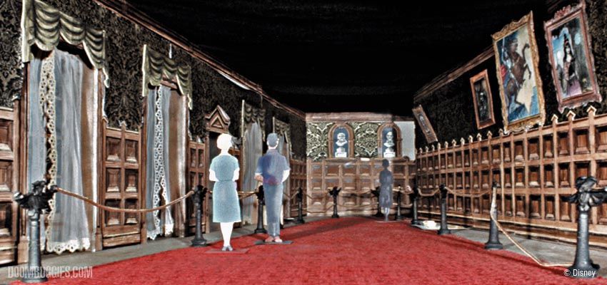
Now we're rolling. Several photos of this part of the model are out there, and as you can see, the finished attraction followed it pretty closely.
You say you'd like to see it in 3D? Yeah, we got that. Do the "magic eye" thing.
One thing the model shows is that the selection of paintings they were going to use was still fluid at
this point. Of the visible paintings, only the Black Knight portrait will make it to the final attraction.
The Witch of Walpurgis is on the far right. She'll make it into the WDW Mansion as part of the "Sinister 11" set,
following you with her eyes but not morphing. The two on the left are concepts that were never used. The one
See the heart on the vase? Nice touch. This would have fit right in if it
had been used. It's a botanical "Master Gracey," a floral April-December.
The other portrait is of an old miser who sold his soul to the
Devil, who has decided the time has come to collect his due.
The blank spot on the wall in the model probably had April-December in it
originally, but she was borrowed for use as random junk in the attic model.
We'll see her later. Her removal from her "rightful" spot in the hallway, however,
eerily foreshadows her actual fate, since she was taken out at the end of 2004.
We'll see her later. Her removal from her "rightful" spot in the hallway, however,
eerily foreshadows her actual fate, since she was taken out at the end of 2004.
April is much missed by fans. She'll
probably be the subject of the next post.
probably be the subject of the next post.
Limbo
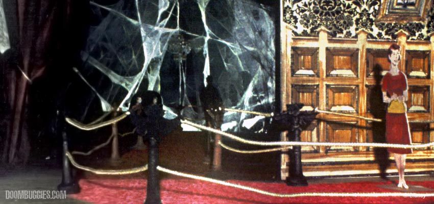
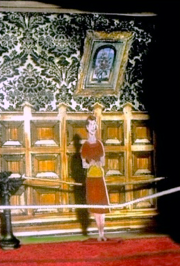
Here are two shots, showing two different areas of the model.
Beyond the skeins of cobwebs, you were apparently supposed to find only bluish gray mist around the doombuggy loading area (top) and total blackness elsewhere (bottom). My guess is that the mist itself was supposed to make for a brighter area around the loading belt, and combined with the few hanging lamps it was hoped that this would provide sufficient lighting. Of course, the blue mist is there, but it does little to illuminate the area. It does make for some moody silhouetting as you ascend the stairs, however. A Claude Coats contribution, don't you think?
If you go on the HM when it's broad daylight outside, your eyes will still not be used to the dark at this point and the effect of total blackness is mostly there, but there are still places where you can see walls and lights that you should not be able to see. For safety purposes, all kinds of lights have been added, illuminating the floor. You'll have to take my word for it that when the ride was new, this room was more impressive. As lighting increased, the overall effect was inevitably diminished, and the "boundless realm" in its original dark glory is a thing of the past.
Today, it's a Catch-22 situation. If your eyes are not yet adjusted to the dark, the limbo area is black enough (with some exceptions), but you can't see any details like the gryphons or the newel posts and staircases. If your eyes are used to the dark, you can see some of those things, but you can also see the walls and ceiling.
Now and then I've tried to produce something that conveys the intended feel of the place. Nostalgia, I suppose.
We did this one pretty thoroughly HERE, so there isn't much to add.
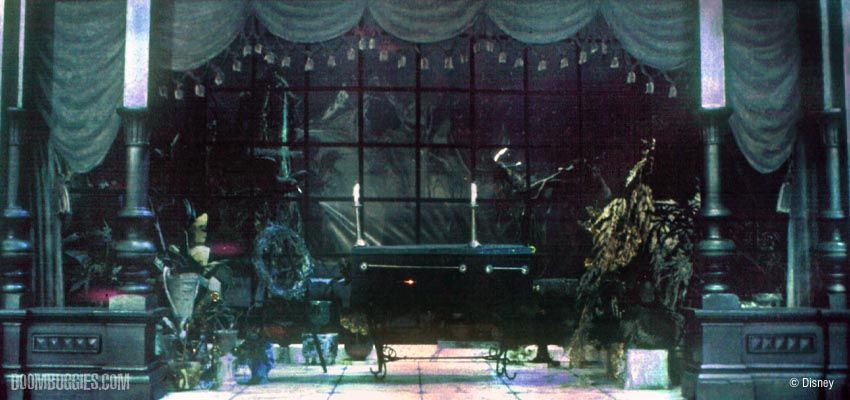
We ran this photo in our Walls and Stares post, so I haven't much to add about the Corridor, but I said nothing about the Conservatory, which is partially visible on the left, and that's an interesting story.
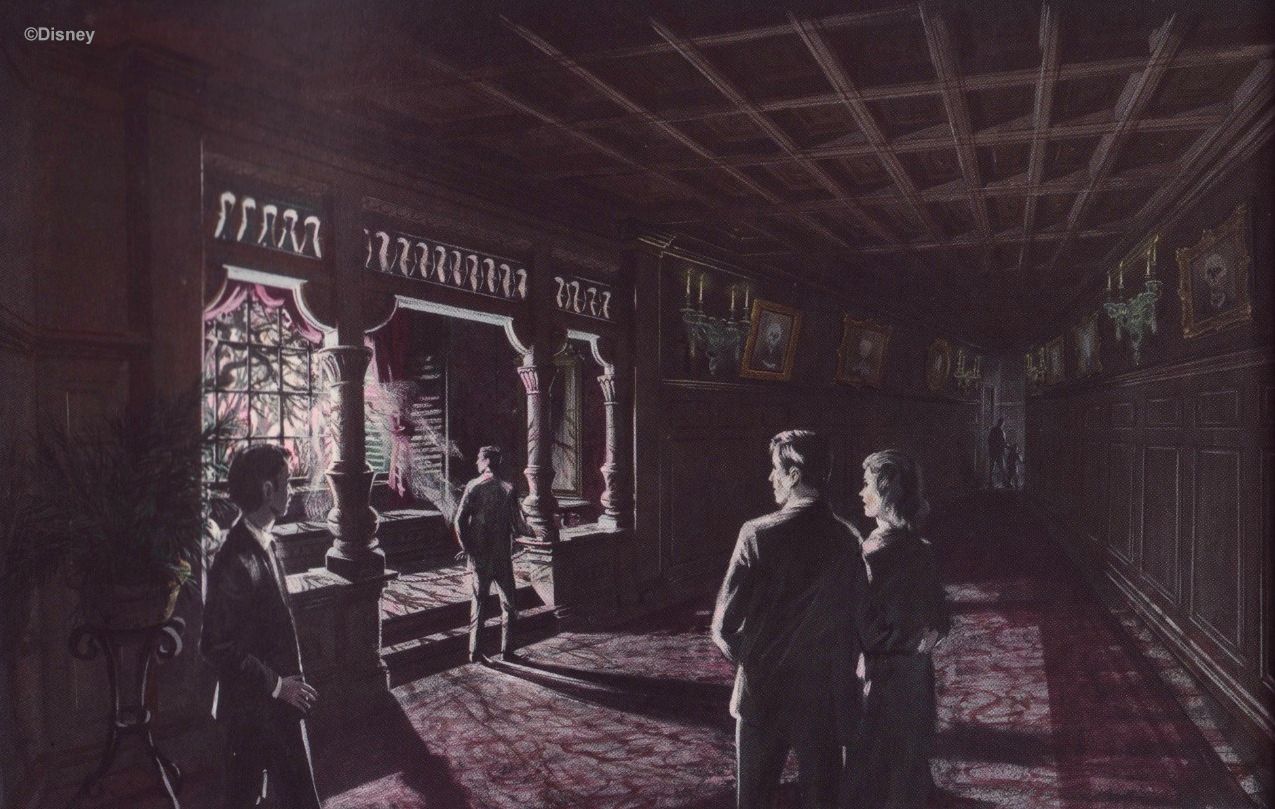
An architectural feature resembling, in design, the eventual Conservatory shows up surprisingly often
in various concept artworks, such as this watercolor by—I think—either Marc Davis or Dorothea Redmond. . .
. . . or in this Collin Campbell concept sketch (unknown before 2019) placing it in the Portrait Hall!
MDIHOW (378)
Notice the handsome turned columns on either side of the opening.
That's what you see in the model too:
That's what you see in the model too:
That's also what you see in Collin Campbell's colorful artwork for the "Story and Song" souvenir record album:
At first glance it seems that this attractive architectural feature
was preserved in the final attraction with little alteration.
was preserved in the final attraction with little alteration.
But "at first glance" doesn't cut it at Long-Forgotten, kid. Look again at those columns. They're
not the simple turned columns of the model and the preceding artwork. They're . . . bizarre.
not the simple turned columns of the model and the preceding artwork. They're . . . bizarre.
They're also hard to photograph in their entire floor-to-ceiling verticality from
the doombuggies, so we'll settle for a montage in order to take a closer look.
the doombuggies, so we'll settle for a montage in order to take a closer look.
Far from being a surrealistic flight of fancy, the Conservatory columns are all about bringing continuity and consistency to the interior architecture of the HM. The lion head corbels, for example, match the similar corbels that were already installed in the grand ballroom when the giant glass panels went up and the trompe-l'oeil background mural was painted.
But what about those claws? Ironically, those are most easily identified by comparison with something you can't even see: the feet of the
bier holding up the coffin. Under optimal conditions, you might be able to see the toes sticking out a little bit, but even that much is doubtful.
bier holding up the coffin. Under optimal conditions, you might be able to see the toes sticking out a little bit, but even that much is doubtful.
They're stylized representations of eagles' talons, complete with "thumb" or "spur."
That spur, in a similarly stylized form, is also what you see ringing the columns. Hmm...if the spurs are taken from eagle anatomy, do you suppose the "scales" can be explained the same way? Perhaps they're a stylized representation of the scales we see on the eagle's foot? Let's think about this. We've got eagle anatomy at the bottom of the columns and lion's heads at the top. We've seen that the columns were clearly given leonine features in order to tie them in with the upcoming ballroom. Do you suppose the aquiline features also tie in somewhere else? Eagles...eagles. Eagles and Lions. *insert lightbulb* D'oh, EAGLES + LIONS! Of course! The gryphons at the foot of the stairs!
And the fog slowly lifts. Those may not be scales at all, but feathers, heavily stylized
eagle feathers. Both they and the spur/claw can be seen on the carved gryphons.
eagle feathers. Both they and the spur/claw can be seen on the carved gryphons.
It's actually easier to see the similarities if you look at either the gryphons or the columns upside down. Understandably, the
gryphons are more naturalistic and less stylized, so the resemblance is not precise, but nevertheless I think we have a winner.
So the claws and feathers point back to the aquiline features of the stairway gryphons, while the corbels point
forward to the lion heads in the ballroom. There are also lion heads in the center of the doors in the upstairs Corridor.
Since gryphons are half eagle, half lion, they furnish you at the beginning of your second-floor journey with two of the animal motifs you will be seeing along the way until you get to the attic and exit the house. (They aren't the only ones, however; there is also a recurring serpent motif in doorknobs and corbels.)
Before we enter the Séance Circle, dig on the Ghostfather Clock model, from the Burns collection:
The Séance Circle
For some reason, there are a lot of photos out there of the Séance circle model before they turned Leota around to face the other way.
One curiosity is the flying object toward the upper left. What is that thing, anyway?
It's a round, three-legged table, very similar in fact to the table
found at this location in the actual Séance circle of the Orlando HM.
In this photo of the model, the table is casting two shadows, one faint, one heavy, from two lights being used for illumination. The table cloth is all rippling and wavy, not laying down on the table top. I'm not sure what the third, smaller object is. Another piece of cloth, like a doily or something? I don't know.
We have a later film clip of the Séance circle model after they had turned Leota around into her current position. Many of you no doubt have seen it. It's from the Osmonds 1970 TV special. In fact, if you hear Kurt Russell's voice in your head saying "...and the ever-popular horn-blowing," as you look at the lower photo, then you've seen the clip way too many times. Don't raise your hands; this is between you and your priest.
The Ballroom
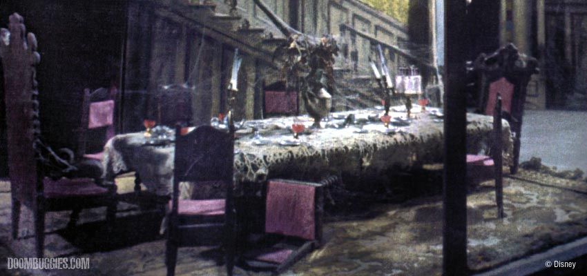
The working scale model of the ballroom came complete with the "Pepper's Ghost" reflection effect. To some degree all they did was reproduce what Yale Gracey had already done in his original working model. Both used a small turntable to have ghosts come into the room through a door on the back wall.
Some of the film of this model in action was so good that they spliced it into the reel
of stock film otherwise made up of ride-through footage of the actual attraction.
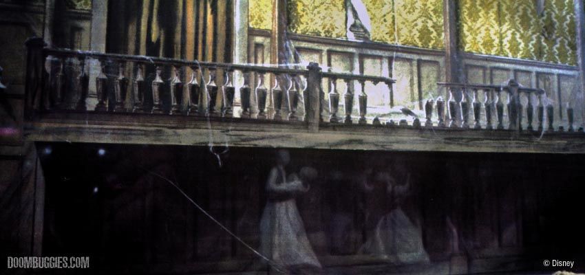
In this shot you can see the row of doombuggy models coming out on the balcony overhead and even part of
the Séance room railings through the doorway. Dang, this model must have been some fun to be around.
The Harriet Burns collection contains some very nice photos of the ballroom,
showing how amazingly closely the final attraction followed the model:
The Attic
This wide shot shows the gap within the model where Imagineers could walk.
We've looked at this particular photo in close detail many ... times ... already, so we won't linger over it now, but as promised, there's the April-December portrait, probably moved here from the portrait hall. That painting rattles around inside the lunatic fringe of our great Jean Lafitte conspiracy, of course. Fun detail: She's got a cat in this one.
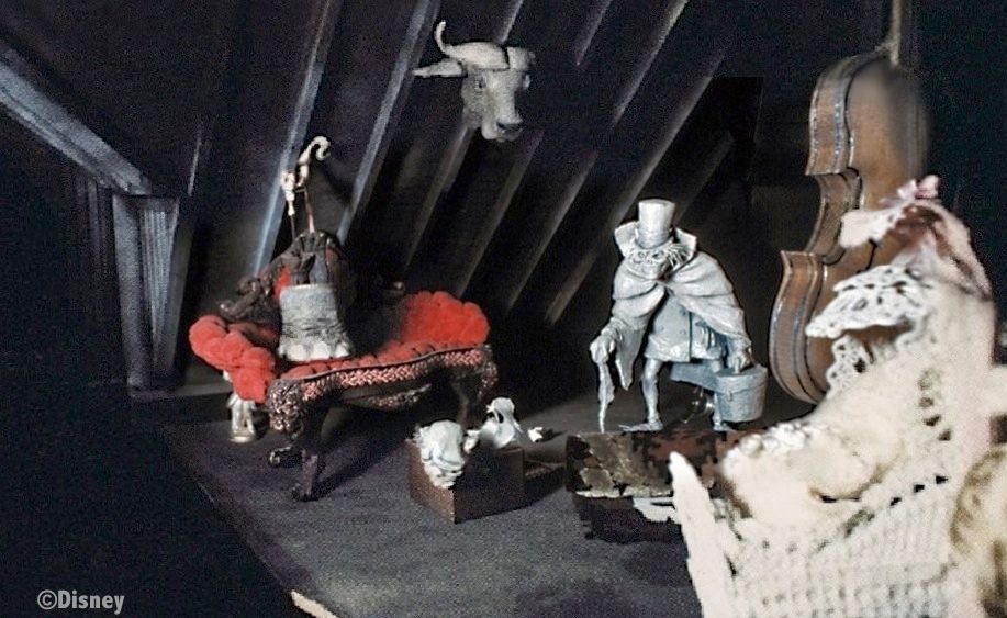
This photo of the other side of the attic model has also been posted
before, but there's something strange in it that hasn't been discussed.
Look at that grotesquely HUGE bass fiddle. My guess is that they just got hold of the smallest toy violin they could find and used it in the model
to save time and effort. Oddly enough, Collin Campbell reproduces it in a "Story and Song" painting with the same ludicrous proportions.
This is probably nothing more than an example of Collin's extreme conservatism whenever he rendered other peoples' artwork, but still, you have to wonder about that bass. This may sound off the wall, but . . . is it possible that the Imagineers were tapping into vague childhood fears of big, slightly menacing, serious-looking . . . um, things, you know, the unidentified things standing in nooks and crannies and dark closets over at uncle Fred's or grandma's house? Fascinating but strange and unfamiliar things, "grown-up" things, things not yet explained to you, unlike anything you have seen at home? I'll bet there are lots of little 'uns who have never seen a bass fiddle up close and would be scared of one standing in a dark corner. Maybe it's just me, but I suspect that a huge bass like that lurking in the shadows of the attic would have been creepy in some inexplicable way.
Unless I just explicated it?
That's what we do around here, friends: comprehend the incomprehensible, explain the unexplainable, unscrew the inscrutable.
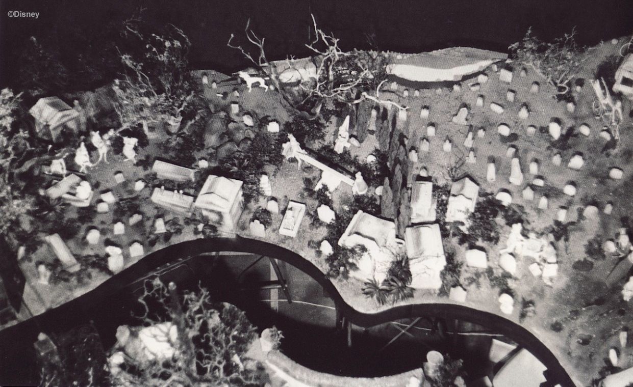
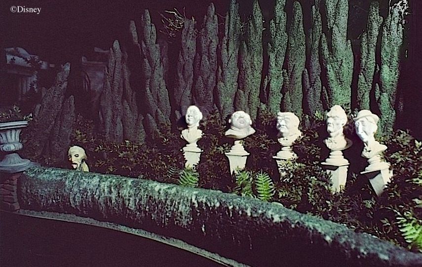
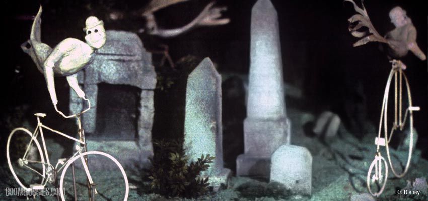
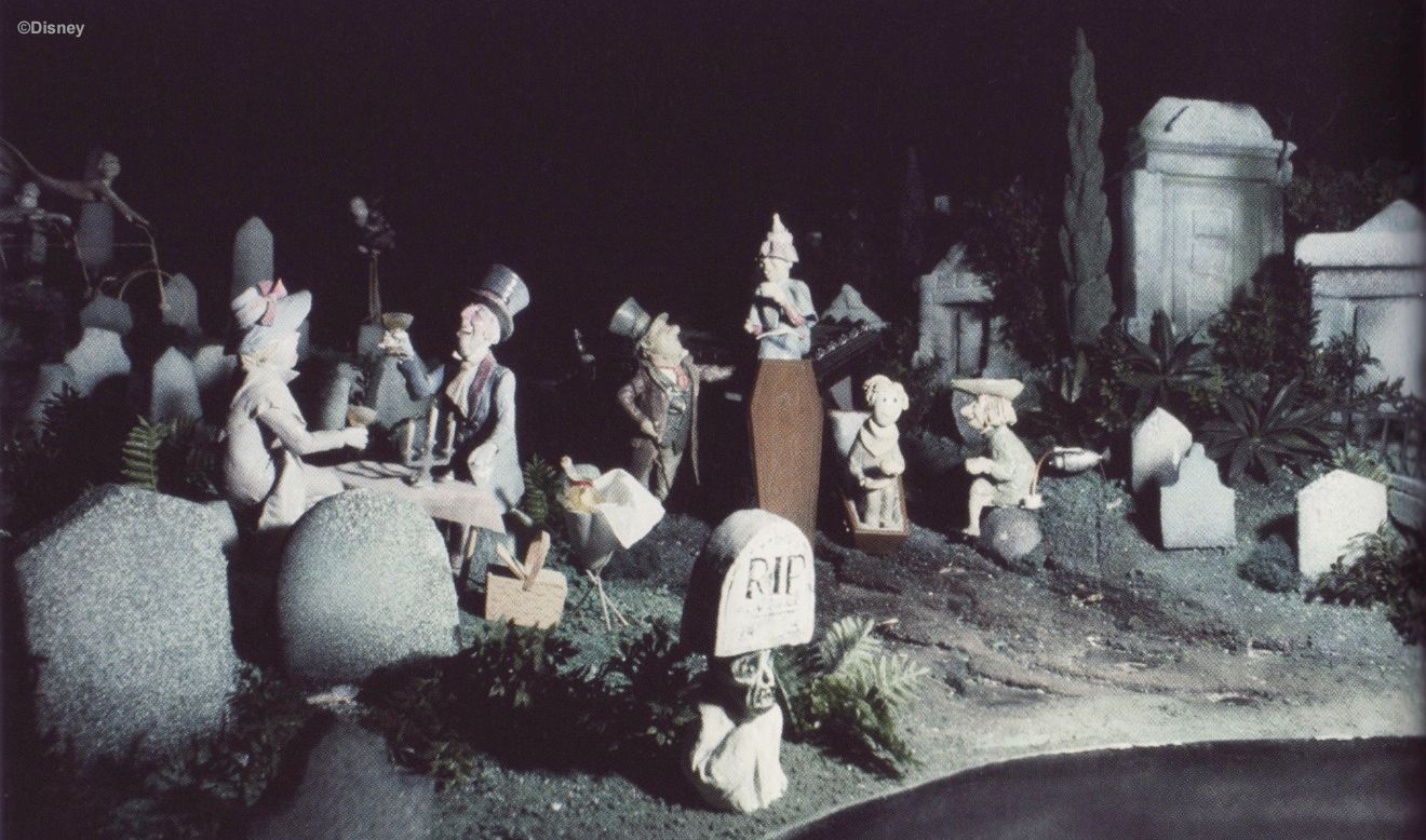
The Graveyard
Oooooo, lots of nice pix here, not surprisingly.
MDIHOW 404
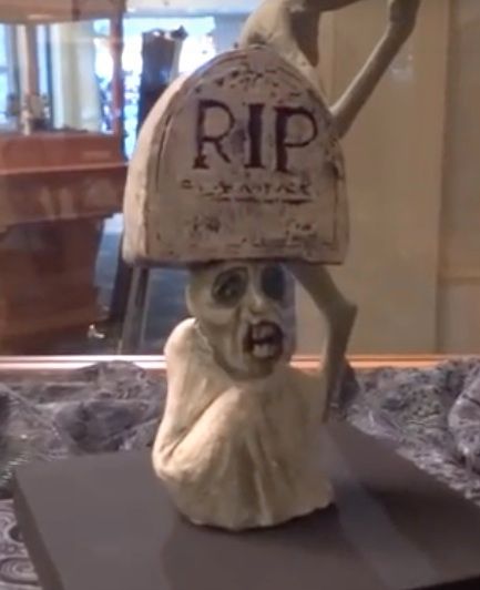
The most curious thing about that shot of the singing busts, of course, is the pop-up ghost. He would have been the eighth one in the graveyard, and he's on the effects blueprints, but I'm pretty sure he was never installed.
MDIHOW 406
The maquette figurines populating these models closely reproduce the designs in Marc Davis's concept art. It was only when they were turned over to Blaine Gibson for their transformation into life-size figures that they changed to a more realistic appearance. Speaking of Gibson, do you see that pop-up ghost with the tombstone on his head?
There's an interesting story to be unearthed there, and around here we leave no stone unturned and no pun unemployed when it comes to interesting stories.
The Imagineers were originally going to do a lot more with the pop-ups than they did. Here we have a tombstone that suddenly rises up with a ghoul underneath. They were also going to have one with a frog on his head. Here he is with Blaine working on him:
The frogs were going to be over by the band, either on lily pads or on stones:
It's that familiar gag you've seen oh so many times in cartoons. Someone crosses a creek on stepping stones, and one of the "stones" looks up quizzically. Surprise surprise, it's a turtle. Or a big rock standing in a grain field turns out to be a rhino (Peter Pan). So here, the "rock" that the frog is sitting on turns out to be a pop-up ghoul's head. You can easily imagine more examples (e.g., a bush turns out to be the hair on a silly spook). I'm glad they ditched this idea. Too cutesy, too corny.
The Exit Crypt
We end our tour with the famous trio . . .
. . . . and Little Leota, who is very little indeed in this case. The actual tableau follows
the scale model almost exactly. It's one of the most perfect things in the Disneyland Mansion.
If you manage to be the last in your group, and the Mansion is not too busy that day, you can walk slowly backwards on the escalator and enjoy the little ghost as long as you want, all alone. Also, those of you who have never been to Anaheim may not know this, but if you lean over and look down in there, the walls descend a long way and disappear beautifully into the darkness. There is a convincing feeling of a bottomless pit to the scene, which somehow adds a great deal. The little ghost beckons to you and taunts you at the same time. In one way, she seems so close you could almost reach over and touch her, but in another way, she's separated from you by a "great gulf fixed" (cf. Luke 16:26). It's a memorable and deeply satisfying way to end your experience. This is one place where the Anaheim original is unquestionably superior to the other Mansions.
Hurry back.








This excellent post reminded me of a video I saw years ago. This show did a tour of the magic castle. The castle has something they claim to be an original model for the the mansion. Here's the link:
ReplyDeletehttp://revision3.com/trs/wysiwygninja/the-magic-castle
At 00:26:33 you can see it. Not sure if it illuminates anything, but seems like it should be in the Long Forgotten archives.
Thanks for your tireless and wonderful work.
You're welcome, and yes, that model is authentic. I made some references to it (with some screen grabs from that very video) in The Haunted Mansion: It's Magic!, posted back in Dec 2010.
DeleteGreat post! One thing, though - was that weird ox-head or elephant umbrella stand ever covered in a previous blog/thread post?
ReplyDeleteYes, sorta. In the Are Imagineers Geeks? post, June 2010.
DeleteTop notch post; I truly enjoyed it!
ReplyDeleteThat's not the portrait hall. Where're the thousand or so people squishing me like it's a Who conert?
ReplyDeleteYou have to learn how to play the crowds. Be last out of the stretchroom and sorta dawdle. You can often have the hall to yourself for a few moments after the mob has all turned the corner.
DeleteVery good post!!
ReplyDeleteI've never noticed the Comedy & Tragedy Masks at the top of the posts in the foreground of the grand ballroom.
I'll be looking for them from now on!
Actually, they're lion heads.
Deleteah, yes, I see them now.
DeleteJust a matter of my eyes seeing what my brain is more likely to look for.
And here's a fun detail: take a look at the photos at the very end of the previous post (The Haunted Clock), and you will see that the lion head corbels face in all four directions.
DeleteVery nice article, as always! It's too bad the old miser who sold his soul didn't even become one of the Sinister 11 over at WDW. I wonder if it had something similar to do with the fact that there weren't any crosses in the attraction like you mentioned in an earlier article (I have never been to the DL HM, so I wouldn't know if it ever showed up there). No crosses, no devil either.
ReplyDeleteIt's true there are currently no indisputable devil's heads in the HM, but at one point they made some devil's head blastups (popup ghosts), even though it's not clear whether they ever used them, and the carving on the top of the large chairs in the ballroom is arguably a devil's head (see the post about The Man Who Saved the Gryphons). At any rate, the lack of devil's heads probably has little to do with concerns about religious offense: just look at all the devils in Mr. Toad's Wild Ride. Also, the artist who created the Old Miser changing portrait was Marc Davis, almost certainly the same guy enforcing the no-cross ban.
DeleteLet's not forget the most obvious devil's head: The gate plaque!
ReplyDeleteGood one. Even in that case, however, there are quibblers who note the lack of a stereotypical beard and prefer to call it a satyr.
DeleteI wonder what the painting in Yale's working model is? It's clearly not one of the Dualists. Also what's up with all the girl and cat paintings? The Witch of Walpurgis I get, but the opera glasses woman and the April-December with cat? Do you think there was a deeper story going on there? Could Beating Heart have been April-December? Or is this all just a big coincidence? The Conservatory seems like it was intended to be much bigger, I guess back when it was still a walk-through idea. Instead it makes you feel just as claustrophobic as Coffin Lid Guy and the ghosts in the COD. Also it's interesting that their appears to be a hand creeping out of the trunk in the Collin Campbell art. A personal touch or something more? heh-heh-heh...
ReplyDelete(1) It's a silhouette of a big guy with an ax against a normal painting of an unrelated subject (2) Davis liked black cats; they're all over the place in his concept art. Traditional Halloweeny feel; that's probably all it is. (3) BH ≠ AD. Just two unrelated characters (4) The conservatory inspiration is only that little part on the far left in that watercolor, not the whole room.
Delete1. Nice, and we ended up with a singing executioner in the graveyard, even better. 2. Makes sense to me. 3. I guess the AD with cat is just random attic junk then. 4. The area with the billowing curtains? Then what was the rest of the room supposed to be?
ReplyDeleteI really don't know what the room represents. I suspect they may have done a number of sketches just to see what kind of architectural feel they wanted for the interior.
DeleteI seriously can't imagine one of the pop-up ghouls actually appearing balancing a tombstone on his head. It's a great way to hide it but the result would be laughter, not surprise.
ReplyDeleteThe way I've always interpreted that Gibson photo was yet another "let's do something silly for the press photo" shot... I've never actually considered that the intent was to seriously have the frog as part of the pop-up ghoul. I could be totally wrong, however, as I have a vested interest in that frog, because it was slightly re-sculpted to "smile" and actually used in the WDW Jungle Cruise for about two years. Supposedly, Dick Nunis ordered the frogs removed because they "looked dumb".
Your observation shines new light on the frog mystery, however. Davis got his way 100% of the time on the Florida Jungle Cruise, and that is the attraction he moved onto following completion of his work on Haunted Mansion. On the Jungle frogs concept art, he's written "2nd revision - replaces man eating plants".
Of course, frogs on lilypads appeared again in America Sings. What kind of frog obsession was he nursing? on one hand, we can see the re-use of the frogs as part of Davis' frugality - he always tried to operate within the realm of the "achievable". On the other, we can see it in Mansion as a symptom of his need to make everything a joke - even a scare.
Ugh oh, we're back in the realm of scary vs. funny........
I'm pretty sure the frog photo isn't just a silly photo concoction because the frog is so perfectly form-fitted to the ghoul's head. Look at the fingers and toes. I suppose it's possible Gibson took a sculpted frog in still-wet clay and shaped it to the head, but that seems like a lot of work for a silly publicity shot.
ReplyDeleteexcellent post as always
ReplyDeleteGreat post, I'm always impressed with the amount of detail that goes into those models. Sometimes it really is the best way to show 'design-intent' to the people who are actually going to build it.
ReplyDeleteThis is a fascinating post. Haunted Mansion is one of the few rides that the whole family enjoys. Thanks for putting in the time to create this.
ReplyDeleteThanks, Danny, arch, Shawn.
ReplyDeleteMight I suggest an article where you count the ghosts to see how close the number of them is to 999. I know it's a stupid idea but it would be a fun read
ReplyDeleteIt's been tried, believe me. It bogs down over the definition of "ghost." With a strict definition, there are only a few hundred. With a loose definition, it's thousands. "That way lies madness." 999 was just a number plucked out of the air.
DeleteActually 999 upside down is 666. Also where do you get some of the concept art you use in your posts
DeleteMany places.
DeleteYou may find this interesting - a replica of the Disneyland Haunted Mansion is for sale. http://www.ebay.com/itm/Disney-House-HAUNTED-MANSION-Replica-10-000-Sq-Ft-7-Bedroom-6-Bath-Atlanta-GA-/390474474254?#ht_11026wt_1066
ReplyDeleteI may be wrong, but using a noticeably out-of-scale prop in what's more or less supposed to be a finished model seems unlikely. Making model props in the right scale is easy enough (especially when you have a crew of assistants), and having something out of scale kind of defeats the purpose of a scale model.
ReplyDeleteBut who knows.
You make a good point, which is basically why I tried to find some kind of explanation for a deliberately oversized bass fiddle. It's quite an anomaly, though.
DeleteI LOVE the miniature version of the Haunted Mansion...it in fact inspired me to 'bring to life' (no pun intended) my concepts for an attraction I hope to actually get made at some point...the scenes are inspired by the HM, as I have loved it since I was a kid in California, tho my attraction concept would revolve around a fictional TV 'reality' show (Spectre Seekers) taking guests on as 'new crew members' and touring an abandoned mental hospital (Bedford Asylum...the most HAUNTED place on EARTH!...;)
ReplyDeleteYou can see a test video I created utilizing the Pepper's Ghost effect here:
https://vimeo.com/49940932#at=0
Thanks for a GREAT post, I loke everything you put up, but this one is particular turned me into a massive Grim Grinning Ghost...
One of my favorite posts so far.
ReplyDeleteI don't suppose for a moment that the imagineers saw these photos, but some of the faces in the mansion (especially the pop up ghost with the frog on his head) remind me of this poor gentlemen having his facial muscles stimulated with electrodes https://commons.m.wikimedia.org/wiki/File:Experiments_in_physiology._Facial_expressions;_Terror_Wellcome_L0037463.jpg
ReplyDelete