

One way to understand and appreciate Claude Coats' contribution to the HM might be to review what exactly it was that he did in his 54-year career at Disney and to see how those special skills are showcased in the finished attraction. This is not by any means a full survey of Coats' work, of course; there are other places to find that.
A Career in Quick Review
No question about it, Coats belongs on the short list of all-time greatest Disney Imagineers. He joined Disney about the time that work on Snow White was beginning to accelerate. Coats was a background painter, eventually becoming a color stylist as well. He was happy to stay in that area, which seems appropriate, since he was a quiet, polite, self-effacing guy, showing little inclination to call attention to himself. They called him the "gentle giant" (he was a little over 6' 6"), and people who worked with him recall a gifted, amiable, and exceedingly generous colleague and mentor.
As background artist and color stylist, he worked on every Disney animated feature from Snow White to Lady in the Tramp, plus innumerable shorts. Dude. Already with Pinocchio and Fantasia, his concept sketches and backgrounds were widely admired around the studio.


Of course, a high percentage of Coats' paintings were less dramatic affairs:
But even in these, the use of color, perspective, and simple architectural details creates an instant illusion of space and depth. The clean designs, muted tones, and carefully controlled color palettes result in a perfect balance: the paintings are attractive without attracting attention to themselves. A neat trick, that. These are the stages upon which the actors will perform, and it is they who are supposed to occupy your attention, not the scenery. Coats always understood this. He was a master of "stage design." When Eyvind Earle's backgrounds for Sleeping Beauty were criticized as too dazzling, threatening to upstage the characters (and in places this is almost true), he was essentially being criticized for departing too much from the just-right Claude Coats look.
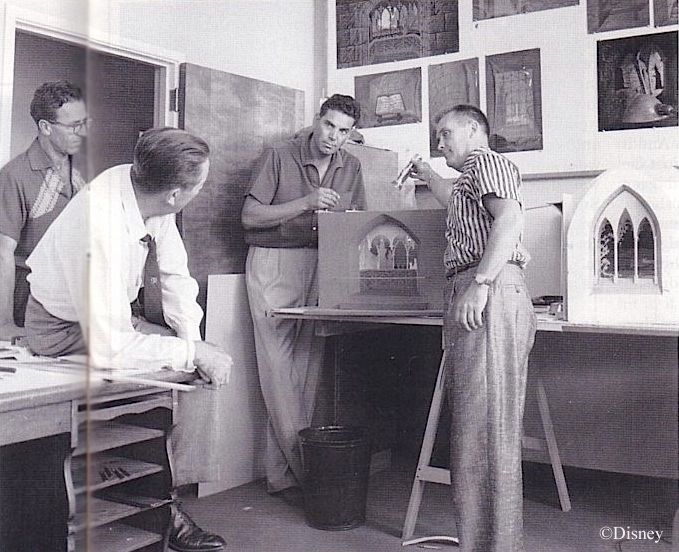
Coats was one of the artists Walt pulled out of the studio to work on Disneyland as it neared completion. He had studied architecture as well as painting, and he seemed a natural pick for designing the interiors of dark rides, starting with Mr. Toad's Wild Ride. Among other things, Coats had a knack for squeezing an amazing amount of ride into a ridiculously small space. He and Ken Anderson must be given the lion's share of credit for Mr. Toad.


The precise extent of Coats's contributions to the other two 1955 originals, Snow White and Peter Pan, is less clear, but there seems to be little doubt that he participated. Later dark rides in which he was heavily involved include Alice in Wonderland and Adventure Thru Inner Space (which was practically all Coats; notice that there are no characters in ATIS).
(Coats concept art for Mr. Toad's Wild Ride)
The precise extent of Coats's contributions to the other two 1955 originals, Snow White and Peter Pan, is less clear, but there seems to be little doubt that he participated. Later dark rides in which he was heavily involved include Alice in Wonderland and Adventure Thru Inner Space (which was practically all Coats; notice that there are no characters in ATIS).

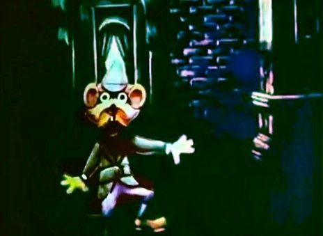
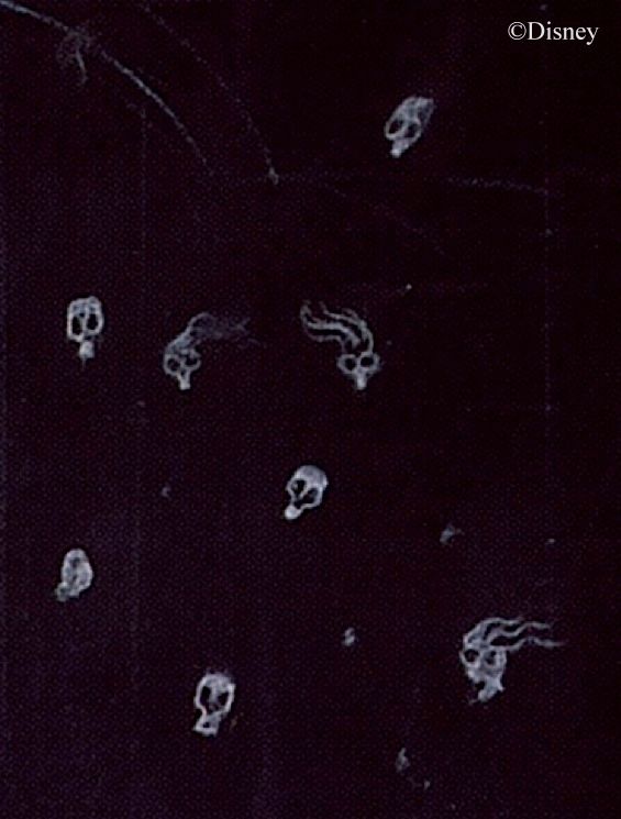
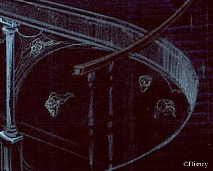
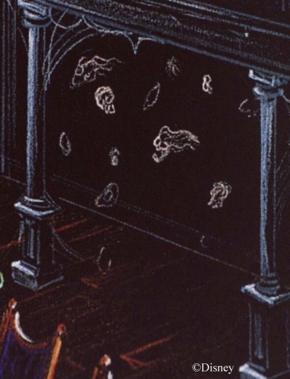
From the original Snow White's Adventures. The whole skeleton wiggled
while the skull extended toward you as you headed straight for it.
Anderson's and Coats's use of fluorescent paint was far more sophisticated than anything previously seen. They used darkness and black lighting to create a continuous flow of convincing spatial illusions.


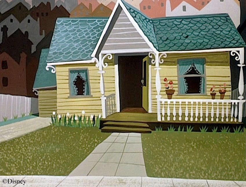
As a background artist, Coats found that he was now doing pretty much the same thing in these dark rides, except on a larger scale. For the man who had already done so many beautiful background paintings for Peter Pan, scenes like these would have been a natch:
Besides the sheer scale, another difference in this work was the mixture of 2D and 3D. Coats was now doing background paintings with bulges, a sort of bas-relief. He quickly showed himself a master of this technique. This Peter Pan shot is modern (hat tip Daveland), but it preserves the illusioneering Coats and Anderson pioneered at Disney, layering shallow, three-dimensional models against flat paintings:


From Designing Disney's Theme Parks (ed. K.A. Marling; Flammarion: NY, 1997) 127.
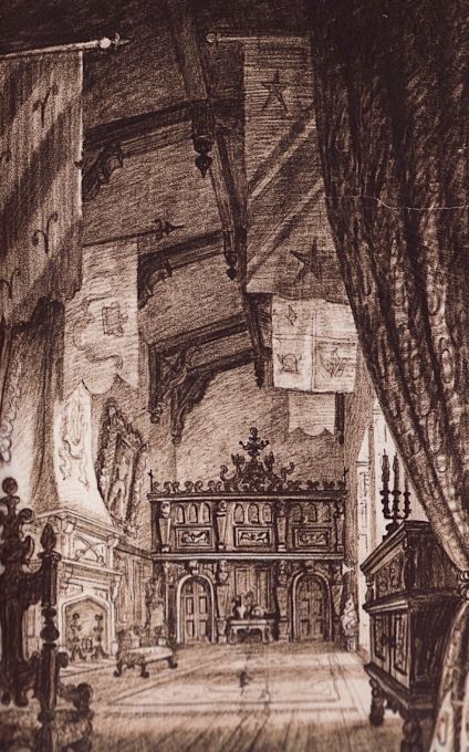
(This rarely seen sketch is thought to have been done by Coats and is dated 1955. It has been suggested that it shows interior sets
for Peter Pan, but that seems extremely unlikely to me. More plausibly, these are concept sketches for Fantasyland itself, before
they realized that they were running out of money and went for the less-expensive, "Medieval Faire" look instead. It is fascinating
to compare some of these drawings with some of the ride façades created for the New Fantasyland in 1982-83.)
This ability to create convincing environments by cleverly blending 2D and 3D was put
to good use in designing "diorama" attractions like the Sleeping Beauty walk-thru . . .
. . . the Grand Canyon Diorama . . .

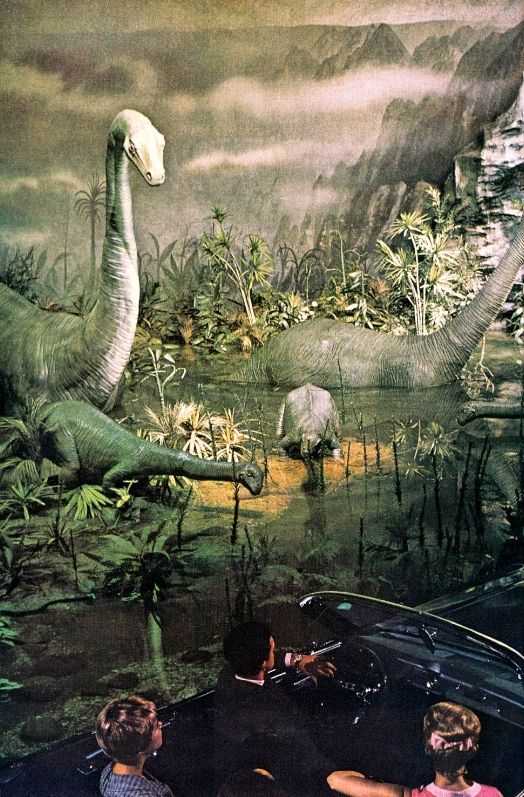
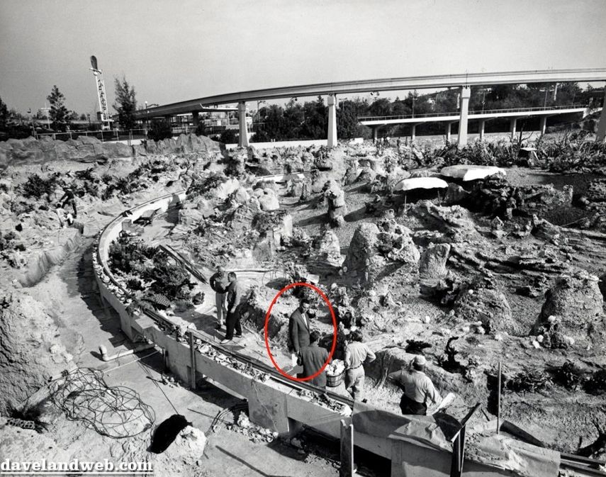
. . . and Primeval World . . .
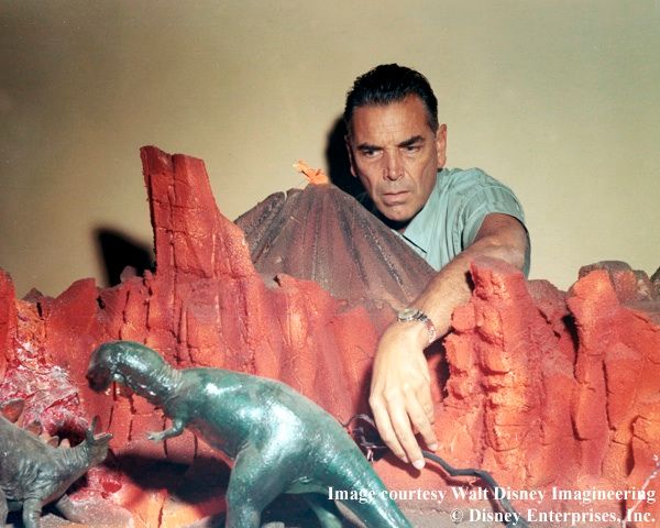
"Run for your lives! It's a CLAUDASAURUS REX!"
(I was lucky enough to see the original Primeval World, a segment in Ford Motor Co.'s Magic Skyway
exhibit at the NY World's Fair. The sets were spectacular, much taller than the Disneyland versions.)
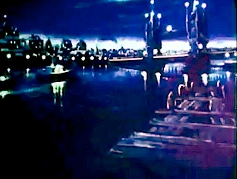
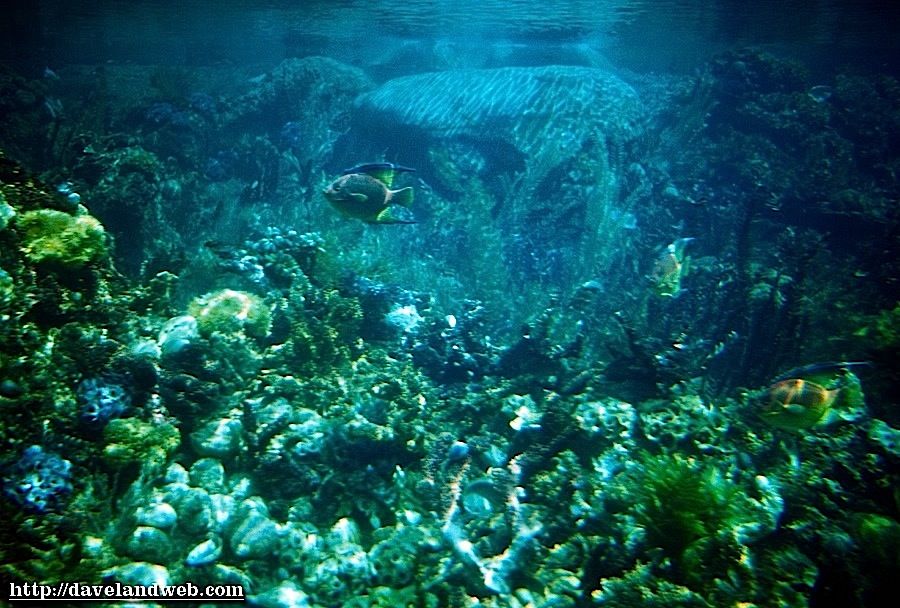
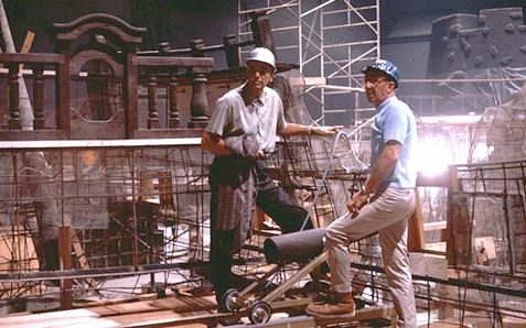
The Submarine Voyage was another Claude Coats masterpiece. The seductive sets
(there is no other word for it) create an illusion of vast space within a confined area.
His six-foot-six frame is easy to pick out in photos:
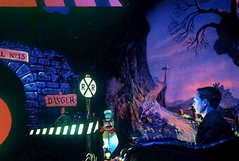
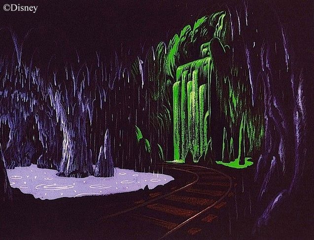
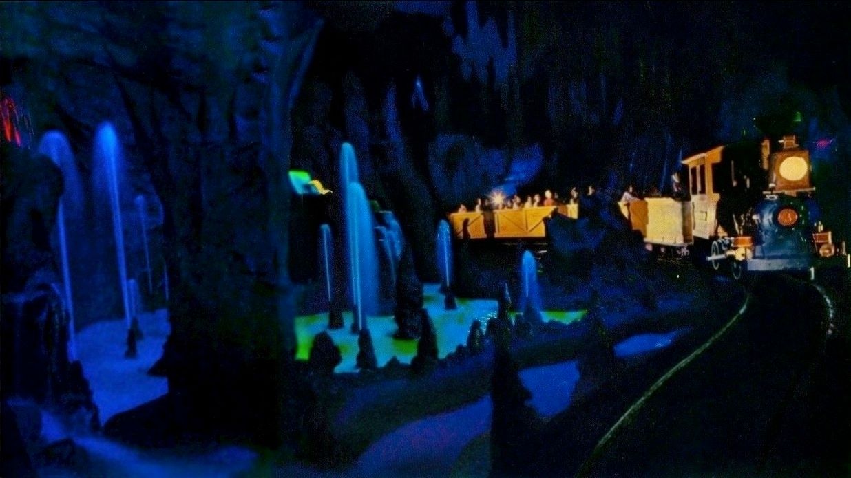
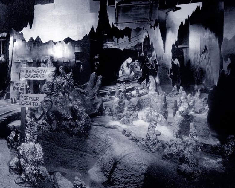
Yet another Coats masterpiece: the Rainbow Caverns portion of the original Mine Train ride, a tour-de-force in creating atmosphere through black lighting and creative use of limited space. Among yesterlanded Disneyland attractions, this one sits at the very top of my most-missed list:

It had a swell soundtrack too. I've added the sound of waterfalls and fountains, for a more virtual experience. As I recall, the water sounds were at least as loud as the music.
Rainbow Caverns with Water Sounds
(Photo by Thomas Nebbia © National Geographic Society)
Butt ugly to unearthly beauty with a flip of the switch.
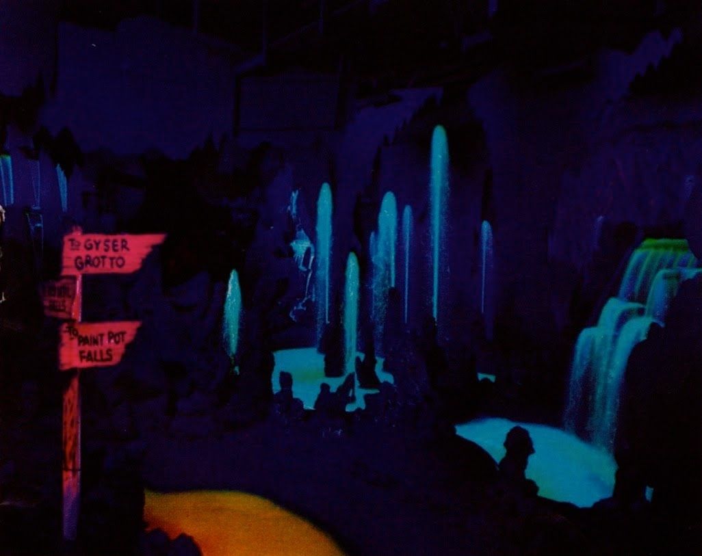
As you look at some of those Coats backgrounds up above, like Gepetto's cottage and the Sorcerer's Apprentice interiors, you almost wish you could step into them and look around, so inviting are they. With Rainbow Caverns, Coats finally enabled you do just that: ride right through one of his moody, atmospheric paintings.
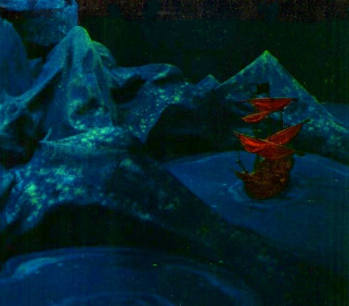
Coats was paired with Marc Davis in the development of Pirates of the Caribbean. In general, Coats created the sets and Davis created the characters (although that's a bit of a simplification). Coats was very much the architect in charge, very hands-on.
Coats was paired with Marc Davis in the development of Pirates of the Caribbean. In general, Coats created the sets and Davis created the characters (although that's a bit of a simplification). Coats was very much the architect in charge, very hands-on.
The smashing success of the Davis-Coats team with POTC made it an obvious choice for the Haunted Mansion. In a rare comment on the latter attraction, Coats said, "Marc Davis had made a whole lot of interesting drawings, so many that we weren't able to use them all. The best ones seemed to drift to the top, and everyone seemed to be satisfied with the final selections.... Marc would work up drawings and I'd find space to put his ideas into the show."
Marc's comments on Claude seem to echo this analysis: "He was a background man, and he studied architecture at USC. His work was very commendable. He would do the settings for things, the environment within the attraction. I guess he did the framing, and I did the dancers within the frame. He was a nice fellow." ("Commendable" seems a bit stingy for an artist of this caliber, but that's Marc for you.)
(Quotes taken from Jeff Kurti, Walt Disney's Imagineering Legends [Disney Editions: NY, 2008] 58)
Coats was never an animator. He rarely drew characters, and when he did, they were generic. He did sketch a few ghosts for the Mansion, but they have no individual personality:

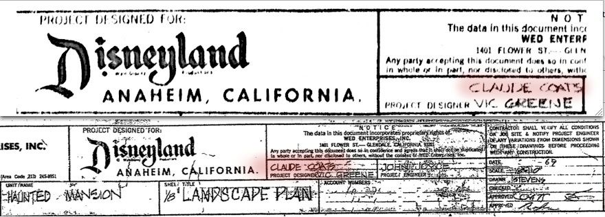
The wraith figure on the right actually did make it into the finished attraction, in the (original) Séance circle and in the Graveyard (i.e., the shrouded figure in the crypt). But this was an exception. Coats was much more involved in the physical architecture of the ride. In fact, the extant blueprints for the attraction have Claude Coats as the top Project Designer (with Vic Greene added second).
So, is that it? Coats was the architect of the house; Davis created the characters unliving in it. Somehow that analysis seems insufficient. There is such a different set of vibes coming from the two Imagineers that something more seems to be involved. It's not just spooky vs. kooky either.
The Painting as Gateway
Marc Davis produced umpteen haunted portrait concepts, not only changing portraits, such as you see in the final product, but talking portraits, portraits in which one character moves to another, and other varieties. For a time, it seems they were thinking of including that hoariest of haunted house clichés, the portrait with shifting eyes.

The original "Sinister 11" portraits at WDW featured a passive version of this gag.
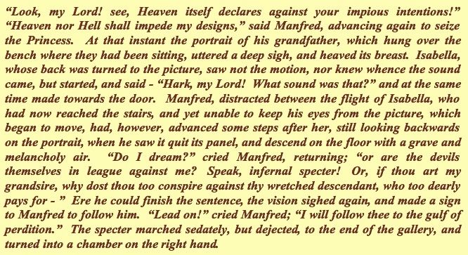
If you think about it, any artist like Davis or Coats who paints in a representational style is already engaged in illusioneering. You feel as if you are looking through a window into a real, dimensional world; or if it's a portrait, you feel as if you are in the presence of an actual person. It's so fundamental that we normally don't even think about it, but it is true nonetheless that paintings can be downright eerie, without them even trying for that particular effect. It's no wonder that enchanted paintings are a stock item in the annals of the supernatural. You already find one in The Castle of Otranto, the first Gothic novel, written by Horace Walpole in 1764. In it, a figure steps right out of the frame of a painting.
The gag has often been recycled since. W. S. Gilbert (of Gilbert and Sullivan fame) used it in Ages Ago, an 1869 stage musical, and again in Ruddigore (1887). Notice how this 1870 London Times illustration of the scene in Ages Ago (right) even mimics an old illustration of the similar scene in Otranto (left).

At one point, Marc Davis played around with this concept for some of the haunted paintings in the Mansion.
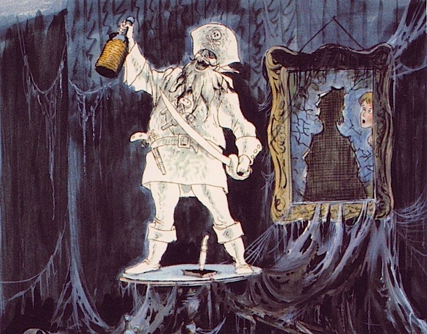
Being the character animator par excellence, Marc Davis's natural inclination was to see a haunted painting as a portal through which a character comes from there to here, interacting with us on this side. That's the tradition, going back at least to Otranto. There would seem to be little interest in the world on the other side of the painting once the character has left it. Look what's left of that pirate portrait once the pirate has stepped out of it.
Some of Coats' published Haunted Mansion artwork is quick-study stuff. There's a mood, but you don't necessarily feel . . . , you know, sucked in.
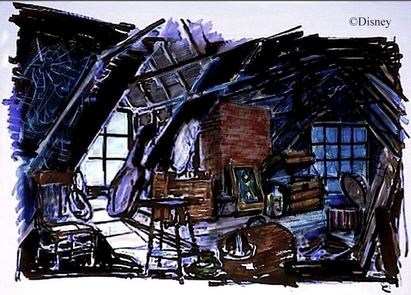
Let's step inside, as best we can.
After examining the Fantasyland dark rides, with their blend of 2D and shallow 3D, bathed in the magic of black light, is there any doubt how this scene would have been accomplished? So cool. And this:
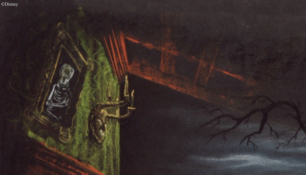
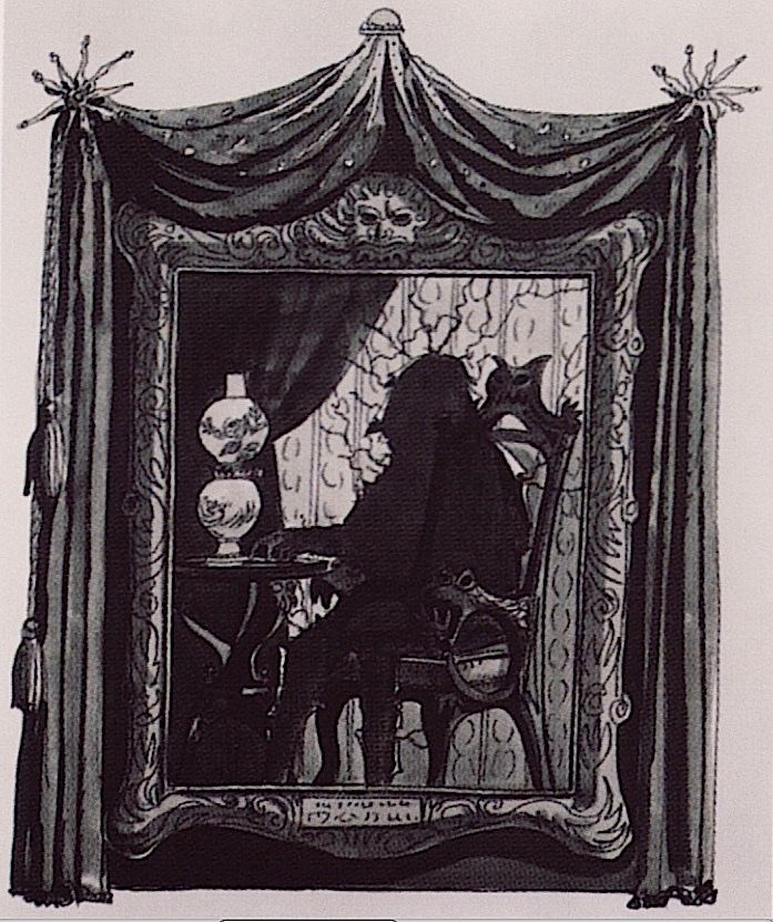
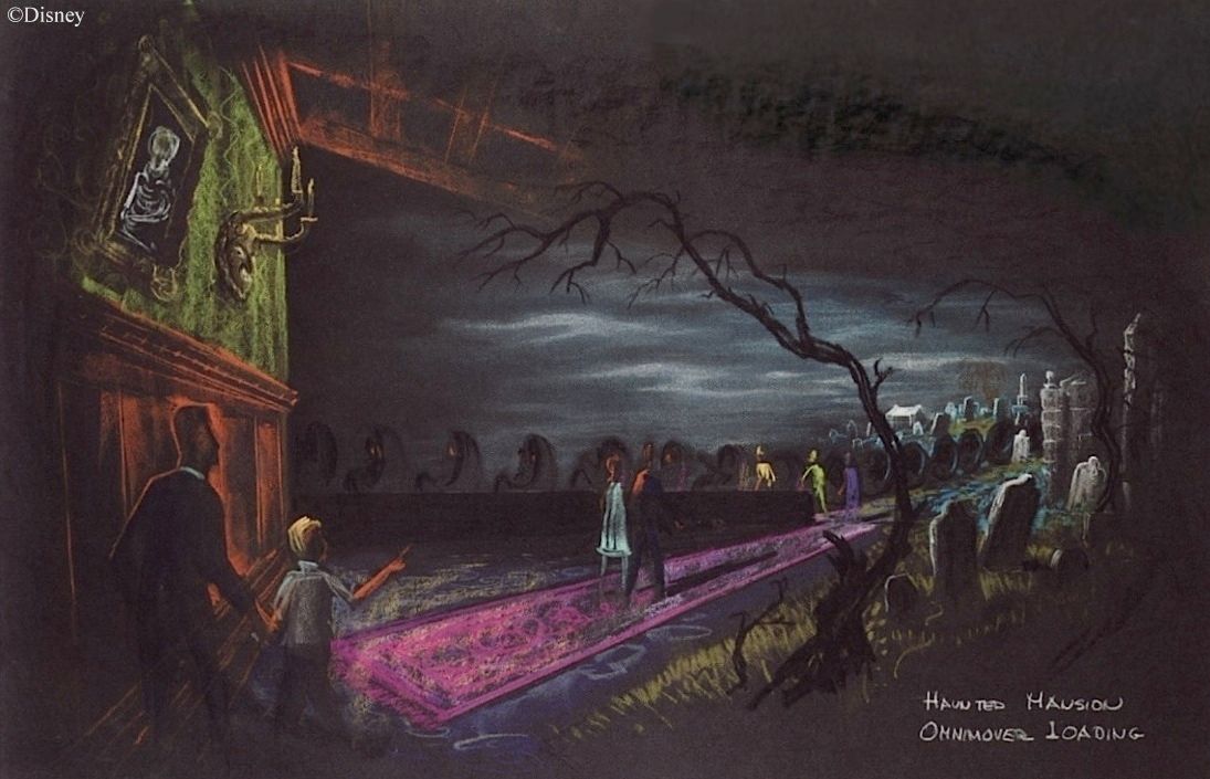
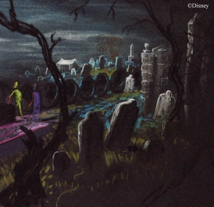
Who would not love to see how this would have been done? The whole drawing depicts a dissolve between there and here, inside and outside, human artifice and wild nature. This is not an exit point for characters stepping over into our presence; this is a place that invites you to enter.
When Marc Davis tried to depict this same sort of erasure of the boundary between inside and outside, he was far less successful. Too much focused on the characters, I imagine.

In this one, he's even got a literal picture frame floating in the limbo. No matter. The clouds,
the inky blackness . . . sorry, Marc, but you should leave this sort of thing to Claude Coats.
the inky blackness . . . sorry, Marc, but you should leave this sort of thing to Claude Coats.

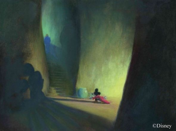
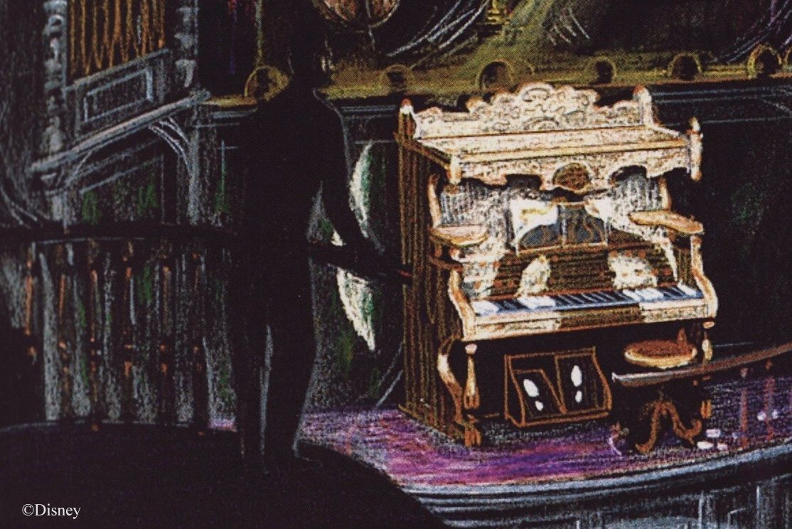
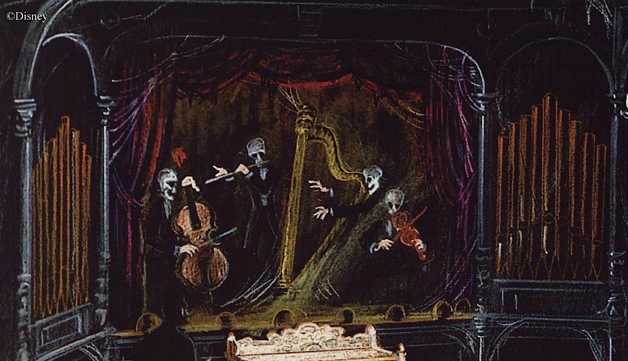
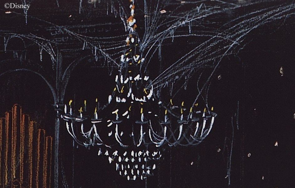
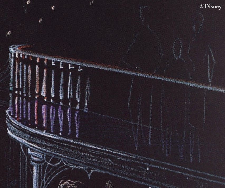
And finally, there's this breathtaking ballroom sketch, from 1966.

We can't walk in, but let's do the best we can.
As we saw previously, this organ is a direct lift from Ken Anderson:
I imagine this band appeared behind a scrim, perhaps like the sideshows in Carousel of Progress.
The chandelier may have been the source for projecting little blobs of light that turn into faces...
Look at that draftsmanship and subtle sense of color.
These faces are too, too creepy. Some of them have an almost jellyfish quality.

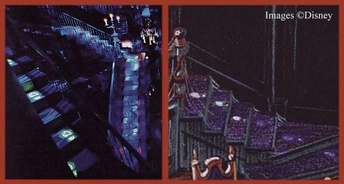
Was this next section an inspiration for the Grand Staircase at WDW?
Hmmm...could be.
Note how the teapot gag in the graveyard was originally intended as a ballroom gag, with wine. Makes more sense. The teapot ghost is the only ghost at the graveyard jamboree who is still completely invisible!
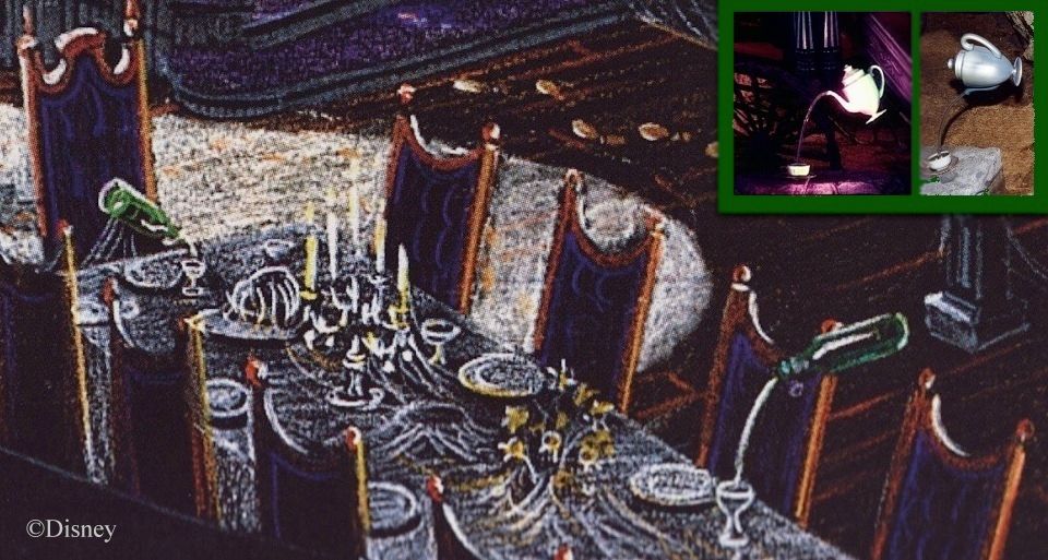
Again, the draftsmanship. Look how well the tricky shadows of the dancing ghosts are rendered. And here's the detail in this familiar sketch most easily overlooked: dozens of orange footprints, left by the dancers all over the floor.

And now we must leave.
Every time you feel that strange urge to wander into the labyrinthian depths of the Haunted Mansion and be lost (the pull is especially strong in the first half), that's Claude Coats the background painter, leaving your very self to supply the missing character cel.


