
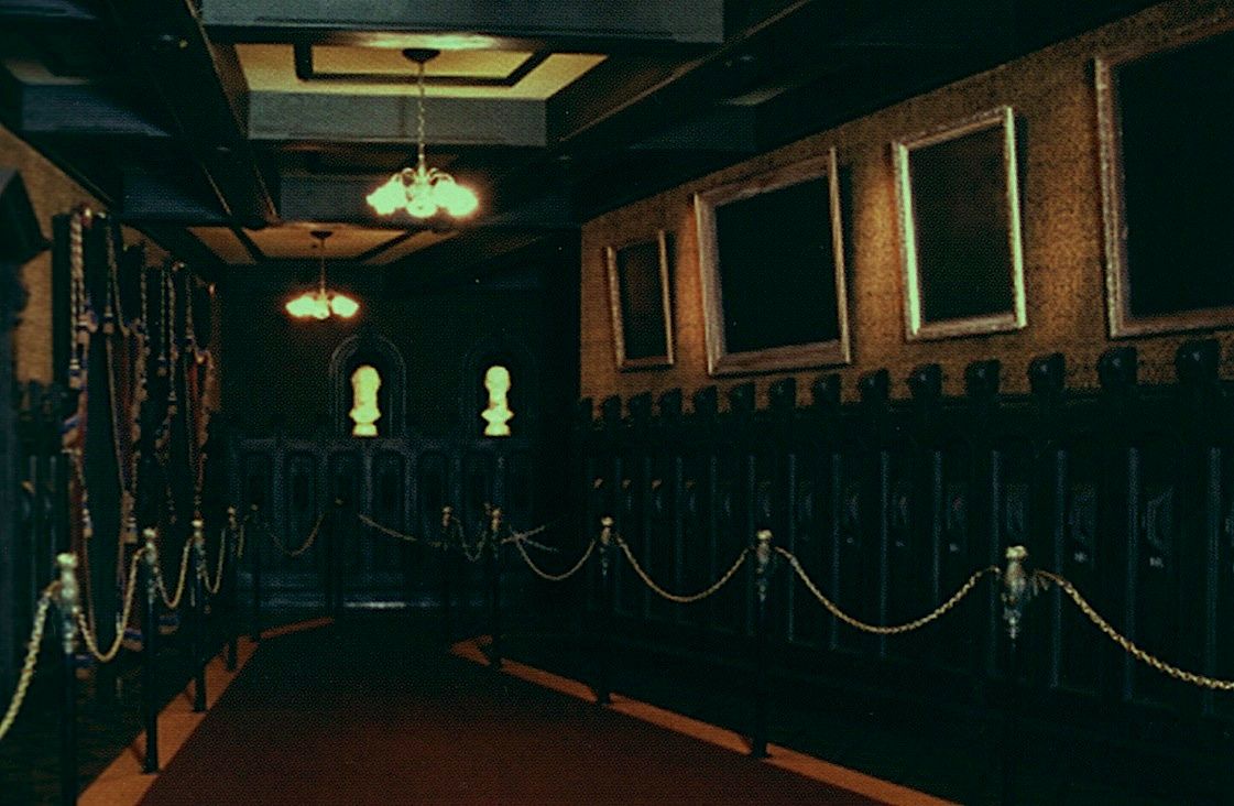
Lights out, nobody home, in this old photo
The late David Mumford of WDI was a great source of information for Disney park historians. According to LF reader Mike Cozart, Mumford once told him that a large trove of negatives and slides for use in the parks came to light many years ago when the Disney Studio was clearing out buildings, including full final sets for the Haunted Mansion changing portraits. Cozart thinks that the multiple sets of glass slides currently going up for auction and featured in Van Eaton's Disneyland catalog likely came from that stash. Makes sense. Wherever they came from, they're forcing us to re-write the history of that part of the attraction.
How so? Well, we've always known that one of the first things Marc Davis worked on after Walt assigned him to the Haunted Mansion project in 1964 was concept art for the changing portraits. Some of them consisted of only two pictures (back and forth), but others had three, four, and even six panels. We have all been under the impression that the longer series were either scrapped entirely or abbreviated to two when the Imagineers recognized that there would not be enough time for guests to watch a sequence of changes longer than a back-and-forth between two images. We all assumed this decision came early in the game rather than late. Boy, were we wrong.
In a number of cases, it was the opposite of what we thought. Rather than condensing the longer concepts to two images, the two-image concepts were expanded to six. It was only at a later point that some of these were shrunk back down again to two panels and used in the ride. Three- and four-image sets that made the final cut were also padded out to six before slimming down to two for the finished attraction.
Kohn
The complex projectors needed for these morphing portraits were built and ready to go. Glass slides were produced featuring a large number of six-panel changing portraits, far more than were needed. It's possible that the Imagineers had plans to switch them out, keeping the hallway fresh by changing the changing portraits every so often. Whatever the case may be, it seems that the Imagineers came very close to actually using the six-panel concept and did not drop the idea until possibly as late as 1969.
In the previous post, we discussed the Black Prince and the Flying Dutchman six-panel sets. They show us that the history of each painting must be considered separately. The Prince was created by Marc Davis as a two-image concept. It was expanded somewhat artificially and unconvincingly to six, and then it returned to two before the ride opened. In contrast, the Dutchman started out as four images and was expanded to six by Davis himself, so the six Kohn paintings were little more than a reproduction of Davis's set. Before the ride opened, of course, it shrunk to two, a mere fragment of Davis's original concept. (We've updated the previous post since the present post was written, so check it out.)
Now, with the publication of the Van Eaton catalog, more previously unknown artwork has come to light. It looks as though concepts rarely seen or heard of and that we never suspected had gone very far in fact almost made it into the ride. Several Davis concepts featuring two, three, four, and six panels are now represented by Kohn paintings that were transferred to glass slides, although many of these slide sets are incomplete.
It would be interesting to learn exactly when they canceled all that work and reduced the portraits to the simpler, two-picture shows that were there when the ride opened, flickering with the lightning flashes.
For now, let's do the Long-Forgotten thing and look at the new artwork, adding our comments, for what they're worth.
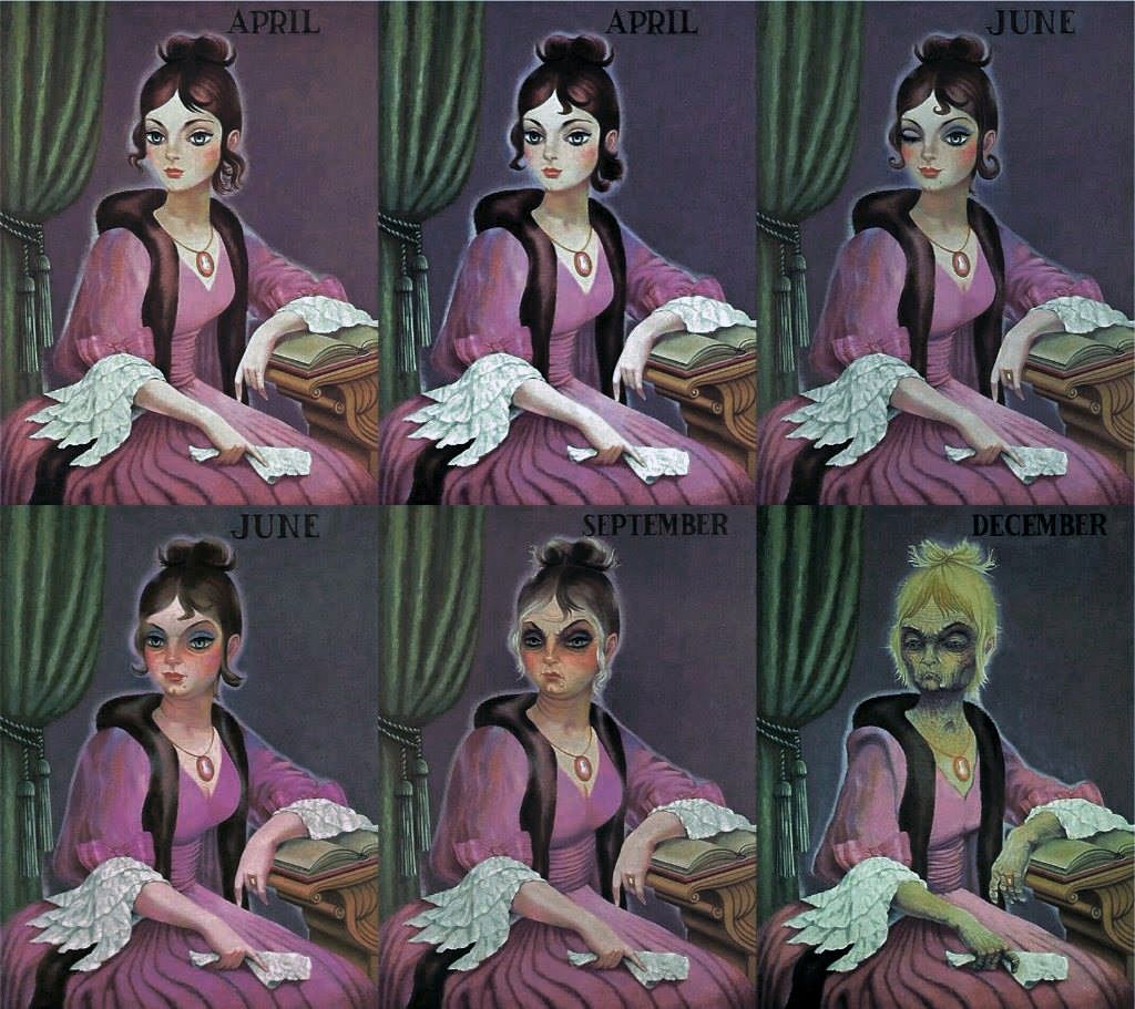
April-December
We've known for a very long time that April-December (removed in 2005) was originally April-June-September-December in Marc's concept art:

This was expanded to six. Kohn images 2, 3, 4, and 5 are seen for the first time in the Van Eaton
catalog (Nov 2015). The first and last slides were the ones used in the ride. (You should know that
here and throughout I've corrected the color, since all of these slides were starting to turn magenta.)
catalog (Nov 2015). The first and last slides were the ones used in the ride. (You should know that
here and throughout I've corrected the color, since all of these slides were starting to turn magenta.)
(adapted from digitally-improved images by Bair Pinuev)
Random comments: (1) The second "April" panel is practically identical to the first, but there are small differences in locks of her hair. Apparently the idea was to start off the metamorphoses with very subtle changes. We saw the same thing going on with the Black Prince, where the second panel is very little changed from the first. (2) The first "June" is close to Davis, but the second seems like a completely new character. Fun. (3) The difference between the Davis and Kohn "Septembers" is as great as the difference between their "Decembers." Me, I like them both. (If it had been up to me, however, I would have called the second June "August" and renamed September as "October.")
April is my favorite of all the changing portraits (see HERE and HERE).
So yeah, I've been geeking out big time over this one.
(Update: Went for $6250 at auction. Highest for any set and fourth highest
HM item. I'm evidently not the only one carrying a torch for Miss April.)
So yeah, I've been geeking out big time over this one.
(Update: Went for $6250 at auction. Highest for any set and fourth highest
HM item. I'm evidently not the only one carrying a torch for Miss April.)
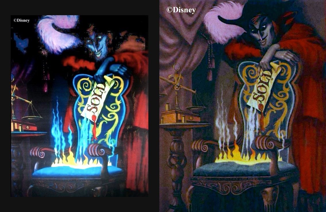
The Burning Miser
We had a good long look at this guy only a couple of posts back, and here he is in the limelight once again. He's always been a six-parter, and the Kohn version is a fairly straightforward reproduction, displaying no conceptual differences whatsoever. (Set went for $4000.)
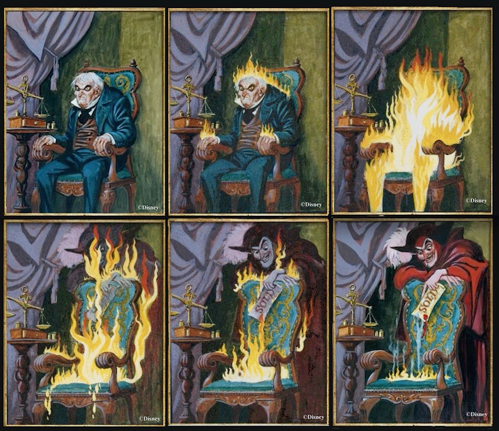

Actually I'm cheating, since the second panel is missing from the Van Eaton set, but it was easy enough to re-create it. I noticed that the only difference between Davis 1 and Davis 2 is some flames on the man's hands and back, so I just 'shopped Davis's flames onto Kohn 1 and ta-da, that's what the lost Kohn 2 must have looked like.
In our original Burning Miser post, we were puzzled by a strange alternate version of the sixth panel that had recently
come to our attention. Now we know exactly what it is: a very poor photographic reproduction of Kohn's final image:
come to our attention. Now we know exactly what it is: a very poor photographic reproduction of Kohn's final image:
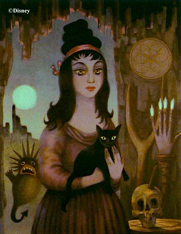
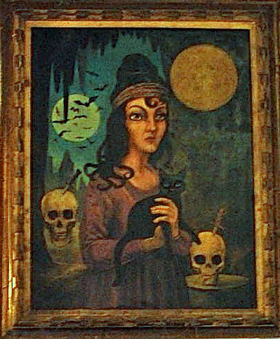
The Cat Lady
Davis originally conceived of the Cat Lady as a simple two-parter. This was expanded to a six-parter, and curiously enough, the
pictures actually used in the ride when it shrunk back into a two-parter were not panels one and six but panels one and four.

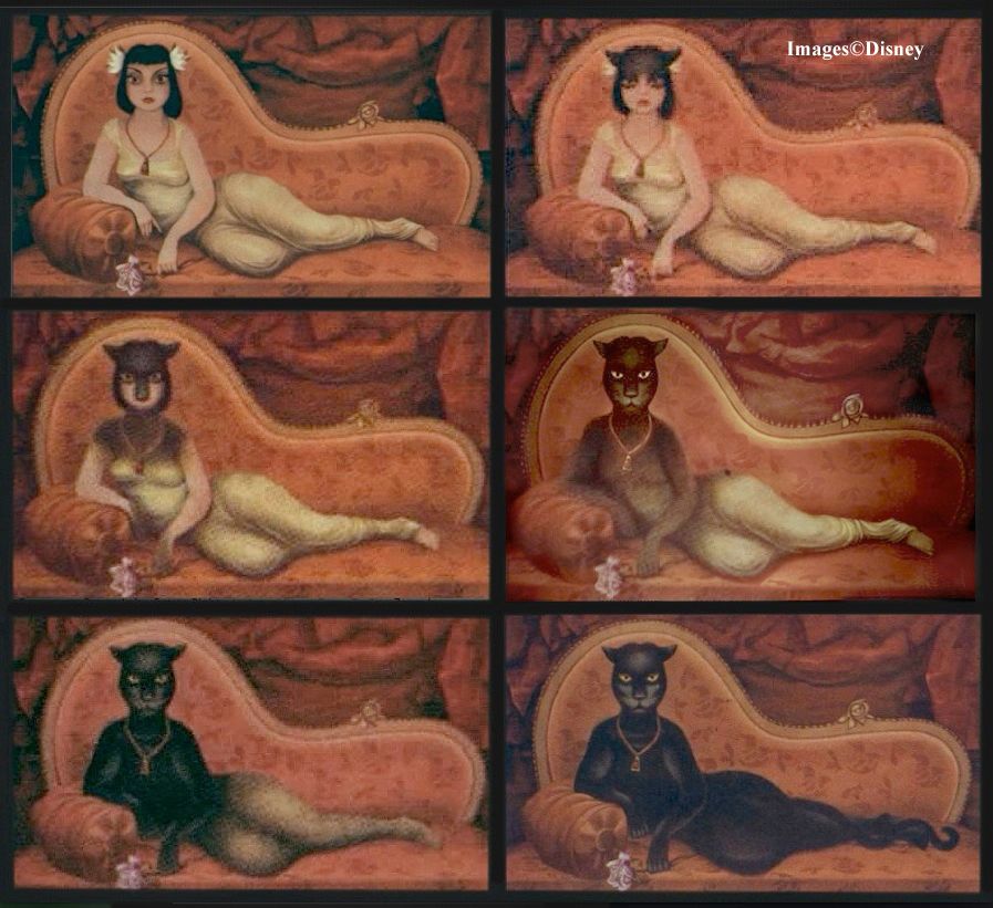
(Went for $4750)
Daphne
This one is a surprise. Up until a few years ago, "Daphne" was only something I had heard about. Then some Marc Davis concept art come to light (courtesy of the Lonesome Ghost), and I published it here for the first time. In 2019 it was put on display at Disneyland:
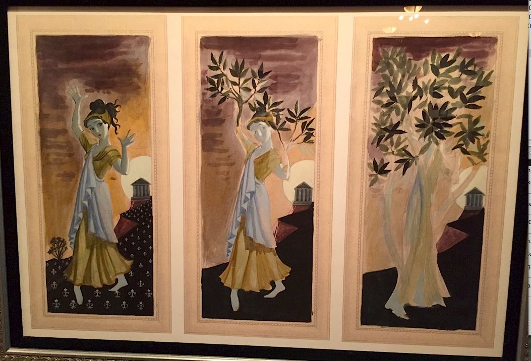
Now we discover that Daphne may have been a serious contender.
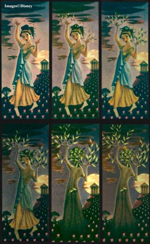
I'm surprised, because it's such an obscure subject and so little horrifying by comparison with others. As we pointed out in
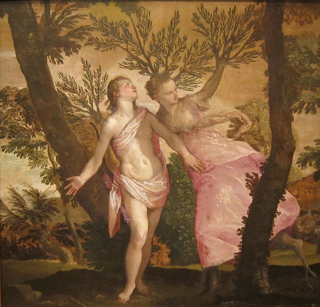
the earlier post, it's an adaptation of the Apollo and Daphne myth, in which Daphne turns into a tree. (Marc took Apollo out of it.)
Of course, a much better choice among Greek myths made it into the Mansion: Medusa. Everybody's favorite Gorgon is not represented in these Van Eaton sets, which may simply mean that the collector in possession of Medusa slides is not selling them or that they are in WDI's possession and archived. We know from the January 1965 "Tencenniel" program that Marc did the Medusa set in 1964 at latest and expected her to appear in the ride. When he did Daphne, we don't know, but evidently she came later as there's no trace of her in published photos or concept artwork.
I have to say that I don't know what Marc was thinking here. Did he want multiple episodes from Greek mythology in the Haunted Mansion portrait hall? Possible, but I wouldn't have expected that. Or if Daphne was put out there as an alternate choice to Medusa, that too is . . . surprising. Seriously, if the vote is between "beautiful girl turns into a tree" and "beautiful girl turns into a snake-haired monster" for inclusion in a haunted house, do we really need a show of hands? Then there's the question of general public acquaintance with the myths involved. Everyone's heard of Medusa, but Daphne? In the Van Eaton catalog she's misidentified as "Persephone," which I suppose illustrates as well as anything how obscure this particular myth is!
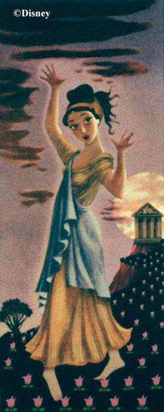
It's one of those "interpretive dance" things, apparently
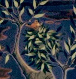
As usual, there are two panels almost alike. The difference between panels five and six is only a little birdie in the tree. I suppose
it's there as a bit of whimsy to lighten the mood, but in my humble opinion the whole thing isn't scary enough to require comic relief.
(My arrogant opinion is similar.) Also, I think the final panel in Davis's concept sketch is much more interesting than what they did here.
(Set went for $1900)
The Dustbowl
The "Dustbowl" sketch is remarkable in that it is not a Marc Davis concept. This one came from X Atencio, I am
told. Exactly how many images are in the Atencio concept art, I'm not sure. There are at least four, but there could be
more. Whatever it is, there is not a great deal of difference between the Atencio set and the Kohn set (which went for $2250).
told. Exactly how many images are in the Atencio concept art, I'm not sure. There are at least four, but there could be
more. Whatever it is, there is not a great deal of difference between the Atencio set and the Kohn set (which went for $2250).


Notice how the crow is skeletonized in the final frame. Once again, a bird has been brought in for some comic relief.
This time the relief is needed. The horrors of the American Dustbowl in the 1930s were hardly ancient history in the 1960s, and this is a pretty straightforward representation of the event, albeit in allegorical form. I had little difficulty pulling up photographic images that were not far removed from what is depicted in this series.

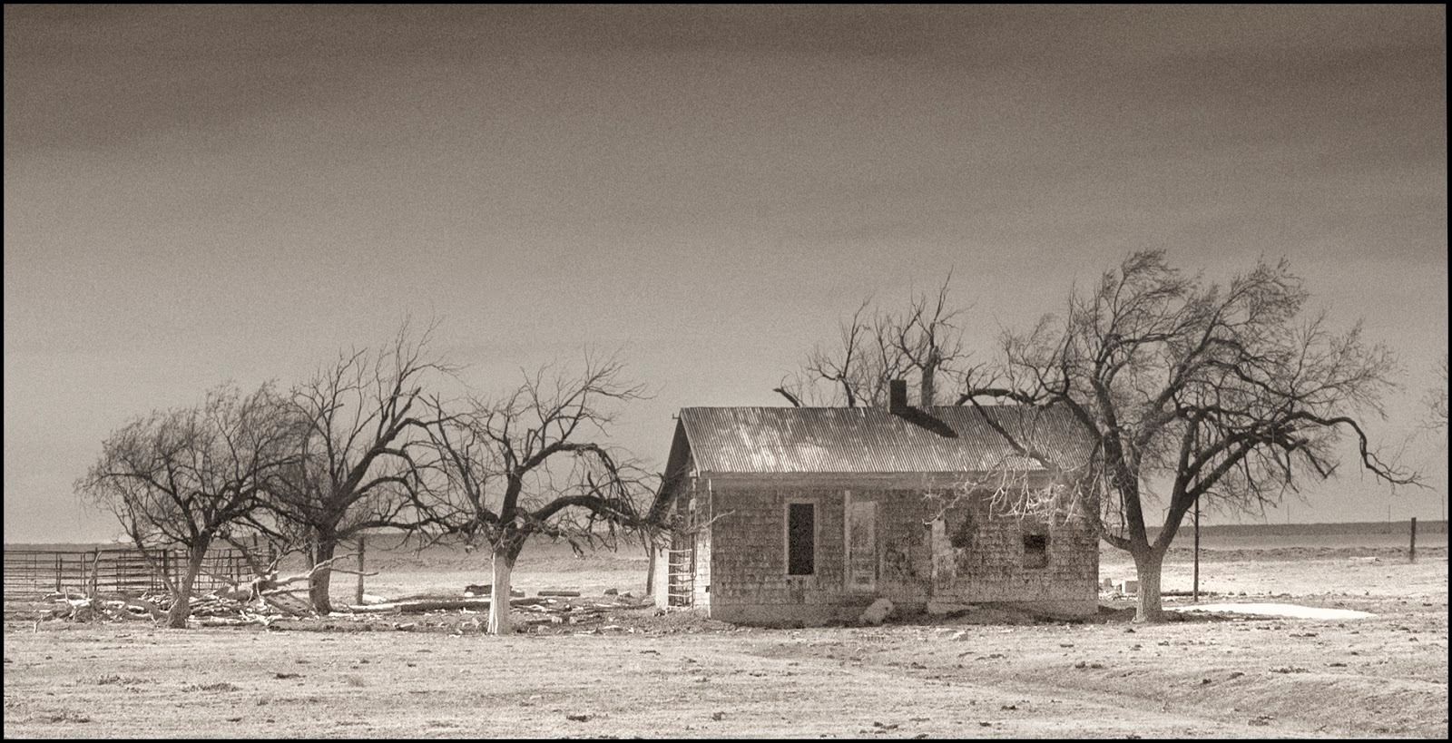

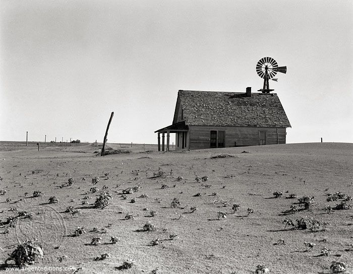
I'm surprised this one was even suggested. I would have thought that 1969 was still a little early to make light of this historical tragedy. How many park guests back then would have had vivid and personal experience with the Dustbowl? And besides, how "haunted house-y" is this topic anyway?*
But what do I know? They were making goofball comedies about WW2 already in the 1950s (Sgt. Bilko) and Nazi prison camps by the 1960s (Hogan's Heroes), so I suppose I shouldn't be surprised that Dustbowl humor wasn't a problem for the Greatest Generation. I have to keep reminding myself that being hurt and offended had not yet been established as the recommended default setting for practically everybody in society. Maybe the problem with the Greatest Genners is that most of them never went to college and therefore never had the chance to learn about the permanent outrage imperative, the glories of grievance, the wonders of whining. But we're off topic. (And if I haven't offended anybody, please accept my apologies.)
The Wilting Roses
For me, the dying flowers are too obvious and too literal as a symbol of mortality. Yes, flowers die, as do all things beautiful and alive. That's food for thought if you're a poet, perhaps, but it's not scary. Even if you are a poet, that hoary cliché, "hoary cliché" comes to mind. "Gather ye rosebuds while ye may...." Still, I suppose it gets the job done. There really isn't much to say about this one. I note that it didn't take much imagination to expand Marc's three-panel original to six. That's a little cupid inside a heart on the front of the vase, adding an extra dash of melancholy, as well as the name "Disney" in a Latin motto. Was this painting done in 1966, I wonder?
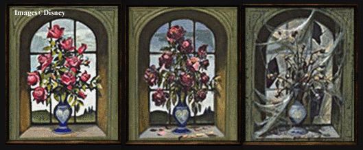
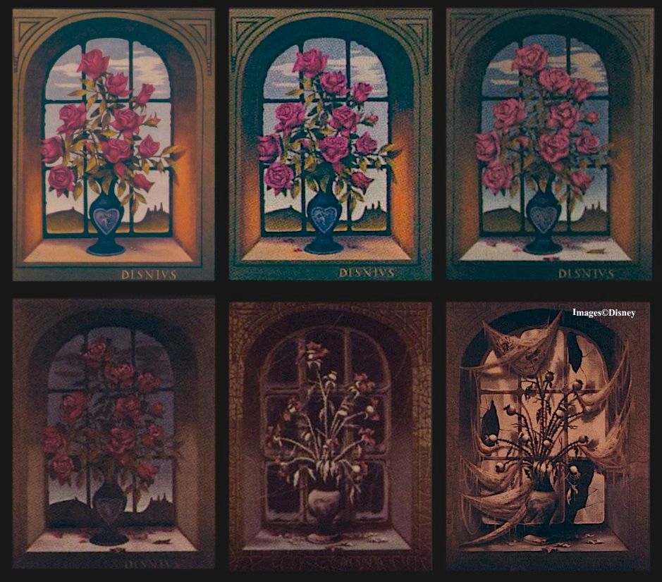
(Went for $1500)
Walpurgis and Watermelon
The Van Eaton catalog also includes a few orphans among their Mansion slides. There's a single Kohn panel from what was presumably a six-panel Witch of Walpurgis set. (She went for $1300.)
It's fun to compare and contrast her not only with Marc's original sketch but with the "Sinister 11" portrait
still on display in the Orlando Mansion. They're very different, suggesting that Kohn may have had little
to do with the S11 portraits, even though his "December" was reproduced quite literally as one of them.

You will recall that the Witch started out as a simple two-image set:

One supposes that the goat took a little longer to get here in the six-panel set.
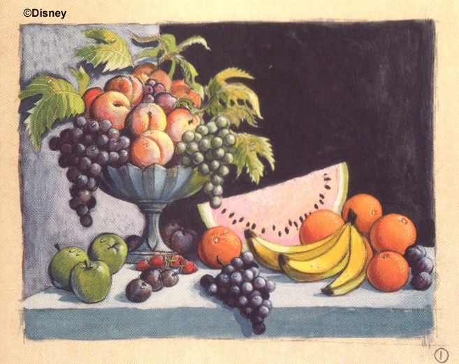
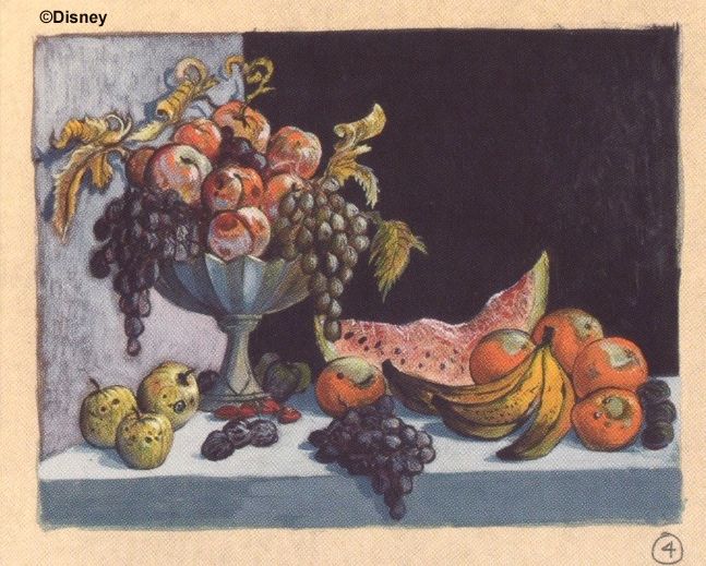
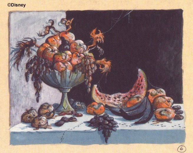
Also in the Van Eaton catalog is a still life with fruit, which you can compare and contrast with what appears to be Marc's original 1964 concept sketch of the same image. What happened in the changing portrait is that the fruit rotted away, much like the roses did. Yawn. Thought provoking, maybe, but hardly the stuff of nightmares. One wonders how this idea beat out some of the other concepts, unless of course practically all of them were made into slides, in which case there are gobs of delightful artifacts still out there in the hands of collectors or collecting dust in WDI archives, if they're not lost altogether.
It may not be spooky, but it's a pretty good painting in its own right. (It went for $325.)

. . . and it follows Marc's original concept sketch very closely.
In 2019 the full set of Davis concept sketches was published for the first time:
In 2019 the full set of Davis concept sketches was published for the first time:
MDIHOW 351
There are a number of other HM relics in the Van Eaton catalog,
but it is these slides that show us something we never knew.
but it is these slides that show us something we never knew.
*****************
*I highly recommend the Ken Burns film about the Dustbowl. It's nothing less than amazing how terrible that chapter in American history was.


My browser went wonky so I'm resubmitting my comment in case it turned to mush:
ReplyDeleteMy guess as to why there are some subjects that seem not that scary is the initial painting is merely meant to look like the kind of framed art you'd innocuously find commonly: still life of fruit, vase of flowers, Greek or Roman female figureand even the landscape of the prairie/farmhouse. The portrait too obviously.
That's a valid enough observation, but the same could be said about many of the changing portraits. What surprises me is how many of them aren't particularly horrifying even after they transform.
ReplyDeleteWhat strikes me about the Fruit Bowl and Flowers is that they seem to be getting at the same basic idea that was done much more interestingly in April/December. Each of the final selected portraits represents a unique idea, which is the difference between the Mansion and what everyone else would've done (had everyone in the portraits skeletonize, which can be seen in low budget haunted houses around the country). Its tough to come up with five variations on "looks can be deceiving", but the original set was five very strong choices.
ReplyDeleteOf the ones that didn't make the cut, the Miser is by far the most conceptually advanced but I suspect that they decided that depicting the Devil in any form, even in the fantasy-operetta form here, was a opening a door that they didn't want to go through. It's a shame because I think the Miser is the scariest one, alongside the full version of the Ghost Ship.
I see I rambled and didn't quite reach my main point here... what I meant to say was: since it seems likely (to me at least) that Marc got the idea for April-December from Dark Shadows, then the fact that there's thematic overlap between the wilting flowers, rotting fruit, and April and the fact that April came onto the scene late may suggest that April "replaced" the previous iterations of the concept. To me that would tend to support the suggestion that she came along later, and that Marc could've combined the DS portrait with his already worked-out ideas for the pieces he was already planning to use in the ride. We do know that Marc watched a lot of TV - a lot of his work on Country Bear Jamboree was inspired by watching Hee Haw!
DeleteMakes sense. Strange that they should continue with the development of the flowers and fruit after April arrived, unless my speculation is correct and they proceeded with all or nearly all of them, producing many more sets of slides than they needed, perhaps with the intention of switching them out from time to time. There are something like two dozen changing portrait concepts that we know about, six that were realized, several more that ended up among the "Sinister 11," and a number of others. One can imagine a "myth and literature" set, a "famous villains" set, maybe a BGGB set (bad guy gets badder, or bad situation gets worse), a melancholy "memento mori" set, a "femme fatale" set, etc. After this demolition of our tidy histories, we're back to "who knows what they had planned?" speculation.
DeleteWell, I dunno, Mr. Toad's Wild Ride contains a scene literally taking place in Hell, so yeah, I'm not sure what the motivation was for not using the burning miser portrait.
DeleteHey, FoxxFur, do you know the really number of slides Cat Lady, Prince, Medusa, Ship and Miss April ?
DeleteAfter reading this post I have come to my own conclusion. I think that as a grouping these should not be thought of as "changing portraits" but "living paintings". Like much of the rest of the house, they are alive and simply now showing the life cycle of the subject. Great article.... Keep them coming!
ReplyDeleteThat's a good thought.
DeleteYes, I don't see the paintings as intended to be horrifying but rather uncannily living as well as evincing temporal shifts/anomalies within the mansion.
DeleteI must disagree with you on the Daphne vs Medusa issue. It might be just general body horror and how I react to it, but the idea of an innocent being turned into a tree is far more creepy and disturbing than "look, it's really a monster". Of course, unlike the Medusa I don't think it could work as a two-panel instead of the slightly longer sequence.
ReplyDeleteThe trouble I have with it is that in the context of the myth the transformation is not presented as an element of horror. In order to escape Apollo's amorous pursuits, Daphne finally cries out to her father for help, and it is he who turns her into a tree. Apollo then vows to tend the tree in perpetuity (explains why the laurel tree is evergreen). Lots of other elements in the plot, but that's the gist of it. I think Marc seized upon it not because of the story (he left out Apollo, after all) but because of the many works of art depicting the myth. She just plain looks creepy with her limbs turning to branches, etc., and that's probably as far as we're supposed to go.
DeleteI quite agree with Mr Grimlin on that, too. Also, I already knew the Daphne myth. Anyway, excellent post as usual, glad to see you back ! The flowers and fruits remind me of the rotting birthday meal of the later party scene… What do you think ?
ReplyDeleteYeah, the rotting fruit in the ballroom is reminiscent of the still life painting. I don't think it signals anything.
DeleteAnother take on the less scary portrait concepts: Perhaps these were still leftover from the "Museum of the Weird" concept?
ReplyDeleteInteresting, but chronologically unlikely — those are by Davis & Kohn, who were not yet on the project when "Museum of the Weird" was still in development.
DeleteI wonder if one design plan involved not only progression within the pictures themselves but progression across pictures. Maybe those pictures hung near the entrance to the hall were intended to be less "scary" and more atmospheric, to introduce the idea that the portraits changed over time -- flowers wilting, fruit decaying, etc -- and then paintings further down the hall were meant to be more narrative and more frightening once guests had cottoned on to the concept. (And then this was scrapped in favor of maximizing scariness and the opportunity for storytelling.) Such an arrangement could also foreshadow the progression of the mansion as a whole from "creepy old house" to "creepy alive house" to "creepy house full of ghosts."
ReplyDeleteThis might explain why some not-especially-frightening pieces made it through to the slide-making stage, like our friend Daphne.
Do you know if Kohn was also the one who painted the Aging Man?
ReplyDeleteI could be wrong, but it appears to me as if the second April portrait has paler skin. It could be the lighting, and it could just be my bad eyes, but I believe that's another difference than what you mentioned. Best wishes, HBG2
ReplyDeleteLooking closely at the original published photos in the Van Eaton catalog, it does not look to me like there's any skin tone differences between April1 and April2. Some of what you see may be the result of color-correction work done by me or others. The originals are starting to turn magenta.
DeleteInteresting. Hadn't thought of that. Well thanks anyway for replying. Have a nice day.
ReplyDeleteThe "beauty is a lie" motif is interesting food for thought, but I wonder if it's meant to foreshadow the Bride? Originally and now, she's a murderer, and cuts an ethereal figure, so perhaps this subliminal motif might have connected to the dark beauty upstairs? I'm just trying to find some justification for the Attic scene to tie into the rest.
ReplyDeleteThe problem with that theory is that the changing portraits were practically the first thing Davis set to work on, but the whole idea of a (possibly) murderous bride in the attic didn't come along until later.
DeleteThe concept sketch of Daphne, unlike the other character from Greek Mythology that is already part of the changing portraits, Medusa, doesn't seem scary. Wouldn't Kali from Hindu mythology make for a good changing portrait?
ReplyDeleteIf what you said about almost all the concepts being made into finalized paintings is true, then could it be possible that somewhere there’s an alternate “Master Gracey/Aging Man” painting done by Ed Kohn?
ReplyDeleteI ask because the final portrait used in the ride doesn’t follow Mark Davis’s concept art very much — the man slowly ages into the skeleton instead of straight-up rotting — except for the first and last panel (of course, it’s completely possible that they just toned it down to prevent younger guests from being scared). Also it doesn’t really look like Kohn’s style, and as far as I know there isn’t any public documentation on who created the six panels used for the WDW foyer.
None of the portraits actually used at WDW look to me like Kohn's work, neither the "Master Gracey" changing portrait nor any of the "Sinister 11," with the exceptions of "December" and "Medusa," which appear to be nothing more than faithful copies of Kohn's DL artwork and were not necessarily done by him personally. Note the huge difference between Kohn's "Witch of Walpurgis" and the S11 version. Other artist(s) were involved. I don't see any reason to suspect that a Kohn set of MG is hiding somewhere, but anything's possible.
DeleteDo we know how the six-slide projectors worked, or what they looked like? I was researching how the effect was planned to work, and I haven't been able to find anything on them.
ReplyDeleteI got this information years ago from a Disney employee who used to work in these areas:
ReplyDelete"Just so you know, i did once see a huge rotating disc slide machine, with indexes, that was most likely the projector for these slides (2 of these machines would have been required for each portrait). It held 10 slides. I was designing special effects for the Imagination ride, and my boss sent a dozen old sfx projectors to me to play with. They were stored in a building by the Burbank Airport. I remember that machine because it had slots for 4x5 inch images, which is an uncommon size for sfx artwork.
There are 2 ways for these slides to be shown. Originally I thought that they would fade between images, first forward, from 1 to 6, then backwards from 5 to 2 then forward. Endlessly.
But the second way would be for the whole exit from the elevator to be a single batched show: The slides would all be on 1 when the elevator exits, and then each portrait would slowly dissolve thru all 6 images and hold on 6 until the last person in the group leaves the gallery and is in the doom buggy load area, when the room would reset to the 1st image and wait for elevator 2 to unload. Somehow, I think that this was the original idea, but testing must have proved that it wouldn't work...operations would not want any gap between one elevator group and the next."
Interesting! Sounds like the mechanism worked sort of like a giant viewmaster.
Delete