Things You're Just Supposed to Know

Most of the time, Long-Forgotten assumes that readers are already familiar with basic facts
about the Haunted Mansion. If you wanna keep up with the big boys, I suggest you check out
first of all the website, Doombuggies.com. After that, the best place to go is Jason Surrell's book,
The Haunted Mansion: Imagineering a Disney Classic (NY: Disney Editions; 2015). That's the
re-named third edition of The Haunted Mansion: From the Magic Kingdom to the Movies (NY:
Disney Editions, 2003; 2nd ed. 2009). Also essential reading is Jeff Baham's The Unauthorized
Story of Walt Disney's Haunted Mansion (USA: Theme Park Press, 2014; 2nd ed. 2016).

This site is not affiliated in any way with any Walt Disney company. It is an independent
fan site dedicated to critical examination and historical review of the Haunted Mansions.
All images that are © Disney are posted under commonly understood guidelines of Fair Use.

________
.
Showing posts with label Collin Campbell. Show all posts

Thursday, April 23, 2026

Sweet. Long-Forgotten Turns SIXTEEN (plus, the Mansion up against the wall)


If Long Forgotten were a Disney princess, she'd now be old enough to get married. To quote Maleficent: "It's incredible! Sixteen years..." Yes, it's incredible.

Ooooh . . .

Ahhhh . . .

Okay, that'll do. Time for the pivot and introduction of a topic worth talking about but which has never merited a post of its own.

In other words, we're going to do what we always do on these august occasions (even though they're always in April). This one has been sitting in the drawer for a long time, waiting patiently for its moment in the sun.

If there's one piece of traditional Disneyana loved by absolutely everybody, it's those big, souvenir park maps that debuted in 1958 and were regularly updated as time went by. But before we get into those, something you may not know is that in addition to their famous early concept sketches, Harper Goff and Marvin Davis also sketched several maps of the proposed Disney park, then just a twinkle in Walt's eye, and in some of those they included a "Haunted House." Here's Goff's 1951 map. The haunted house is at the very top.


And here's Davis's 1953 map. (Middle, far right.)


McKim's McKlassics

Our interest, however, is in those colorful wall maps the parks sold. As most of you probably know, the first of these (and the best) were done by Sam McKim, and from the beginning they have always included the Haunted Mansion (or "Haunted House"). We're not going to do a survey of all the changes in the various iterations of the map, only the ones that affected the portrait of the HM in them. McKim's original drawing of the Mansion remained unaltered in the '58, '59, '60, and '61 editions:

We've discussed this one many times, and I haven't anything new to say about it, so we'll move on to the '62, '64, '65 map (none were printed in '63; we'll find that there are numerous such gaps along the way).

  Hands down my favorite. McKim was good at rendering top-down perspective, and his mastery of line weight was amazing. This is the only rendition of the building that even comes close to being accurate, including as it does the peculiar roofline, which reflects the twin stretching rooms. He probably sketched this in 1961 or early 1962, when the building was not up yet, so he must have seen some of the blueprints.

Perhaps the most interesting feature is the color. Already by 1958, in McKim's rendition elsewhere of the building inspired by the Shipley-Leydecker house, the exterior was expected to be white.

But we also know that the eventual color scheme was not yet set in stone, and as proof, the rugged brown in the 1962 park map may be added to this well-known "color guide" from 1962 or 63.

McKim's realistic inclusion of the northeastern stretchroom in the roofline evidently confused later mapmakers, who took it as virtually a separate building attached to the Mansion (and thought to be . . . what? a spill area? restaurant? ). The famous National Geographic spread on Disneyland (1963) interpreted it that way in its Disneyland map:

We're years too early for the Museum of the Weird, by the way, in case any of you are getting all excited about that possibility. The park guidebooks for '65, '66, and '67 all included a little wing over there as well.


I suspect that this was inspired by a misreading of McKim's sketch, fueled by the false assumption that the house was a simple square. Did they think it was an old-fashioned farmhouse water tower?


I'm Callin' Campbell Mmm Mmm Good

In 1966 the map was redone in a painterly style by Collin Campbell (reproduced in '68, '72, '74, '75, '76). I don't like it as well as McKim's, but I must admit its softer, lusher look has a certain appeal.

The house design is far less accurate, but this will remain the basic look for the rest of the souvenir map's existence. There are several curious features here. One is a weird, non-existent entrance gate leading straight to the front door. I've never heard of any plans to incorporate this feature, but once it got on the souvenir map it had remarkable staying power through subsequent editions. 

More interesting is the implication that the front yard cemetery would extend all the way around to the other side, which of course never happened. But the way the front yard portion is walled-off and enclosed is reminiscent of the old Ken Anderson design for an elaborate cemetery. When the attraction was conceived as a walk-thru (which would still have been the case in 1966), we remember that the northern and southern walled areas were to be twin exit areas complete with graveyards. Were there plans to have them connected? The earliest blueprints of the building do not include the attached stairwell entrance that blocks traffic along the back of the building, so I suppose the idea may have been considered feasible at one point, even though it would always have been a bit of a squeeze.

More interesting still is the presence of the show building. Keep in mind that it was not actually built until the early spring of 1969 (yes, really, 1969), even though the basic size and shape of the building were already determined by 1961:

But why include it at all on a souvenir fun map with no pretensions to strict accuracy? Haven't we been told that 'beyond the berm" isn't supposed to exist when you're at Disneyland? Why, then, the big, ugly, gray blob? Well, the answer is not far to seek. Just south on the same map is the big gray blob of the POTC show building:

As we can see, the Pirates building served as a convenient bulletin board for posting the names of exciting scenes in the upcoming attraction, guaranteed to tease and tantalize map owners.

No doubt when Campbell was recruited to redo the map in 1965 or 66 the powers that be (i.e. Walt) were confident that by the time the map was ready for the printer the Mansion's contents would be just as settled as POTC's. Campbell obviously was not responsible for all that superimposed lettering. They knew what the show building was going to look like and they thought they would soon know what was going to be in it.

What this shows is that as long as Walt was alive and at the helm, everybody thought the decision-making process would keep moving along at a sufficient pace to put a Mansion bulletin board on the park map, in confident anticipation that all the major issues about its contents would be settled by 1966. Didn't happen, of course. The '66 and '68 Campbell maps are solid evidence that things really did lapse into a state of uncertainty and flux when Walt died, just like everyone says it did.

An edition of the map with the interior items tacked on the show building eventually did appear in 1972 (no new maps appeared in '69, '70, or '71). Notice that "the graveyard" is not included. The outside graveyard (still labeled there) is supposed to be understood as being in continuity with the one we see on the ride, and you wouldn't label the same graveyard twice, right? This is evidence that what would eventually be the berm graveyard was conceived as merely the extreme edge of the large public cemetery you see in the ride, spilling over the hilltop into view from the front. The crypt complex that makes up the exit area was to be understood the same way. You enter it riding in your doombuggy and eventually make your way out of it on foot. This is also confirmed in the script for the "Story and Song" album.

For 1978, they decided to redo the map entirely once again and go back to the look of the original Sam McKim maps, more sketchy-graphic and linear, but preserving the Campbell design overall, except for deleting the no longer necessary show building (qua bulletin board). Putting a couple of the hitchhikers on the map seemed sufficient.

This edition was reprinted in '79, '82, '83, '84, and '87. I have to admit that I don't know who the artist was. No one else seems to know either. If I ever find out who it was, I'll put it here (hooray for the blog format). According to Tom Morris, the art library at WDI has the artist listed as "unknown." It's not bad, but I think it suffers by comparison with McKim. When it comes to pseudo-Sam, Chris Merritt does it better.

In 1989 some alterations were made to accommodate the inclusion of Splash Mountain. The hitchers were moved into the front yard, but little else was changed. Same artist, it seems.

In 1995 they redid the whole thing again. The artist was Nina Rae Vaughn. It seems like the goal was to bring in a some of the lushness of the Campbell version. The wraparound graveyard is finally gone (or obscured), and the south porch has finally been given its pediment, but the non-existent front entrance still persists. A few more interior characters appear (Mdm L and the Caretaker). It was reprinted in 2000.

For the 2001 edition (reprinted in '05 and '08), FastPass Gardens was included, and the front entrance was finally put where it belongs.

I have not thought it worthwhile to chart all the little depictions of the Mansion in the park guides, other than the mid-sixties items above, but I find it curious that since at least 2013 (and probably earlier), a strange sort of "Winchester Mystery House" architectural sprawl has served as the HM icon.

 
I can only imagine that the artist wanted you to think that the parts of the building you can't see are in fact able to accommodate all the stuff you encounter inside. Be that as it may, map artists have let their imaginations run wild.


McKim Returns!

Getting back to the big wall maps, there is a wonderful tale to be told about Paris Disneyland. It seems that they convinced Sam McKim himself to come out of retirement and do their souvenir map, and the depiction of Phantom Manor is a sheer delight, full of Sam's distinctive humor and with his graphic skills undiminished and on full display, as if 1958 was yesterday. What a treat.

 A always, thanks to all you Forgottenistas for making this blog worthwhile! Long Forgotten continues to pick up new readers, so . . . there ya go.


******************************


Saturday, April 5, 2014

Four Years? Owl Be Darned

.
Is it bloggiversary time already?  Wow, hard to believe, but this month marks four years of ruminations and revelations.  I have no idea how long this thing can continue. Blog frequency must needs grow more erratic, and more and more it will be a matter of new material coming to light or unexpected visitations by the Haunted Mansion Muse that determine when a new post will appear.  Yes, I know I said something like that last time, and the time before that, and still we have had about one post per month, but let's face it, a slowdown is inevitably inevitable.

Bloggiversaries are appropriate occasions to pause, to reflect.

.   Pause.

.   Reflect.

They're a time for sharing, for being with family. No, wait, that's Christmas.
Okay, enough with the pausing and reflecting.  Don't want to overdo it.

As always, I hate to disappoint readers who came here for some actual Mansionological content rather than narcissistic calendar waving, so I attach a lightweight mini-post on these occasions.  I figure the owls will do just fine.


The Owlallueia Chorus

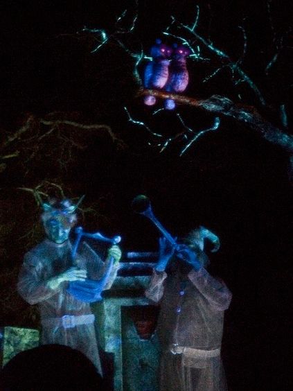
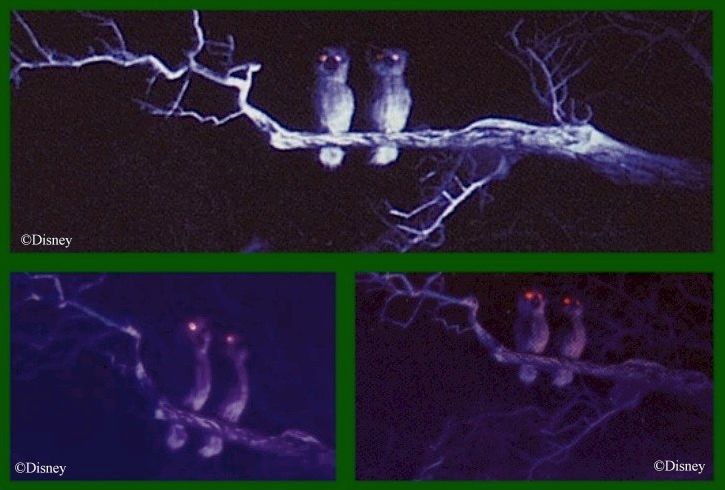
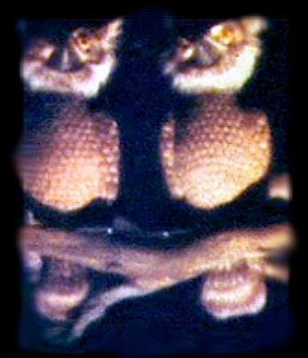
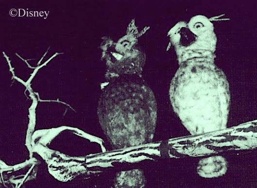
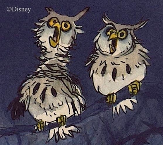
Most of you are aware that there is a pair of owls perched overhead above the graveyard band.  Their history?  Well, there isn't really any "history" to report.  They went straight from Marc Davis's brain down through his pencil and eventually to the AA figures in the ride with little alteration. And they've always been there. And they've never changed in any way.  The only thing of note is the usual thing: Marc's creations were a little cartoony, but the final figures are realistic.


That's a fairly recent pic above.  These below are from 1969, but you'd never know it just by looking.


A gorgeous recent pic:

(pic by Loren Javier)

WDW, about 1973:


The 1990's:


You can compare those with Marc's concept artwork:


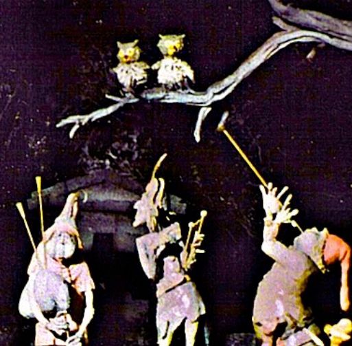
The scale model maquettes follow Davis closely, as usual:


They hoot like real owls, "in spooky harmony," according to the "Story and Song" souvenir record.

That's a Stretch

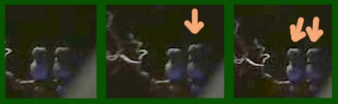
Something you may not have ever noticed is that the owls are animated in accordance with Marc's drawings.  They stretch out their necks when they hoot.  You never see this in the professional pictures officially published, because the figures have all been turned off for the photo shoots.


This Daddy B shot caught one of them in mid-stretch:

(pic by Brett Garrett)

Owls are Spooky

Duh.

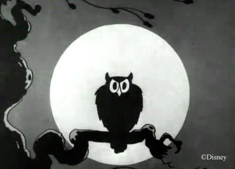
It's not hard to see why people find owls a little creepy.  They have a more human-like face than other birds, they're active at night, and their familiar "whoo-oo" call sounds like a human vocalization.  They're ubiquitous in Halloween decor, of course, and the classic Silly Symphony, "The Skeleton Dance" (1929), begins with the scowl of an owl that looks a lot like our Mansion examples:


That's probably as deep as we need to go to account for the owls in the Haunted Mansion, so we could quit right here, but it might be fun to look back a little further, so why not?  If you have something more important to do and leave now, I understand.


Weird to the Wise

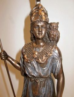
Both of the qualities we traditionally associate with the owl have impressive pedigrees.  The owl was the sacred bird of the Greek goddess Athena, associated with wisdom and learning, so apparently people have thought owls look intelligent for a long time.  The Romans, on the other hand, regarded the owl as a bad omen, so apparently people have also thought owls are eerie for a long time.

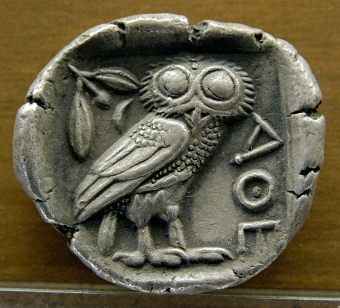
With regard to the brighter side, something you may not know is that the association with Athena made the owl a common figure on Greek coins minted in Athens.  These were widely disseminated over a lengthy period of time, and they were so popular that even non-Greek cultures copied the owl designs on their coins.
Here's a nice Athenian silver tetradrachm.


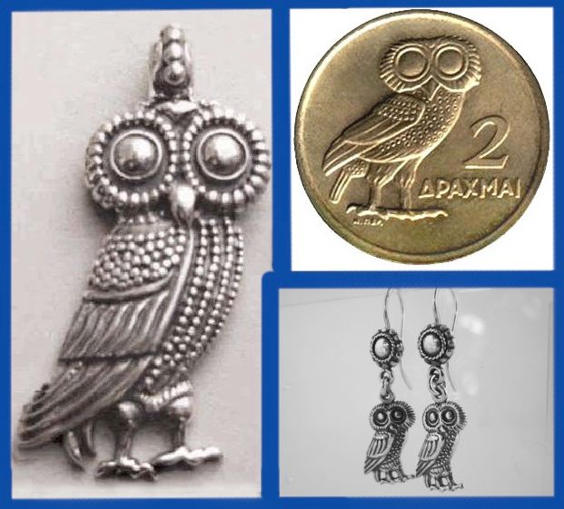
  The Athenian owl yet lives. This classic design is still
used on Greek coins and is also popular in jewelry.


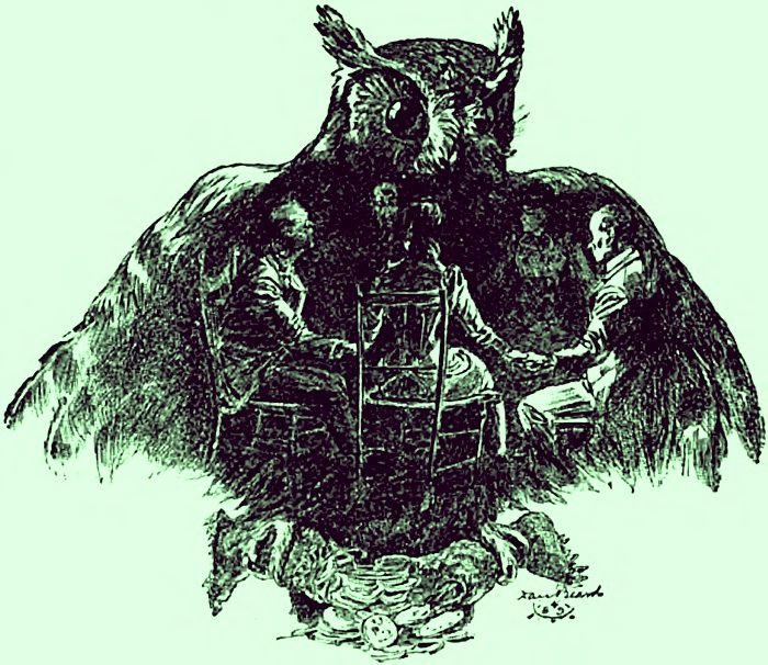
Then there's the more sinister side.  According to our old friend Émile Grillot de Givry, the owl is one of three animals associated with witches since Medieval times (the others are cats and toads), and the Harry Potter series has ensured that knowledge of this triumvirate continues into our own day.  Demons take the form of these animals ("familiar spirits"), and you find artwork showing owls operating in this capacity, like this 19th century print by Ernst Seigneurgens.

"No no no! Stupid bird! That way, THAT way!"

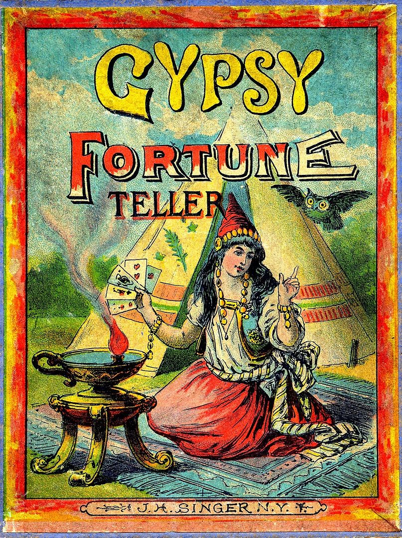
But owls are also associated with the occult in more general ways. The twin associations (wise + spooky)
make the owl a natural mascot for people fascinated with the idea of esoteric knowledge.

1890's card game

Cosmopolitan Magazine, 1893 (hat tip Craig Conley)


The Raven and the Owl

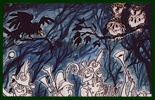
There is a second variety of animatronic bird in the Mansion, of course, and at one point in the process Marc Davis was thinking about
presenting them together:


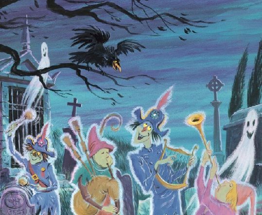
I guess Collin Campbell thought that there was only room for one bird species in this scene, and
he picked the raven.  In his rendition, Marc's owls have been banished, a rare departure by Mr.
Campbell from Davis's artwork.  In Collin's graveyard, the raven shares the arborial spotlight with no one.


But the end result was just the opposite, of course.  It was the raven who
was evicted, and the owls have the treetop stage all to themselves.


I'm sure this never crossed the Imagineers' minds, but ironically, to imagine a sort of rivalry between the raven and the owl would actually be appropriate. The raven is a relative newcomer to the pantheon of spooky, Halloween-y animals.  His inclusion is due to Edgar Allan Poe's famous poem, and if there is any doubt that this includes its appearance in the Haunted Mansion, recall that the raven escort was originally going to croak "Nevermore" all over the place.  What many people don't realize is that Poe ousted the owl to make room for his raven.  As we know, the owl is the sacred bird and constant companion of Athena.  She's also known as Pallas Athena (meaning "Athena of the city," i.e. Athens. Pallas = Greek polis, "city").  In Poe's poem, the raven perches on a "bust of Pallas" (i.e. Athena) and remains there throughout the poem, thus usurping the seat normally reserved for the owl.


In other words, the raven isn't just there, he's there instead of another bird.  Hm.  What means it that the venerable owl has been displaced in the poem by an insolent newcomer?  I don't want to get all English 101 on you, but I can think of two possible interpretations:

First, the poem makes much of the raven's shadow. The darkness of sorrow and uncertainty have blotted out the light of reason and knowledge. Athena stands for "wisdom, courage, inspiration, civilization, law and justice, just warfare, mathematics, strength, strategy, the arts, crafts, and skill."  With regard to all of that, the speaker in the poem is told in a single word, "nevermore."  Mournful reverie displaces rational thought, night extinguishes day, death has defeated life, et cetera.  For the speaker in the poem, the raven has indeed replaced the owl.

Second, we expect people to 'owl when they're ravin', but in the poem we've got a raven when we expect an owl.  See?  Ironic reversal.
Shut up, did I say the two interpretations were equally possible?  No.  Did I say they were equally profound?  No, madam, I did not.

from a sketch by Édouard Manet

Never more shameless a pun has been spun.
Mercifully, thankfully, now we are done.  

Sunday, September 1, 2013

The Black Prince


.                   
      
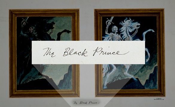
.                                            The first thing to be said is that there is no doubt that this changing portrait
.                                            is called "The Black Prince." It's labeled that way on Marc Davis's concept art.

(Hat tip to GRD)

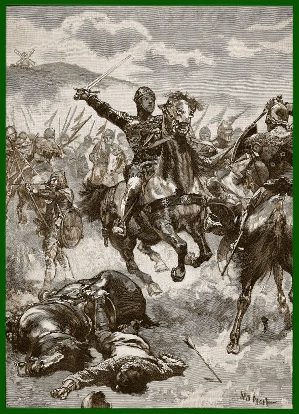
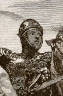
But no one uses that name.  Everyone calls him something more generic, like "The Knight," or "The Black Knight," or "That guy on the horse."  Even on the blueprints, he's just "Horseman."  But Davis says he is "The Black Prince," and that name refers quite specifically to Edward of Woodstock, Prince of Wales, Duke of Cornwall, Prince of Aquitaine, sire of King Edward III, warrior of renown (1330-1376).  We mentioned him briefly in a former post, but we did not go into any detail.  Very good at slaughtering the French, he was.  For his portrait, Davis probably drew inspiration from a late 19th c. sketch by Walter Paget showing Edward at one of his most celebrated triumphs, the Battle of Crecy.

There was bludddd in the saddle...


The pose is rather conventional, of course.


At least until October of 2015, there didn't seem to be anything mysterious or particularly interesting in tracing the artwork for the Black Prince.
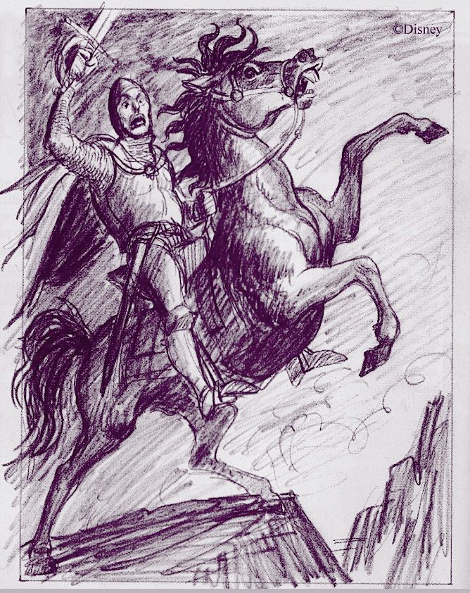
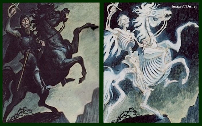
It was another case of Davis nailing it the first time out. There isn't a lot of difference, for example, between his preliminary sketches . . .

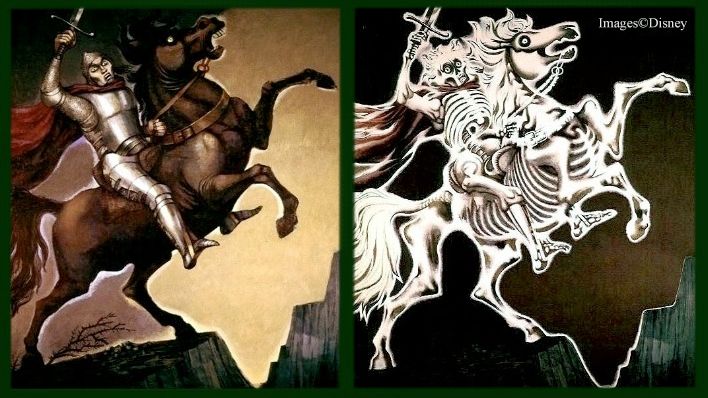
 . . . and his finished concept paintings, just as there aren't any important differences between those paintings . . . 


. . . and the paintings actually used in the attraction, which were done by Ed Kohn.  There is one amusing difference, however.


Mr. Kohn has discreetly moved Edward's scabbard over to the correct side (actually, you
can't even see it). Edward was a righty, and his scabbard therefore belongs on the left.

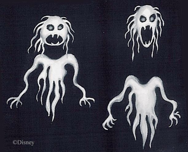
As long as we're tittering over mere trifles, here's another tidbit of trivia you might find amusing. Disney artist Collin Campbell was never one to let an unused piece of Marc Davis artwork go to waste. Take for example these nightmarish Davis ghosties. They were never used, but I would point to them as further evidence that Marc wasn't just a jokemeister but was committed to making the Mansion a scary place as well, as I've argued elsewhere.


Anyway, if they seem familiar, that's because Campbell used them in his artwork for the "Story
and Song" souvenir album. I don't know what those things are, but funny is what they are not.


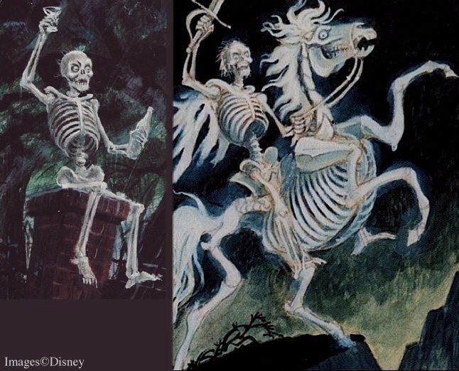
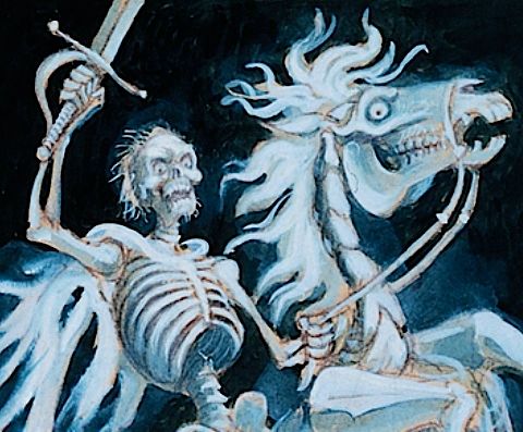
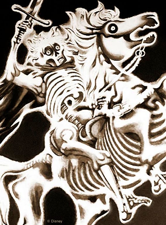
Well, in the case of the Black Prince portrait, Campbell lifted the skeletal horseman from Davis's
original concept painting and this time found a completely different use for one of Marc's creations.


Busted!

Okay, let's get back to the portrait.  Unlike the case with so many of the other changing portraits, there is no evidence that Davis originally planned anything for the Prince other than what we got: a two-stage lightning shift from living horse and rider to skeletal figures.  In other words, there would seem to be no surprises to report at this stage of the game either.  But a major surprise in the history of this portrait was revealed, as I said, in October of 2015. You can read about it HERE.


What Are You Doing Here, Ed?

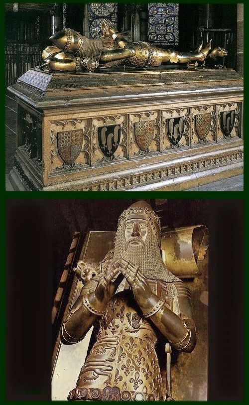
The only real mystery with Edward the Black Prince is this:  Why is he in a haunted house at all?  There are no ghost stories or anything else supernatural connected with him, so far as I know.  We can, if we wish, visit his impressive tomb in Canterbury Cathedral in search of clues.


.  There we find this epitaph:

.          Such as thou art, sometime was I.
.          Such as I am, such shalt thou be.
.          I thought little on th'our of Death
.          So long as I enjoyed breath.
.          But now a wretched captive am I,
.          Deep in the ground, lo here I lie.
.          My beauty great, is all quite gone,
.          My flesh is wasted to the bone.

Sober, yes, even grim, but there's nothing there that would give you goosebumps.

If Edward isn't a ghost, neither is he generally included with "famous villains of history," which was another admission ticket to the Mansion during this period of its development.  Quite the contrary, Edward is regarded as a legendary warrior from Britain's past, a mighty hero . . . more or less. The "less" comes with acknowledging that Edward did have a dark side.  Something about slaughtering women and children now and then, but sheesh, who hasn't done that?  It's so unfair.  One or two massacres and right away you're the bad guy.  But seriously folks, could it be that this less palatable dimension of his story, plus the "Black Prince" title itself (allegedly because he wore black armor), have gradually pushed him over into ambiguous territory, making him villainous and scary?

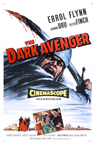
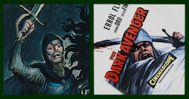
Probably not.  The problem is, this sort of historical revisionism doesn't seem to have destroyed Edward's reputation (yet?), and it certainly had not done so during the time period we are dealing with.  Ten years before Marc's portrait of the Black Prince, Hollywood had put Edward's story on film in The Dark Avenger (1955), with Errol Flynn in the title role.  Edward looks pretty mean and nasty in the movie poster, but the Black Prince is still very much the swashbuckling good guy in the film.  It's Errol Flynn, remember?


As a matter of fact, if we're looking for possible artistic influences on Davis beyond
the Paget print, could that movie poster right there be a candidate?  Um...maybe.


For Some Reason, Beauty is Deceptive

With no obvious justification for his inclusion, Edward the Black Prince is an intriguing and puzzling member of the Mansion family.  Not surprisingly, this complicates our attempts at interpreting the painting.  All of the other changing portraits present us with something pleasant that transforms into something horrifying. In doing so, every one of them demonstrates the truth that beauty is deceptive, but curiously enough, they offer two distinct arguments in support of that claim.

"Beauty is deceptive because it does not last" (April-December, Master Gracey, the "Flying Dutchman" as a handsome ship destroyed by a storm).

"Beauty is deceptive because it can mask something evil" (Medusa, Cat Lady).

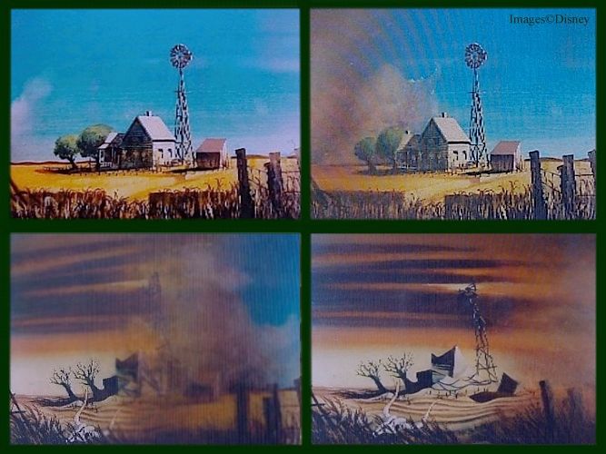
Furthermore, a lot of unused changing portraits could also be cited which fall neatly into one or the other category.  The wilting bouquet of flowers is obviously part of the first group.  So is this unused concept, a terrestrial counterpart to the Flying Dutchman painting.  Call it "Dustbowl," or "The Little Farmhouse that Couldn't." (For both of these, see now the November 2015 updates HERE.)


Several unused "femme fatale" portraits featuring charming young women
taking a homicidal turn just as obviously belong in the second category.

Scroll if you must.

Taking it a step further, one could argue that the two responses can be reconciled as essentially one by recognizing Death as our enemy and never our friend, whether he comes softly with the creeping decrepitude of age and disease or suddenly and violently at the hands of another while we are still in the bloom of youth.  The cold-hearted spirit who animates the homicidal maniac is the same one who patiently takes you apart piece by piece until you can't go another step, even if it takes 99 years. That is a distinctly Christian view of Death. There are many attempts in many religions and philosophies to appease the Reaper, or to ignore him, or to negotiate with him, or to soften him, or to stoicly accept him, or to outright embrace him.  Many attempts.

Screw 'em all. Death must die. In the Eastern Church, and curiously enough also in the writings of the Puritan American Jonathan Edwards, "beauty" is a theological category, a fundamental dimension in spiritual reality.  Consider this: We cannot help mourning over the transitive nature of earthly beauty.  We're always a little sad when our flower does what all flowers do, always a little shocked and disappointed when we see old photos of our various heroes in their youth and compare them with their grayed and brittle-boned present.  But if it has always and ever been thus, why do we stubbornly continue to feel this sense of loss, almost a betrayal?  It's because we know something, instinctively.

Divine beauty never can and never shall deceive. It is Beauty who whispers to us that Death is an alien presence, a mocker, an enemy.

Okay, is he done?  I think he's done.


Part of the Team, or an Outlier?

Is the Black Prince portrait also a commentary on the deceptiveness of beauty?  If it is, which of the two statements does it make?  This is the most interesting thing about the portrait for me.  You can make a case that this changing portrait is like all the others, but to do so you have to claim that (1) the first phase of the painting presents a form of beauty, and that (2) the second phase either foreshadows Edward's tragic mortality ("beauty doesn't last") or reveals Edward as a fiend in human form ("beauty can mask evil").

It's a stretch no matter which way you go.  With regard to the first point, it's true that those scowls don't necessarily mean he's a bad guy.  Witness that movie poster.  And you can claim that what you're seeing is the handsome image of a tough, brave and determined warrior.  And it's true enough that Edward the Black Prince has always been presented as a fearsome fighter but basically a good guy, so why should this be any different?  

Against all this is the fact that we are given no clues whatsoever to help us identify the figure as Edward in the first place, and you have to admit that he looks not just brave but pretty scary with those orange, madman eyes and those bad teeth.


If we're supposed to like him, why not give us something a little more cuddly, like the guy in
the Paget print?  He looks like he could be the lead singer in the latest boy band sensation.


As for the second point, only the fiendish interpretation is really defensible.
No way can this be taken as just another wistful example of memento mori.


If it's ridiculous to look at that and see only a sober reminder that beauty is destroyed in death, it's just as hard to see a shocking, vivid contrast between it and the first phase of the painting, where one is pleasant and positive and the other unexpectedly horrific.
 
UPDATE October 2025. This newly-discovered sketch is very interesting. It suggests that Davis was thinking diabolically when he began tossing out images that eventually evolved into his Black Prince.

 
Let's face it; the Black Prince is not like all of the other changing portraits.  I suspect that Davis used extant portraits of Edward only as artistic models for a ferocious horseman and wrote "The Black Prince" on his sketch without giving it much thought, knowing that it didn't matter, because no one would have enough clues to identify the knight with a specific historical character anyway.  If that's the case, we should ignore the title and just concentrate on the portrait itself.

I don't think we're seeing any sort of commentary on beauty at all.  It's something else.  It's a BGGB.


The BGGB Portrait

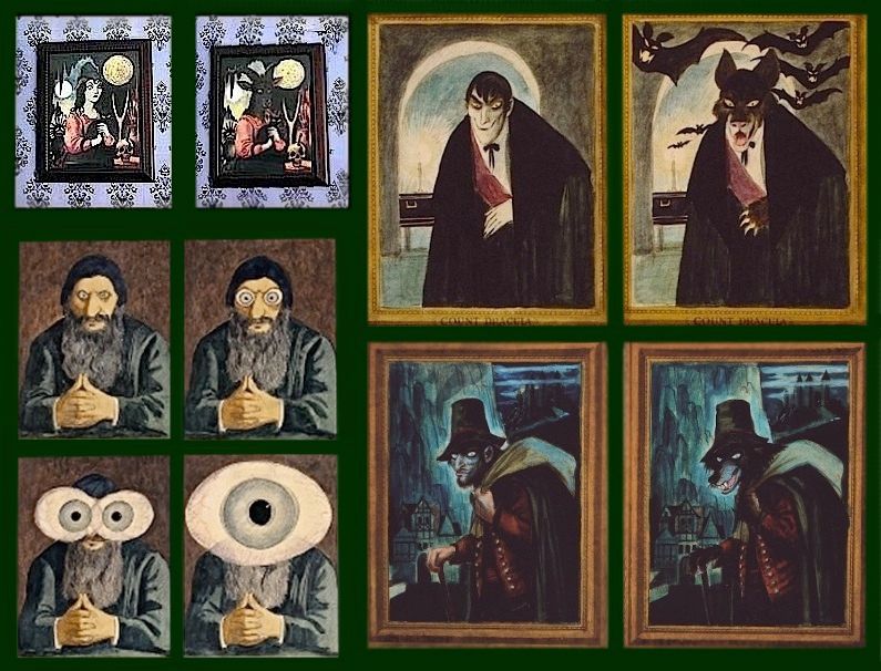
The Black Prince is hard to place because it represents the only surviving example of something that currently lacks a name.  I do hereby dub this genre, "BGGB changing portrait."  That stands for "bad guy gets badder."  A portrait of someone who is sinister but nevertheless human transforms into something far worse.  Most BGGB's start out with a recognizable historical or literary villain, soon to be revealed as a strange and diabolical creature in human guise.

Originally, there were lots of BGGB's.  Some were never used, and some ended up among the "Sinister 11," following you with their eyes but not transforming.  Among these would be Dracula, the Witch of Walpurgis, Rasputin, and the Wolfman.  (These are all discussed HERE and HERE.)  All look human, and all change into something inhuman.

These BGGBs will give you the Heebie Jeebies

There are other BGGB's, but those are the plainest examples.  The only one of them that starts out with a nameless, generic character is the Witch of Walpurgis, so she would be the closest parallel to the Black Prince if he's going to be read as simply "a fierce and frightening horseman."

That's my explanation, but who knows?  You may come up
with a different solution to the puzzle of the Black Prince.