Updated with new artwork May 17, 2014 and Oct 19, 2019
We continue our tour of the Mansion, looking for Ken Anderson's fingerprints.
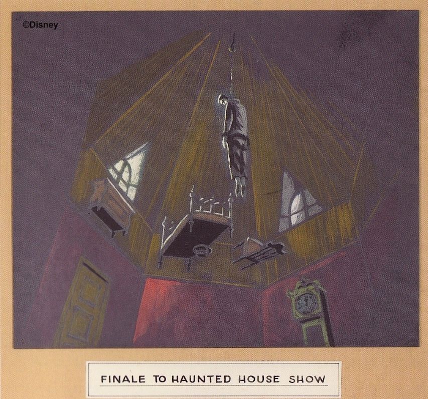
I want to go back to the stretching portrait gallery, because, dude, that place is Anderson city. He conceived of (1) an octagonal room with (2) a ceiling that disappears (3) as the lightning flashes in the windows, (4) revealing a corpse hanging overhead (5) from a peaked roof. No kidding.
(pic by K447)
In May of 2014 this astonishing piece of Anderson concept art was published for the first time. It proves that what we
have in the finished attraction is close to 100% Anderson. The only significant difference is the presence of furniture.
As if that weren't enough, we now discover in late 2019 that Anderson did a much more finished painting of the above sketch, dated sometime before March of 1957:
MDIHOW 343
Well, none of that stuff made it. But notice in the upper right hand corner that Anderson wanted "bats" and a "lightning flash" effect. The lightning has always been there, of course, and in 2007 he finally got his other wish posthumously when the sound of bats was added to the WDW stretching galleries. I know that pixie dust sometimes takes awhile to kick in, but...50 years?
(artwork by Neil Engel)
In Anderson's floor plan this room is depicted as an irregular octagon . . .
. . . but the newly-discovered sketch seems to show a regular octagon, exactly like the room we eventually got. Keep in mind that the house had not yet been built when these sketches were made, so the shape of the room as well as the gag overhead must both be credited directly to Anderson. Rolly Crump and Yale Gracey later turned it into a stretching art gallery which functioned as an elevator, but they changed almost nothing of Anderson's original design.
And on and on it goes. As noted earlier, the Mansion's raven mascot seems to be an Anderson idea.
Update Sept 13, 2012: It now seems likely that Anderson should
also be credited with the idea of a haunted grandfather clock.
Hey, how about a séance where the medium is herself a ghost? Been there, done that.
Yale Gracey and Rolly Crump are sometimes given a little too much credit for introducing the "Pepper's Ghost" glass reflection effect into the Mansion. The fact is, Anderson had already made heavy use of it in the Sleeping Beauty walk-thru and planned to use it again in his Ghost House.
The guide opens the door and is almost mauled by "Hairy the Arm." As the plan shows, "Hairy" is really off to the right,
in a "black hall," but he's reflected in the glass (which Anderson misnames "mirror"), so he looks like he's rushing straight
towards the doorway. With clever lighting, he can be semi-transparent and can appear and disappear quickly or gradually.
At the climax of the show, Anderson planned to have the guests on a balcony looking downward and inward at a grand hall, where a cobweb-shrouded table was prepared for a wedding feast, including a cake. Various ghostly manifestations were planned for the scene (probably using Pepper's Ghost), and a phantom organist would provide music for the party. Anderson's frequently-published sketch of this scene lacks most of those details, which are rather to be found in his show scripts and on his floor plan, where he indicates the position of the bride and groom.
Disneyland, Walt Disney World, and Tokyo Disneyland all have a birthday (or deathday?) party going on rather
than a wedding feast, but Phantom Manor goes back to the Anderson model, since the backstory there fits the
"wedding gone awry" theme that Anderson originally used in most of the proposed scripts for the Ghost House.
(pic by Marcel de Neidels)
In the early 90's they kicked around the idea of revamping the DL table in the same
direction, dropping the birthday party in favor of a wedding feast, complete with cake.
Those plans didn't go anywhere, but with the Constance backstory now firmly planted in the Mansion, they might consider
reviving this idea at some point. I hope not, but there it is. Better get those "Save the Birthday Gal" petitions ready.
When we look down at the ballroom today, some of Anderson's gags can still be seen. Great Caesar's Ghost is
Anderson's idea. So is Rockin' Granny, as Ed Squair has noted (E-Ticket 14, p 27):
Anderson puts the rocker in the bedroom scene, not the Grand Hall; nevertheless, note how he describes it: "The room
'comes to life' as a green fire ignites itself in the fireplace and an empty rocking chair beside begins to rock."
As for the attic bride, we have seen previously that ultimately, she goes back to an Anderson sketch inspired by the Brown Lady of Raynham Hall.
Also, in that same post, we saw that the unfinished attic with bats fluttering around and spider web strings hanging down (both features of the original 1969 attic) was anticipated in some of the passageways of Anderson's Ghost House.
Jason Surrell has suggested that the new Grand Staircase scene at WDW (aka, the "Endless Staircase," aka the "Escher stairs") owes something to Anderson, and to prove it he brings forward a couple of Anderson sketches (The Haunted Mansion, p. 67).
Well...if this is indeed the right tree up which to bark, then I would argue that Anderson's ideas were filtered through Claude Coats first:
It's much more certain that Anderson's Ghost House provided the direct inspiration for the hitchhiking ghosts in the mirror gag, noted in passing in an earlier post. The hallway between the two octagonal rooms had two-way mirrors on each side, and guests would see "traveling ghosts" tagging along with them as they proceeded. The effect would have been done in much the same way as it is today, with ghost figures on a continuous loop and passing behind a black barrier for the return trip.
Talking busts? Yeah, that too.
Incidentally, I suspect that Anderson drew inspiration here from the famous Richard Connell short story, "The Most Dangerous Game."
"And now," said the general, "I want to show you my new collection of heads. Will you come with me to the library?"
Ed Squair (E-Ticket 14, p 23) sees Andersonian influence in the "family portraits" that grace the Corridor of Doors. Could be:
At one point, WED architectural engineer Paul Saunders wanted to hit the HM guests with a blast of cold air, signifying the presence of the supernatural. Chief architect Vic Greene liked the idea, and Saunders believes the idea was actually used. It was definitely planned. A blast of cold air would come out of the Endless Hallway as guests passed by, and it's possible the effect actually was used for a short time in 1969. Needless to say, Ken Anderson anticipated this idea too. He had several places in his Ghost House where cold air would hit the guests. In this case we have an idea that could well have occurred independently to more than one Imagineer.
We've talked about the projected wraiths in the graveyard several times now. They're explicitly
a Ken Anderson idea. You don't mind if I post these lovelies again, do you? My blog, you know.
I don't think I've mentioned the fact that Anderson wanted to experiment with fans blowing on the scrims, to see if
it would add further animation to these guys. As it turns out, it's a good idea. That's pretty much how they put the
subtle flutter into the wraith within the crypt. (That's also how they animated the late, lamented Purply Shroud.)
Anderson thought it would be a lovely idea to have guests exit into a courtyard and garden area, with a family cemetery
over on one side. Among other things, there would be arched crypts in some of the walls, with epitaphs on them:
Good idea, Ken.
(pic by Regions Beyond)
That's more than enough, wouldn't you say? We'll halt here and take a different tack in Part Four, where we'll talk about big concepts rather than incidental details, plus we'll ask the question: After all of this, is there a tribute to the "Father of the Haunted Mansion" in the Mansion? Subtle and witty tributes to other Imagineers are scattered throughout the ride, mostly on tombstones. No love for Ken Anderson?
.


Thank you! I've always felt that Ken Anderson hasn't gotten anywhere near enough credit for his work on Mansion (or that he used SBC as a proving ground for the various effects). But very educational - and about of 1/3 of the Anderson renderings you show, I've not seen before! Great article.
ReplyDeleteRepost Ken's art as many times as you want. Can't see enough of it!
ReplyDeleteFantastic series!
ReplyDeleteYes, the fact that the Sleeping Beauty walk-thru was a proving ground for HM effects is definitely an underreported story. Some of the links are amusing. As you know, the SBC originally had a Bottomless Pit tableau using mirrors to make it look truly bottomless (and topless). Also, there was an echo effect there for a short time. Well, in the courtyard after-show area of Ken's HM, there was to be an "echo well," obviously using the same ideas.
ReplyDeleteI know that this might not get updated, but at the WDW HM they use a blast of cold air when the GH talks about amenities including hot-and-cold running chills.
ReplyDeleteKen Anderson was the first name I became familiar with thanks to audio interviews with him done by Persistence of Vision magazine in the mid 90s. A few years later, I would get my pictures taken with Tony Baxter and then Bruce Gordon without knowing who they were, yet.
ReplyDeleteOf note, in the pre web days, an online service called GEnie had a text file someone typed up from a Ken Anderson headless horseman concept. Years later, I sent my copy to a new haunted mansion website run by Chef Mahem (before he even had a domain). Sadly, the file was corrupt and cut off... I guess today this is all out there, but it was a real mystery back then...
Nothing like talking about the Web to make you feel old, eh?
DeleteA kid went into a library and saw an encyclopedia set. "What's that?" "An encyclopedia set." "Dude, you mean someone downloaded the whole thing?"