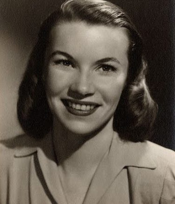
Dorothea Redmond, that is.
We've talked about all the major players who brought the Mansion to (after)life. Anderson. Davis. Crump. Coats. Gracey. Atencio. Baker. We've also tipped the old LF hat to a number of artists who played lesser roles, some of whom were major Imagineers but just didn't happen to have the same degree of involvement as the Seven. What we're doing today is paying special tribute to one of those latter artists, rather belatedly (a word you're going to see many times in what follows).
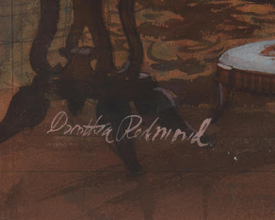
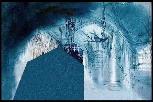
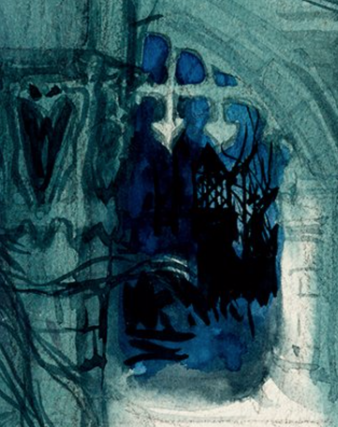
Part of the problem is that Redmond's known concept artwork for the HM is a relatively small group of paintings, and decent reproductions of most of those few have only recently become available. For example, until this summer this mutilated monstrosity was the best I could do for one of her paintings:
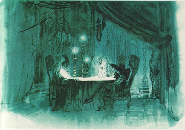
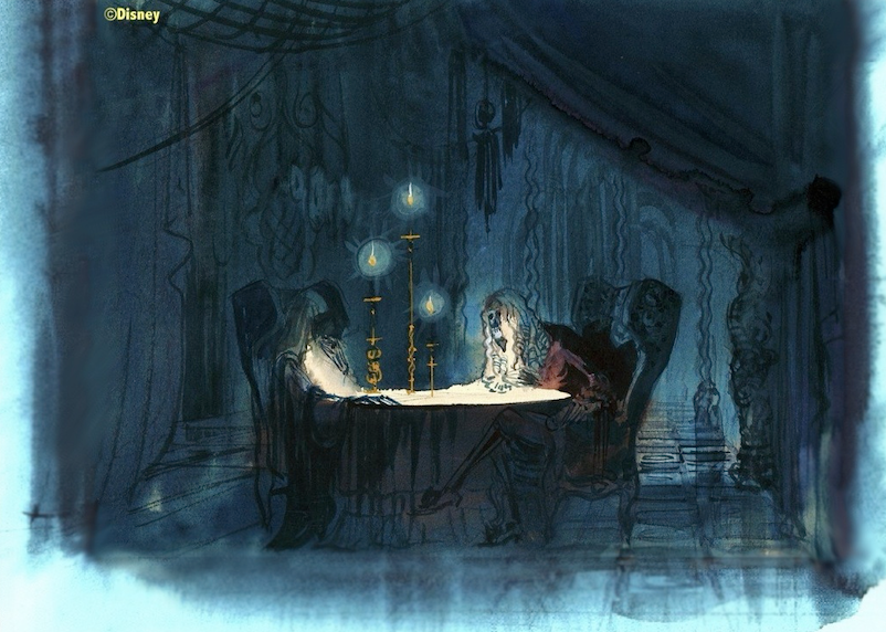
And there was a time when this was the best available reproduction of her Séance:
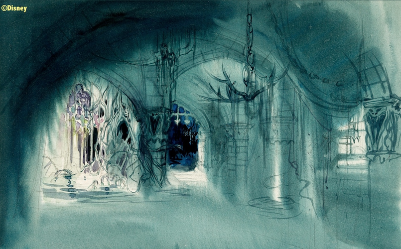
The only available "Hallway" reproduction was just as bad.
A fourth artwork was only available in a heavily cropped version, and a fifth was passed around only as a bootleg, with the understanding that it was not for publication. As a result, only two of her Mansion paintings have seen wide circulation, due to their inclusion in the Jason Surrell HM book (all editions), and even there the Hallway sketch was attributed to Claude Coats in the first edition, while the Séance sketch wasn't attributed to anybody at all in any of the editions.
Thanks in large part to Joshua Harris, to Chris Merritt, and also to the fact that the aforementioned bootleg has now been leaked on the 'Net so often that there's no real reason to refrain from showing it any more, at least nine pieces of Redmond's Mansion art are now available in decent reproductions.
Enough for a LF post, for sure.
Many of my observations below have been made before in the various and sundry places Redmond's artwork has appeared in other posts, but her work deserves to be collected and commented upon in its own right.
Here, in the gallery, you see rare paintings, some of our Redmondses, as they appeared...
Before we get into Dorothea's bio, let's hurry up and put the artworks on display, since that's really what y'all are here for.
Starting with the two that everyone has seen...
I love this hallway sketch, just like, oh, approximately 100% of all the other HM fans in existence. The execution of the concept seen here would have been relatively easy, I tend to think. Mirrors on front and back walls, floor, and ceiling, except that the mirror-wall closest to us is a two-way. The floating lights would bob on thin wires hanging down or perhaps project from the wood-panel side walls, much like the fiber optic stars in Peter Pan. These would light up the interior enough so that we would see through the two-way as a window, but we wouldn't see ourselves reflected in it if we were in a dark enough space, and from the inside looking back, the two-way would then function like an ordinary mirror, creating with the back mirror an endless depth.
Easily the creepiest of all Séance Circle concept sketches. For many of us, that means it's the best. There isn't even a crystal ball. Nothing can be learned by asking who these two figures are, or what they're doing. We are utterly in the dark. And I for one wouldn't have it any other way.
Pure surrealism, and incorporating the Beating Heart ghost (I won't say "bride") in headless form.
More surrealism. I've commented before that this and the previous one have "watery" floors, enough to make you wonder if they were done during the short time they were toying with the notion of making the Mansion a boat ride. If it would have looked like this, I'd have been okay with it.
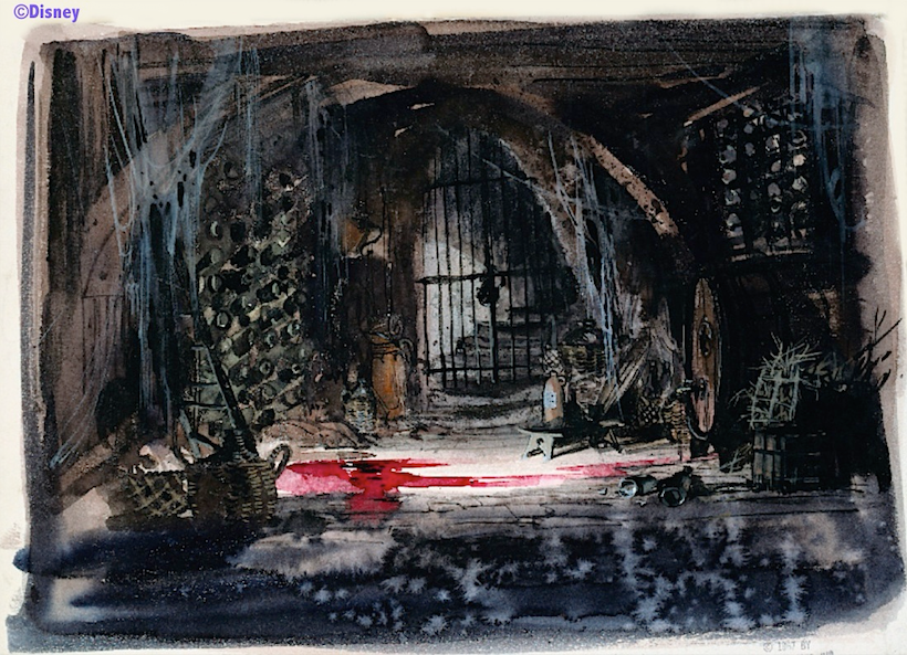
I've said before that there are two places in any respectable haunted house where the Awful Truth is locked up and kept secret: the attic and the cellar. In some of Ken Anderson's concepts, the chest in which poor Priscilla meets her demise is in the cellar rather than the attic; otherwise, this gorgeous Redmond watercolor seems to be the only serious attempt to conceptualize a haunted cellar tableau. It's also the only one of the five major works seen so far that does not have any surrealistic or fantastic features, and yet it fits in with them.
Is that wine . . . or blood? Dot only knows.
Redmond should probably get credit for the Conservatory design. Just scoot the coffin right in there, boys. Thanks.
A companion piece to the previous one. For a long time it wasn't certain these were Dorothea's, but there is no longer any doubt.
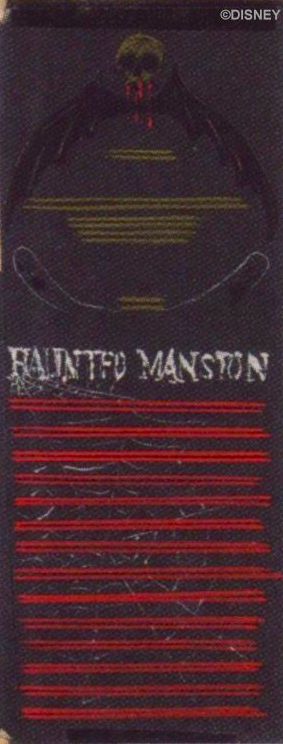
I sure do wish I could show you another piece of artwork I've seen. [And when you wish upon a star... check out the next post.] Rolly Crump created a sign advertising the coming of his "Museum of the Weird" in 1966. The bleeding skull and cobwebs on it are obviously inspired by this Redmond design for the "Coming Soon" placard. Dorothea's concept is the prototype for the famous sign put up outside the Mansion at the beginning of 1965. This is proof that she did HM-related work the first year she arrived at Disney.
Here's a new one, published in a new book, The Happiest Place on Earth (2025). I like the faces in the cobwebs:
I see Redmond's Mansion artwork as a cross between the hallucinatory fantasy of Rolly Crump and the moody mahogany atmospherics of Claude Coats. And that, friends, is a nice mix indeed. Dorothea's paintings may be my favorite collection of HM concept art to just sit and stare at.
Belatedly
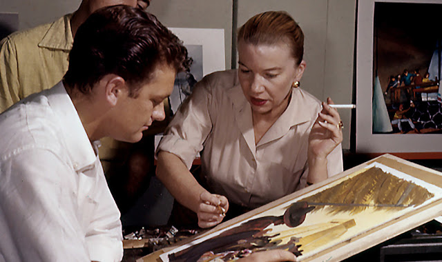
"Belatedly" tolls like an iron bell throughout any discussion of Dorothea Redmond. She began her career at Selznick International Pictures in the 1930s and worked on quite a number of famous pictures, including Gone With the Wind. But while other art directors and designers (the male ones) got screen credits, Dorothea did not, even though she designed Tara, fer cryin' out loud. Belatedly, her contributions to GWTW and many other famous pictures have come to be recognized and appreciated, but I'll leave a fuller discussion of that part of her career to the links (HERE and HERE and HERE).
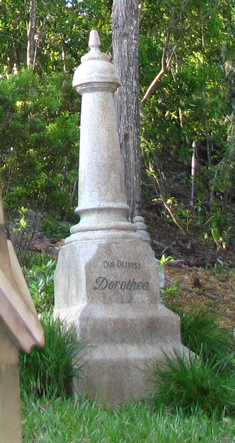
She came to Disney in 1964 and went immediately to work on a number of then-current projects. Her Mansion stuff seems to date from 1964 to 1967, and in keeping with the belated recognition that seems to dog her career, hers is the last truly notable body of HM concept artwork to become available for online posting in decent reproductions. She is also among that group of HM Imagineers who belatedly got tribute markers on the grounds of the actual ride, in the 2011 queue addition at WDW:
She died at the age of 98 on February 27, 2009, so this marker only postdates her actual death by a little over two years. It's a real pity she never got to see it or hear about it.
Beyond the Mansion...
She only worked at Disney for ten years, but she was incredibly prolific, and her skills at design were much in demand at the studio throughout that time. What folks say is that she was a helluva nice gal, one of those people without a nasty bone in her body.
Long after she retired in '74 she was officially recognized as a Disney Legend, in 2008, a mere thirty-four years after leaving the company. Rather belated, I'd call that.
She did a lot of concept art for WDW:
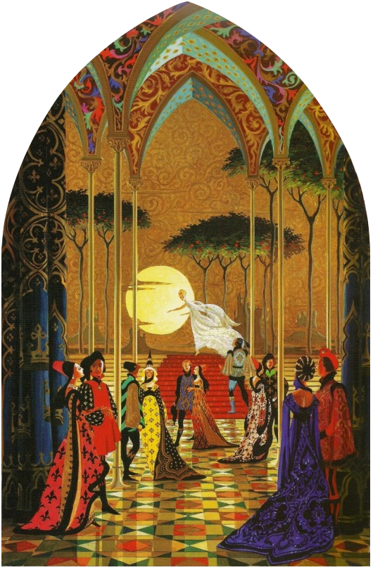
The most prominent public exhibition of her artistry anywhere in the parks is the large Cinderella mosaic inside the castle at WDW.
There's plenty of other Redmond artworks from her Disney years out there. Check it out. (Google is your friend.)
Meanwhile, our belated Long-Forgotten tribute to one of the Mansion's minor contributors is done (minor only in quantity; major in quality).
******************












-395993010.jpeg)


I don't think I ever realized that the "spirit lights" endless hallway was hers. I prefer it to what we eventually got, even though they ended up putting the floating candelabra in it. The dim and (maybe?) slowly fading in and out lights would have been much more effective, in my opinion.
ReplyDeleteHer cellar picture is wonderful simply because we all know that isn't wine. It's a darker tone than the mansion has now, and I like it. Likewise for headless Beating Heart.
I would rate her atmospherics up there with Mr. Coats' . She has a good eye for architecture as well. Thank you for pointing her to us!
A fine tribute. There is a sampling of Redmond's work on "Gone With the Wind" in Ronald Haver's book, DAVID O SELZNICK'S HOLLYWOOD; the interior styles look similar to the HM drawings.
ReplyDeleteLooks like Poe was an inspiration for the cellar illustration, with his cask of Amontillado.
If Adventure Thru Inner Space influenced the HM (Omnimover, Paul Frees narration), her sketch of the spooky hallway may have guided the water molecules scene in ATIS; same technique of two way mirrors and endless spheres.
"Her cellar picture is wonderful simply because we all know that isn't wine."
ReplyDeleteI never spill... wine.
I'm with Stu on the hallway; the orbs would be quite the spooky spectacle. I wonder if they went with something else for practical reasons, or if they just thought that something more subtle would work better at that point in the journey.
I always want to take more time to just soak in the beauty of the Cinderella mosaics, but I've never been able to find a time when there weren't a hundred people walking in front of them.
So easily to miss, on the Beating Heart picture, the claw-like skeletal hand drawing back the curtain in the foreground, staring at you with the curiously eye-like gem of the ring. Love it.
ReplyDeleteThank you for yet another amazing post here, I would apologize for my belated thanks... but it seems to fit the post in this particular case.
ReplyDeleteI had been wondering about the rest of that picture with the large chunk out of it ever since I first saw the incomplete version here. Although there is the sense that details you can't see but are only hinted at are completely appropriate when looking at the Haunted Mansion.
I’m so glad to see your tribute to Dorothea Redmond, an artist I previously only knew a little about. I’d seen a few of her Disneyland concept pieces, and it is clear that she was as good as John Hench or many of those names that are familiar to us today. I guess it’s not terribly surprising that she did not get the credit she deserved during her lifetime; even though she lived a long life, it’s a shame that she didn’t get to see the later appreciation of her work. Kind of like Mary Blair, who could have never imagined the fandom devoted to her art.
ReplyDeleteIt’s a pleasure to see so many beautiful examples of her work, both Mansion-related and beyond. I had no idea Redmond designed Tara! That alone should have made her famous with movie fans. Boy, that painting with the Plantation/Blue Bayou is a real beauty.
Thank you for yet another entertaining and informative post, I’ve enjoyed every one.
For the record, if you managed to bottle this blog up into a physical or even an e-book, you couldn't take my money fast enough.
ReplyDeleteYep, and with all the ©Disney stuff on here, the next thing I'd be taking is a letter from the legal arm of the house of mouse. As long as I'm not selling anything and it's strictly for informational use, they're okay with it. But the minute I tried to make a buck off of it I'd be ghost 1000.
DeleteThis comment has been removed by the author.
DeleteI love the articles, as a fan of HM and POTC. I miss going to both of these rides so I started making dioramas inspired by both and have made a working reproduction diorama of the endless hallway.
ReplyDelete