Things You're Just Supposed to Know

Most of the time, Long-Forgotten assumes that readers are already familiar with basic facts
about the Haunted Mansion. If you wanna keep up with the big boys, I suggest you check out
first of all the website, Doombuggies.com. After that, the best place to go is Jason Surrell's book,
The Haunted Mansion: Imagineering a Disney Classic (NY: Disney Editions; 2015). That's the
re-named third edition of The Haunted Mansion: From the Magic Kingdom to the Movies (NY:
Disney Editions, 2003; 2nd ed. 2009). Also essential reading is Jeff Baham's The Unauthorized
Story of Walt Disney's Haunted Mansion (USA: Theme Park Press, 2014; 2nd ed. 2016).

This site is not affiliated in any way with any Walt Disney company. It is an independent
fan site dedicated to critical examination and historical review of the Haunted Mansions.
All images that are © Disney are posted under commonly understood guidelines of Fair Use.

________
.
Showing posts with label Sam McKim. Show all posts

Thursday, April 23, 2026

Sweet. Long-Forgotten Turns SIXTEEN (plus, the Mansion up against the wall)


If Long Forgotten were a Disney princess, she'd now be old enough to get married. To quote Maleficent: "It's incredible! Sixteen years..." Yes, it's incredible.

Ooooh . . .

Ahhhh . . .

Okay, that'll do. Time for the pivot and introduction of a topic worth talking about but which has never merited a post of its own.

In other words, we're going to do what we always do on these august occasions (even though they're always in April). This one has been sitting in the drawer for a long time, waiting patiently for its moment in the sun.

If there's one piece of traditional Disneyana loved by absolutely everybody, it's those big, souvenir park maps that debuted in 1958 and were regularly updated as time went by. But before we get into those, something you may not know is that in addition to their famous early concept sketches, Harper Goff and Marvin Davis also sketched several maps of the proposed Disney park, then just a twinkle in Walt's eye, and in some of those they included a "Haunted House." Here's Goff's 1951 map. The haunted house is at the very top.


And here's Davis's 1953 map. (Middle, far right.)


McKim's McKlassics

Our interest, however, is in those colorful wall maps the parks sold. As most of you probably know, the first of these (and the best) were done by Sam McKim, and from the beginning they have always included the Haunted Mansion (or "Haunted House"). We're not going to do a survey of all the changes in the various iterations of the map, only the ones that affected the portrait of the HM in them. McKim's original drawing of the Mansion remained unaltered in the '58, '59, '60, and '61 editions:

We've discussed this one many times, and I haven't anything new to say about it, so we'll move on to the '62, '64, '65 map (none were printed in '63; we'll find that there are numerous such gaps along the way).

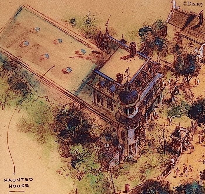
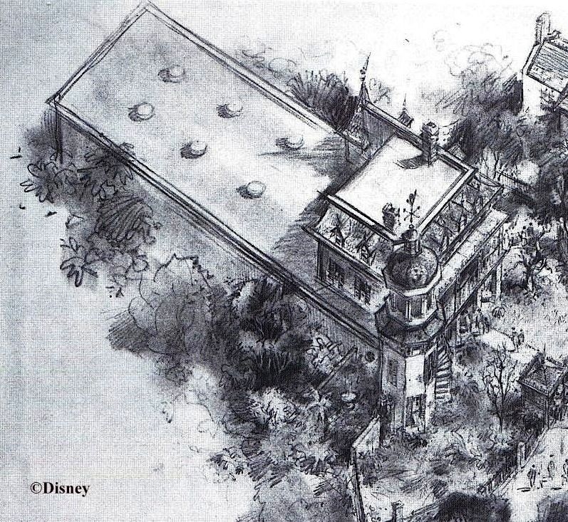
  Hands down my favorite. McKim was good at rendering top-down perspective, and his mastery of line weight was amazing. This is the only rendition of the building that even comes close to being accurate, including as it does the peculiar roofline, which reflects the twin stretching rooms. He probably sketched this in 1961 or early 1962, when the building was not up yet, so he must have seen some of the blueprints.

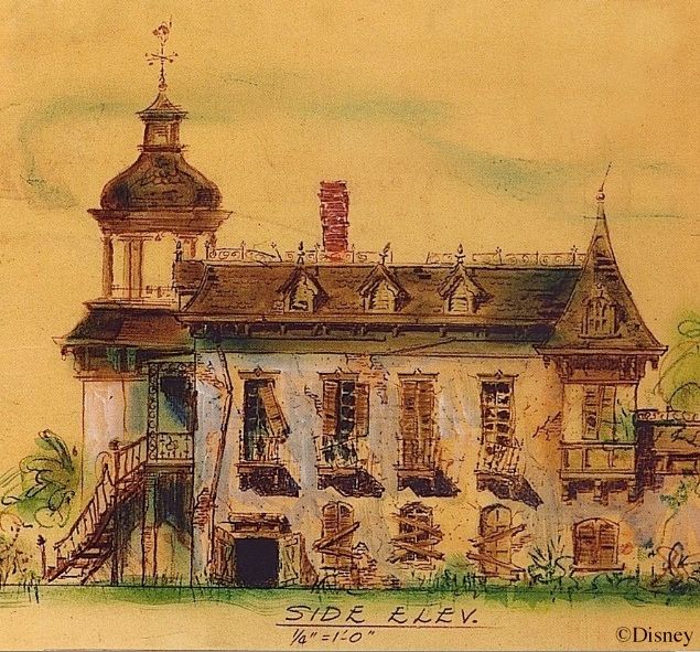
Perhaps the most interesting feature is the color. Already by 1958, in McKim's rendition elsewhere of the building inspired by the Shipley-Leydecker house, the exterior was expected to be white.

But we also know that the eventual color scheme was not yet set in stone, and as proof, the rugged brown in the 1962 park map may be added to this well-known "color guide" from 1962 or 63.

McKim's realistic inclusion of the northeastern stretchroom in the roofline evidently confused later mapmakers, who took it as virtually a separate building attached to the Mansion (and thought to be . . . what? a spill area? restaurant? ). The famous National Geographic spread on Disneyland (1963) interpreted it that way in its Disneyland map:

We're years too early for the Museum of the Weird, by the way, in case any of you are getting all excited about that possibility. The park guidebooks for '65, '66, and '67 all included a little wing over there as well.


I suspect that this was inspired by a misreading of McKim's sketch, fueled by the false assumption that the house was a simple square. Did they think it was an old-fashioned farmhouse water tower?


I'm Callin' Campbell Mmm Mmm Good

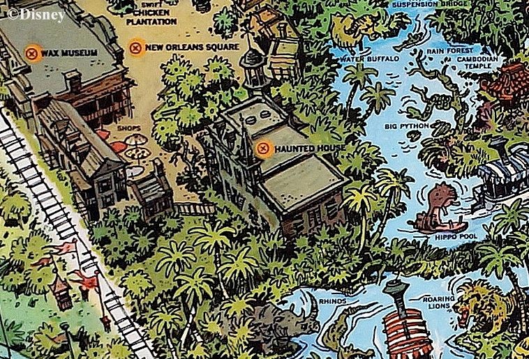
In 1966 the map was redone in a painterly style by Collin Campbell (reproduced in '68, '72, '74, '75, '76). I don't like it as well as McKim's, but I must admit its softer, lusher look has a certain appeal.

The house design is far less accurate, but this will remain the basic look for the rest of the souvenir map's existence. There are several curious features here. One is a weird, non-existent entrance gate leading straight to the front door. I've never heard of any plans to incorporate this feature, but once it got on the souvenir map it had remarkable staying power through subsequent editions. 

More interesting is the implication that the front yard cemetery would extend all the way around to the other side, which of course never happened. But the way the front yard portion is walled-off and enclosed is reminiscent of the old Ken Anderson design for an elaborate cemetery. When the attraction was conceived as a walk-thru (which would still have been the case in 1966), we remember that the northern and southern walled areas were to be twin exit areas complete with graveyards. Were there plans to have them connected? The earliest blueprints of the building do not include the attached stairwell entrance that blocks traffic along the back of the building, so I suppose the idea may have been considered feasible at one point, even though it would always have been a bit of a squeeze.

More interesting still is the presence of the show building. Keep in mind that it was not actually built until the early spring of 1969 (yes, really, 1969), even though the basic size and shape of the building were already determined by 1961:

But why include it at all on a souvenir fun map with no pretensions to strict accuracy? Haven't we been told that 'beyond the berm" isn't supposed to exist when you're at Disneyland? Why, then, the big, ugly, gray blob? Well, the answer is not far to seek. Just south on the same map is the big gray blob of the POTC show building:

As we can see, the Pirates building served as a convenient bulletin board for posting the names of exciting scenes in the upcoming attraction, guaranteed to tease and tantalize map owners.

No doubt when Campbell was recruited to redo the map in 1965 or 66 the powers that be (i.e. Walt) were confident that by the time the map was ready for the printer the Mansion's contents would be just as settled as POTC's. Campbell obviously was not responsible for all that superimposed lettering. They knew what the show building was going to look like and they thought they would soon know what was going to be in it.

What this shows is that as long as Walt was alive and at the helm, everybody thought the decision-making process would keep moving along at a sufficient pace to put a Mansion bulletin board on the park map, in confident anticipation that all the major issues about its contents would be settled by 1966. Didn't happen, of course. The '66 and '68 Campbell maps are solid evidence that things really did lapse into a state of uncertainty and flux when Walt died, just like everyone says it did.

An edition of the map with the interior items tacked on the show building eventually did appear in 1972 (no new maps appeared in '69, '70, or '71). Notice that "the graveyard" is not included. The outside graveyard (still labeled there) is supposed to be understood as being in continuity with the one we see on the ride, and you wouldn't label the same graveyard twice, right? This is evidence that what would eventually be the berm graveyard was conceived as merely the extreme edge of the large public cemetery you see in the ride, spilling over the hilltop into view from the front. The crypt complex that makes up the exit area was to be understood the same way. You enter it riding in your doombuggy and eventually make your way out of it on foot. This is also confirmed in the script for the "Story and Song" album.

For 1978, they decided to redo the map entirely once again and go back to the look of the original Sam McKim maps, more sketchy-graphic and linear, but preserving the Campbell design overall, except for deleting the no longer necessary show building (qua bulletin board). Putting a couple of the hitchhikers on the map seemed sufficient.

This edition was reprinted in '79, '82, '83, '84, and '87. I have to admit that I don't know who the artist was. No one else seems to know either. If I ever find out who it was, I'll put it here (hooray for the blog format). According to Tom Morris, the art library at WDI has the artist listed as "unknown." It's not bad, but I think it suffers by comparison with McKim. When it comes to pseudo-Sam, Chris Merritt does it better.

In 1989 some alterations were made to accommodate the inclusion of Splash Mountain. The hitchers were moved into the front yard, but little else was changed. Same artist, it seems.

In 1995 they redid the whole thing again. The artist was Nina Rae Vaughn. It seems like the goal was to bring in a some of the lushness of the Campbell version. The wraparound graveyard is finally gone (or obscured), and the south porch has finally been given its pediment, but the non-existent front entrance still persists. A few more interior characters appear (Mdm L and the Caretaker). It was reprinted in 2000.

For the 2001 edition (reprinted in '05 and '08), FastPass Gardens was included, and the front entrance was finally put where it belongs.

I have not thought it worthwhile to chart all the little depictions of the Mansion in the park guides, other than the mid-sixties items above, but I find it curious that since at least 2013 (and probably earlier), a strange sort of "Winchester Mystery House" architectural sprawl has served as the HM icon.

 
I can only imagine that the artist wanted you to think that the parts of the building you can't see are in fact able to accommodate all the stuff you encounter inside. Be that as it may, map artists have let their imaginations run wild.


McKim Returns!

Getting back to the big wall maps, there is a wonderful tale to be told about Paris Disneyland. It seems that they convinced Sam McKim himself to come out of retirement and do their souvenir map, and the depiction of Phantom Manor is a sheer delight, full of Sam's distinctive humor and with his graphic skills undiminished and on full display, as if 1958 was yesterday. What a treat.

 A always, thanks to all you Forgottenistas for making this blog worthwhile! Long Forgotten continues to pick up new readers, so . . . there ya go.


******************************


Saturday, July 29, 2017

The Oldest Haunted Mansion

.
Updated June 2020

It's time once again to talk about Ken Anderson, celebrated here at Long Forgotten as the "Father of the Haunted Mansion" in four consecutive posts back in 2010. Those were followed by a fifth post detailing his extraordinary blueprint for a walk-thru Mansion that contained traces of his own show-flow sketch work. (Just a reminder: we now know that the "purple" concept paintings were done by Duane Alt, based on Anderson sketches.)


Two More "Essential Andersons"

As more material has come to light, essential Ken Anderson posts have continued to materialize. THIS post, for example, inspired by 2019 discoveries, belongs in the "Essential Anderson" collection alongside the five listed above. But before that one appeared came the one you are now reading, completely redone in 2020.

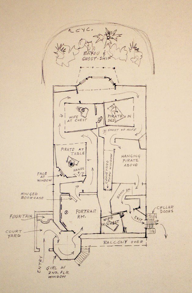
A remarkable relic of Haunted Mansion history came to light at the D23 Expo of July 14-16, 2017, over in the POTC section: A layout sketch of Ken Anderson's "Ghost House" walk-thru, reflecting Ken's earliest known backstory concepts.

pic by Jeff Baham

The sketch was put on display between a copy of a March 1957 memo and an early concept painting for the Pirates walk-thru by Bruce Bushman. Among other things, the memo mentions a "rough story outline" for the Haunted House by Bill Cottrell and Ken Anderson and "three key sketches and a proposed plan" for a pirate-themed Wax Museum in New Orleans by Bruce Bushman. Originally, I assumed the layout sketch above belonged with the Cottrell/Anderson part of the memo rather than with the Bushman part, but Imagineer Chris Merritt tells me the drawing is archived with Bruce's stuff and labeled as a Wax Museum sketch.

Since the layout sketch conforms to an early Ken Anderson plan for the Haunted House (as we shall see), one can only assume that not just Cottrell but Bushman also worked with Anderson on it and that "Wax Museum" at this point may have been something of an umbrella term for both the Pirate walk-thru and the Haunted House, as if they were two interconnected exhibits at the same expo.

If you know your HM history, you know that in 1957 Anderson came up with several show concepts in rapid-fire succession. The first was the infamous "Sea Captain" tale, still recalled whenever folks want to discuss what the "real" backstory of the Haunted Mansion is. Until the discovery of this crude blueprint sketch, no one suspected that there was any layout artwork associated with it.

As of 2019, we now have a set of 1957 storyboard sketches from Ken as well, blocking out one of his Sea Captain scripts for the attraction. It has many things in common with this layout but also differs from it in a number of ways. If you have no familiarity with the "Legend of Captain Gore and Priscilla" backstory, I suggest you check out that post first and then come back here. (I linked to it at the top of the post, but HERE it is again.) 

The order of the rooms seems to follow the story sequence as found in the earliest known script (from Feb 1, 1957), and the layout is for a very short and very simple walk-thru. It may well represent the oldest known plan for Disneyland's haunted house, reflecting Anderson's thinking from as early as January of '57.

Sam's Place?

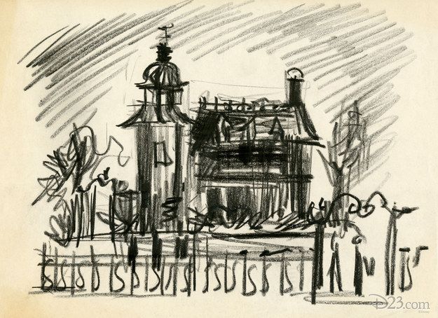
The floor plan is based on concept art for the Haunted House that has often been mistakenly attributed to Sam McKim. Sam did get involved very early, but he was working with Ken Anderson and from Ken Anderson's original sketches. This first sketch is not by Sam, as previously thought, but by Anderson:

pic from D23.com

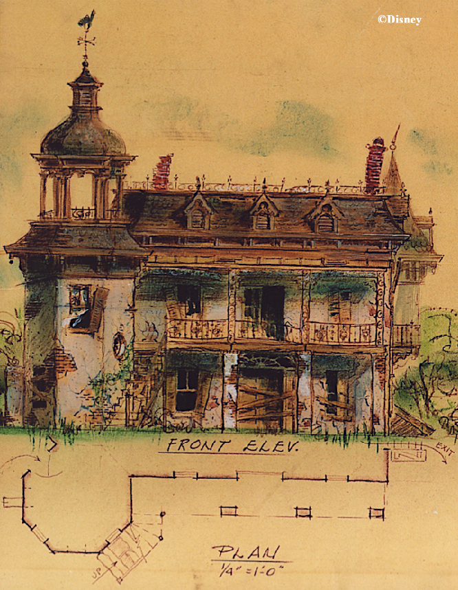
But these well-known sketches, following Anderson's basic concepts,
are indeed from Sam McKim, with input from Marvin Davis:


Some of the artwork circulated for an unknown length of time in an uncolored state:


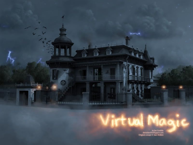
In addition to those, you really should check out Joe Cardello's amazing


One or two pieces of Ken's concept artwork can now be identified as belonging to this archaic 1957 plan. Other pieces may or may not belong to it, but we're going to take a tour of the house as best we can, using what we've got. We can also use several of the Anderson storyboard sketches to help illustrate what we see here.

Ready? Let's go.


Our Tour Begins Here

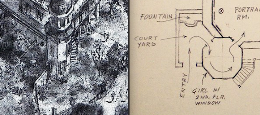
 ENTRY was to the left, through a small COURTYARD and into the base of the tower:


GIRL IN 2ND. FLR. WINDOW.  There is a description of this "girl in the window" gag in Anderson's September drafts for the "Bloodmere Estate" concept. The girl screams and is suddenly "throttled by a large hairy hand which draws her back into the darkness." We now know that this gag was a holdover from the Sea Captain version of the attraction.

As of 2019, we are fortunate to have a set of Ken's own storyboard sketches for it.


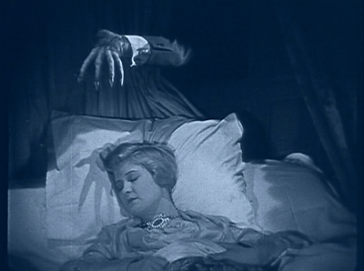
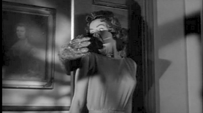
It's the sort of cheap cinematic cliché that made Rolly Crump groan. You can find
it in campy horror movies from Cat and the Canary to House on Haunted Hill.


pix from Foxxy

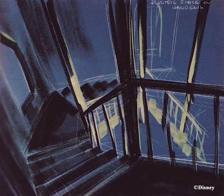
Once inside, guests would climb stairs to the second floor. It's possible that this Anderson sketch depicts the scene:


That howling sound you hear isn't ghosts. It's Disney lawyers noticing the plans for electric shocks in the hand rails. Good heavens, we wouldn't want people to actually touch the safety rails, would we?  (It wouldn't have taken long to get to ghost #1000 in this place.)

Moving along...


             Here, in the Gallery


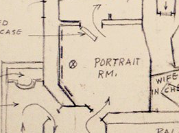
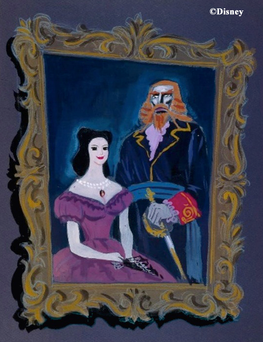
I notice that the PORTRAIT ROOM does not include a fireplace anywhere. All of Anderson's known sketches for this room have one. Oh well. The butler or maid would no doubt have pointed out here either a portrait of Captain Gore and Priscilla...


...or a portrait of the Captain alone, or separate portraits of Gore and Pris. Different combinations occur in the various scripts. (For details, see the Sea Captain post already mentioned.) Egress from this room is through a HINGED BOOKCASE strikingly similar to what we see in this sketch:


                        Trunk and Disorderly


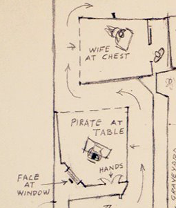
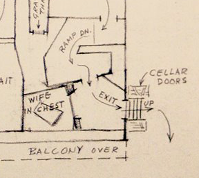
According to most versions of the "Legend of Captain Gore," we are supposed to see the ghost of Priscilla at this point. The map, however, takes us rather quickly to this tableau with PIRATE AT TABLE. We can only guess what was supposed to go on there. There is a FACE AT WINDOW and a pair of grabby HANDS coming out of a trap door on the left. The hands, of course, show up in later versions as "Hairy the Arm," but at this point they are unexplained. It looks like Gore has a document in his hands. A treasure map, perhaps? What needs to be established story-wise at this point is the awful truth about Gore's secret life as a pirate, and the label "Pirate" here indicates just that. By the way, it looks like Anderson and/or Bushman had a change of mind about which wall would be open to view. See the little arrow?

The 2019 storyboards show this scene in more detail, but they do not shed much light on the plot element(s) that are being developed.

The WIFE AT CHEST tableau requires little explanation at this point. It looks like a Gore figure was going to swing around and appear in the doorway. At that point Pris would scream, and the room would be plunged into darkness.

When this post was first written, in 2017, the only artwork available for this climactic moment was an ambiguous sketch Anderson did in 1992 for The "E" Ticket magazine that may be a depiction of the moment of confrontation.

The "E" Ticket 13 (Summer 1992) p 6

But the 2019 storyboards give us for the first time real-deal sketches of the scene:


However, proof that the storyboards reflect a different script than the layout sketch can be seen in the captioning. In the layout, she's his "wife," but in the storyboard captions, "she refuses to marry him."

The next item is a CYCLORAMA featuring a BAYOU and a GHOST SHIP, and believe me, I'd love to have seen that as much as any of you. Well, we're not going to let a pesky little thing like reality stop us, are we? Let's play around with a couple of existing Anderson artworks and maybe give ourselves some small inkling of what the cyclorama might have looked like. Ken did sketch a bayou scene at one point, albeit a scene full of voodoo deviltry, and he did do a quick charcoal-pencil drawing of the ghost ship for the storyboard set that came to light in 2019.

©ImagesDisney

So with a little photoshop wizardry, we can at least come up with a concept
sketch of a concept sketch. (And you know, it didn't come out too badly.)


                                   ' Wake and Swinging


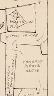
Now we're getting somewhere. We definitely have an Anderson sketch of the PIRATE IN BED:


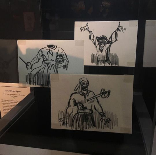
The room is full of gags not indicated in the floor plans. It seems that Gore was tormented by the spirits of others besides Priscilla. Some of these figures can be seen in independent concept sketches displayed at the D23 Expo:


The card below them reads:

Haunted Mansion

Original story sketches
Colored pencil and Conté crayon on paper
1957

Some of Ken Anderson's earliest drafts of the Haunted Mansion
script were focused on the actions and spirit of a pirate named
Captain Bartholomew Gore. These early sketches feature
various ghastly scalawags who never made it into the 
mansion itself.

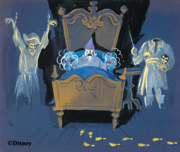
We now know that these little sketches were in fact from the storyboard collection that surfaced two years later! Thanks to those, and the accompanying manuscript, we have a much clearer idea of what the PIRATE IN BED sketch depicts. Ken's early scripts had a scene in which the Captain is shown terrified in bed, clutching his pistols, haunted by all these pirate ghosts, including one that only seems to reveal himself by his glowing footprints.

We turn the corner and see the GHOST OF WIFE at the end of the hall. The storyboards have strengthened the case that this is the scene Ken had in mind:


The GRAVEYARD THRU WINDOW at the end of a long hall behind glass is intriguing. There must be a reason for the long passage, but whatever special effect was envisioned here, we can't recover it from the drawing. The storyboards do have a graveyard scene ("Ghosts in garden, skeletons up from graves") that probably corresponds to this in the layout:

The PIRATE HANGING ABOVE is in a room irregularly shaped but roughly rectangular, and Anderson did do a sketch of a hanging in a room like that, but it's clear enough that he's moved on to a different story concept by this point, as there is more than one figure in the tableau.


           Yo Ho, Yo Ho, It's Out the Door You Go


We wind our way down a RAMP into a cellar area, where we eventually see through an opening in the wall the unfortunate WIFE IN CHEST. The wall here is noticeably thick, suggesting that this is the place she is about to be (or was) bricked up. It's not indicated on the plan, but one can imagine the importance of sound effects as part of the show here. (The storyboards agree with the layout here and confirm our hunch about the importance of sound effects.)

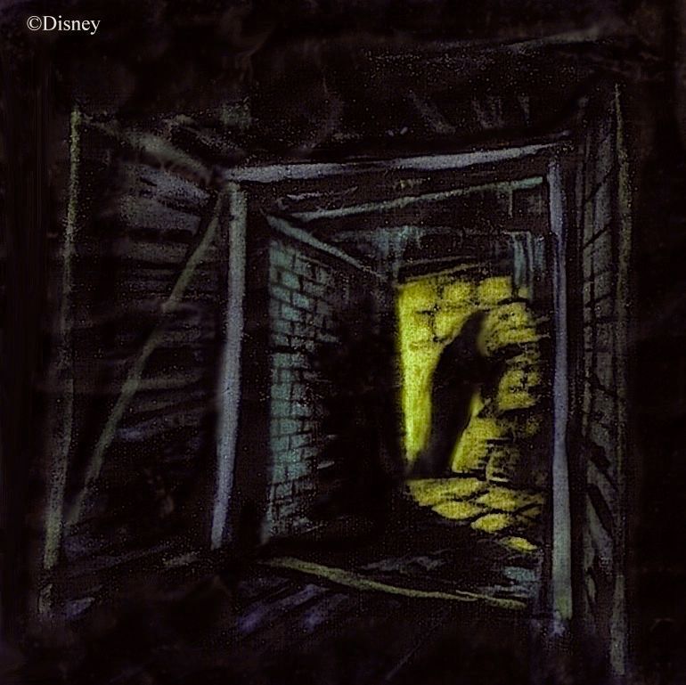
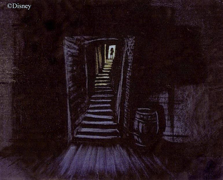
The two sketches below are certainly not related to this HM concept directly, but they at least give us some idea of what Anderson conjured up when he was looking for a "creeping-around-in-a-dark-old-cellar" atmosphere. Notice the odd, irregular, "fun house" angles common to both the artwork and the house plan. As we have observed in another context (the Corridor of Doors), depriving your subconscious mind of predictable architectural dimension translates into a sense of exaggerated size (in other words, if the walls are goofy, you remember it as bigger than it is).


Concluding Observations

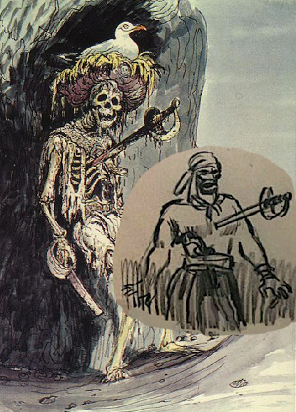
For me, one fun thing about this new discovery is the way it eerily foreshadows the sort of POTC-HM mashup that forms the subject of one of this blog's most popular posts. Disneyland's haunted attraction and its pirate attraction were born joined at the hip, just a year and a half after the park had opened. Besides the fact that this new sketch is archived with Bruce Bushman's work as a plan for the "Wax Museum"—something normally associated exclusively with the history of the POTC—we can see evidence for this sort of blurring of the boundaries in one of those pirate ghost sketches by Anderson also on display at the D23 Expo (now identified as a storyboard sketch). It could easily have inspired the skewered skeleton on the POTC beach.


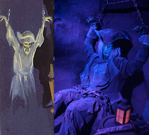
It's also fun to see how Anderson's work continues to influence generations of new Imagineers. For example, if the 1957 pirate-ghost-in-chains in the earlier sketches looked familiar, it should. It served as a template a half century later for a 2007 pirate ghost on DL's Tom Sawyer Island.


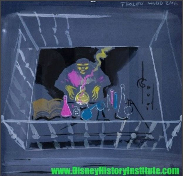
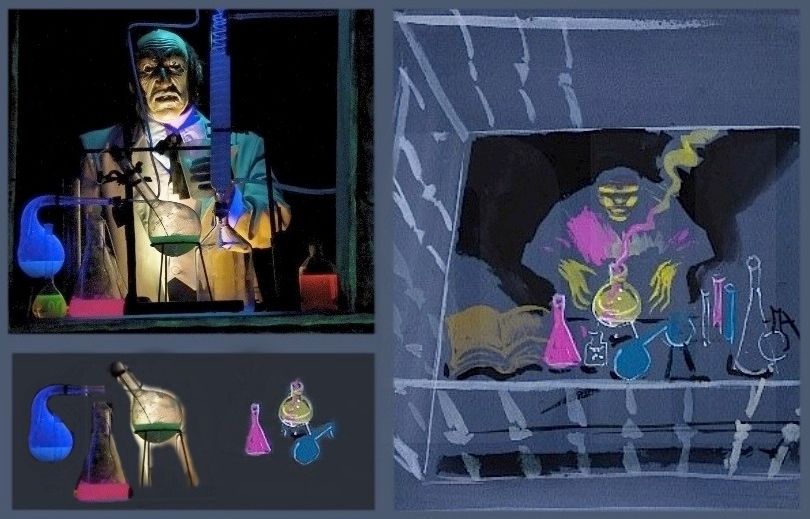
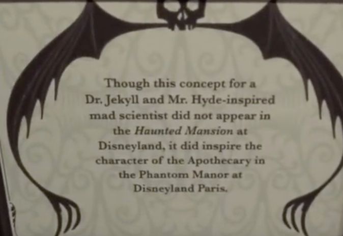
Or compare this Anderson sketch of a mad-monster scientist...


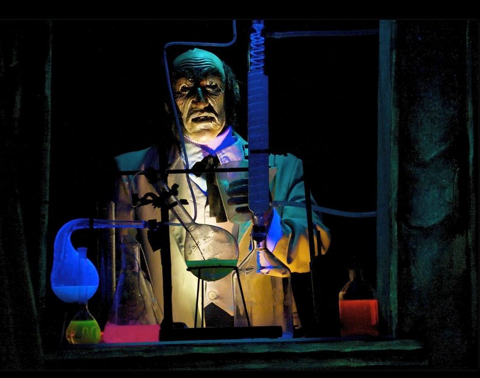
... with the "Dr. Jekyll" tableau in Phantom Manor:


What? You don't see it? Here, let me spell it out for you:


Post Script: In 2019 the Anderson "mad scientist" sketch was on display at Disneyland
for the Mansion's 50th Anny, and this notice was posted beneath it. Toldja.


Ah, Ken . . .  you still da man.


*************