Things You're Just Supposed to Know

Most of the time, Long-Forgotten assumes that readers are already familiar with basic facts
about the Haunted Mansion. If you wanna keep up with the big boys, I suggest you check out
first of all the website, Doombuggies.com. After that, the best place to go is Jason Surrell's book,
The Haunted Mansion: Imagineering a Disney Classic (NY: Disney Editions; 2015). That's the
re-named third edition of The Haunted Mansion: From the Magic Kingdom to the Movies (NY:
Disney Editions, 2003; 2nd ed. 2009). Also essential reading is Jeff Baham's The Unauthorized
Story of Walt Disney's Haunted Mansion (USA: Theme Park Press, 2014; 2nd ed. 2016).

This site is not affiliated in any way with any Walt Disney company. It is an independent
fan site dedicated to critical examination and historical review of the Haunted Mansions.
All images that are © Disney are posted under commonly understood guidelines of Fair Use.

________
.
Showing posts with label Grand Hall. Show all posts

Friday, January 14, 2011

The Duelists

.
A major boost to the theory laid out in this post was added in December 2013.  See below.
New artwork added in October, 2019.

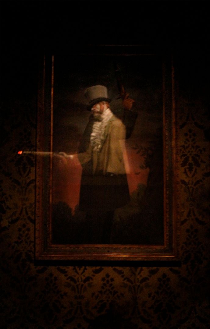
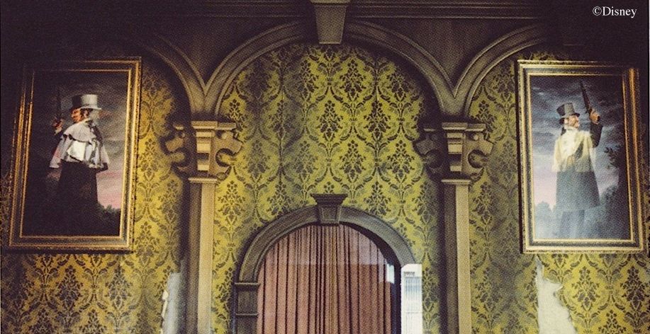
In a blog post last year I discussed Marc Davis's talent for telling a funny story in less than a second.  Under most circumstances artists try to avoid clichés, but for this task stock characters and stereotypical situations are your best friends (although I have to say that even here it is remarkable how few truly stereotypical situations Davis uses).  Another friend of the quick-joke artist is ritual.  If you show characters involved in a well-known ritual (say, a wedding or a funeral), you have already incorporated a good deal of story before you've even begun.  The best example of this in the Haunted Mansion is the pair of duelists depicted in the grand ballroom's portraits:

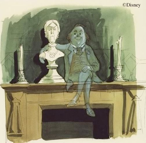
Marc hit on the idea of a ghostly duelist quite early. This sketch dates to mid-1964:
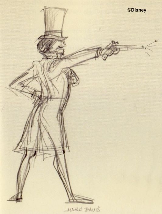
MDIHOW (341)

You've probably seen this sketch...
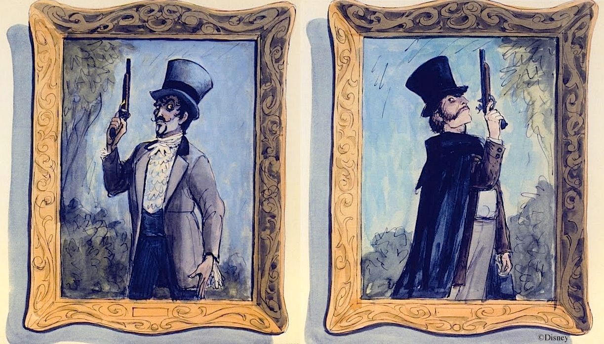

But have you seen this one?
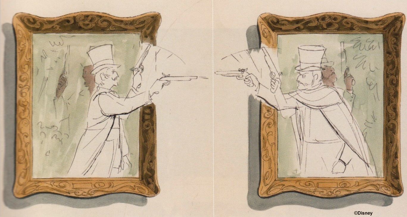
MDIHOW (393)

Think how much you "know" within half-a-second.  A gentleman of some social standing believes his honor has been slighted by another gentleman of about equal social station, and he has challenged him to a duel.  The other fellow makes no apologies and so accepts the challenge.  The time period is not modern, but 19th century or earlier.  The two men are somewhat stuffy, humorless characters.  In particular, they seem almost melodramatically sensitive when it comes to their personal honor.  You know all of this at a glance, because you know the rules for this particular ceremony, and you probably share the current perception about the kind of people thought to be attracted to it.  A dueling scene is a brilliant choice for a drive-by joke.

And what is that joke?  Obviously, the duel settled nothing and continues ad infinitum in the afterlife.  What was supposed to be the ultimate way of settling a dispute in fact ensured that the dispute would never be settled.  It has always been my opinion that the two shot each other dead, leaving no winner, and so the duel continues, stuck in an endlessly repeating loop.  I know that GRD thinks there is a real winner, based on a slight sideways head movement by one of the duelists at the end of the cycle, and others who have worked on the figures confirm that the little movement is there, but it's virtually undetectable to guests, and I'm not yet fully convinced it represents a bullet hit rather than drawing a bead.  What would truly settle the issue is if one of the two guns went off before the other.  The pistols have a special bulb for a barrel flash as well as a bang, so it should not be an irresolvable question.  Perhaps one of you Forgottenistas has an insider's familiarity with the shot sequence.
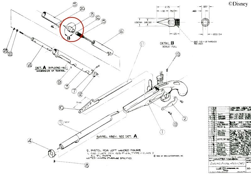
Yer goin' DOWN, dude

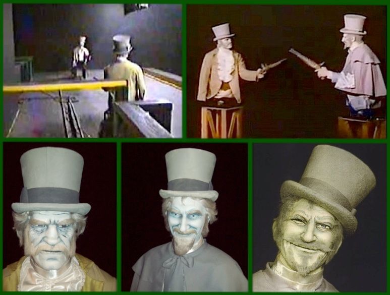
While we're snooping around backstage looking at light bulbs and head nods, here are a few fuzzy pix that some of you might find interesting.  Top left is the actual set up at DL.  Directly underneath them the doombuggies are scooting along the balcony.  Top right shows them in the shop, not long before installation in 1969.  The bottom row gives you some close-ups.  Center and right are the same character, one recent (center) and one old (right).  As you can see, they've done up his eyes a little differently over the years.  That's the Auctioneer's head from POTC, by the way.

There are more unsolved mysteries with the duelists than whether or not one of them won the duel.  There is also reason to suspect that they are not located where they were originally planned to be.  Much of what follows may be filed under "speculation," but hey, nothing wrong with that so long as you admit it.

It all begins with Collin Campbell's artwork for the "Story and Song" souvenir record album.


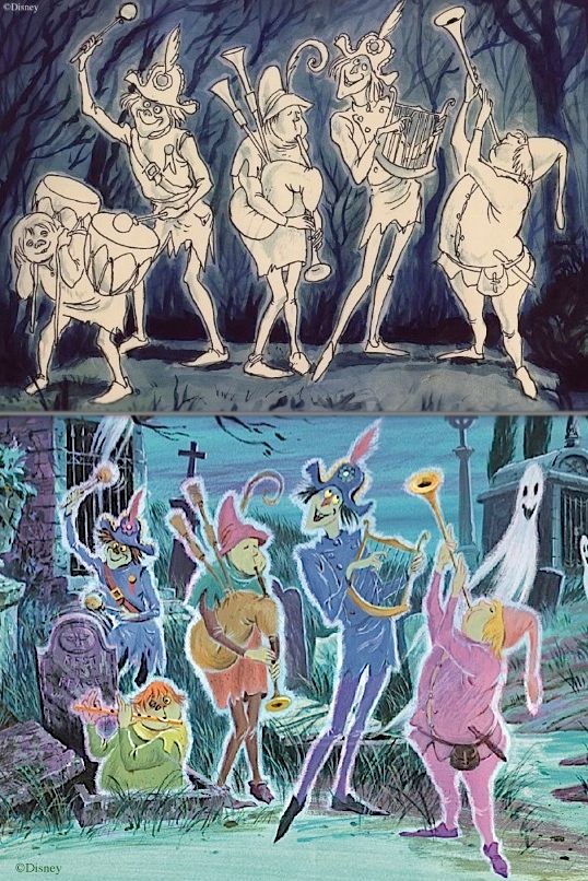
These lush, colorful illustrations are beloved by Mansion fans.  But despite their breezy, painterly quality, if you compare them to the corresponding Marc Davis concept art you find that they are extremely conservative.  Campbell stayed very close to his sources.  This is typical:

Now let's take a look at the Grand Ballroom illustration, which spreads across two pages.  The left side would be the place
you might expect to find the duelists, but they aren't there.  Balcony railing gingerbread obscures that portion of the wall.
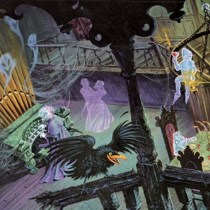

But that doesn't mean that Campbell ignored the duelists.  Over on the right side of the painting is a
little surprise, something unknown until this artwork was re-issued with the CD version of "Story and Song"
in 2009.  The painting as it was known from the booklet in the 1969 record album looks like this:
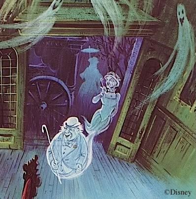

But the same painting in the CD booklet looks like this:
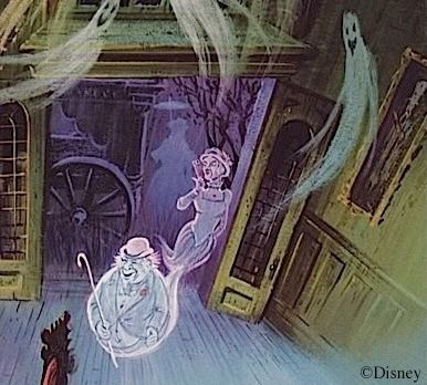

Note the portrait on the wall, fully visible for the first time in 2009.  Is that . . ? Is that . . ?
It is.  It's one of the duelist portraits.  What's it doing over here on this side of the room?
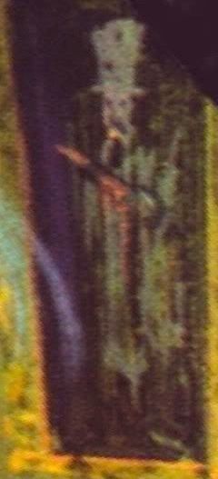

It wouldn't be so odd except that Collins is so consistently literal in his reproductions of Davis artwork.  Putting a duelist on the wrong side of the room is a little bold for him.  Unless Davis also had the duelists on that wall in his sketches.  Is that possible?  Alas, we don't have Campbell's source art.  Well, okay, what's on that right-hand wall in the actual attraction?  The fireplace.  And above the fireplace is the Mantelpiece Ghost.


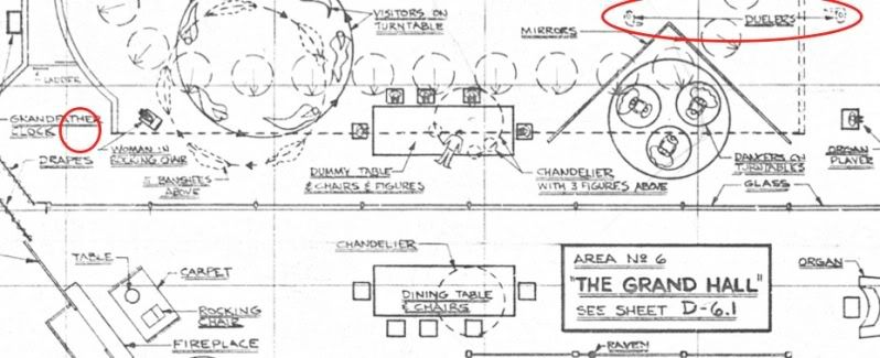
Funny thing about Mantelpiece Ghost.  He's missing entirely from the two Effects blueprints produced in the first quarter of 1969.  If that's just an oversight, it's odd that it happened not once but twice and was never corrected on the blueprints, which were repeatedly updated as they were used.  This would also be the only such erroneous omission on these blueprints.  Mantelpiece Ghost should be in the red circle on the left.


You can see him in a WDW blueprint of the same area:
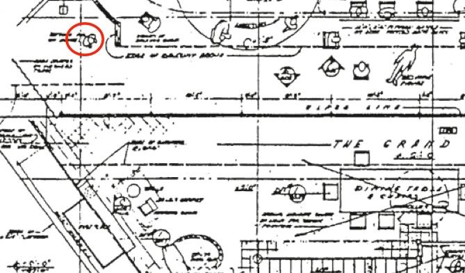

Hmm.  Is it possible that the duelist portraits were originally going to be on the wall above the fireplace but were subsequently relocated, while a new ghost was put in that area, the Mantelpiece Ghost?  There's plenty of room on that big, blank wall:


Joshua Harris

Complicating this theory is the fact that the duelists are right where they should be on these same blueprints (see the red circles on the right).  What may have happened is that they realized the duelists would work a lot better on the back wall, above the balcony, and they decided they would definitely move them there, even before they came up with something to replace them on the right.  That would explain the blueprints.  By this scenario, Marc Davis came up with Mantelpiece guy fairly late in the game, no earlier than mid-to-late spring, in fact.

Added December 22, 2013:

There is a compelling piece of evidence supporting the theory just advanced: the figure numbers.  All figures in the Haunted Mansion are given a number like "F-12" or "F-39."  (The "F" stands for "human figure.")  Also, the Mansion is divided into numbered "Areas" and the figure numbers in each area follow the flow of the ride.  "Area 1" is at the beginning and contains only F-1 and F-2, the two hanging corpses in the two stretching galleries.  The list next moves to Area 6, the ballroom, where figures 3—35 are found, beginning with granny and ending with the second duelist.  Area 7 is the attic (F-42 is marked "omitted"; guess who?).  Area 8 is the graveyard, featuring F-43 (the caretaker) through F-75 (the beheaded knight).  Area 9 is for all the hitchhikers, closing out the list with the ghosty-go-round hitchhikers in the mirror (F-80 to 94).  Projected ghosts like Mdm Leota, the singing busts, and Little Leota are not included on these lists.

So where do you suppose the Mantelpiece Guy is?  He's tacked on near the very end (F-79), a conspicuously out-of-place Area 6 interruption on the Area 9 list.  That can only mean that he was a Johnny-come-lately, one of the last AA figures added to the ride.
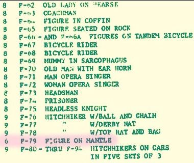

The only AA figures later than Mantelpiece Guy are the hitchhikers in the mirror.  That's not hard to explain; we now know with certainty that they didn't show up until the last minute.

.

Tuesday, November 9, 2010

Thinking BIG

.

This is going to be a very unusual post.  It's about 95% irrelevant to the Haunted Mansion, and yet, in order to claim that 5% it's necessary to wade through the whole.  Not that the topic is dull, because it's not, so we'll have some fun getting to that 5%.

One of the things we admire about the HM is the sheer audacity in its imagineering.  Those stretchrooms, for example, are just as impressive today as they were when they were first designed, nearly a half-century ago.  It took a bold imagination to dream up something that unique.  Since they were in the building when it was built (in 1962), they were designed during the period when Rolly Crump and Yale Gracey had the Mansion assignment.  In fact, Rolly designed the original stretchroom portraits, but Marc Davis didn't like them and came up with a set of new ones (and don't we all wish we could have seen Rolly's versions!).  The ingenious stretching effects, with a complex system of telescoping wall panels and unrolling paintings, were almost certainly a Yale Gracey invention.

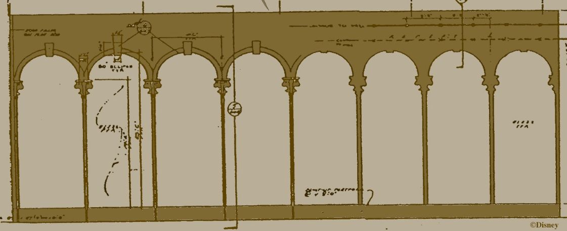
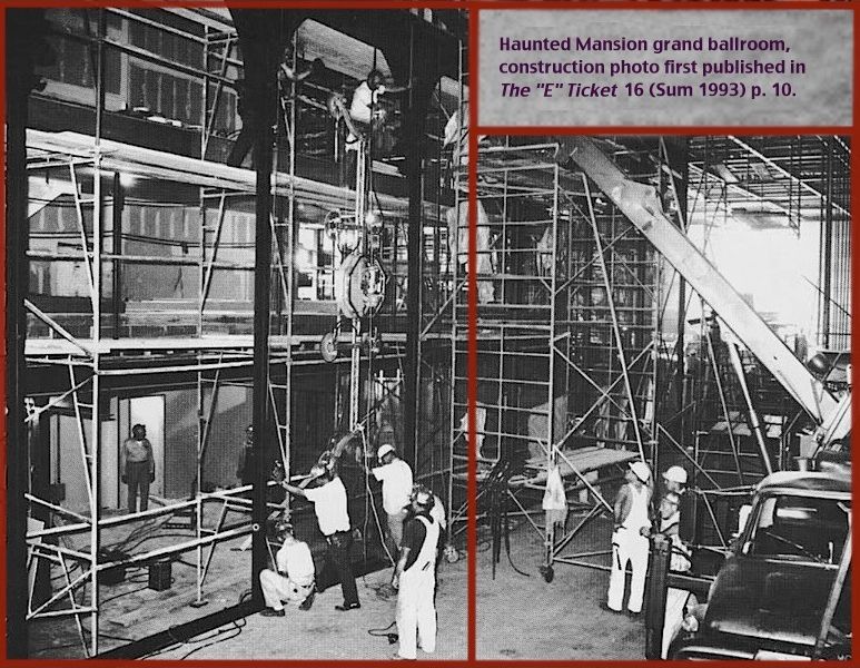
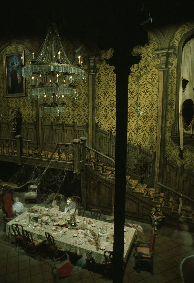
For sheer scale, however, the prize for audacity goes to the Grand Ballroom, the largest "Pepper's Ghost" illusion ever created.  The arcade that you look through is roughly 90 feet long and 30 feet high.  There are eight panes of glass, each one about 10.5' x 23.5'.


"Uh, you guys do realize that no one has ever even made a sheet of glass that big, don't you?"  "No foolin'?  Hm.  So, what's your point?"

Testicular diameter, my friends.

They ordered up at least eighteen of them—eight plus a spare for Anaheim and eight plus a spare for Orlando. 
(The spares are stored behind the fireplace on the right side.)  Transport and installation took careful planning (duh).


When you're looking at the Ballroom, part of the wow factor comes from the sense of space, the sheer size of the scene.


Okay, hold that thought.  Now let's go all the way back to World War II for a long parenthesis.

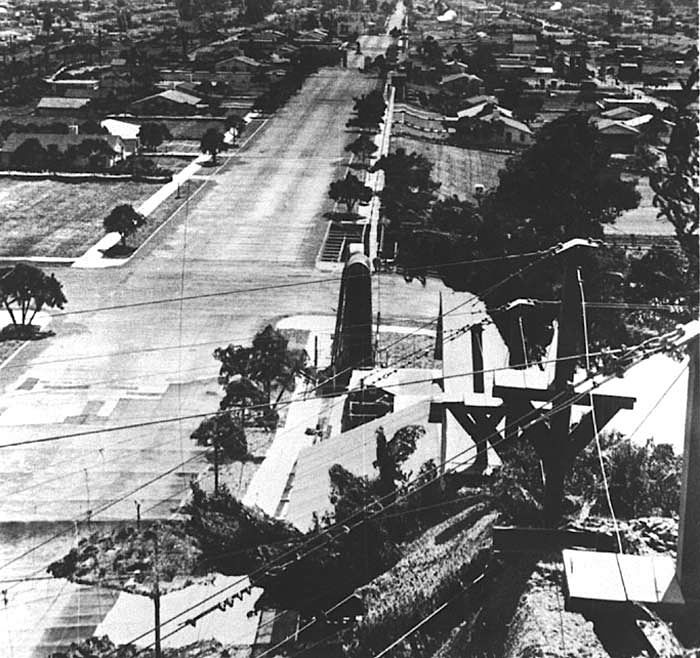
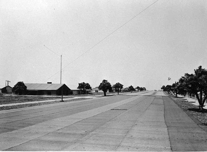
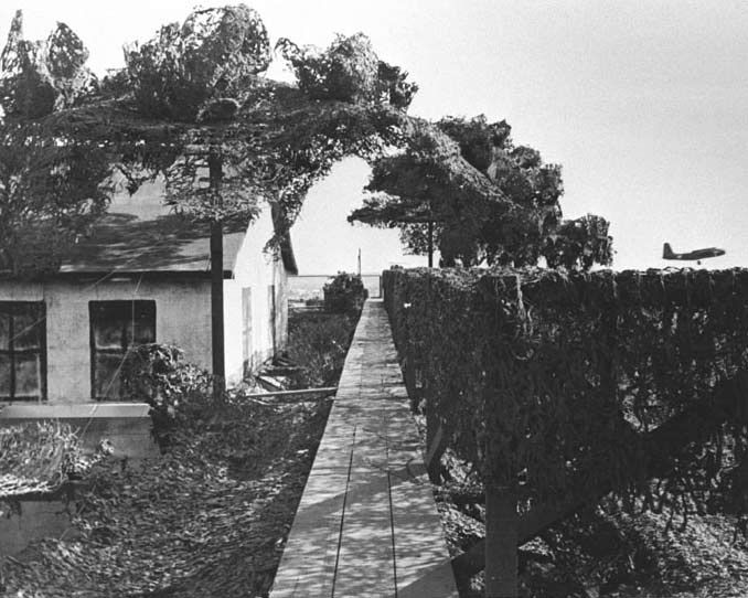
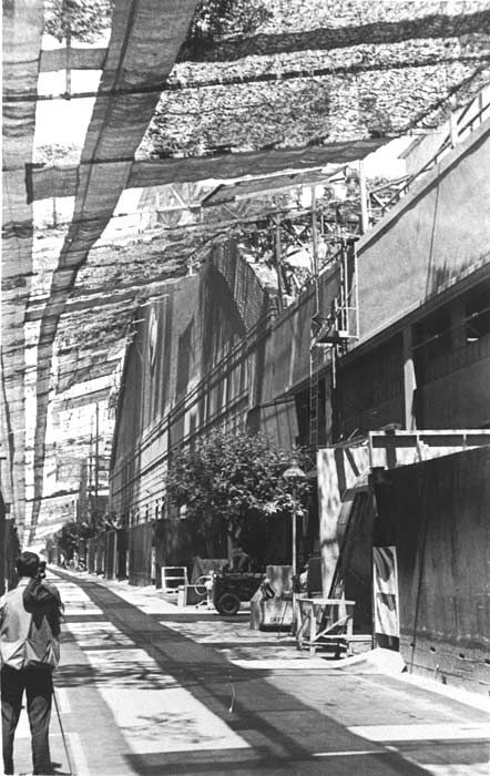
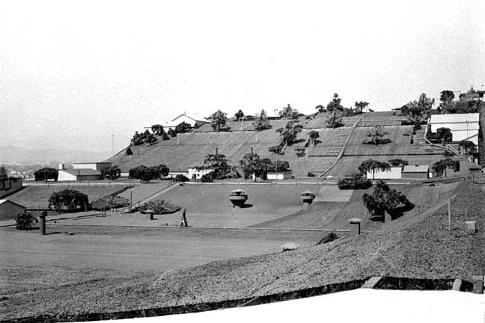
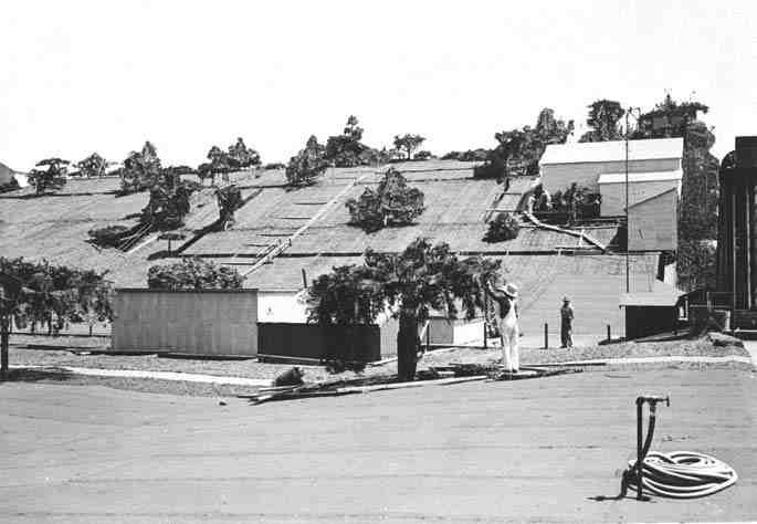
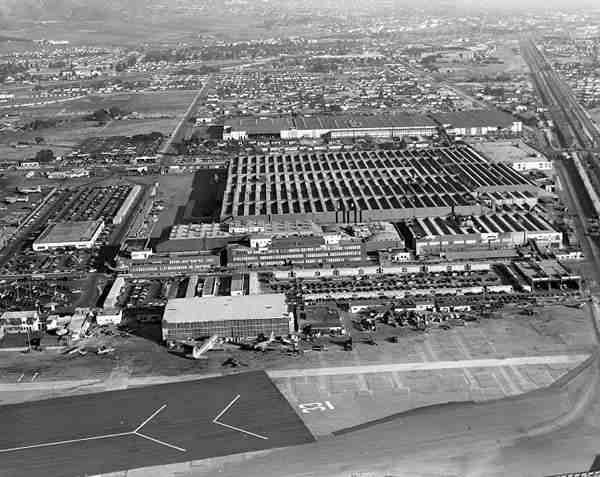
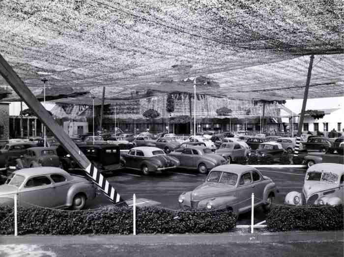
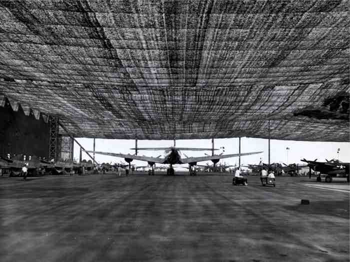
Believe it or not, in February of 1942 Japanese submarines appeared along the California coast, and one of them actually fired a few shells at an oil storage facility in Santa Barbara.  One of them hit a pier.  That was a rude wake-up call.  Suddenly it was apparent that the continental U.S. was vulnerable to attack.  Among the prime targets for possible Japanese bombing runs were a number of important aircraft manufacturing plants along the west coast.  It was decided that these plants had to be disguised.  For help, the military turned to the major movie studios—MGM, Fox, Warners, Paramount, Universal, and of course, Disney.  An army of set designers, art directors, painters, animators, carpenters, and prop designers took up the task of camouflaging the airplane factories and other vulnerable targets, 34 in all.

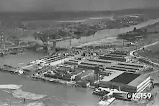
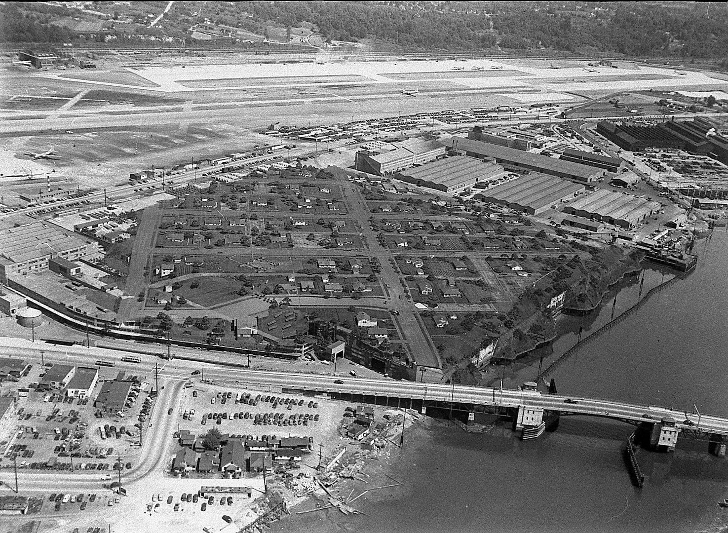
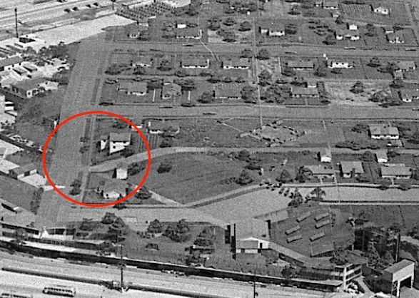
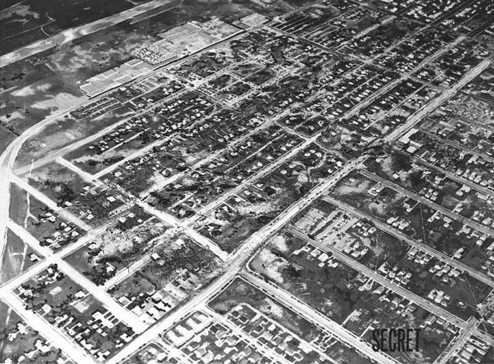
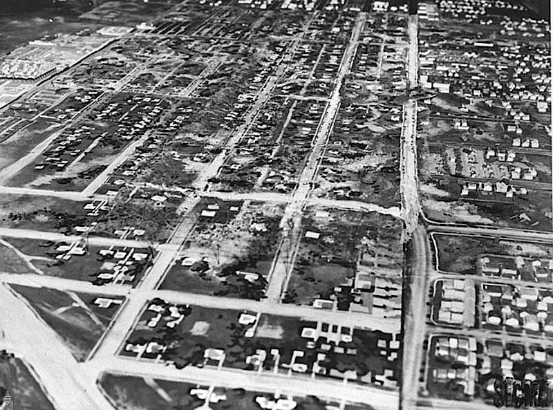
The Boeing manufacturing plant in Seattle was not the first to get the magic transformation, but frankly it provides some of the best photos, so we'll start there.  The site covered nearly 26 acres.  What the movie men did was design an entire fake neighborhood, a Potemkin Village, all of it set on a vast field of chicken wire and burlap and elevated above the plant on wooden stilts.  [I'm told that the following photo and the one below it are not the same site, as there were two Boeing plants in the vicinity. See the Comments. Nevertheless, you can still get a rough idea of the before-and-after effect by comparing them.]


And when they were done, it looked like this:


Dude.
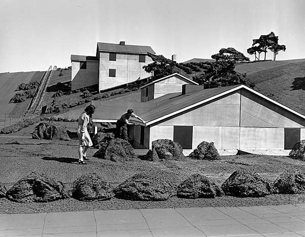
As luck would have it, we have some nice close-ups of a spot you can easily identify in the above photo.


They figured out that it's hard to tell the difference between a four-foot wall and an eight-foot wall from the air,
so they saved material and weight by making a lot of the houses pretty squat.  Forced perspective!


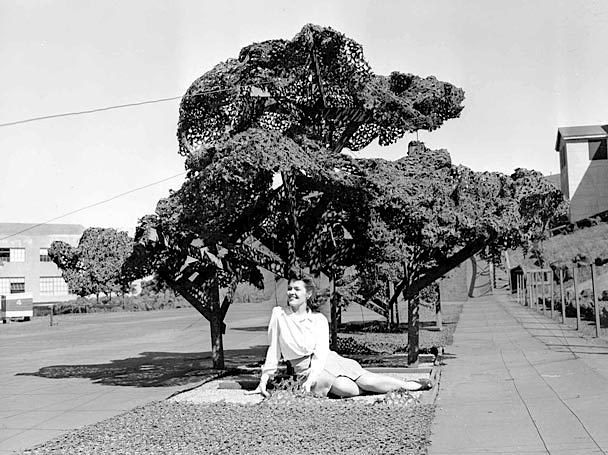
She almost looks real, doesn't she?


Buildings were plywood or canvas on wooden frames.  Trees were chicken wire treated with adhesive and then covered with chicken feathers and painted green.  Lawns were green-painted burlap.  It all looked phony up close (just look at the "cars" in the above photo), but from the air it was realistic enough to fool even local pilots.  Rubber cars were re-located daily, simulating going to work and coming home.  Fake laundry went up and down on clotheslines.

Impressive as Seattle was, the artisans did little to blend it into the larger environment.  Streets go off the edge into nowhere.  Nearby airfields and other buildings were left uncamouflaged.  The Boeing cover was designed to be "invisible" to a pilot looking specifically for something else.


The covers for the Douglas aircraft plant in Santa Monica and the Lockheed plant in Burbank were more ambitious about blending into the larger landscape.  One of the designers for the wizardry that follows was a Disney man, the legendary Harper Goff!

The chief designer at Santa Monica was somebody named Edward Huntsman-Trout, and a lot of talent from Warner Bros made it happen.  Goff was reportedly involved, but his specific contribution is unknown.  Anyway, here's what it looked like when it was all done.


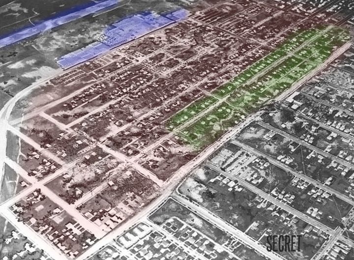
The building at top (purple) is a fake, a replica of the actual main plant, which is underneath the floating neighborhood
along with other buildings (green area).  The runway up there (purple) is also fake.  All of the pink
area is fake, either trompe l'oeil painting right on the ground, or a canopy with a model on it.


Another pair of shots for comparison:


The blue area is just paint.  The long blue section on our left is the actual runway.  The area outlined in green is the phony suburb on stilts.  If you look close (red circles), you can see the elevated "streets" lined up to match the "streets" painted on the ground below.  On the right, a fake highway in the sky is visually spliced into a real road below, right at the slight bend.


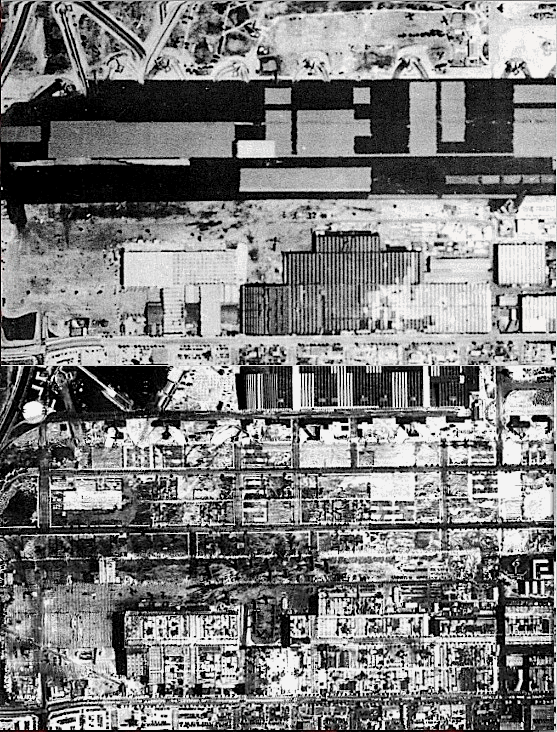
Here's a gif I put together with two photos, one from May '42 and one from Sept '42.  In the first one they've just gotten started on the project, and in the second they're getting close to finishing.  In the first one you can see the real plant at the bottom, with its saw-tooth roof.  The large black area with gray squares in it is the real runway, with the camouflage paint job already begun (that explains the gray rectangles).  In the second picture the dummy plant is nearly done (at the top of the photo) and the phony screen over the real plant complex is mostly done.  The slight bend in the road, pointed out above, is visible in the lower left, a handy reference point.  The whole project took about six months.


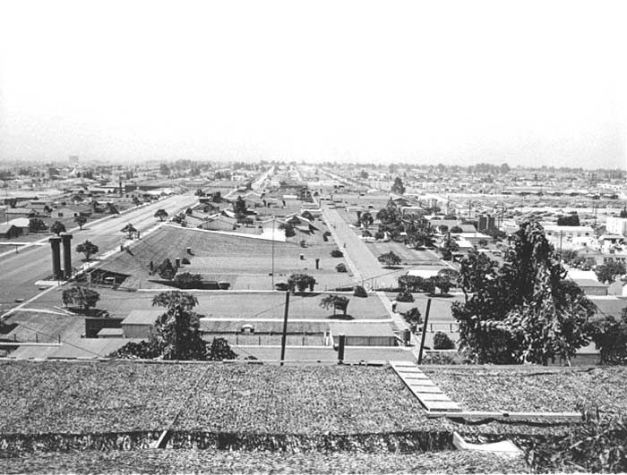
Let's go down below.  So cool.  See the scaffolding holding up the "houses" overhead?  Impressive.


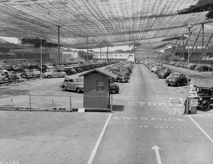
This thing was a monster.  About 5 million square feet of chicken wire, stretched over 400 poles.


Heh.  Whoever painted those windows indulged in a little artistic overkill, I'd say.

At the edges, they simply tapered down to real ground level:


Made a good area for parking.  Just don't bump your head on the lawn as you get out of the car.


Really tall building?  Simple.  That's where the "hill" goes.


Painting the roses red, we're painting the roses red...


The best-known of these projects is the Lockheed plant in Burbank, where a lot of Disney talent contributed.  Harper Goff's design
contribution was probably more important here.  Many of you have probably seen some of these before, but they never fail to impress.

Now you see it:


Now you don't:


A lot of people were part of this underground, undercover operation.


After the battle of Midway, the Japanese fleet was no longer a threat to the mainland, and all of this stuff came down in 1945.

It would be great if we had a list of Disney artisans involved in this large-scale illusioneering, but as it is we can only speculate. [Blaine Gibson was reportedly involved; see Comments below.]  Claude Coats joined Disney in 1935 as a background painter.  Yale Gracey joined in 1939 as a layout artist.  It is not at all unlikely that they were among the small army of artisans who contributed to these massive camouflage projects.  The Lockheed plant was only a few blocks away from the Disney studios.  Over in England, they had hired professional magicians years earlier to help create decoys and decoy strategies that would fool the Nazis.  With his lifelong interest in magic, one can easily imagine Yale lending his talents to the problem of making whole airfields disappear.

So...what's the point?  Take a look again at the photos with which we began:


I swear they look different now.  They almost look...well, they almost look tiny.  The whole purpose of this exercise was to de-mystify (if only a little bit) the big-scale mindset of the Imagineers who came up with the sort of things you see at Disneyland and at the New York World's Fair.  De-mystify, but certainly not diminish!  Seriously, after you've created illusions that are literally the size of an entire neighborhood, not much is going to feel too big.  These guys were part of what has come to be called the "greatest generation."  One reason they were such a can-do generation is that they could, did.
.