Things You're Just Supposed to Know

Most of the time, Long-Forgotten assumes that readers are already familiar with basic facts
about the Haunted Mansion. If you wanna keep up with the big boys, I suggest you check out
first of all the website, Doombuggies.com. After that, the best place to go is Jason Surrell's book,
The Haunted Mansion: Imagineering a Disney Classic (NY: Disney Editions; 2015). That's the
re-named third edition of The Haunted Mansion: From the Magic Kingdom to the Movies (NY:
Disney Editions, 2003; 2nd ed. 2009). Also essential reading is Jeff Baham's The Unauthorized
Story of Walt Disney's Haunted Mansion (USA: Theme Park Press, 2014; 2nd ed. 2016).

This site is not affiliated in any way with any Walt Disney company. It is an independent
fan site dedicated to critical examination and historical review of the Haunted Mansions.
All images that are © Disney are posted under commonly understood guidelines of Fair Use.

________
.
Showing posts with label Pepe Le Queue. Show all posts

Friday, February 7, 2025

Beyond the Bride: The Other Changes in 2025

UPDATED March 15, 2025

When "classic Mansion" finally returned in 2025 after an unprecedented absence of approximately a year and a half, we found a lot more than a reimagined attic bride. Now that we've dealt with her (see previous post), it's time to review the rest. Some of the new stuff is very good, and some of it is . . . not. 

But before all that we need to point out one more thing about the New Connie:


She's Still a Baddie, Not a Saddie

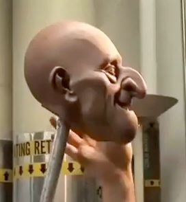
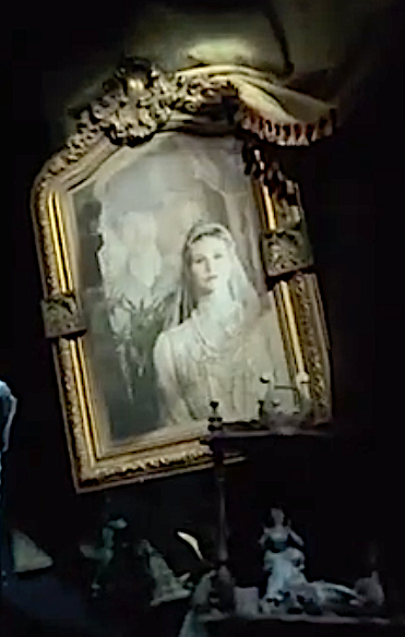
It seems that when they redid the hubby portraits in order to eliminate their insufficiently sensitive decapitations, no one on the team had enough presence of mind to realize that they also needed to redo Connie herself in the "Constance & George" portrait, because as things stand she is still indisputably identified with the Widow portrait in the stretching gallery. I've put up this montage before, more than once:

MasterGracey

The 2005 team clearly went to great lengths to make the identification as explicit as possible. The 2024 team did nothing to undo it.

LA Times
 
So there's no way around it: Connie is still the Widow, and if so, it's still the case that she offed George with a hatchet. And if she rubbed out husband #5, it's a cinch she offed the previous four as well, especially since the team also failed to remove the little ceramic figurines of a female beside a male with his head snapped off. These are still to be found in the Ambrose and Frank tableaux.
 
 
Sorry, Kim Irvine. Until the last portrait is altered or simply removed and the figurines eliminated, all that talk about a sad, bewildered bride ghost searching for her lost love(s) is contradicted by the ride itself. Like it or not, as things stand the New Connie is still a cold-blooded killer.
 
Now let us turn to other things.
 

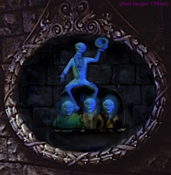
Graveyard Wraiths and Blue Mist
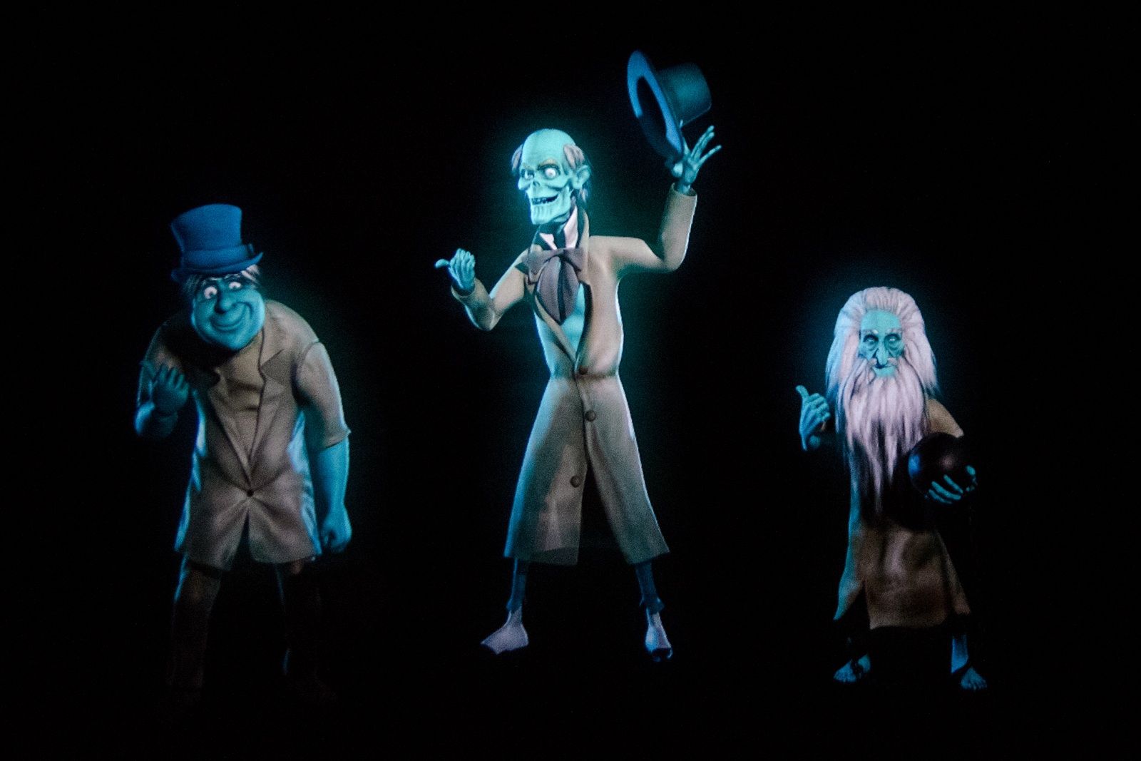
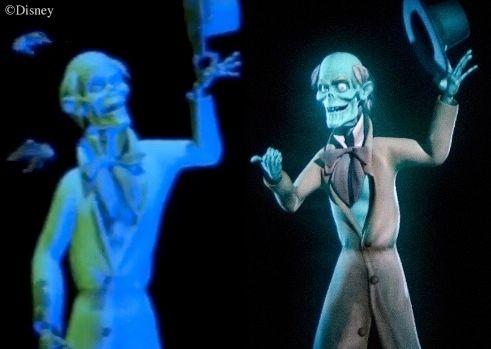
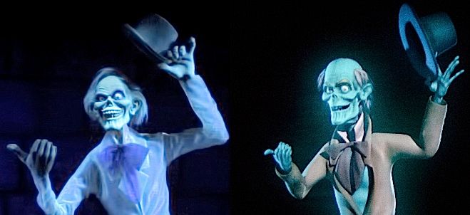
The ghosts projected on the scrims in the graveyard are greatly improved. No more spinning wheels. They now vary in speed and direction and you find here and there a subtle waving motion. This is a 100% positive improvement. Well done. (vid and stills: WDW News)

 
By the same token, we have nothing but praise for the improvements in the floating blue mist effect, both in the Limbo load area and in the graveyard. Besides the improved projection effect itself, in the load area it looks like they noticeably expanded the blue mist to cover a larger area of the screen.


Look also behind the Royals in the video clip above. With regard to Limbo, there's also a new exit/entrance in it for wheelchairs and scooters. At great expense, Disneyland added a more ADA compliant elevator entry and exit system. (This was the main reason for the prolonged shut-down.) The huge new mausoleum in the expanded queue area, as most of you know, houses the new elevator. There are plenty of videos out there giving tours of this new feature. The Mansionification of the halls and elevators is superficial and not very atmospheric. Despite a random set of Marc Davis concept sketches hanging on the walls of the passages, it doesn't quite feel like part of the Haunted Mansion, but I view it as purely utilitarian. It does what it's supposed to do with enough decoration added to at least take the raw edges off the break in illusioneering.
 

VicariousCorpse

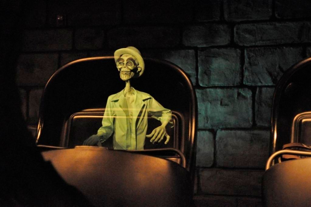
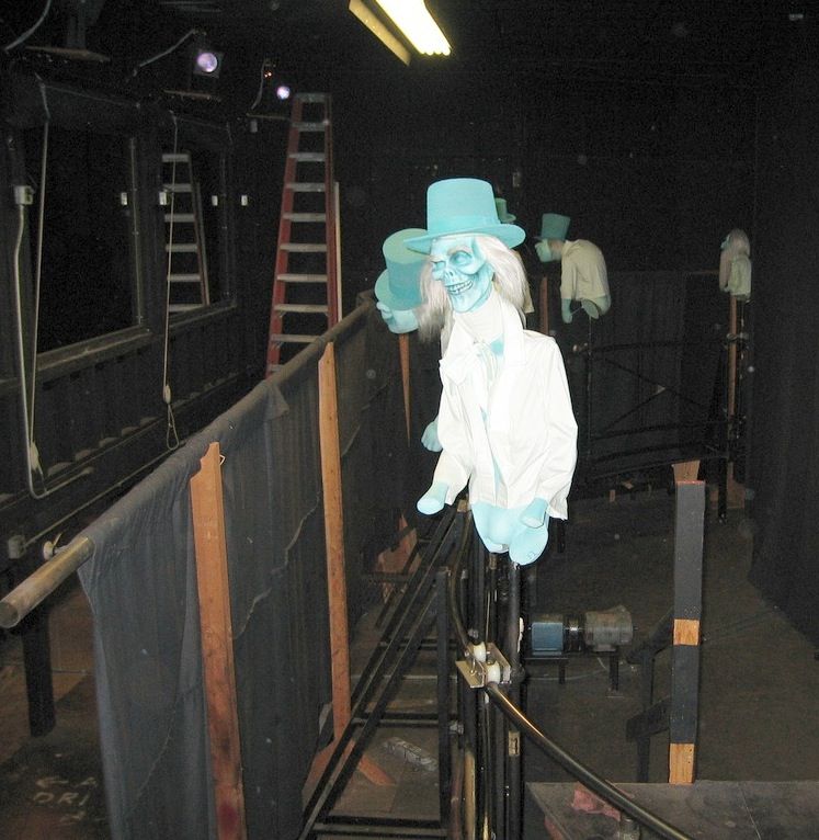
The Bat Cage Returns

This item appeared in 2023 for a couple of days near the Endless Hallway and then vanished.

 
Jeff Baham

It appeared again during the last Haunted Mansion Holiday in the Corridor of Doors. Now it has stayed behind for classic Mansion.

My sources say it's still on trial. If it doesn't go over well, they may reserve it for HMH alone. Some people don't like it, but I have no problem with it. (Someone somewhere is making a note: "Long-Forgotten says it's cool.") Why? Well, it fits in well enough with my read of the ride's narrative. To recap, I think that when we were downstairs the spooks were toying with us, trying to scare us off. There were paintings that appeared to stretch and change, not to mention the walls themselves. Other paintings flickered foreboding images with the lightning flashes. Busts appeared to follow our moves, but stopped moving when we stopped. A whole room seemed to open into an "eerily lit limbo of boundless mist and decay." The Ghost Host had taunted us with a dilemma: are these hallucinations or actual metamorphoses? They're messing with our heads, leaving us wondering if these haunted happenings are actually taking place or "just our imagination." It's a false dilemma, since it's also possible the ghosts can manipulate the very fabric of the building and its furnishings in some sort of real/unreal way.

When we get to the second floor, where even the staff fears to tread, the gloves are off. No more hide and seek. Now when they manipulate the fabric of the building, they leave it that way, and they make a lot of noise too. In the COD, the wallpaper and the "family portraits," which presumably would have been normal-looking before we got there (like the downstairs furnishings), have become grotesque and distorted, with no return to "normal" to leave us wondering if we're seeing things. They're done with that flickering-back-and-forth rubbish. They want you to know they're real, and that perhaps you shouldn't have come this far.

The bat cage fits this environment fine. What was probably a bird in a cage before we got there (or more likely just an empty cage) now seems to have a gruesome little bat in it. If it had been downstairs, it would have been out of place, but in the COD it fits the environment satisfactorily.


The "Rolly" Chair is Back (But Still No Rotting Fruit)

No big thing, but the "Rolly" chair is back, the one they added in 2021 to the Séance Circle's airborne flotilla and later removed. At the time I suspected that since they had used a commercial design, maybe they had failed to get proper permission. Well, either they got the necessary permission or that was never an issue.

I wish they would restore the Purply Shroud over there, especially now that they've removed his twin brother in the graveyard crypt. I also wish that in the Ballroom they'd turn the rotting fruit effect back on. I can't help thinking it's basically just a light switch somewhere that people have forgotten about. It's one of those cool minor effects you only notice on your fiftieth ride or so.
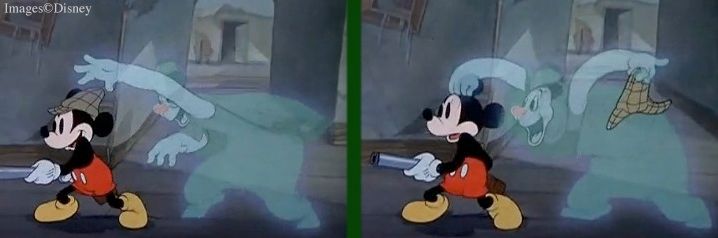
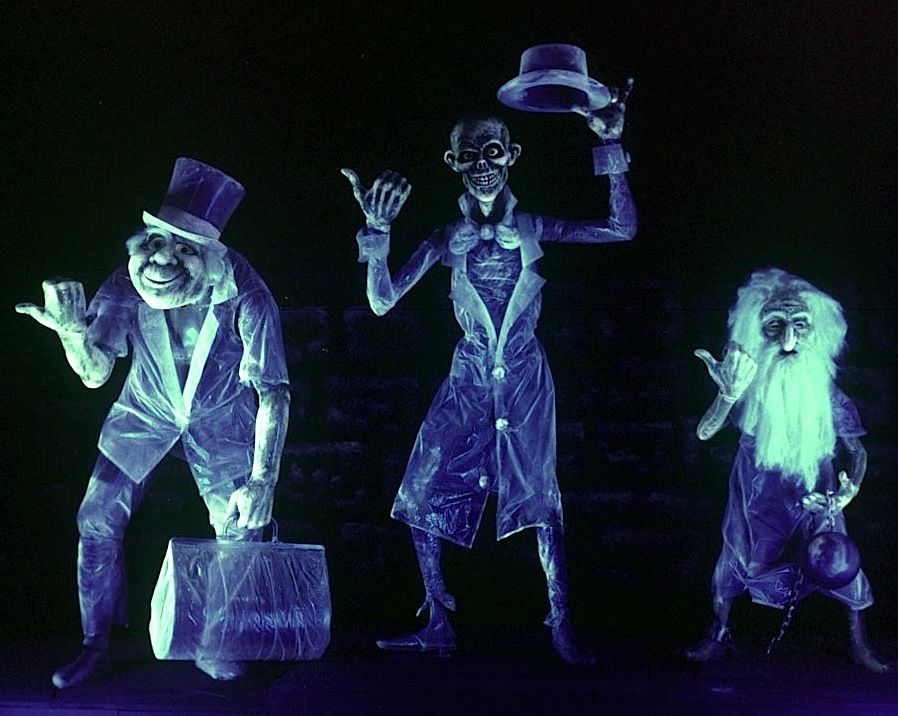
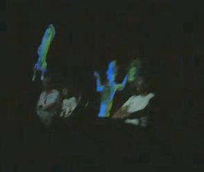
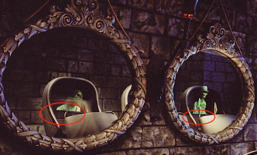
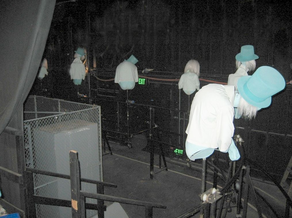
 

Digital Hitchhikers

We all heaved a sigh of relief when the cartoon antics of the Orlando hitchhikers did not reappear in the Anaheim mirrors when they went to digital imagery. Instead we got a slavish reproduction of the original rod-puppets. I understand that they created these images from photos of the original figures rather then de novo using CGI. Good. Clearly they wanted everything to look the same as it always has. For this, THANK YOU, team. There has been criticism about the sharp cut-off line at the bottom of the figures, but that was an irritating feature of the old system too. My main worry was that the figures would look flat, since the old figures were genuinely three-dimensional, but the feedback I'm getting has been entirely positive, that they don't look flat. Also, they fade in and out at the beginning and the end of the line, "materializing and dematerializing," in ghost language.

It leaves you wondering why they bothered changing it at all. I presume it's a maintenance issue. The ghosty-go-round was a big, clanky, mechanical contraption requiring diligent upkeep. Barring electronic glitchery, there's now a lot less to go wrong. I regret the disappearance of the Victorian-era magic trick technology that went with the original, but I appreciate the effort to make the change not look like a change.


The Caretaker's Shed

This thing is not really part of the "new queue" but a way of camouflaging something utilitarian that apparently needs to be there. It's not bad looking.

 
But what's this? A human femur in the dog's dish? Here is an example of how shallow and obtuse the thinking of these guys can be. The Caretaker is presumably also a grave digger (note his shovel), and his dog has evidently been munching on human bones. It's a macabre joke, see? Well, what this "joke" utterly ignores is the character of these characters.  Both he and his dog are utterly without guile, completely sincere and innocent, and a bit cowardly to boot. There is NOTHING sinister about the man or his dog. Does anyone need to be told that? Both of them would be absolutely horrified at the gruesome suggestion here. This is like seeing Winnie the Pooh tell a dirty joke. It's something that would never happen.


This little tableau also ignores the fact that the Caretaker is the caretaker of the public cemetery next to the Mansion, not the caretaker of the Mansion. That can be seen most clearly in the Collin Campbell artwork for the "Story and Song" album, which follows the Imagineers' intentions scrupulously.


The New Queue

Again, we breathe a sigh of relief that we didn't get anything like the Orlando "interactive" queue, known around these parts as PLQ (Pepe le Queue). What this labyrinth of creamy walls and mostly off-the-shelf artwork most resembles is the Fastpass garden it displaced. In fact, most of the statuary from the latter has been retained here. A lot of this mundane "artwork" came from commercial catalogues of outdoor decor, and it shows. There is no uniformity of style, and with few exceptions, it lacks any spark of life. Some of the pieces are borderline kitsch. For example, more than one commentator has been put off by those garish bowling balls. I haven't seen anything down at "pink flamingo" level, but too much of this stuff is only a notch above "garden gnome" level. 

Something that really puzzles me is the color palette. The warm, creamy surfaces—almost yellow—are anything but chill and foreboding, and with that red brick trim it almost has a "California Mission" feel to it, which is totally wrong here.

Why didn't they go with the sombre gray hues of the old queue? Disney used to have the best colorists in the business (Mary Blair, John Hench). What has happened?

I'm withholding judgment to some degree, because the place will no doubt look better once the plants have a chance to fill in. We shall see.

There are traces of wit here and there. Did you notice the skull face?

There are also doors left open for future development. No one knows yet what this safe is for:

But with that lighthouse on it, it's possible we're going to be seeing a tie-in with the S.E.A. master theme, although Kim Irvine associates this area with "Gracey."  Huh? Make of that what you will.


The book on the table was published in 1917, which is pretty awkward, but I doubt we're supposed to know that. John Paul Jones hails from the Revolutionary War period. Plausibly, he would have been of interest to the Mansion's original builder around the time of the War of 1812, if they're trying here to keep the old "Sea Captain" business alive in some way. I can't see this prop lasting very long as it doesn't look waterproofed and it's outside. What's with that? This has to be a temporary situation.
 
I suppose you could read a seascape into this glasswork as well. Note that the ironwork has eyes (albeit a bit too obviously), which is something we find frequently around the Mansion. There's plenty of this sort of thing in the new queue if you're looking for it.

Music is playing throughout the queue, very reminiscent of Phantom Manor, but for some reason it's more upbeat. I'd rather not have it, but it doesn't bother me much. Music is playing outside at DL just about everywhere, and in this case you could justify it as helping to mask all the other noise around you, stuff that you must screen out in order to maintain the illusion that you are at a haunted house in New Orleans. I suppose that for many people, the new music helps them get into that mindset. If I want, I can just screen it out like all the other noise.


 Graveyard Lite?

Maybe there are plans to add more to it later (fingers crossed), but as things stand, the berm graveyard has been considerably abbreviated. The "great eight" set, paying tribute to the original Imagineers (plus Phineas Pock) is currently incomplete, and one of the four stones paying tribute to the 2016 team that brought back the graveyard is also missing. What's there looks pretty bad at present, but when the plants have had a chance to grow up it will no doubt look better. At least the stones all look like they could actually have a grave in front of them, which was a major beef I had with the 2016 incarnation. Maybe someone actually listened? If so, thanks.


So much for the queue. Architecturally, I don't get any New Orleans, ante-bellum vibes from it. It's not criminally bad, but it's not ominous or spooky, and your Long-Forgotten administrator finds it uninspired and uninteresting. It's Fastpass Gardens spread over what seems like half an acre. I will definitely miss the spacious and far more beautiful area it has replaced.


It's Time to Despond

Lastly, we have this Turdasaurus Rex. If you want to know what I think of Madame Leota's Somewhere Beyond, check out the video by this guy. Brickey's not my favorite Disney historian and I don't recommend all his stuff, but he's dead right about MLSB, and he pulls no punches. In fact, he says it's the worst structure ever erected at Disneyland. Is he right?

Yes. Yes, he is.  See also this. (Chris is very good.) Nobody likes this building. You hear "Home Depot" and "Tuff Shed" among the more family-friendly mutterings, and in fact it didn't take long for sharp-eyed Disneylanders to recognize it as a brazen knock-off of a pre-fab barn: Armstrong's Legacy Post-and-Beam model 4236.

It's supposed to be the Mansion's old "carriage house," but as Brickey says, it looks nothing like the sort of carriage house you'd expect to see alongside a New Orleans ante-bellum plantation house. It looks like what it is: a barn, and it's dull as dishwater.

UPDATE: They've now painted the thing in order to age it. For a thorough review, see HERE. Brickey can be long-winded and repetitive, but here once again he is on the mark. Yes, the building does look older now, but that was not the worst problem.

No, the biggest problem is that it's TOO DAMN BIG. There is no forced perspective to bring it down to scale within its surroundings, and it makes both the Mansion itself and what was formerly called "Splash Mountain" look small.  That is criminal.

Compare the concept artwork with the actual thing. The painting gives you the impression that the shop will be a modest structure tucked away beneath the shadow of the magisterial Mansion. Instead we got this clumsy behemoth shoehorned into the available space and big-footing the view on that entire side.

Ironically, the shop within is rather small, while the building exterior does everything it can to look bigger than it is, exactly the opposite of what they should have done, if they had to do this. Consider: (1) It has oversized eaves; (2) it has a pointed peak in the middle with a narrow, Gothic window to emphasize verticality, (3) with a filigree on the rooftop to make it look even taller; (4) it has big barn doors; and (5) it has broad shoulders to emphasize horizontality. The colonnade is visually subsumed into one of those shoulders so as to make it feel like part of the main structure. All of this says: "I am a large building."

According to Brickey, this thing was entirely planned and built by Disney's Merchandising division (who have their own budget and creative team), and in their minds, making their small shop look as BIG as possible was apparently a goal. Idiots. Ignoramuses.

The worst thing about it is what has been lost. One of the most beautiful vistas in the entire park has been destroyed, just so that they can sell a few more Jack Skellington mugs and tee-shirts. 

THIS is unforgivable: 

Gone.  It's gone.

Look at it.  Look what they destroyed.  Shame on them. 

                                         Putting that building up was an act of vandalism.                                            The only way to atone for this crime is to tear it down.

One could just weep. Some people have said, "Well yeah, it's true, the exterior is disappointing, but at least the interior is good." I disagree. Again, was there nobody on this team with any instinct at all for color? The concept art featured a palette built around the familiar green-and-magenta combination that spells spookiness like no other:

 
But the actual interior is what one thoroughly disgusted senior Imagineer called a "dog's breakfast." The green-magenta interplay has been swallowed up in browns, yellows, blues. In fact there is no dominant color scheme at all. Some smiley-faced bright-siders say the place looks magical. I say it looks like some kid decided to use all 64 crayons.

No, I'm not done yet. For decor in the upper shelf areas, someone thought it would be cool to feature some of the instruments that float around in the Séance Circle, like the tambourine . . .
 

. . . and the trumpet . . . 

 . . . and the snare drum . . . .

When I saw that, my jaw dropped. It's a MODERN snare drum. To be precise, it's a PDP Concept Series 7x13 maple shell.

Call it "good-enough-ism." This is sloppy, cheap, and unworthy of a Disney production. Some say, "So what. Who will notice?" I respond, "How many guests does Disneyland have in a typical week? How many among those tens of thousands are probably drummers? How many are at least in bands and know what a modern drum kit looks like?" HUNDREDS of people are going to notice. How hard would it have been to have someone at the model shop whip up an antique-looking drum, or score one from a prop supply house? Here's what should have been there:

Disneyland and the other parks used to be known for their attention to detail, including historically accurate detail. This stupid snare drum may be a small thing in itself, but it's a symptom of a bigger problem as well as just one more log on this particular fire.


 I'm going to say it. Yes, I'm going to go there. If Walt saw this thing, people would be FIRED, and the bulldozers would be in there tomorrow.  Somewhere Beyond can go . . . somewhere beyond. It needs to be torn down.


********************

Saturday, June 11, 2011

Beware of These Hitchhiking Ghosts

,
Let's look at the other major addition to the WDW Mansion: The new Hitchhiking Ghosts.  Carsillo's team spruced up the classic threesome we encounter as we enter the crypt, and they changed the mirror effect.  No longer is there a solitary hitchhiker sitting beside us.  Now, thanks to some fancy high-tech equipment, we have computer generated hitchhikers frolicking about and pulling pranks on us, like switching faces around, blowing our heads up like a balloon, falling off the top of our doombuggy, etc.


As with Pepe Le Queue, there are some good things here, along with a whole lotta bad.  Let's start off with the good things.


Lonesome Ghosts

This time, the concept actually makes sense.  After the ghosts have materialized, and you have discovered to your relief that they are not hostile, you start to wonder if they take notice of you at all.  None of them seem to pay any attention to your presence, with the exception of the pop-ups, who seem to get a kick out of scaring you.  Eventually, near the end, the Ghost Host informs you that they have indeed taken particular notice of you; in fact, they have selected you and will follow you home, haunting you until you return.  The new mirror gag cements that message by showing the ghosts teasing you and pulling good-natured pranks.  Well what do you know, they like us, they actually like us.

One of the cinematic influences on the HM, mentioned briefly at the end of an earlier post, was the 1937 short, Lonesome Ghosts, a Mickey Mouse vehicle (with Donald and Goofy) featuring a haunted house full of silly spooks who like nothing better than scaring visitors.  They pretend to terrorize.  It's all in good fun.  Ken Anderson, you will recall, was actually going to use a ghost host with the name, "Lonesome Ghost" in his early walk-thru designs for the Disneyland Haunted House.  But pranky spirits who could actually play tricks on you were beyond the reach of 1960's technology.  You just couldn't do something like this:


Trying to bring a little of this into the Haunted Mansion was a bold step and not necessarily a bad idea.  A kind of Lonesome Ghosts atmosphere is clearly what the Carsillo team is going for with these new mirror HHG's, and I'll grant to them that it's done at the right place in the ride for it.


The Three

Another good thing is the spruce-up job on the audio-animatronic hitchhikers in the classic tableau.  The figures themselves have been redone tastefully and look very good, although I wish they had gone back to the original, bald Ezra, and I think Gus's bindle is ridiculous.  He's not a hobo; he's an escaped con with a ball-and-chain.  But everyone tells me I'm being too picky about that, so I'll let it go.

(pic by Joe Penniston)

You can compare those with the originals:


One reason the new figures look good is that the Carsillo team meticulously reproduced the original Blaine Gibson heads
and simply added more detail.  They talk about this in their promotional video.  First class craftsmanship on display here.


How about Ezra in 3D?


I wish I could end it here, but alas, there is much that is wrong with these new additions.


Is that supposed to be Ezra?

The first problem is that the CG Ezra doesn't look like Ezra.  This is absolutely baffling.  How could they so carefully and lovingly reproduce the original figure in the AA, and then get the CG character so horribly wrong?  I'm mystified.

While they were working on the new figures, they covered the tableau with a black screen and projected CG figures onto it, a stop-gap until the new ones were ready.  When they first appeared, folks were a little alarmed, since everyone seemed to agree that these cartoons looked pretty dorky.  Especially Ezra.  But word quickly got out that these were just temporary substitutes until the real thing was ready.  So chill.

(pic by Jeff Fillmore)

Fans should have stayed alarmed.  Unbelievably, the new CG hitchhikers in the mirrors seem to be cut from the same cloth as these ugly things.


I say unbelievably, because they did such a careful job of maintaining the authentic look of the
originals when they re-did the AA figures.  What were they thinking?  Do these look the same to you?


Never mind the head; look at the hands.  Great Caesar's Ghost, how simple is this?  Blaine Gibson gave the hitchhikers BIG hands, with BIG thumbs, in order to immediately slam their hitchhikerliness in your face, as I've said elsewhere.  Okay, now ask any animator whether hands are important in conveying character.  What, are you stupid?  They're extremely important.  I mean, Duh.

Ezra is a tall, gangly, loping figure with big hands.  At Disneyland, the hitchhikers on the ghosty-go-round behind the mirrors have no hands, but at WDW and at Tokyo they do.  The guys who made those figures took a number of liberties of their own in reproducing the trio, it is true, but one thing they got right is the hands.  I think they just used the same molds.

(pic by PhotoMatt)

In contrast, the CG Ezra has delicate, small, skeletal hands.  Check out the first photo at the top of the page.  And besides that, he flutters around like a nimble ballerina.  Huh?  Guys, he's a giraffe, not a butterfly.  This is sheer incompetence.  Whatever else they do, the Carsillo team needs to call their computer animators back to their terminals post haste and thoroughly re-do the Ezra figure.  This is just embarrassing.


High Tech and Low Tech

Reports about the appearance of the HHG's in the mirror vary wildly.  Many say that they look convincingly three-dimensional and the effects work well.  Others have experienced poor performances from these high tech wonders and complain that the ghosts look flat.  I'll leave that issue aside, since I have no solid basis for forming an opinion.  I will comment on one complaint I've read several times, however:  When you look sideways in the mirrors at the ghosts in the buggies on either side of yours, and even further down the line (and who doesn't do that?), they do indeed look flat.  You can see it in photos.


If you're expecting another furious blast, or at least some snark, sorry to disappoint you.  I can't get worked up about this defect, for two reasons.  First, I can think of a way to fix this problem for about $100.  Seriously.  I won't say anything about it, because if I do, and the same idea occurs to someone at WDI (which is entirely possible), they won't be able to use it for fear I'll sue them for stealing my idea.  That's how it is these days.  It's sad, but such is our litigious society, ladies and gentlemen.  Second, yeah, it's true, they don't look too good at an angle like that, but guess what?  They never have.  Oh, certainly, the old types look fully three-dimensional (being as they are three-dimensional), but they look bad in another way that we have all gotten so used to that we don't even notice it any more.

Pardon, your slip is showing.

There is something else about the new mirror HHG's that worries me, though.  They represent eye-popping, cutting edge high tech—today.  So tell me, how many years do you suppose it will take before you can download a set of programs, buy a couple of pieces at Fry's, and achieve the same sort of effects at home?  Four years?  Six, maybe?  The Imagineers have committed themselves now.  When the razzle loses its dazzle, what kind of antics will the mirror ghosts have to display in order to stay ahead of the curve?  And does anyone believe that thematic consistency and good taste will survive this process?  Hah.  Those will be the first things thrown under the bus.

"Well, that may be true, but let's face it: the old effect needed to be upgraded.  Sure, it
wowed people when it was new, but that was in 1969.  Today it looks old-fashioned."

I've heard that one more than once.  What absolute rubbish.  The original mirror effect wasn't anything close to high tech in 1969.  It was low tech.  It was like Pepper's Ghost and changing portraits and all those other 19th century (and older) magic tricks.  There is nothing about it and its mechanics that would have puzzled a stage magician from the 1890's.  Criminy, this thing could have been built in the 1890's.  The hitchhikers on the ghosty-go-round are nothing more than rod puppets.  They aren't even electric.  Two-way mirrors are nothing but regular mirrors that have been partially silvered instead of fully silvered.  Old as the hills.  Tracks.  Wheels.  Connecting rods.  A couple of simple electric motors and some basic lighting and you're there.


Despite the whole Lonesome Ghost thing, which I kinda like, I get a bad feeling from all of this.  

Every time they trade in a classic, low tech magical illusion for a gee-whiz high tech wonder, I fear that something of the character
of the ride is being diminished.  It's that old-timey magic show feeling that suits so well the Victorian look of the Haunted Mansion.


The Hitchhiking Ghost Tableau

Back around the corner again for another look at the tableau featuring the famous trio.  Surely this is the icon of icons for the Haunted Mansion, a slice of elegant perfection, a stroke of simple genius.  Who would deny it?  So ... what can be said about a mentality that looks at that classic scene and thinks, "Gee, look at all the wasted space!  You know, this would be a perfect spot to place a portrait of one of our new characters.  There's plenty of room.  Great opportunity for blending in one of our new narratives."

Thumbs Down
(pic from Orlando Attractions Magazine)

Like I say, what can be said about such a mentality?  Stupid, you say?  Evil? Insane? Did I hear someone say incompetent?  Well, look, we can all be friends about this.  Let's just say that we all agree that anyone, anyone, who thinks that that right there is a good idea should never have been allowed anywhere near the table where decisions about the future of this attraction were made.  Shouldn't have been allowed in the same building.  Can we all agree to that?  All right then.

By the way, why would someone living in the house store their artwork in a crypt in a public cemetery adjacent to the house?  Oh, that's right.  How quickly I forget the lessons of Pepe Le Queue.  The Haunted Mansion doesn't have to make any sense.  The Haunted Mansion is wacky land.  Woo hoo.

I keep forgetting.