.
It's a topic we've discussed
more than
once: The supposed conflict among the Imagineers over the question of whether the Haunted Mansion should be funny or frightening (Silly vs. Scary, Kooky vs. Spooky, Light vs. Fright).
I've also given my own opinion more than once. I think the "conflict" has been exaggerated. Scary vs. Silly makes for a good—
suspiciously good—Disneyfied version of history, and since it has long been the official line, it does not surprise or particularly impress me that the Imagineers have routinely cited Silly vs. Scary as a key (or
the key) for explaining the fits and starts that dragged out the ride's development and for understanding the odd amalgam of moods in the finished ride. It's frequently the case that if you repeat something often enough you may jolly well begin to actually believe it.
There are two reasons for bringing up the topic again. First, some new materials have surfaced which really should be part of that particular conversation. They shed additional light on the thinking of X Atencio and—less directly—of Claude Coats, both of them supposedly strong advocates of the scary approach. Secondly, we're soon going to be taking a long look at Marc Davis's contributions to the Haunted Mansion, taking advantage of the wealth of new material that came to light in 2019, and as Marc is considered the chief proponent of the funny approach, inevitably the Silly vs. Scary controversy is bound to crop up in that discussion at some point, so that gives us another reason to briefly revisit the topic beforehand.
Can You Spell Kooky With an X?
As we know, Atencio occasionally made remarks to the effect that he preferred the scary approach, and
as we have seen, it is easy enough to trot out spine-chilling concept art from X. I might point out, however, that the
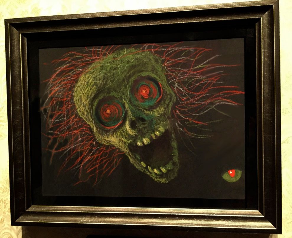
genuinely horrific artwork he produced was all part of a single series, the "one-eyed black cat" concept, always identifiable by the evil eye present somewhere in the background:
Without that series, you do have some creepy stuff from X, but nothing
really frightening (with the possible exception of the
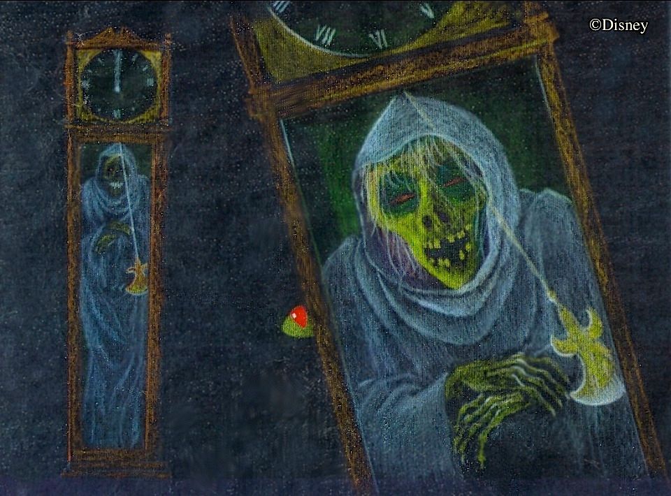
Man in the Web). We have also seen that some of X's stuff is much more light-hearted.
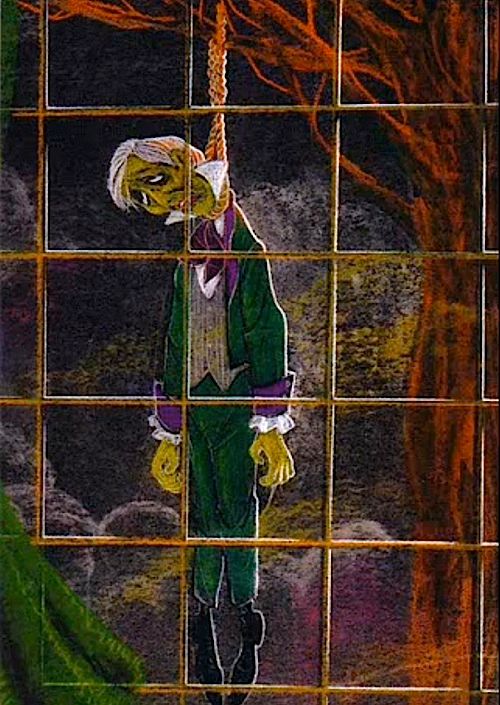
Even his take on the hanging ghost host is surprisingly cartoonish, meant to amuse rather than frighten. No evil eye in sight.
©DISNEY
Tom Morris has discovered something that may give us some further insight into X's frame of mind: the earliest draft of what would eventually become "Grim Grinning Ghosts." Remember that X's assignment from the get-go was to be the HM
show writer. That might explain why we don't see concept art from him in anything like the quantity that we find in the case of Ken Anderson or Marc Davis. Anyway, the "
Kook Spookin' Song" as it was called, doesn't exactly sound to me like an attempt to bend the ride toward the darker side. In fact, it's silly almost to the point of embarrassment:
The point here is that the man who wrote this piece clearly recognized that the ride needed to be silly as well as scary. To X, like everyone else, it was a matter of finding the right balance:
"We had two schools of thought—one group wanted it a little bit scary, and another wanted it a little more lighthearted. Walt wanted it to be funny—he didn't want to scare the hell out of people! He wanted to just have a good, Halloween-type show. He was very particular on the feeling of the audience that he wanted; he wanted to frighten them, but he didn't want to scare them to death, you know? So that's how they decided. John Hench and Dick Irvine [the Imagineers' immediate bosses], they said to us, 'Let's move in that direction' " (MDIHOW 340).
What all of that really amounted to was sticking with Ken Anderson's original formula, dating back to 1957-58. As Jason Surrell notes, one reason Ken was probably chosen by Walt for the project in the first place is that he had already demonstrated in the Fantasyland dark rides his knack for combining "fear with enjoyment"
(Surrell, Haunted Mansion 2003 and 2009 p 14; 2015 p 12).
Campy Claude
It's hard to imagine Claude Coats actually
quarreling with anyone. By all counts, he was as amiable and agreeable as they come. Coats too is regularly assigned to the scary camp, not because of things he said or wrote but because his acknowledged contributions to the Mansion are creepy and atmospheric. He gets much of the credit for the eerie first half of the ride, where—we are told—there is nothing silly or funny except for Marc Davis's macabre stretching portraits. Claude was a background painter, a stage designer, a creator in this case of moody and sinister environments, like the Corridor of Doors.
The problem is that
settings are not enough. In many cases you cannot tell if you're in kookyland or spookyland until the characters show up,
and
Claude seemed happy enough to leave that part to Marc. What do I mean? Imagine, for a moment, that you are back in the '60s and know nothing at all about
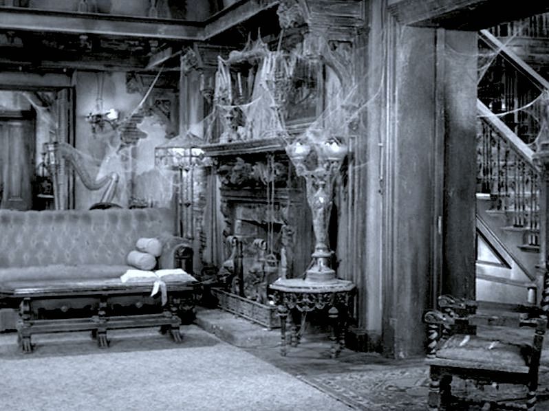
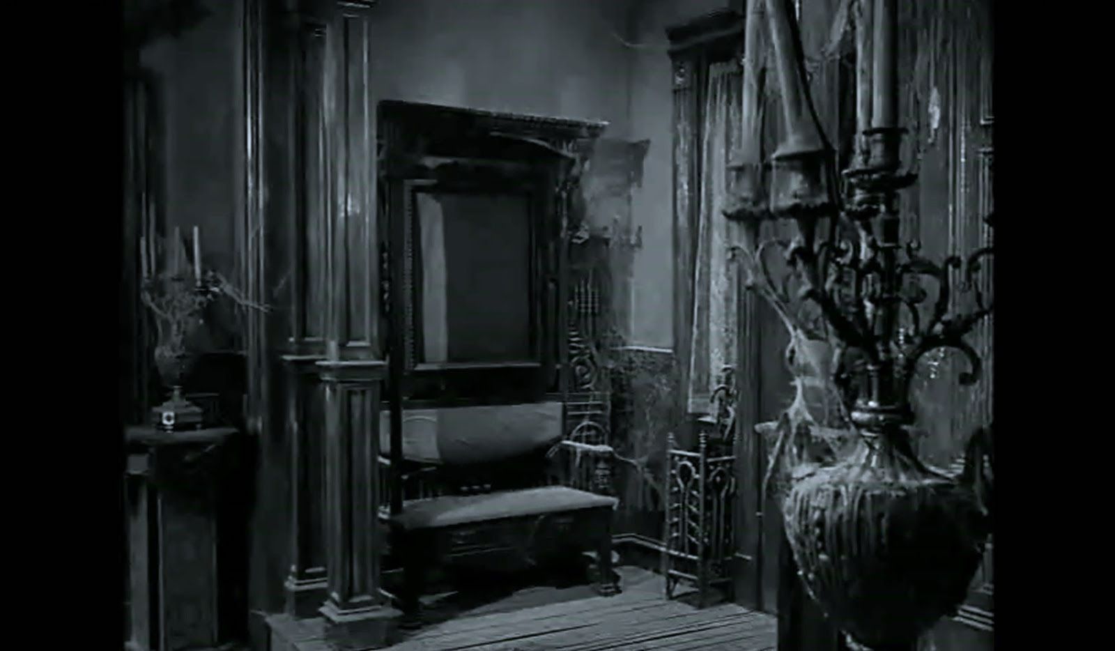
The Munsters TV show but have wandered onto its sets on a day when no one is around. Is there
anything there to suggest that this is the stage for an ultra-campy, screwball comedy?
Nope, you could be on the set of a classic, 1930's Universal horror picture. No one would seriously argue that the
Munsters' art director wanted the show to be scary but the show writers overruled him and went with silly. I suppose someone might argue that the cobwebbed, Frankenstein look is
too picture perfect for serious horror, and it could be claimed that this
in itself is a tipoff. It's a point, I allow it. And if we look at the
Munsters' fraternal twin,
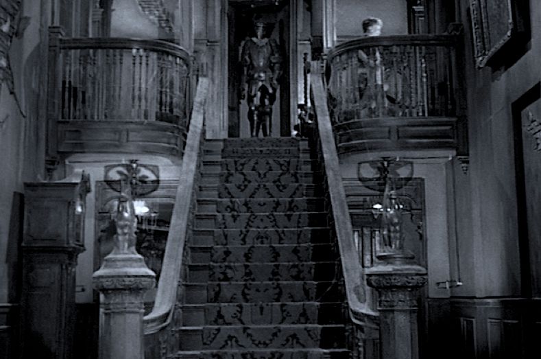
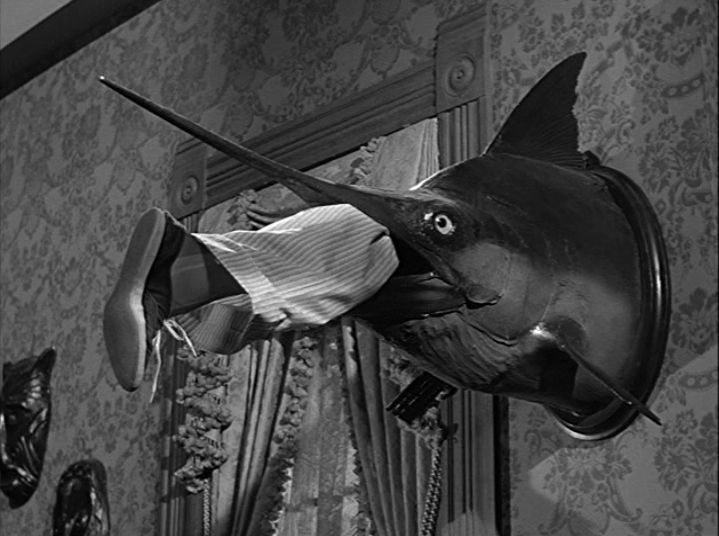
The Addams Family, we find there a similarly creepy, Victorian, gothic look overall, but in this case there are some obvious sight gags thrown in to tell you it's a goof.
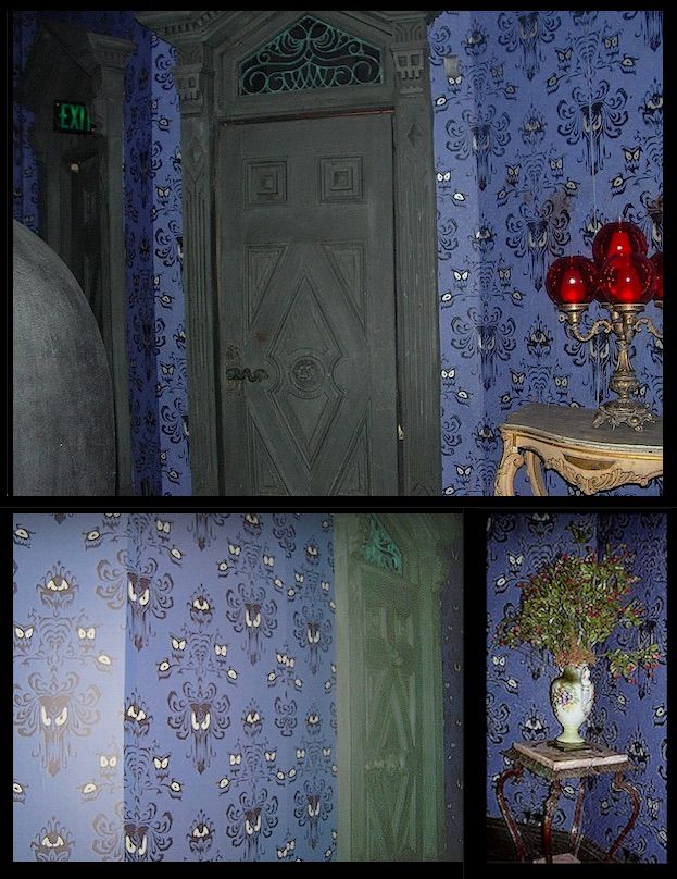
Right. Well. Let's take another look at what is arguably the Mansion's scariest environment,
the Corridor of Doors. Do we see anything there hinting that all of this may in fact be camp?
WDW Sampler
We can thank
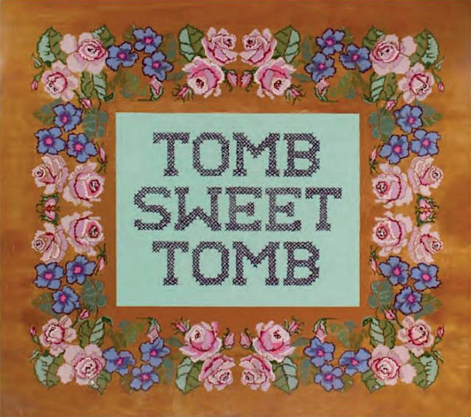
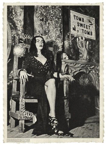
Doombuggies for noticing that the "Tomb Sweet Tomb" sampler may be a direct rip-off from
The Vampira Show (1954-55), the first "creature feature"-type local program. Maila Nurmi came up with a cheesy formula that is now very familiar: a costumed, creepy-kooky host in a mock horror setting showing dumb old monster movies.
Before Elvira, before the Carolyn Jones Morticia, there was
Vampira. As Jeff also notes in the link above, she referred to herself at least once as a "ghostess" and promised to supply "hot and cold running chills." Lotta smoke coming outta that gun. And note that it was show writer X Atencio who incorporated that exact language into his HM script already by 1968, so once again we see how someone in the scary camp nevertheless did not hesitate to draw from cheeseball source material.
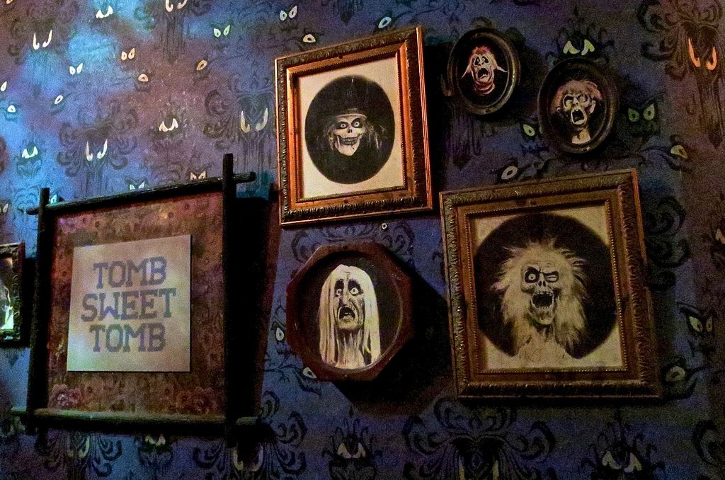
And let's not overlook the fact that the COD is also home to the so-called "family portraits," which might seem to some more like something
from The Munsters or The Addams Family (or the set of The Vampira Show) than anything you'd see in a straight, no-nonsense horror setting.
Disneyland
[Edit Nov 22] As Imagineer999 has reminded me in the Comments section, the "family portraits" did not appear in the Florida Mansion until the "rehaunting" in 2007, and someone could argue from this that Claude Coats was indeed resistant to including anything so campy in the Orlando COD, where he had greater creative control. Unfortunately, that argument leaves us without any explanation for the inclusion of the Tomb Sweet Tomb sampler, which has always been in the Florida version just as it has been in the California original. Unlike the portraits, that prop is unambiguously cheesy.
(bottom pic: Hoot Gibson)
WDW pre-2007
I have to admit that I've never really liked the TST sampler. Maybe it's because it can
only be explained as schlocky, camp horror, whereas the "family portraits" can be interpreted as ghostly manipulations intended to genuinely freak you out,
changing portraits that are no longer bothering to change back. And of course, they are faithful reproductions of ghostly visages yet to appear, as pop-ups in the attic (pre-Constance) and in the graveyard, and those pop-ups are arguably among the scariest apparitions in the Mansion, so even if they're a bit cheesy, we might be making a mistake if we try to simply file them under "funny."
"The Kook Spookin' Song" and Vampira's "Tomb Sweet Tomb" sampler are more grist for the mill,
more evidence (in my book) that the Imagineers all wanted both fear and fun in the Haunted Mansion.
If they disagreed at times, I think it was simply a matter of balance, of fine-tuning that mixture.
*****************