Things You're Just Supposed to Know

Most of the time, Long-Forgotten assumes that readers are already familiar with basic facts
about the Haunted Mansion. If you wanna keep up with the big boys, I suggest you check out
first of all the website, Doombuggies.com. After that, the best place to go is Jason Surrell's book,
The Haunted Mansion: Imagineering a Disney Classic (NY: Disney Editions; 2015). That's the
re-named third edition of The Haunted Mansion: From the Magic Kingdom to the Movies (NY:
Disney Editions, 2003; 2nd ed. 2009). Also essential reading is Jeff Baham's The Unauthorized
Story of Walt Disney's Haunted Mansion (USA: Theme Park Press, 2014; 2nd ed. 2016).

This site is not affiliated in any way with any Walt Disney company. It is an independent
fan site dedicated to critical examination and historical review of the Haunted Mansions.
All images that are © Disney are posted under commonly understood guidelines of Fair Use.

________
.
Showing posts with label changing portrait hall. Show all posts

Monday, January 11, 2016

Thanks a Million! (Plus, Changing the Changing Portrait Hall, Part Four)

.
Long-Forgotten has now been visited one million times. So I owe all of you out there in the blogosphere a million thanks. It's humbling and ego-inflating at the same time. Just plain mind-boggling.

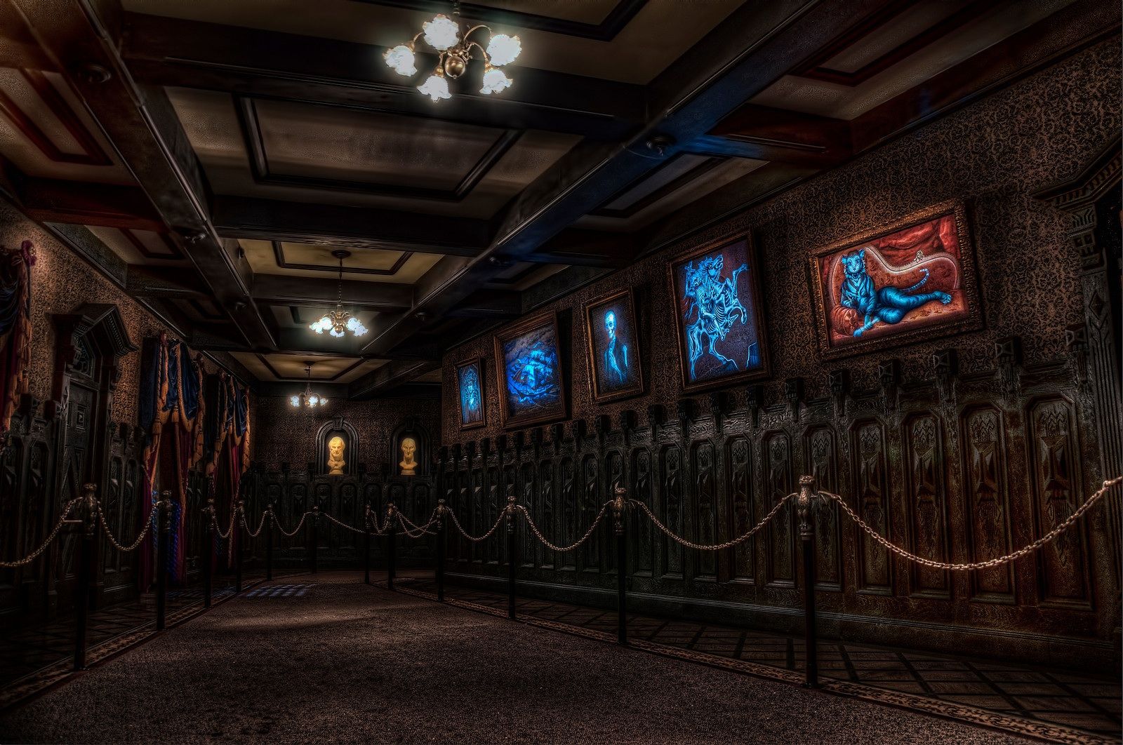
With these victory-lap type posts, I always try to include some bona-fide Mansionology as well. Around here lately, it's all been about the New View of the changing portrait hall. It's clear now that it was a circumscribed show scene, like the stretching room before it and the foyer before that. Well, here are still more observations on the subject.


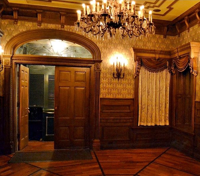
The Enchanted Foyer Room

I should have pointed out last time that we already had evidence that the foyer was originally going to be a carefully circumscribed little show unto itself, because we know that for a long time there was going to be an animated bust in the corner, springing to life and talking at us (probably as the Ghost Host himself).

For a short time, the bust was changed out for the raven before the whole idea was scratched. 


We talked about all of that before. The only new point here is to acknowledge how perfectly all of this fits into the New View. With the
raven in there, perched up in the corner and engaged in conversation, the foyer would have been reminiscent of the Enchanted Tiki Room.
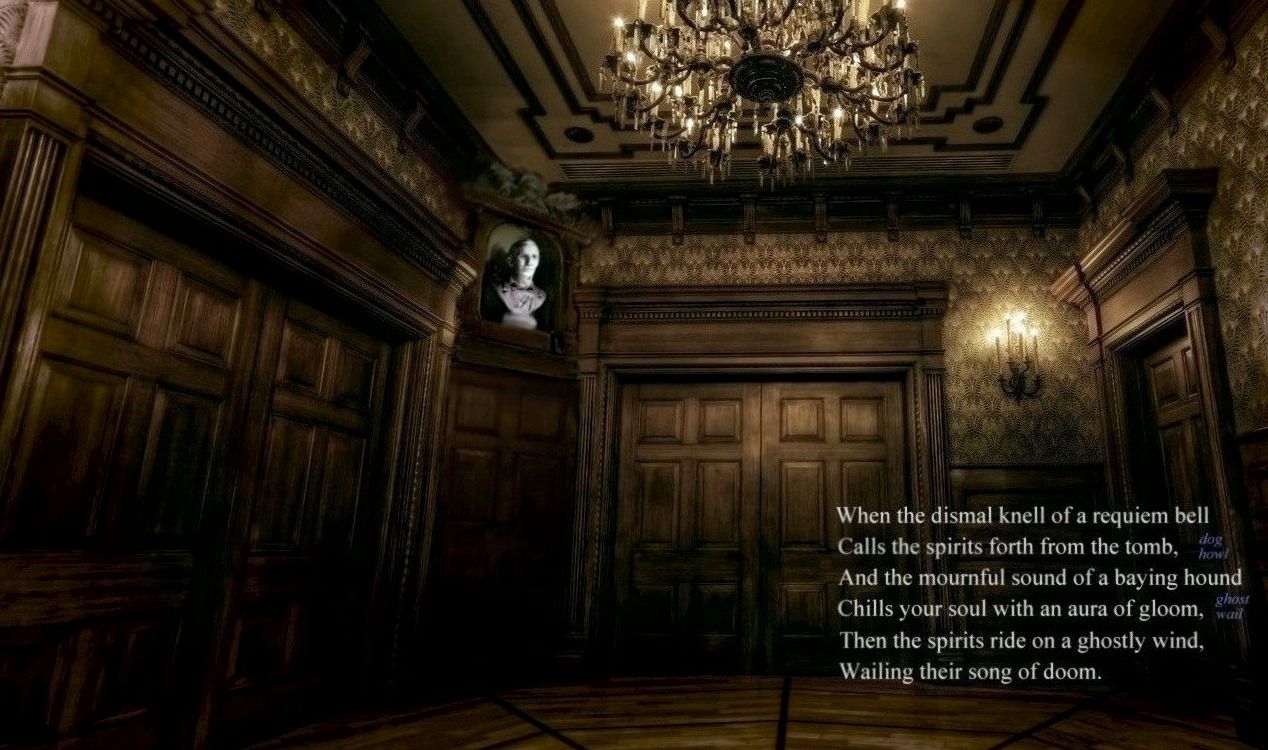


"A Tour of My Home"

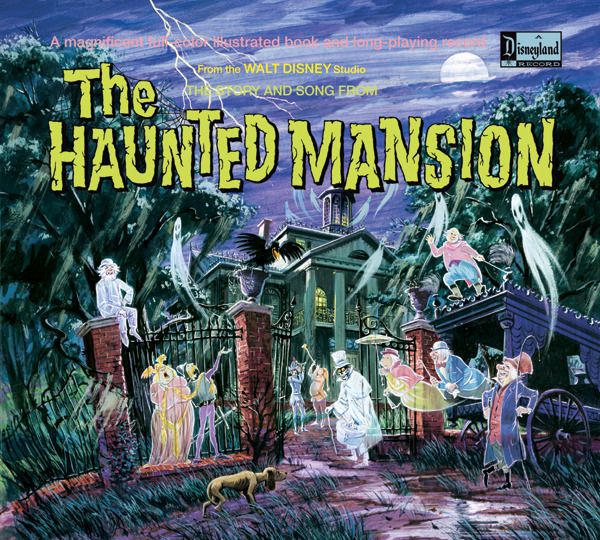
Many of you will recognize that as a quote from the "Story and Song from the Haunted Mansion" souvenir album. Foxxfur, mistress of the Passport to Dreams Old and New blog, informs us that "in the old days at DL and MK, very often Disney would not schedule a cast member dedicated to the position at the head of the load belt, instead allowing the Stretch CM to walk guests to the load belt, load them, then go back for the next group. At MK this often involved opening the doors to the Foyer as well."  We see in this that the tour guide mentality of the original walk-thru concept persisted into the finished attraction, more evidence that nicely fits the new revelations about how the changing portrait hall was going to be shown to the guests. We're talking about a show concept going all the way back to 1957. Somewhere Ken Anderson is smiling.


Caws and Effect

I remarked last time that (1) we have no recorded traces of any Ghost Host monologue to go with the six-panel changing portrait show, as well as the fact that (2) the narration to the "Story & Song" album refers to the portraits as changing with the lightning flashes, both facts indicating that the six-panel idea was scotched by spring of 1969 at the latest. What I failed to note is that there ARE remnants of a missing show in exactly this location. While the narration for the S & S album is late (spring 1969), the basic script being followed throughout is older, going back to a 1968 X Atencio show script. (That's what explains the numerous discrepancies between the album and the actual ride.)

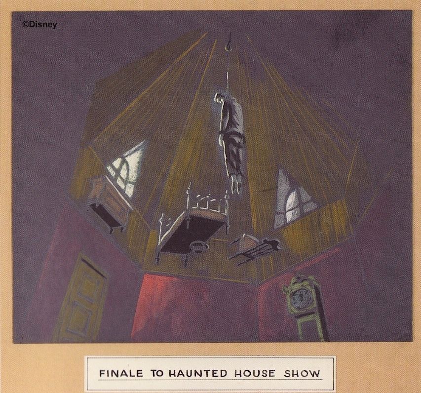
In the ride as it is, the raven doesn't put in an appearance until the Conservatory scene, but in earlier versions, the bird was ubiquitous. As we have seen, for a time it was going to be right there in the foyer. What it would have said, we don't know, but it was also slated to appear in the next scene, the stretching gallery. As many of you know, after the hanging corpse was revealed, the raven would have squawked and mocked the Ghost Host for choosing the coward's way out.

Most likely the raven would have been up there in the rafters, opposite the corpse. This is a reasonable enough guess in itself, and the illustration used for the children's souvenir record seems to support it.
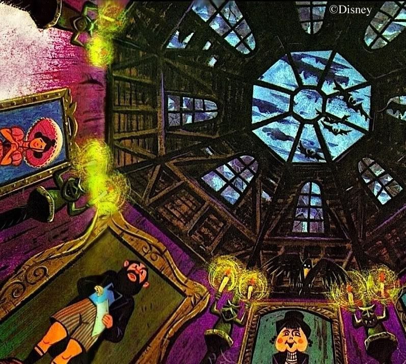

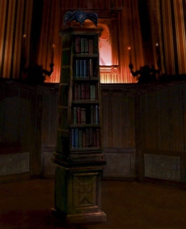
According to the S & S album, however, the raven sits on a bookcase. I've tried to visualize a bookcase down on the floor of the room . . . 
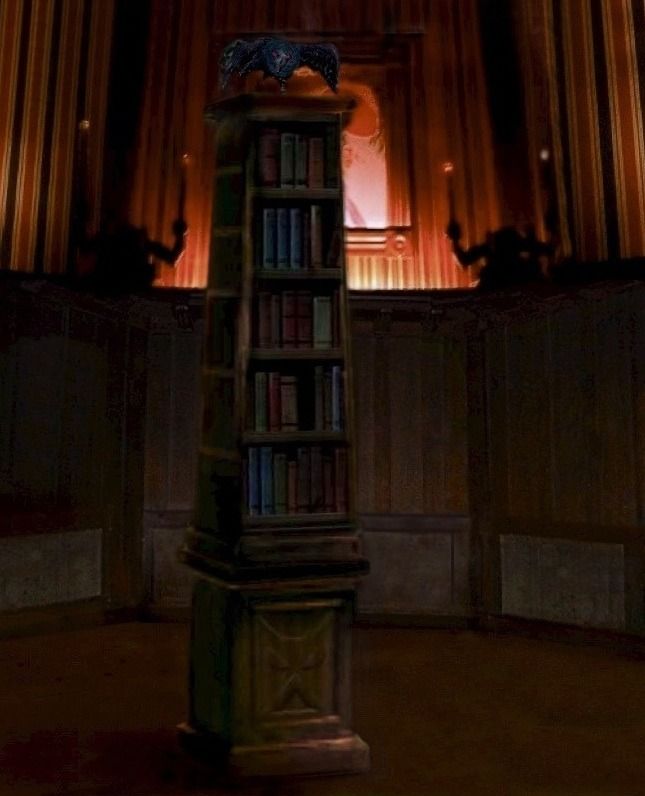

. . . but more likely they had in mind furniture up in the attic, in some such manner as we see in Anderson's old concept artwork for the scene.


"Did Someone Scream?"

Let's pick up the narrative from the Story & Song album at this point.

Narrator: Lightning flashed from above the room, illuminating the attic area. There seemed to be no roof. From the rafters a corpse swayed, dangling from a taut rope. < Fluttering wings > A black raven flew into the room and perched on the bookcase.

Raven: Caw! Caw! Coward's way out! He chose the coward's way out! Caw! Caw! Caw!

Narrator: The candles Mike held went out mysteriously. Karen clutched his hand during what seemed to be an endless darkness. In a few seconds, the candles re-lit. < Wall panel sliding open > A panel opened exposing a dimly lit hall. On the left side were windows revealing a grotesque landscape, frequently illuminated by the lightning flashes. On the opposite side of the corridor were large portraits. When the lightning flashed, these paintings turned into decaying corpses.

Karen: We should never have come in here! < Fluttering wings, then Karen screams > What's that?!?

Mike: It's okay . . . it's just that raven.

Ghost Host: Did someone scream? Ah . . . we didn't mean to frighten you prematurely. Apparently, the restless spirit of an old nag has taken possession of that poor, wretched raven's mortal being. Be on your guard . . . it may want to better itself! < Evil chuckle > Come along, now . . . 

Narrator: Mike and Karen walked down the long tapering corridor. There seemed to be a light at the far end, pitch blackness behind them. The hallway made a sharp turn into an eerily-lit limbo of boundless mist and decay.

And it's on to the next scene. A story element here that may have been part of the 1968 plans for the changing portrait hall is the business about the raven. By now the audience is really beginning to wonder what's up with that bird. Something like an explanation is needed, and something like an explanation is supplied. The scream that kicks off the conversation could have been part of the soundtrack. The lack of explicit reference to the changing portraits may reflect the Imagineers' intent to change them out from time to time (and why not?), since we know that they had many more than just five ready to go. If they were going to vary, the GH would hardly be expected to comment on them too closely.

Where would the raven have been located? Several possibilities suggest themselves. One possibility is the far end of the hallway, to our left of the male follow-you bust. That's quite a roomy corner, actually.
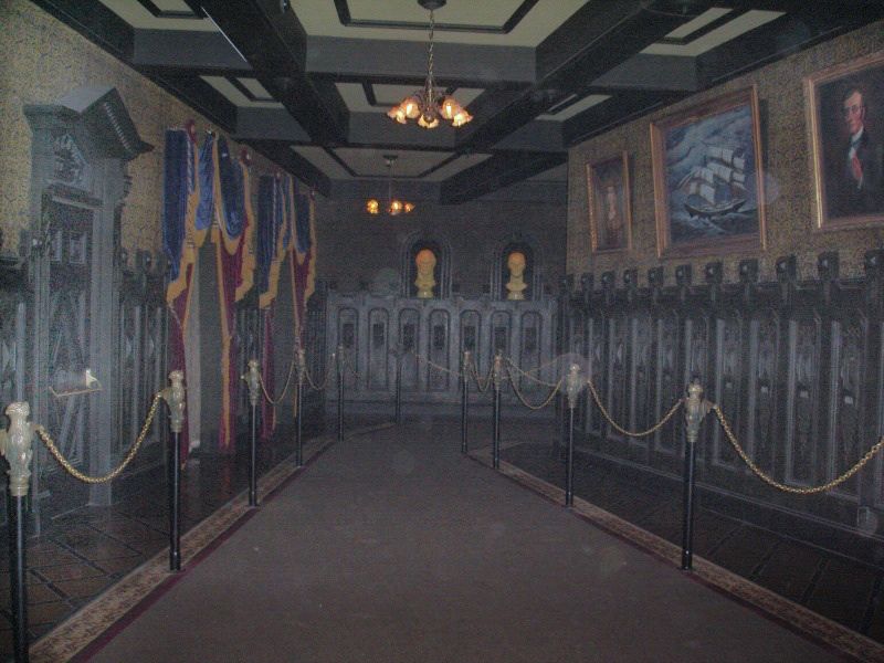
pic by Scourge 999
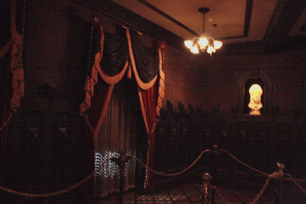
pic by Nenya

However, there's nothing in the scale model of the ride to suggest such a location.
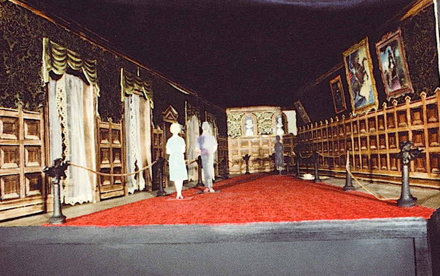

A better possibility is on a corbel or cornice above and between the two elevator doors—exactly as the raven would have been placed in the foyer, actually. With a nice, deep corbel, the bird wouldn't be visible until guests were well into the room and looked back.
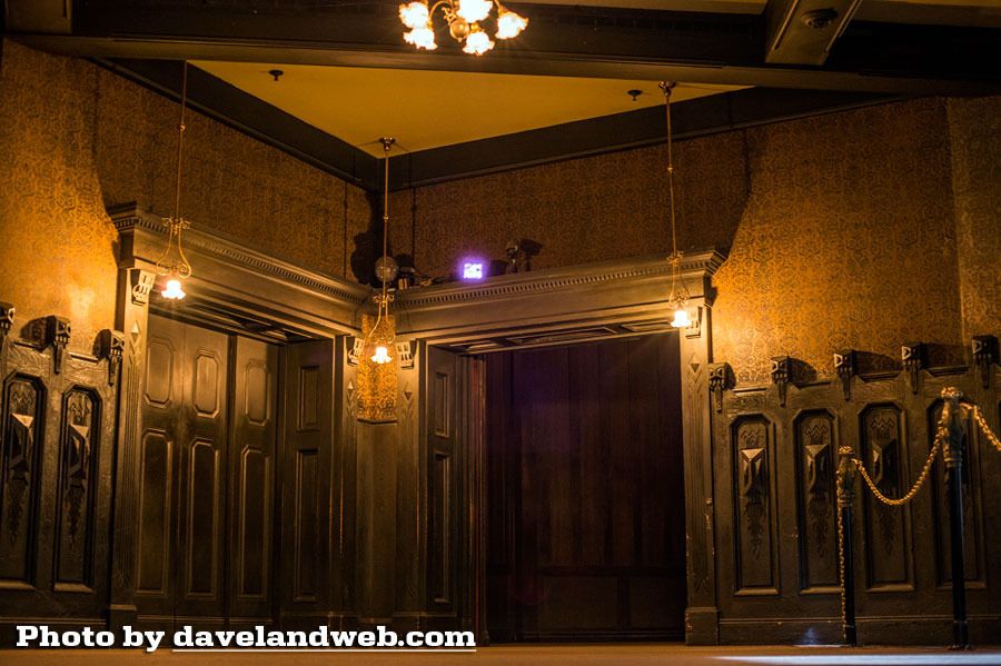

However, the only location that has even a thin scrap of visual evidence in its favor is right outside one of the windows. That's where Ken Anderson imagined it, and that's where the artwork for the children's record puts it also.

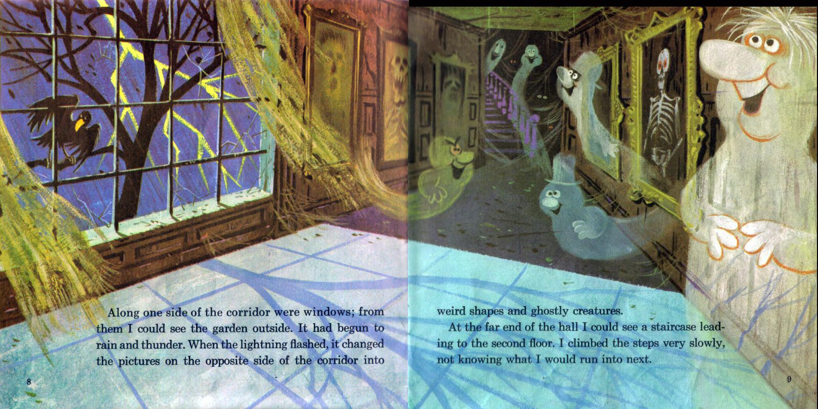

If the usual patter about the Mansion as a retirement community were used either before or after the little conversation about the raven, there would perhaps be enough time for the changing portrait show to silently proceed without comment. I don't like the way the animated gif from the last post looks, with all five cycling simultaneously. People wouldn't follow any of the stories through, being distracted by the changes taking place in all the other pictures. I'm more inclined to think they would change one by one in a soft, domino effect, until all five were finished.

And there you have it.


Wednesday, December 23, 2015

Changing Our Portrait of the Changing Portrait Hall (or, "Rewriting History Part Three")

.
Updated January 17, 2018.

Welcome to the third consecutive post dealing with the lost history of the changing portrait hall. This is the latest information about this still-unfolding story. It could have been appended to the previous post, I suppose, but the topic seemed worth blogging about on its own terms.

I've had a chance to exchange emails with the man who put up for sale the slides of the changing portraits that appeared in the recent Van Eaton auction and have been the subject of the previous two posts. He's a former WDI Imagineer (goes by "gerG"), and he tells me that he originally rescued the slides from the trash, and that there were no fewer than eight sets. A couple of those sets went back to Disneyland somewhere, a couple of sets went to WDI archives, gerG kept a set, and the other three sets were tossed out (I know, hard to imagine). Eight sets is a lot of back-up, and gerG thinks this is yet another indication of a heavy commitment. I would add that another indication is the size and complexity of the projection machines Yale developed for the effect. The Imagineers must have really and for truly expected to use this six-panel system.

When did they cancel those plans? I think it's safe to say that the concept must have been abandoned by the time they wrote the script for the "Story and Song" souvenir album (May 1969). The narrative describes the portraits as changing with the lightning flashes (which is, as you know, how it was done when the ride opened and how it is done now).


gerG is pretty sure it went like this: the six-panel changing portraits were going to be shown to each group of guests separately after they exited the stretchroom elevators. Each group would stop in the hallway and watch the five pictures run through their six-panel shows simultaneously, and then, after the group had moved on, the portraits would reset to scene one for the next group.


(No, I don't know that the Burning Miser was slotted for the middle position; it's just one of the many portraits
that were ready to go, and I'm using it to illustrate the system, since a six-panel Medusa has never surfaced.)

Clearly the walk-through portion of the ride was still expected to follow the same episodic show-flow that they had assumed it would have for as long as the attraction was planned as a walk-through, beginning with Ken Anderson's 1957-58 scripts and continuing through the Rolly Crump/Yale Gracey phase (1959-1964). That is, they planned for group movement from room to room, with a brief show in each. Remnants of that show-flow still exist in the Anaheim Mansion, but it is obscured by the fact that the first scene (the foyer) and the third (the changing portrait hall) no longer adhere to it.

It was supposed to work like this: A group of people would enter the foyer, and the doors (plural) would be shut. The show would then begin with the familiar opening spiel by the Ghost Host, and the scene would end when the group had entered the elevator. Only when the elevator doors were closed would the front doors be opened and the next group admitted to the empty room. You never saw anyone outside your group.

When I rode the HM during opening week, they followed that format in the foyer. Both of the front doors were closed between groups. And as late as 2000, it seems that could still do it this way if they wanted, to judge from this video clip.


Nowadays, of course, only one is typically closed. The other remains open for late-arriving guests dribbling in. The groups are hot on each others' heels, and there is little or no sense of separation between them. Guests-per-hour is the name of the game. The psychology is that the walk-through portion is really part of the queue. The "real" ride begins with the doombuggies.

Scene One

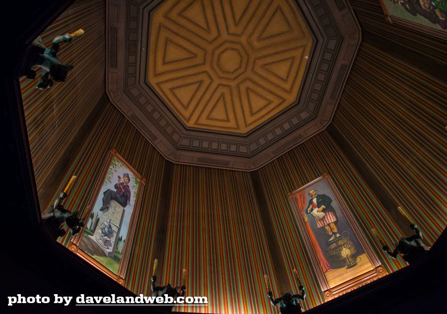
By way of contrast, scene two (the stretching gallery) continues to follow the original concept, because the room's design mandates it. You have one and only one group in there, standing still, and the scene has a clear-cut beginning and end, marked by opening and closing doors.

Scene Two

The changing portrait hall would have been the third scene, following the same format. Until the full group had exited the elevator and the doors were closed, the portraits would have all been frozen on their first panel. Everyone would stand still as the pictures morphed through their six scenes. gerG thinks they would have all done this simultaneously, and perhaps he's right, but it's also possible that they would have done it one by one, like falling dominoes. At scene six they would have frozen again, and the butler or maid would have shoo-ed the guests around the corner to the load area. As I said earlier, once the corridor was empty, the portraits would have reset to scene one, and the next group would emerge from their elevator.

Scene Three
(pic by Kevin Crone at Tours Departing Daily)

Conceptually, the show in the hallway would have been much like the show immediately preceding, where all of you watch all four of the paintings stretching before your eyes and they stay that way until you leave, at which point they roll back up.

At some point the Imagineers must have realized that this was not the most efficient way to do things between the elevators and the doombuggy loading zone. For one thing, they may have foreseen that people might not understand that they were supposed to stop and wait. The CMs would have had to herd them pretty carefully, that's for sure. There's also the matter of visibility. Unlike the elevators, not every place in the portrait hallway is a good vantage point for seeing the paintings as a group.

With the sort of show described here, one might have expected something in the Ghost Host's spiel tailored more specifically to this hallway. The fact that we have no Paul Frees outtakes talking about the paintings may be another indicator that plans for treating the hallway as a discrete show scene were already long gone by the Spring of 1969, when the Ghost Host recording sessions were done. If the GH originally did have a spiel for the scene, however, that would explain why the boarding instructions come so early ("And now, a carriage approaches..." etc.). That part of the spiel would originally have been intended for the next scene, the load area.

Frankly, I'm glad it ended up the way it did. With a little luck and planning, you can sometimes have the hallway to yourself for a few moments, and as I've said before more than once, that's worth a lot.


Tuesday, January 1, 2013

Does Size Matter?

.
Updated November 2019 and May 2020

No.  Well . . . okay, for awhile it did.  Or it almost did.  But not for long.

This is one of those "road not taken" posts.  Not taken, and as a result . . . long forgotten.

In our Walls and Stares post (May 2012), we talked about scaring people by resurrecting their childhood fears; in particular, how the Mansion takes wicked advantage of our propensity for finding frightening faces in seemingly innocent patterns and designs.  Is this kind of psychological exploitation cruel or cool?  Both, you say.  That's it!  It's crool.  In this post we're going to discuss another crool strategy for giving folks goosebumps: intimidation through sheer size.  My hunch is that this particular fear factor is another throwback to the vulnerability of childhood, of living in a grown-up world, where everything is (too) big.  We already touched on this idea a few posts back as we scratched around for an explanation for the anomalous and absurdly oversized bass fiddle in the scale model of the HM attic and in Collin Campbell's artwork.


EDIT (1-12-24): I was surprised to learn that an instrument this size really does exist. It's called an octobass and it's tuned two octaves below a cello. It's mostly used for ridiculously low rumbling sounds beneath the rest of the orchestral sound.


As a scare tactic, "Big = Scary" is nothing new.  It features prominently in the very first Gothic novel, Horace Walpole's The Castle of Otranto (1764), a book we have referenced before.  A giant helmet falls out of the sky and kills somebody right at the beginning of the book, and further humangous ghostly manifestations follow.  You could say that spectacular size, plays a big, big role, as a horror device, in Horace Walpole.

(You could say that, yes, you certainly could; but I'm guessing you probably won't.)


"No it doesn't.  PAPER covers ROCK."

Whether or not the Imagineers were influenced by Walpole, some of them did consciously plan to use a similar strategy in the Haunted Mansion.  As an Imagineering trick, it's a twisted, unfriendly reversal of forced perspective.  With forced perspective, things that are actually small look larger than they are, but with size intimidation, grotesquely oversized things are used to make you feel smaller than you are.

Have you got that, shrimp?

At the Mansion, discussion of this strategy begins and ends in a familiar place.


Once Again, the Stretching Gallery

Time and again we've highlighted the "actually happening or your imagination?" dilemma posed by the stretching gallery.  It's an essential key for understanding the experience in store for us.  Either the ghosts have power to manipulate the very fabric of the building, or they are able to trick the mind, perhaps even induce hallucinations.  Either of those prospects is scary enough, but our inability to even know which of the two is in operation only adds to the disorientation and unease.  And so the table is set, and we're off and running on a haunted house adventure.

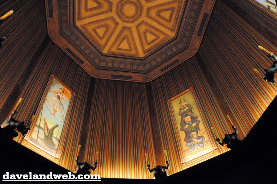
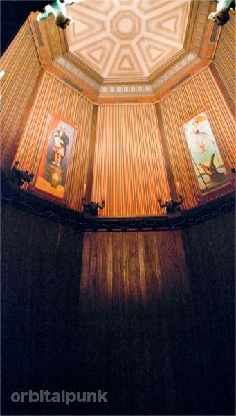
Something we haven't discussed is the specific nature of the manipulation/hallucination.  The room stretches.  It gets bigger, much bigger.  So one thing the gallery does is make you feel small.  When the place is fully expanded, it really is an impressively big room.  This is something I've particularly noticed in my most recent trips to Disneyland.  The sense of smallness and vulnerability that guests are liable to feel reminds me of Alice during one of her shrinking episodes.  As with her, it is like a dream that is turning into a nightmare.


(I couldn't decide which of these two photos better conveyed that sense of hugeness, so you're getting both.)

(pic by orbitalpunk)

After the gallery finishes stretching, you are plunged into darkness for a few moments, and then you exit into the next room, the changing portrait hall, where everything is once again normal in size.  You're still in a fear-inducing environment, but the specific sense of smallness is left behind.  What you probably don't know is that once upon a time they seriously considered keeping you small and vulnerable, at least for awhile.


Changing the Changing Portrait Hall

We know this, because in a 1964 show script, Marc Davis spoke of the portrait hall as a room "filled with oversized furnishings, paintings, and sculptures."  In other words, everything was going to continue to look BIG.  This would have been consistent with our experience in the stretching room, and the dilemma was going to become a trilemma:  (1) Is the room really expanding? or (2) is it your imagination? or (3) are you shrinking?

Interesting, but how could they have accomplished this gargantuan feat?  Well, to begin with, they had plenty of room.  The space where the changing portrait hall would eventually go was already there when they finished the 1962 façade building.


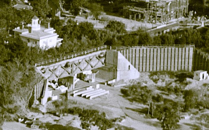
The foyer and stretching elevators were built into the familiar white mansion during construction, and down below, the passageway under
the railroad tracks was cleared, leading out to the area where the main show building would be constructed early in 1969. This is a 1964 photo.


Hellooo-ooo in there -ere -ere -ere.   Here's another view, from 1966 -ix -ix -ix.


In those early years, the Haunted Mansion was going to be a walk-thru, and in order to handle the traffic, they were going to have two complete versions of the attraction side by side.  That's the original reason for building two stretching rooms.

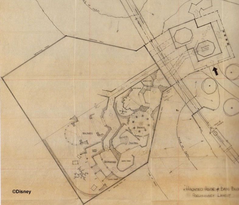
This November 1961 "preliminary layout" sketch by Marvin Davis (no relation to Marc) and—according to Tom Morris—possibly also by Carroll Clark, shows an early attempt to come up with a walk-thru layout that would fit into half of the show building. It's so early in the process that no account has even been taken yet of the railroad trestle support in the center, and there's no sign yet of the plans for dual exits into two courtyards, north and south. What is really surprising is that even this early they had settled on the final shape of the show building!

MDIHOW 338

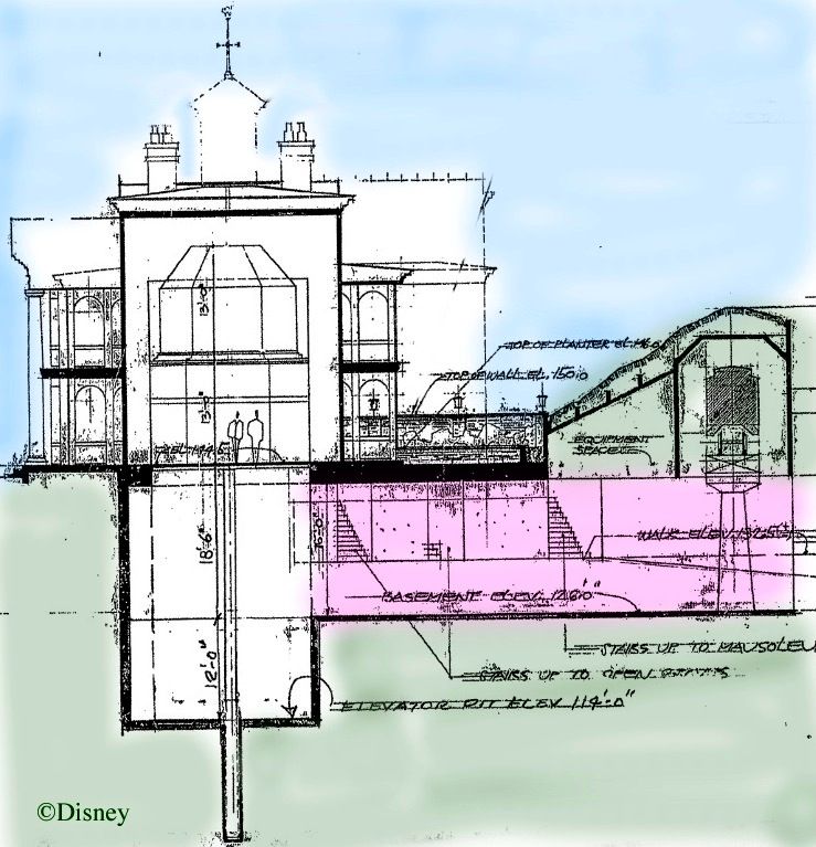
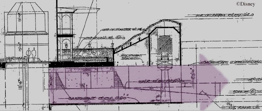
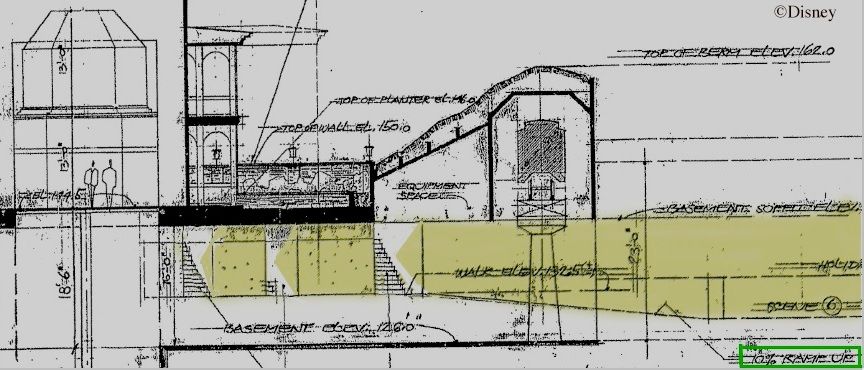
When it became clear that the massive trestle support in the center would effectively bifurcate the opening, it meant that each of the two walk-thrus would need its own departure and return corridor under the railroad. So when you look at that open space, cut into halves by the trestle support in the center, you should also try to envision each side being further divided in half, making a total of four passageways coming out from under the tracks. Anyway, even after the division into four, each of the hallways would still have been an impressively large, cavernous structure with a high "ceiling" (i.e. the RR bridge).  Not only that, but there are clear indications on the blueprint seen earlier that they intended to make the return hallways something much closer to a normal size for a house, thereby leaving even MORE room for the departure halls, which could be made that much loftier and wider.

You emerge from the stretchroom and depart via a hallway with an approximately 16-foot ceiling:


You return via a hallway with a ceiling that is already a few feet lower by that point, and you go up a "10% ramp" until the hallway has a normal nine or nine and a half foot ceiling, and you finally return to the outside world via one of three staircases.  (And now your curiosity is aroused, isn't it?  Don't worry; we'll talk about those stairs in the next post——and that thing is going to be a humdinger.)


So the room following the stretching gallery would have been . . . BIG, perfect for Davis's oversized furniture and artwork.  Already in Ken Anderson's ghost house, the hallway leading under the berm to the show building was going to be a changing portrait gallery, and as far as I can tell this plan was never altered.  So it may be that the massive size of the area encouraged Imagineers to think of an equally massive room for the changing portraits.

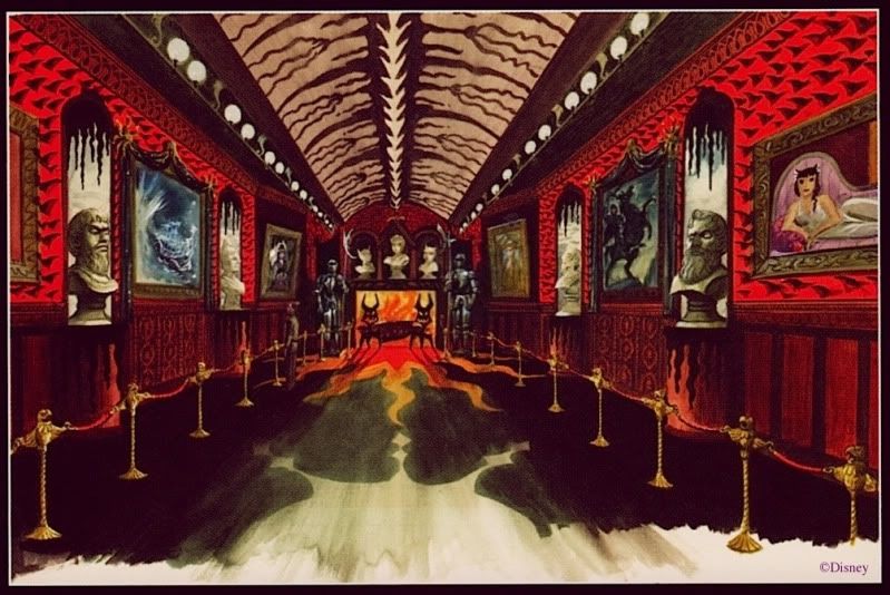
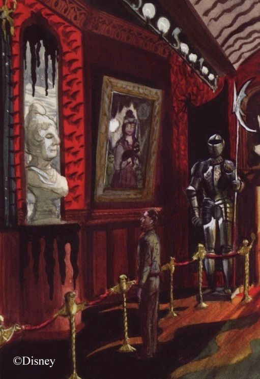
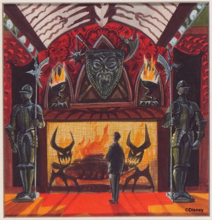
When Marc Davis got around to doing some concept art for the portrait
hall, it reflected this idea, although it's something very easy to miss.


That room is bigger than it may look.  Notice the size of the man on the left, and compare him with the suits of armor or the busts.


"I'm feeling a little . . . little."

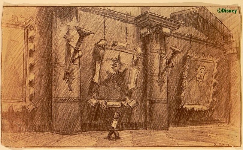
Disney artist Bruce Bushman, a name not usually associated with the Haunted Mansion, did a concept sketch for this hallway that uses
the same approach, intimidation through sheer size.  In fact, this sketch may illustrate the idea better than any other HM artwork.


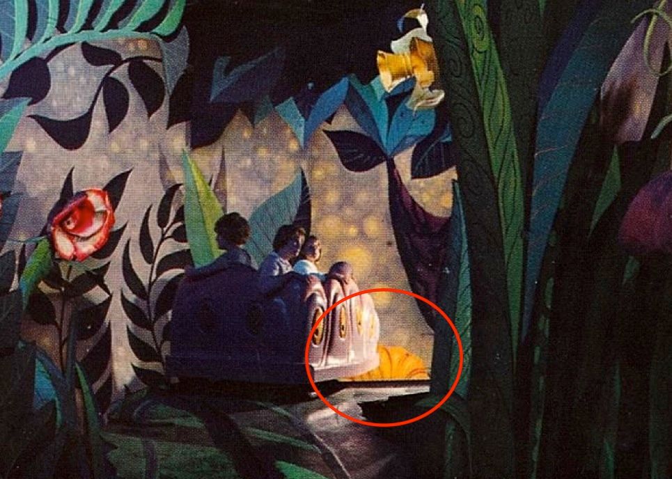
Architecturally, it isn't too difficult to imagine that scene as one of the four hallways fitting into the space under the train tracks, is it?  It makes me think of Mickey's visit to Willie the Giant's castle in "Mickey and the Beanstalk," or poor Alice, shrunk to the size of a caterpillar.  I mentioned Alice earlier, and as a matter of fact, it was the Alice in Wonderland ride that seized on this idea and actually used it, as can be seen from this rare interior photograph of the classic 1958 dark ride:


If you ask me, THAT is scary.  It also illustrates well what is perhaps the greatest strength of this gimmick: repeatability.  This scene feels intimidating no matter how many times you look at it.  (It was bad enough to have that cat laughing at you continuously, but as soon as you went under his chair, he popped down in front of you on the other side, upside down.  You can see him by the girl, already there.)  It's not surprising that this section of the original Alice ride featured a great Haunted Mansion forerunner: the first pop-up bogey in the park.  Toward the end of the garden of live flowers, an angry Dandelion used to pop up on your left with a roar and a scowl.  I've found no pictures, but in this one you can see the top of his head.  He's poised and ready to jump.


When I was a wee one, I had to close my eyes at this point.  I'm not kidding.

UPDATE May 19, 2020: Well, well, a photo of the pop-up Dandelion has finally surfaced:


Anyway, back, back, back we go to the changing portrait hall, and plainly none of this oversizing was implemented.  I don't know why.  Perhaps they couldn't figure out how they would sustain this surrealistic motif for the entire ride, or perhaps they thought it would wear out its welcome after awhile.  And when the ghosts finally materialized, what were they going to be, giant ghosts, à la Otranto?  Then again, it could have been a purely practical decision.  It must have taken a LOT of "padding" to prevent the sound and vibrations from the train from leaking through, so there was probably no way the ceiling could have remained quite so high as they may have liked.

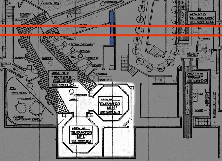
This is how the space was eventually utilized, with both elevators spilling into the same changing portrait hall, going off at an angle.  The red shows approximately where the railroad tracks are, and the central trestle support is in blue.


Bigness Elsewhere

You might say that in the end, the changing portrait hall was not a big deal.  You might also say, "Not one of your better puns."  You might also say, "Get on with it."  Okay, is there any place else where size intimidation made it into the Haunted Mansion?  The stretching gallery is still there, of course, but it has no furnishings to set the true scale for the house, one way or the other.  (But did you know they almost put a piece of furniture in there?  See below.)  There is a bass fiddle in the attic, but it is a normal size, so that prop didn't materialize.  At eight and a half feet, the grandfather clock that we discussed a few posts back is tall, but not extraordinarily so.  In their heyday, longcase clocks were commonly six to eight feet tall.

Unless I'm overlooking something, the only example of a giant thing in the HM beyond the stretching rooms is the jumbo
spider web with its oversized spider that framed the entrance of the doombuggies into the Limbo loading room until 2001.


Tokyo still has its giant spiders further along in the ride, but WDW lost theirs to the Grand Staircase scene in 2007.  I suppose that technically, "giant spiders" qualify as an example of size intimidation, but . . . meh.  Weak example. They're alive, and therefore monsters, arachnophobic nightmares, not evidence that you are small.  They're also campy Halloween decor, as we've discussed before, and you could even say they're a Disney cliché.  If the spiders are all that's left of the size intimidation scare tactic, then there isn't much.

So I guess that's it.  We're pretty much done.  Except I do have one idle speculation left, offered for what it's worth.

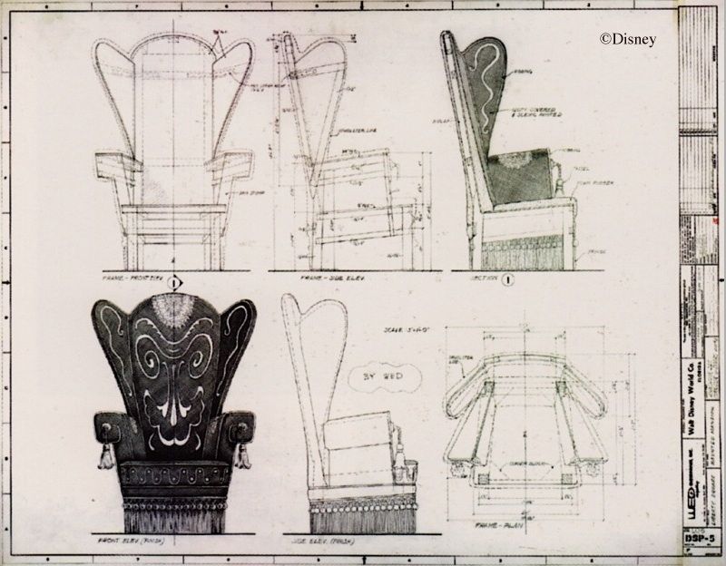
It's always seemed odd to me that the so-called "Donald Duck chair" was designed absolutely from scratch.  It seems like a lot of bother for such a relatively unimportant prop.  Couldn't they have simply found an appropriate looking overstuffed chair and put the creepy embroidery designs on that? perhaps with a few other modifications?  With its chunky wooden skeleton, it strikes me that the blueprints for the chair look like the sort of thing you might expect if it were originally going to be a huge, Alice-in-Wonderland-sized prop, one of Marc Davis's "oversized furnishings."  I wonder.  Is it possible that after the oversizing gimmick was scrapped, they salvaged their plans for a crool, sinister-looking, giant chair and simply scaled it down to normal size?  To judge by Davis's concept art, oversized = about twice normal size, so it would have been a simple matter of halving all of the original dimensions.


This is only conjecture, I admit.  But we've all seen giant prop furniture, most commonly in old
sci-fi movies and TV shows, and doesn't this chair design have that same artificial, boxy look?

(pic by Loren Javier)

So there you have it, as the Brits say.  At one time the Imagineers thought they would unnerve you by making you feel very, very small, but that approach was rejected in the finished attraction and subsequently forgotten, long forgotten.  You had to go on the Alice ride if that kind of creepy feeling was your cup of tea.  (Just half a cup if you don't mind.)


A Post Script on the Bookcase that Never Was

There is no furniture in the stretching gallery, but as late as the spring of 1969 they had plans to put a raven in there, taunting the Ghost Host. ("caw caw, the coward's way," etc.)  Apparently the bird was going to be sitting on a bookcase.  What kind of bookcase, and where they were going to put it, no one seems to know.  For what it's worth, here's a photoshop photoslop I threw together.  It at least gives you an idea of one way they could have done it.  There must be artwork somewhere.  It would be fun to know what they were actually going to do.