Things You're Just Supposed to Know

Most of the time, Long-Forgotten assumes that readers are already familiar with basic facts
about the Haunted Mansion. If you wanna keep up with the big boys, I suggest you check out
first of all the website, Doombuggies.com. After that, the best place to go is Jason Surrell's book,
The Haunted Mansion: Imagineering a Disney Classic (NY: Disney Editions; 2015). That's the
re-named third edition of The Haunted Mansion: From the Magic Kingdom to the Movies (NY:
Disney Editions, 2003; 2nd ed. 2009). Also essential reading is Jeff Baham's The Unauthorized
Story of Walt Disney's Haunted Mansion (USA: Theme Park Press, 2014; 2nd ed. 2016).

This site is not affiliated in any way with any Walt Disney company. It is an independent
fan site dedicated to critical examination and historical review of the Haunted Mansions.
All images that are © Disney are posted under commonly understood guidelines of Fair Use.

________
.
Showing posts with label Alice in Wonderland. Show all posts

Friday, August 14, 2020

Roland in Wonderland?

.

The overlap between Lewis Carroll's Alice books and the Haunted Mansion is almost nil.  To date, I think that the closest connection I have found between the HM and anything at all related to Alice would probably be the scary Dandelion popup in the flower garden of the pre-1983 Fantasyland ride, a direct ancestor to the popup spooks in the Mansion's graveyard 11 years later. That sure ain't much, is it?  We've talked about it before, but as long as the subject has popped up again, I've got an update:

Until recently, the only available picture of the Dandelion showed just the top
of his head, before he rose up. But recently a rare photo has come to light:


Combine that with the previously known photo, taken from almost the same spot...


. . . and maybe we can cobble together something a little more vivid:


The Dandelion appears only briefly in the movie, and there he is an amiable character. Here, he let out
 a loud, terrifying roar, and he had his leaf/paws lifted in a threatening manner. You can't see this in the
 newly discovered photo, since he's only about half-way up, but you can see it in a ride layout drawing:


 So . . . sorta kinda like this:


That's a little more like what I remember.

In addition to this, in that earlier post I discussed how the Mansion Imagineers at one point considered incorporating the idea of making the guests feel tiny in an oversized environment, a concept used effectively in the Alice ride. Ultimately, they abandoned the notion.

Now, you would think that the Alice books might at least have exercised some influence over Rolly Crump's "Museum of the Weird," wouldn't you? The surrealism, the absurdist humor, the impossible animals, the whimsy, the fantasy, the Disney rights—c'mon, it's a natural! We know that Rolly drew inspiration from the phantasmagorical films of Fellini and Cocteau, so why not Alice in Wonderland or Through the Looking Glass?

Well, as it happens, it may just be possible that Rolly did take inspiration for the Museum from a pair of John Tenniel illustrations for the Alice books. Since the Museum never came to realization, that means we are talking here about a footnote to a footnote, and usually I balk at such, but this is the freakin' Museum of the Weird we're talking about, not just any old failed concept, and if like me you're a huge fan of both the Museum and the original Alice books, there is some genuine satisfaction to be had in thinking that maybe, just maybe, the former may have drawn some inspiration from the latter, be it only lightly, or slightly, or ships-passing-in-the-night-ly.

The piece I have in mind is this sketch of the Museum's séance room, which we've all seen many times before:


And the Tenniel sketches I have in mind are these, from the first chapter of Through the Looking Glass:


Among the details inserted by Tenniel (they're not in the text) are the faces
on the clock and the vase, which only appear in the "looking glass" house.

(Incidentally, many readers fail to notice that a face has also appeared in the ornament over the fireplace.)


(And if you want to argue that the clock inspired Cogsworth, be our guest.)


                             The Face and the Vase

We are not interested here in those items. This is the one I want to focus on:


If you look closely at Rolly's sketch, you'll see that he too has put a vase on the mantelpiece, and
it too has a face on it, and only in the mirror. (Incidentally, the candle is lit, but only in the mirror!)


The parallel is not exact, but still, I have to wonder whether Tenniel's sketch was at least an un- or sub-conscious influence here.
After all, the Alice artwork is hugely famous, and the books are dream-fantasy classics.  Rolly was undoubtedly familiar with them.

Rolly's face is actually a skull, of course. In this there is nothing particularly weird about the Museum thereof. Victorians were fond of putting all kinds of things under bell jars. Not just floral arrangements and clocks, as in Alice, but virtually any old curiosity they might have sitting around, including human skulls.


In fact, these things were common enough that Marc Davis decided to include one in a Mansion sketch.


Anyway, is there anything else in the Crump sketch that might support our suspicions?  Maybe.


                A Global Phenomenon

Rolly's crystal ball is held aloft by a hand. He apparently liked this feature. You find
it in all of his Museum sketches as well as in a maquette he and Jack Ferges made.


Now take a look at the other Alice sketch, the one before she enters the looking glass:


Yea, verily, this could be nothing more than an optical coincidence. Luckily, I don't
have to actually prove anything here. I'm just having fun floating the possibilities.
As always, you'll have to decide for yourselves if anything is going on. YMMV, etc.


                A Fly in the Ointment?

Roh roh. It is my solemn duty to inform you of a historical wrinkle that threatens to put an end to our little game.
As it happens, the mysterious circle around Alice's hand is not always visible in reproductions of Tenniel's drawing.


Unless you're a passionate student of Tenniel's Alice work, you may not know their intriguing history. It seems his original illustrations were engraved on wood blocks (by the Dalziel brothers; that's why you see the name "Dalziel" at the bottom of some of them). But the Dalziels convinced Tenniel that because his work was so delicate, it would be better to use the wood engravings as masters from which electrotype copies could be made, producing copper plates that would last longer. And that's what they did. The problem is that the books were so popular and went through so many printings that the plates got worn, and the quality of the illustrations in Alice editions deteriorated over time. But as chance would have it, the original wood engravings were rediscovered in 1985, pristine and unused! Multiple new sets were soon made from them.

What it all means is that Tenniel's illustrations in the more recent editions of the Alice books are sharper and more detailed than in previous editions. Since this all happened long after Rolly did his Museum sketches, one has to ask: Was it even possible for him to see the circle around Alice's hand in the murkier editions of Through the Looking Glass available to him in 1964?

Somewhat dejectedly, I did some investigation, and contrary to what I expected, I discovered that the visibility of the circle does not seem to depend upon whether the illustrations were printed from muddy, pre-1985 plates or sharp, post-1985 plates. Here it is in a crappy old print:


So yes, Rolly could certainly have seen this. That being the case . . . (brace yourselves for the massive qualifier) . . . we cannot altogether dismiss the possibility that it was a subconscious influence, along with the vase-with-face in the mirror. Again, I admit to being biased in favor of the theory, because it just seems so fitting that the world of Alice and the world of the "Museum of the Weird" should meet at some point.


********************

Tuesday, January 1, 2013

Does Size Matter?

.
Updated November 2019 and May 2020

No.  Well . . . okay, for awhile it did.  Or it almost did.  But not for long.

This is one of those "road not taken" posts.  Not taken, and as a result . . . long forgotten.

In our Walls and Stares post (May 2012), we talked about scaring people by resurrecting their childhood fears; in particular, how the Mansion takes wicked advantage of our propensity for finding frightening faces in seemingly innocent patterns and designs.  Is this kind of psychological exploitation cruel or cool?  Both, you say.  That's it!  It's crool.  In this post we're going to discuss another crool strategy for giving folks goosebumps: intimidation through sheer size.  My hunch is that this particular fear factor is another throwback to the vulnerability of childhood, of living in a grown-up world, where everything is (too) big.  We already touched on this idea a few posts back as we scratched around for an explanation for the anomalous and absurdly oversized bass fiddle in the scale model of the HM attic and in Collin Campbell's artwork.


EDIT (1-12-24): I was surprised to learn that an instrument this size really does exist. It's called an octobass and it's tuned two octaves below a cello. It's mostly used for ridiculously low rumbling sounds beneath the rest of the orchestral sound.


As a scare tactic, "Big = Scary" is nothing new.  It features prominently in the very first Gothic novel, Horace Walpole's The Castle of Otranto (1764), a book we have referenced before.  A giant helmet falls out of the sky and kills somebody right at the beginning of the book, and further humangous ghostly manifestations follow.  You could say that spectacular size, plays a big, big role, as a horror device, in Horace Walpole.

(You could say that, yes, you certainly could; but I'm guessing you probably won't.)


"No it doesn't.  PAPER covers ROCK."

Whether or not the Imagineers were influenced by Walpole, some of them did consciously plan to use a similar strategy in the Haunted Mansion.  As an Imagineering trick, it's a twisted, unfriendly reversal of forced perspective.  With forced perspective, things that are actually small look larger than they are, but with size intimidation, grotesquely oversized things are used to make you feel smaller than you are.

Have you got that, shrimp?

At the Mansion, discussion of this strategy begins and ends in a familiar place.


Once Again, the Stretching Gallery

Time and again we've highlighted the "actually happening or your imagination?" dilemma posed by the stretching gallery.  It's an essential key for understanding the experience in store for us.  Either the ghosts have power to manipulate the very fabric of the building, or they are able to trick the mind, perhaps even induce hallucinations.  Either of those prospects is scary enough, but our inability to even know which of the two is in operation only adds to the disorientation and unease.  And so the table is set, and we're off and running on a haunted house adventure.

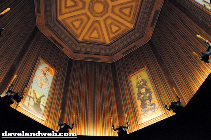
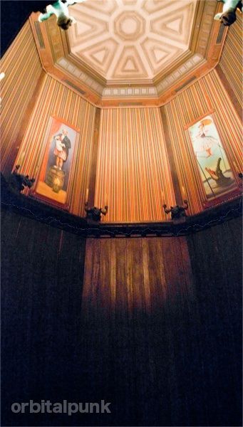
Something we haven't discussed is the specific nature of the manipulation/hallucination.  The room stretches.  It gets bigger, much bigger.  So one thing the gallery does is make you feel small.  When the place is fully expanded, it really is an impressively big room.  This is something I've particularly noticed in my most recent trips to Disneyland.  The sense of smallness and vulnerability that guests are liable to feel reminds me of Alice during one of her shrinking episodes.  As with her, it is like a dream that is turning into a nightmare.


(I couldn't decide which of these two photos better conveyed that sense of hugeness, so you're getting both.)

(pic by orbitalpunk)

After the gallery finishes stretching, you are plunged into darkness for a few moments, and then you exit into the next room, the changing portrait hall, where everything is once again normal in size.  You're still in a fear-inducing environment, but the specific sense of smallness is left behind.  What you probably don't know is that once upon a time they seriously considered keeping you small and vulnerable, at least for awhile.


Changing the Changing Portrait Hall

We know this, because in a 1964 show script, Marc Davis spoke of the portrait hall as a room "filled with oversized furnishings, paintings, and sculptures."  In other words, everything was going to continue to look BIG.  This would have been consistent with our experience in the stretching room, and the dilemma was going to become a trilemma:  (1) Is the room really expanding? or (2) is it your imagination? or (3) are you shrinking?

Interesting, but how could they have accomplished this gargantuan feat?  Well, to begin with, they had plenty of room.  The space where the changing portrait hall would eventually go was already there when they finished the 1962 façade building.


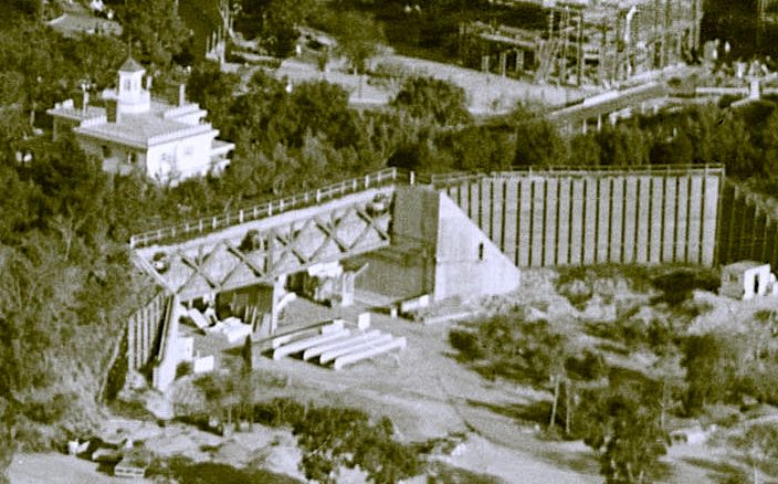
The foyer and stretching elevators were built into the familiar white mansion during construction, and down below, the passageway under
the railroad tracks was cleared, leading out to the area where the main show building would be constructed early in 1969. This is a 1964 photo.


Hellooo-ooo in there -ere -ere -ere.   Here's another view, from 1966 -ix -ix -ix.


In those early years, the Haunted Mansion was going to be a walk-thru, and in order to handle the traffic, they were going to have two complete versions of the attraction side by side.  That's the original reason for building two stretching rooms.

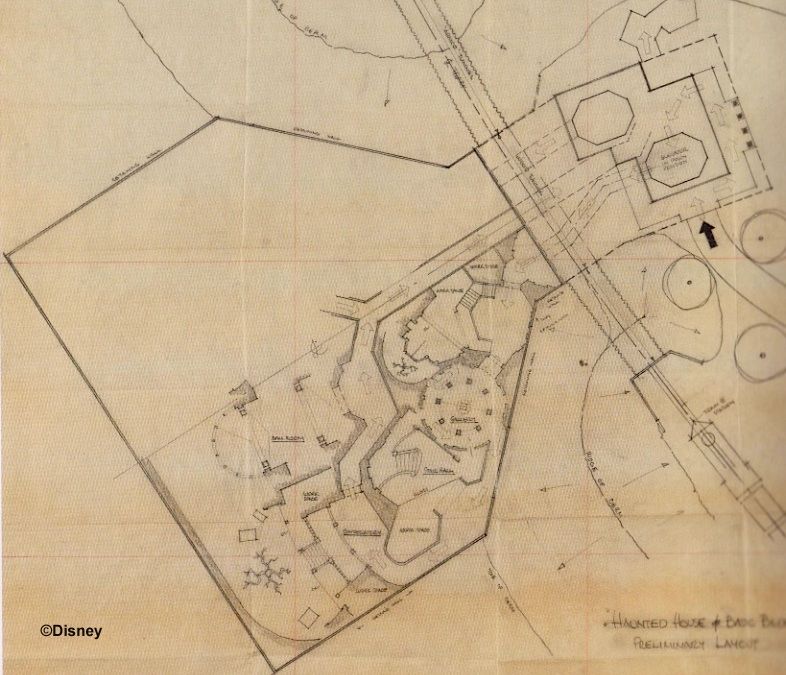
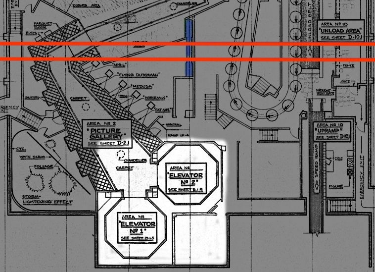
This November 1961 "preliminary layout" sketch by Marvin Davis (no relation to Marc) and—according to Tom Morris—possibly also by Carroll Clark, shows an early attempt to come up with a walk-thru layout that would fit into half of the show building. It's so early in the process that no account has even been taken yet of the railroad trestle support in the center, and there's no sign yet of the plans for dual exits into two courtyards, north and south. What is really surprising is that even this early they had settled on the final shape of the show building!

MDIHOW 338

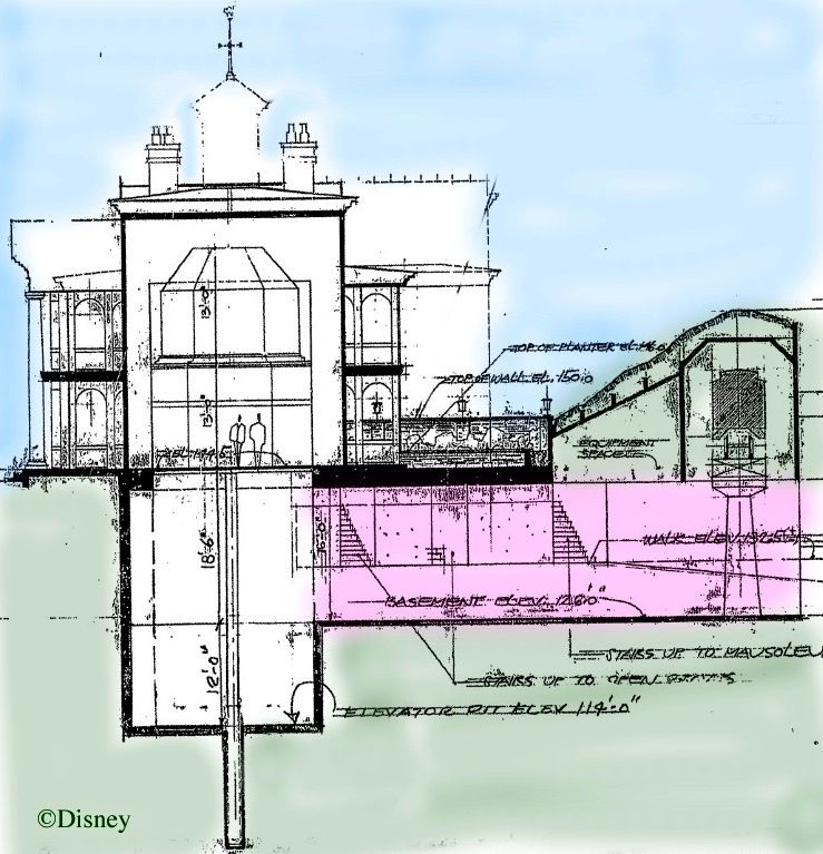
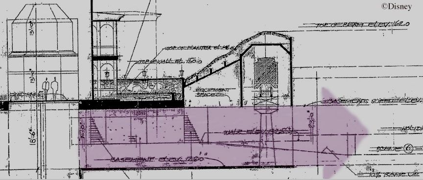
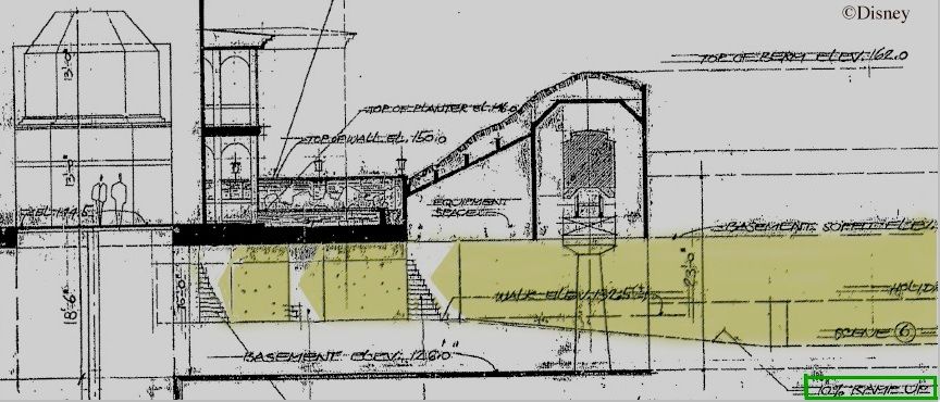
When it became clear that the massive trestle support in the center would effectively bifurcate the opening, it meant that each of the two walk-thrus would need its own departure and return corridor under the railroad. So when you look at that open space, cut into halves by the trestle support in the center, you should also try to envision each side being further divided in half, making a total of four passageways coming out from under the tracks. Anyway, even after the division into four, each of the hallways would still have been an impressively large, cavernous structure with a high "ceiling" (i.e. the RR bridge).  Not only that, but there are clear indications on the blueprint seen earlier that they intended to make the return hallways something much closer to a normal size for a house, thereby leaving even MORE room for the departure halls, which could be made that much loftier and wider.

You emerge from the stretchroom and depart via a hallway with an approximately 16-foot ceiling:


You return via a hallway with a ceiling that is already a few feet lower by that point, and you go up a "10% ramp" until the hallway has a normal nine or nine and a half foot ceiling, and you finally return to the outside world via one of three staircases.  (And now your curiosity is aroused, isn't it?  Don't worry; we'll talk about those stairs in the next post——and that thing is going to be a humdinger.)


So the room following the stretching gallery would have been . . . BIG, perfect for Davis's oversized furniture and artwork.  Already in Ken Anderson's ghost house, the hallway leading under the berm to the show building was going to be a changing portrait gallery, and as far as I can tell this plan was never altered.  So it may be that the massive size of the area encouraged Imagineers to think of an equally massive room for the changing portraits.

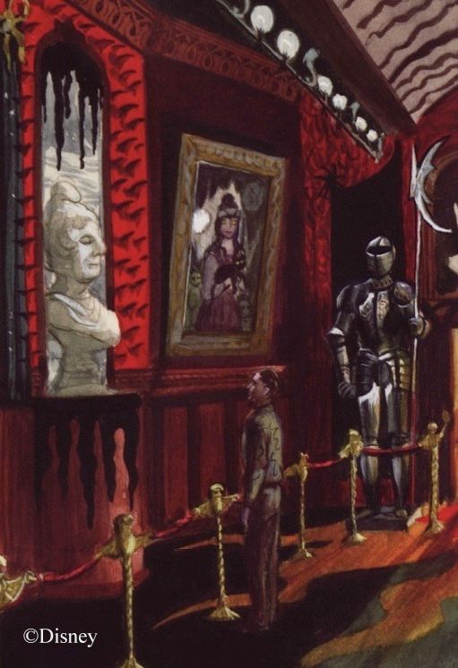
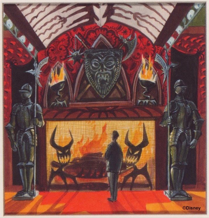
When Marc Davis got around to doing some concept art for the portrait
hall, it reflected this idea, although it's something very easy to miss.


That room is bigger than it may look.  Notice the size of the man on the left, and compare him with the suits of armor or the busts.


"I'm feeling a little . . . little."

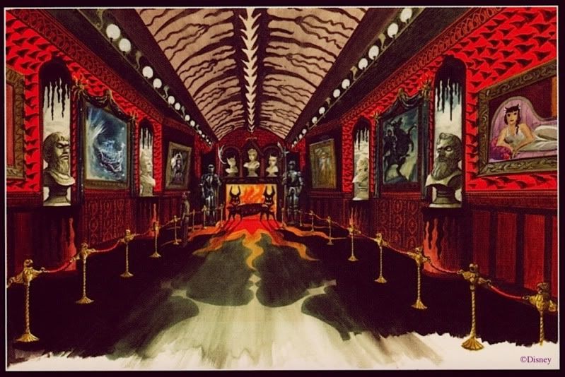
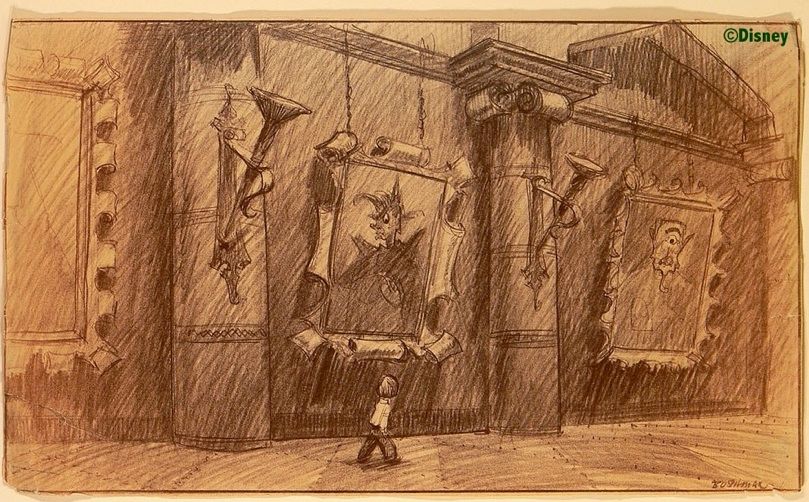
Disney artist Bruce Bushman, a name not usually associated with the Haunted Mansion, did a concept sketch for this hallway that uses
the same approach, intimidation through sheer size.  In fact, this sketch may illustrate the idea better than any other HM artwork.


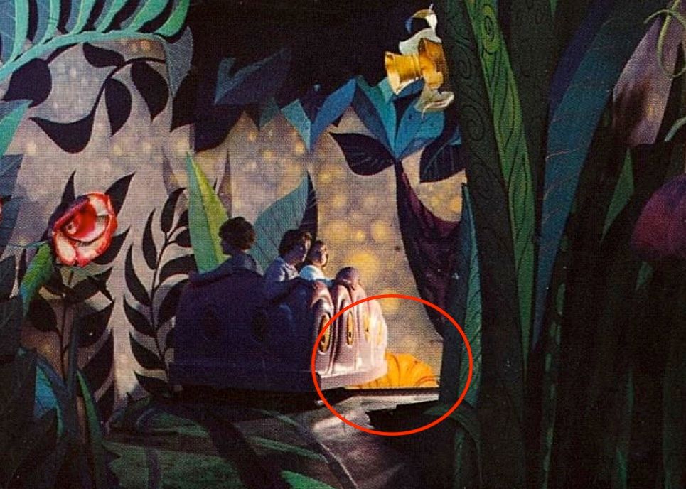
Architecturally, it isn't too difficult to imagine that scene as one of the four hallways fitting into the space under the train tracks, is it?  It makes me think of Mickey's visit to Willie the Giant's castle in "Mickey and the Beanstalk," or poor Alice, shrunk to the size of a caterpillar.  I mentioned Alice earlier, and as a matter of fact, it was the Alice in Wonderland ride that seized on this idea and actually used it, as can be seen from this rare interior photograph of the classic 1958 dark ride:


If you ask me, THAT is scary.  It also illustrates well what is perhaps the greatest strength of this gimmick: repeatability.  This scene feels intimidating no matter how many times you look at it.  (It was bad enough to have that cat laughing at you continuously, but as soon as you went under his chair, he popped down in front of you on the other side, upside down.  You can see him by the girl, already there.)  It's not surprising that this section of the original Alice ride featured a great Haunted Mansion forerunner: the first pop-up bogey in the park.  Toward the end of the garden of live flowers, an angry Dandelion used to pop up on your left with a roar and a scowl.  I've found no pictures, but in this one you can see the top of his head.  He's poised and ready to jump.


When I was a wee one, I had to close my eyes at this point.  I'm not kidding.

UPDATE May 19, 2020: Well, well, a photo of the pop-up Dandelion has finally surfaced:


Anyway, back, back, back we go to the changing portrait hall, and plainly none of this oversizing was implemented.  I don't know why.  Perhaps they couldn't figure out how they would sustain this surrealistic motif for the entire ride, or perhaps they thought it would wear out its welcome after awhile.  And when the ghosts finally materialized, what were they going to be, giant ghosts, à la Otranto?  Then again, it could have been a purely practical decision.  It must have taken a LOT of "padding" to prevent the sound and vibrations from the train from leaking through, so there was probably no way the ceiling could have remained quite so high as they may have liked.

This is how the space was eventually utilized, with both elevators spilling into the same changing portrait hall, going off at an angle.  The red shows approximately where the railroad tracks are, and the central trestle support is in blue.


Bigness Elsewhere

You might say that in the end, the changing portrait hall was not a big deal.  You might also say, "Not one of your better puns."  You might also say, "Get on with it."  Okay, is there any place else where size intimidation made it into the Haunted Mansion?  The stretching gallery is still there, of course, but it has no furnishings to set the true scale for the house, one way or the other.  (But did you know they almost put a piece of furniture in there?  See below.)  There is a bass fiddle in the attic, but it is a normal size, so that prop didn't materialize.  At eight and a half feet, the grandfather clock that we discussed a few posts back is tall, but not extraordinarily so.  In their heyday, longcase clocks were commonly six to eight feet tall.

Unless I'm overlooking something, the only example of a giant thing in the HM beyond the stretching rooms is the jumbo
spider web with its oversized spider that framed the entrance of the doombuggies into the Limbo loading room until 2001.


Tokyo still has its giant spiders further along in the ride, but WDW lost theirs to the Grand Staircase scene in 2007.  I suppose that technically, "giant spiders" qualify as an example of size intimidation, but . . . meh.  Weak example. They're alive, and therefore monsters, arachnophobic nightmares, not evidence that you are small.  They're also campy Halloween decor, as we've discussed before, and you could even say they're a Disney cliché.  If the spiders are all that's left of the size intimidation scare tactic, then there isn't much.

So I guess that's it.  We're pretty much done.  Except I do have one idle speculation left, offered for what it's worth.

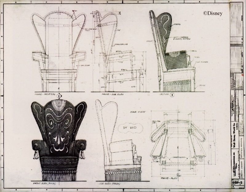
It's always seemed odd to me that the so-called "Donald Duck chair" was designed absolutely from scratch.  It seems like a lot of bother for such a relatively unimportant prop.  Couldn't they have simply found an appropriate looking overstuffed chair and put the creepy embroidery designs on that? perhaps with a few other modifications?  With its chunky wooden skeleton, it strikes me that the blueprints for the chair look like the sort of thing you might expect if it were originally going to be a huge, Alice-in-Wonderland-sized prop, one of Marc Davis's "oversized furnishings."  I wonder.  Is it possible that after the oversizing gimmick was scrapped, they salvaged their plans for a crool, sinister-looking, giant chair and simply scaled it down to normal size?  To judge by Davis's concept art, oversized = about twice normal size, so it would have been a simple matter of halving all of the original dimensions.


This is only conjecture, I admit.  But we've all seen giant prop furniture, most commonly in old
sci-fi movies and TV shows, and doesn't this chair design have that same artificial, boxy look?

(pic by Loren Javier)

So there you have it, as the Brits say.  At one time the Imagineers thought they would unnerve you by making you feel very, very small, but that approach was rejected in the finished attraction and subsequently forgotten, long forgotten.  You had to go on the Alice ride if that kind of creepy feeling was your cup of tea.  (Just half a cup if you don't mind.)


A Post Script on the Bookcase that Never Was

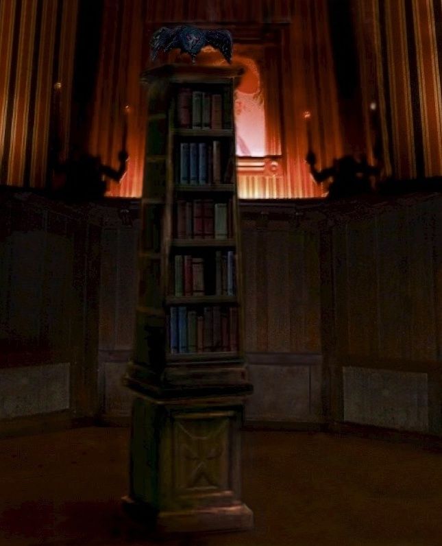
There is no furniture in the stretching gallery, but as late as the spring of 1969 they had plans to put a raven in there, taunting the Ghost Host. ("caw caw, the coward's way," etc.)  Apparently the bird was going to be sitting on a bookcase.  What kind of bookcase, and where they were going to put it, no one seems to know.  For what it's worth, here's a photoshop photoslop I threw together.  It at least gives you an idea of one way they could have done it.  There must be artwork somewhere.  It would be fun to know what they were actually going to do.