Things You're Just Supposed to Know

Most of the time, Long-Forgotten assumes that readers are already familiar with basic facts
about the Haunted Mansion. If you wanna keep up with the big boys, I suggest you check out
first of all the website, Doombuggies.com. After that, the best place to go is Jason Surrell's book,
The Haunted Mansion: Imagineering a Disney Classic (NY: Disney Editions; 2015). That's the
re-named third edition of The Haunted Mansion: From the Magic Kingdom to the Movies (NY:
Disney Editions, 2003; 2nd ed. 2009). Also essential reading is Jeff Baham's The Unauthorized
Story of Walt Disney's Haunted Mansion (USA: Theme Park Press, 2014; 2nd ed. 2016).

This site is not affiliated in any way with any Walt Disney company. It is an independent
fan site dedicated to critical examination and historical review of the Haunted Mansions.
All images that are © Disney are posted under commonly understood guidelines of Fair Use.

________
.
Showing posts with label Constance. Show all posts

Friday, January 31, 2025

Here Comes the Bride, Part Six: Connie Loses Her Axe

 .UPDATES ADDED 2-28-25 

Los Angeles Times

Kid you not, within days of the debut of the New Constance (Jan 18, 2025), I began getting inquiries as to why I hadn't said anything yet. "Well? Where's the post??"  *sigh* That's how things go these days. Everyone wants instant analysis. But I say it's better to let the first wave of excitement/outrage run its course before taking to the keyboard. Otherwise, you end up saying things that look embarrassingly knee-jerky and outdated within a very short time.

We'll deal with all the other new stuff—the stuff outside the attic—in the next post. That will include not only the new queue and the execrable Somewhere Beyond, but all the other items as well. There are quite a lot of them, actually. Some are good, some are bad. You'll see.


What's New?

We had better begin with what was actually done and who did it. According to my sources, the new attic and all the rest of the new changes to the Mansion were done locally, at Anaheim, rather than by Walt Disney Imagineering. If so, don't blame WDI (at least not directly) if there's anything there you don't like, or praise WDI if there are things you do. I'm told this was done by Disneyland, and for good or ill, responsibility for the whole thing goes ultimately to DL's art director, Kim Irvine.

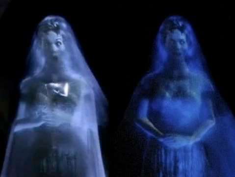
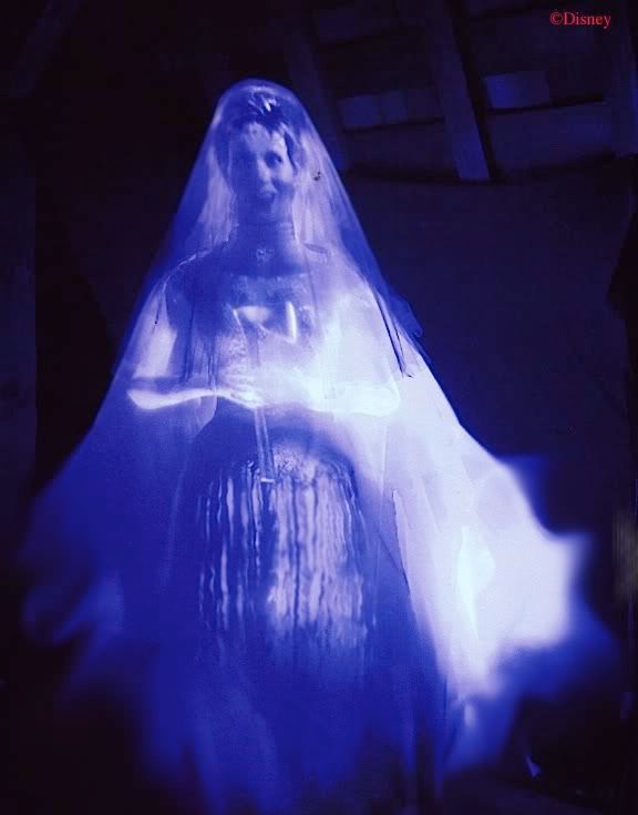
The New Connie is an odd combination of Pepper's Ghost and mapped projection onto a blank white mannequin. If the latter sounds a lot like the old Connie, you hear correctly. They put in a huge piece of glass at a 45º angle, tilting toward you. The reflected image in it is projected from a very shallow hollow in the floor. They evidently wanted a blowing fabric effect for the dress, which wouldn't have been very easy to accomplish if the reflected image were laying horizontally, so we've got this mannequin along with Pepper, which is strange, because it seems to defeat the whole genius and raison d'être of Pepper's Ghost: its magical transparency. The face is totally Pepper's, so there's no real reason why it couldn't be animated to some degree, and perhaps it will be in future.

 You can see the new diagonal beams on either side of her, put there to support and hide the edges of the sheet of glass, which is well-done, but in some videos, you can glimpse part of the figure in the floor.


One problem with Pepper's is that the large sheet of glass in use can inadvertently pick up reflections of irrelevant objects that happen to be in the wrong spot and are too brightly lit. Ever since Connie debuted in 2006, this has been an irritant, because the Ambrose portrait and other items in that attic tableau can be seen reflected in the ballroom glass as you scoot along. Alas, the same issue is found here, as a pile of brightly lit packages and dishware on the floor next to the Connie & George portrait can be seen floating upside down in the air near the attic ceiling while you're looking at the new bride.

VicariousCorpse

You've heard of the mystery of the haunted wedding gifts, haven't you? Some say they float along the ceiling upside down. Others say it's only a trick of the light.

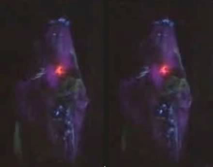
Maybe they'll fix that. I'm told that they were still tweaking the thing until the last minute, and it shows. The bride's nose is all wonky in the early photography. (See the pic they released to the LA Times at the top.) Hopefully they will fix it.* Of course, I kept saying that about the old Constance too. I'm also struck by the fact that the new figure is totally static. The older brides swayed back and forth and moved their candle arm. This one just stands there, stock-still.

*UPDATE 2-12-25: Looks like they did.

Steven Lewis

They haven't changed the bride's name. "Constance" is still attested numerous places in the hubby-portrait tableaux, so we haven't got a new bride so much as a complete overhaul and reinvention of the old one.


One has to wonder whether "Hatchaway" is still supposed to be her maiden name, since the pun is now inappropriate. It has been canonical these last 20 years, since it's on the marriage certificates that have been on public display in the attic (albeit a little irregularly), even though riders can't possibly read them.


But if those are gone now (yet to be confirmed as of this writing), "Hatchaway" may be considered gone as well.

So . . . why the change?


Technological Advances? 

If you check out the Tom Martens article about the new bride in the LA Times, you will be told that it involved, among other things, an updating of the technology.

According to the Times, the new bride utilizes "the latest in projection technology," and you're looking at a technological "advance." He got this rubbish from Kim Irvine, who told him the "projection technology on the prior figure had become so outdated as to necessitate regular maintenance," which is an odd thing to say since everything needs "regular maintenance."

What I'm told is that the projector in the floor is exactly the same projector used for the old Constance. So much for technological advance. Someone might point out here the gee-whiz magical effects that come with the new bride, those ghostly little orbs floating around her in three-dimensional space. Whatever else you might say, no one can deny that the effect looks very cool . . . 


. . . just like it did in 1957:


Matter of fact, if you check out the current incarnation of the Sleeping Beauty walk-thru, you'll see an array of impressive Pepper's effects beyond which the new Connie advances not a single millimeter.


Sensitivity Issues?

Kim sez: "The bride that used to be in there was an ax murderer, and in this day and age we have to be really careful about the sensitivities of people. We were celebrating someone chopping off her husband's heads, and it was a weird story." Not surprisingly, these kinds of comments have sparked a lot of mockery and indignation, but at the same time there's a kernel of truth in all that. As I argued years ago, the Connie story doesn't jibe well with the artistic statements of the HM, which are two: (1) the afterlife may be joyful rather than horrifying. However, (2) justice must be served. It was the attic's job to temper the Mansion's otherwise universal message by adding a detective story, brilliantly told in about one minute of actual time. The essence of all detective stories is that evil exists and the demands of justice must be met. That stern claim cannot simply be wished away. (It may be washed away by an act of atonement, but at that point we're talking about Christianity.) Anyway, as I pointed out, the Constance story does not fit either message: it was a story in which the devil wins, which is a common horror theme but foreign to the Mansion until 2006. So yes, however much wicked fun people got out of her, there was always something out of place with the Constance saga. Talking about "sensitivity" may not be the best approach to the problem, but it does recognize that something smelt funny about her.


The Boring Truth?

It's possible I'm wrong about this, but if I am, there's an extraordinary coincidence that wants explaining. The original Constance character was brought to (after)life by two talented ladies, Kat Kressida and Julia Lee.


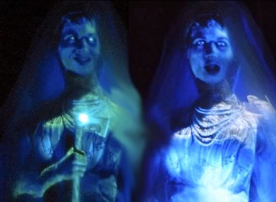
Kat provided the voice and Julia the look (although it's never been absolutely clear whether Kat as well as Julia contributed something to the heavily-doctored and digitized visual projection of Connie). Anyway, Connie debuted in May of 2006, so these gals most likely contracted with Disney in 2005.

Shortly after Connie's debut, Julia added a credit to her now-defunct website:
 

That "next twenty years" business is VERY strange. Disney normally owns outright the performances for which they contract, and yet it's hard to account for these comments unless they represent something or other in the contract. Can you think of any other way to explain them? Okay, well, do the math, people. 2025 is 20 years after the original contract with Julia (and presumably Kat?). Of course, Julia's visage still appears in the hubby portraits, but perhaps this "twenty years" business pertains only to the video imagery. Whatever. Until I learn otherwise, this will be my answer to the "why" question: Expiration date reached.

These are from one of the Julia Lee photoshoots:


Why the Why? What About the What?

Yes, let's do the real Long-Forgotten stuff. What is supposed to be going on with the new bride? Irvine has given out some blather about bringing back the sorrowful figure that the original Imagineers imagined, a bewildered bride searching for her lost husbands. A story of lost love. So sad.

Ugh. You can read the whole "Here Comes the Bride" series here at LF if you want to know what the original Imagineers were up to. It's true that in many ways the new Connie is a throwback to the old Beating Heart bride, but the original figure was the Corpse Bride, and she was scary.


Not only that, but the Hatbox Ghost made it pretty clear that she was a murderer who beheaded her victim. It's true that after Hattie was gone and Beating Heart continued to evolve (the Black-Faced bride, the Blue-faced bride), she became more ambiguous. I myself used the word forlorn in those discussions, so if Kim wants to claim that bride was sad, I can't say she's crazy to think so. Once the Hatbox Ghost was gone, the murder mystery was destroyed anyway, and people were free to read the bride in multiple ways.


However, Connie 2.0 is not the only new character in the attic. There is also a black cat at her side.

You'd look grumpy too if someone stuck a candy corn in your eye (pic: Mike Kindrich)
 

Is She a Witch?

As everyone knows, this feline friend of Connie's is a tribute to the unused X. Atencio concept, the One-Eyed Black Cat, and this, dear friends, is how tributes should be done: a subtlety found in something organically connected with the story, not a gratuitous addition put there just for the sake of having a "tribute." So kudos to Kim and Co. for that. But with that black cat there, the message I immediately receive is, "The bride was a witch." I've been told that the team responsible for the new attic weren't aiming for that. Irvine has explained the bride as something quite different, a sympathetic character. It is supposed that the black cat is adequately accounted for as a tribute to X and nothing more should be read into it.

But artistic intention only counts for so much if you're trafficking in cultural symbols and stereotypes. "Spooky woman with a black cat at her side" = she's a witch. I feel a little stupid defending that reading, because we are talking here about a pretty firmly embedded symbol in the collective (sub)consciousness of our culture, many centuries old. And besides, what was that One-Eyed Black Cat, anyway? The Atencio character was unambiguously a demonic figure who only appears as a cat. Look up "witch's familiar" if you really need help here.

Some have argued that since she doesn't LOOK like a witch (pointy hat, broom, etc), the assumption is shaky. A ghost with a black cat is not automatically witchy. Neither is a bride with a black cat. So I guess it's every interpreter to their keyboard, and we still have ourselves an open mystery. Fair enough. WITCHever you decide, one must allow that there is BROOM for more than one view. What the HEX, I don't need to SPELL it out any further.

By the witchy reading, though, the interpretation of the new attic is fairly straightforward. The successive husbands of this woman, all of whom mysteriously disappeared, did so because she was an evil witch who probably did them in. That also neatly explains why husbands two through five were increasingly imbecilic in that they did not suspect anything was wrong. It's simple: they were bewitched! Of course, if Connie 2.0 is still a baddie, it means that the attic still gives us an anomaly, a yet-unpunished and yet-unredeemed villain, that all they've done is replace an axe with a hex. (Hmm . . . no wonder they thought a tribute to X fit here.) Finally, I will point out that a sinister interpretation is encouraged by retaining the name "Constance" and her hubby portraits, in continuity with the previous 20 years of history, which unavoidably bring with them certain expectations about her that will continue to hang over the whole place. We have not been given a clean break. (This will be taken up further in the next post, so stay tuned.)


The Hatbox Ghost Disappears Again

The worst thing about this addition, in my admittedly subjective opinion? With the total expunging of the beheading theme, there is no longer any organic connection between the Hatbox Ghost and the attic. He's been standing outside the attic proper for ten years anyway, but now he really is outside; that is, he can no longer be considered an "attic character." I suppose he's become so famous that he's no longer seen as requiring some particular reason for fitting him into the Mansion, no more than, say, the Opera singers or the Royals. But the fact that henceforth he does not tie in with any known narrative with regard to the Mansion's imaginative history feels to me like the unkindest cut of all.


The Candelabra Floats

I don't mind in principle their attempt to expand the character's presence in the Mansion by matching her candelabra not only to the one in the Endless Hallway but also to a new candelabra in the graveyard, which replaces the purplish wraith in the crypt by the Opera Pair.


Like others, I think the ghost was much more interesting than the new candelabra, and I always hate it when a 1969 original effect is scrapped. But the idea itself is agreeable in that it deliberately raises questions which it doesn't answer, like any good haunted house should.


Influences

Since we're in the awkward position of denying what the Imagineering team claims they intended to do, there is no point in pulling up examples of stuff that may have influenced the new figure as a concept, but we can at least say a few things about visual influence. First of all, the new Connie looks a lot like some of the concept art for the old Connie:

The eerie flowing effect on her gown reminds me a little of the Falls of the Bride in Peru. It's possibly an influence, but I wouldn't press it. Otherwise, see the previous brides for visual influences.

Something Wicker This Way Comes

It took a long time for photos to finally appear, but as was reported earlier there is a wicker coffin in the corner of the attic where the HBG originally stood and where the Beating Heart bride stood from late 1969 until the spring of 2006.

yensidtlaw

Wicker coffins were popular during the Civil War period because they were cheaper to make, and they continued to be popular for various reasons through Victorian times and beyond (i.e., for transport, for displaying the body at funerals, for temporary use until a doctor could examine the corpse, etc.). Here's an authentic Victorian example:


 Also new is a pig-shaped picnic basket in the Ambrose tableau:

 yensidtlaw
 

Again, nothing original about these:

The grapes and bread are somehow still fresh, but then, so is the wedding cake, so . . . supernatural preservation, I guess.

I don't see any need to tie these new props together within some sort of new, united backstory. More likely, one or another of the Imagineers involved came across these antique wicker items online or in a shop somewhere and thought they looked kinda Mansiony.


Conclusions

The consensus to date is that the new Connie is visually an improvement over the old Connie, but that's a pretty low bar. The amount of money and effort that went into this new version hasn't produced anything like the hoped-for results. "Underwhelmed" is a word that keeps appearing, and I've encountered exactly that same reaction from die-hard Mansion freaks and casual park goers alike. Overall, an improvement, but it feels like a missed opportunity. Maybe more is coming?


**************

Thursday, March 10, 2011

The Many Faces of...the Other Stretching Portraits

.
Following up on the Tightrope Walker post, it seems only fair to give the other portraits the same treatment.  The differences in artistic interpretations of these characters are at least as noticeable as was the case with Ally Gal, and in some cases they are even more dramatic.

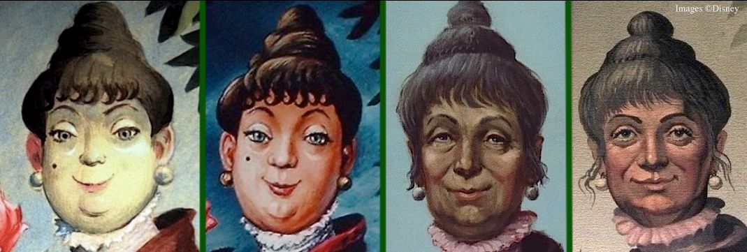
Here's Connie (née "Abigale Patecleaver," her name in that same old X. Atencio script cited earlier).  Left to right we've got (1) Marc Davis's original sketch, (2) a Davis-style canvas actually used in the attraction during the first year or two,* (3) Clem Hall's version ca 1982, and (4) the current DL version.  We'll use that formula with the other characters as well, displaying the same four representations in the same order.


The first thing I always notice about Marc's original is that this widow is not very old.  She's put on a few, but she's still cooking on all burners.  Secondly, there's a huge contrast between the fried-egg madness in the eyes of Marc's Tightrope Walker and the nimble intelligence of this widow.  If this is madness, it's an utterly different form of madness.  This is truly a classic Marc Davis sketch, in my opinion.  The self-confidence is there, the cold-bloodedness, the wicked edge.  She seems quite pleased with herself.  She keeps her secret without a trace of guilt feelings.  And check out the colors in that face!  Yellow skin, grayish-green shadows, pink ears—and yet, mirabile dictu, she doesn't look sickly but very much alive and well.  Unless someone had called your attention to it (like I just did), would you ever have noticed how daring and original Marc's palette is in this sketch?

As I pointed out in the Ally Gal post, the first stretching portraits tried to retain the Davis drawings, but they "naturalized" the colors.  As was the case with Ally Gal, the widow done this way isn't nearly as good.  And don't think Marc didn't notice the way they trashed his color scheme.  During an interview with Alice Davis during one of the 40th Anniversary events in 2009, she lamented that many of Marc's gags were either not used or were "overloaded."

Interviewer:  "But a lot of Marc's stuff is still in the Mansion, with—like the stretching portraits, and things like that."
Alice:  "Yes, but they're not his.  They're somebody else's, and the color is not as, uh, nice as what Marc's or Mary Blair's would be to the eye."

When we get to Clem Hall's widow, we have a real revolution.  She's quite a bit older.  She's drunk.  She's got a droopy, somewhat vacant look as a result.  But she's still got a few essential qualities remaining from the Davis original.  She's smug and self-satisfied.  She knows something that you don't know, but that woozy look keeps her from looking pompous about it.  You suspect that there's definitely something going on in there when she's sober.

And then there's the current version.  Another disappointment.  That woman has been drinking iced tea, not wine.  Too friendly, too sincere, and like the current Ally Gal, seriously lacking in personality.  Does she look to you like she's keeping a secret?  Pthh.  On to the next...


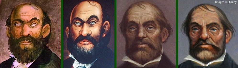
Marc's original Dynamite Guy looks like a leftover pirate from POTC, and I mean one of the mean ones.  Look at those beady eyes.  This is a look of undisguised cruelty and barely-suppressed rage.  The colors are much more natural this time, so the canvas version is not such a radical departure.  Very little difference, except that the eyes have been softened.  With those pretty blue peepers, you're tempted to think that maybe, just maybe, this guy started out in life as a nice little boy and turned bad at some point.  Davis's original, on the other hand, was born bad.

Clem Hall, once again, reinvents the character.  This guy isn't evil or angry (let alone crazy or drunk); he's just plain stupid.  It's a study in pride and vacuity.  The more you look at him, the more convinced you are that he hasn't had an interesting or intelligent thought in his life, but that apparently hasn't kept him from becoming a Somebody.  Are those eyes gazing unfocused at something in the distance, or are they gazing inward at the void where his soul should have been?  Seriously, if you were told that this is a painting of a blind man, you might well believe it.

In this case, the current version has aped Hall's version so closely that there isn't a lot to say.  So that's it.  On to the next...


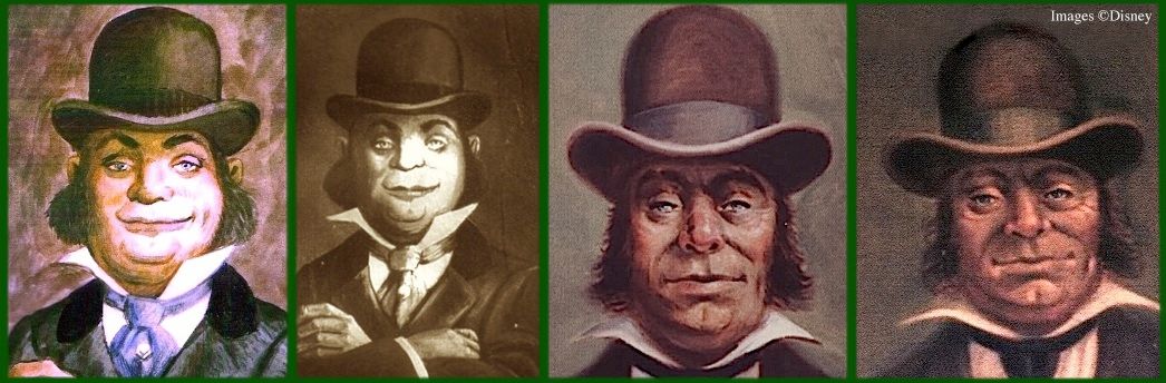
What we have here is a smug toad.  He's self-satisfied and superior, but he's not threatening, not particularly vicious.  Alas, I have no color photo of the Davis-like canvas, so we are at a disadvantage there, but it looks like they botched the shape of his face a little.  The smile is not as broad, the cheeks don't bulge out as they should.  Something is definitely lost in that part of the face.

Once again Clem Hall, it seems to me, has given us a drunk.  Nose and cheeks are red, eyes are pale and watery.  He's feeling no pain.  It's another study in vacuity.  Those eyes are staring out at the world unseeing.  Remember the overall message of the stretching portraits?  The things most highly prized in this life are mere vanities that only serve to distract us from the reality of death.  That is what many would call a "sobering thought."  With Hall's characters, the state of mind untroubled by that sobering thought is represented, quite naturally, by what looks like an alcoholic haze.

As usual, the current version has sobered up the subject considerably, and as usual it has failed to fill the void with anything particularly interesting.

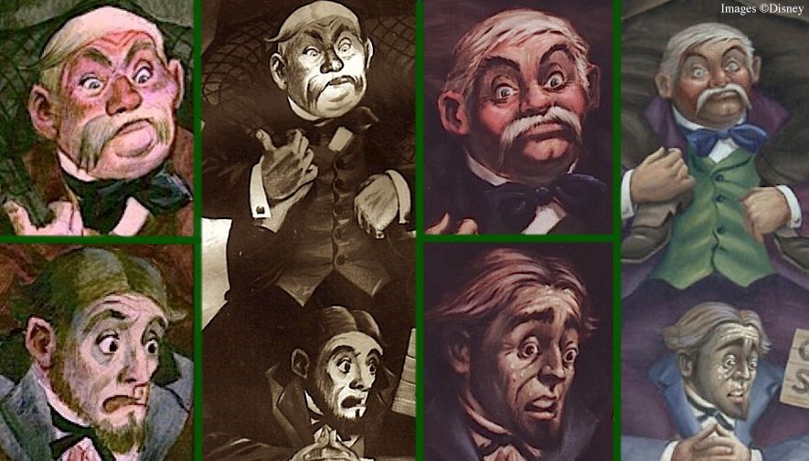
The remaining Quicksand Men are of less interest, since by the time you see them the joke is beginning to unfold.  As the ironic distance between the smug upper portrait and the macabre reality beneath diminishes, so also opportunities for artistic reinterpretation of the joke diminish.  Not surprisingly, then, the post-Davis versions don't reinvent the two lower Quicksand Men very radically.


The middle guy has only just now spotted the quicksand sign and has only begun to realize his dire situation.  You see pure shock in his face.  Even in this moment, he still has his sense of self-importance with him.  It's not, "This can't be happening!" so much as "This can't be happening to me!"  The bottom guy is past that.  He's been aware of the situation for several seconds by now.  Initial panic has turned into a full comprehension of the inevitable.  Hall et al have added sweat droplets to Davis's original.  Hmm.  Is that the hot sweat of exertion or the cold sweat of terror?


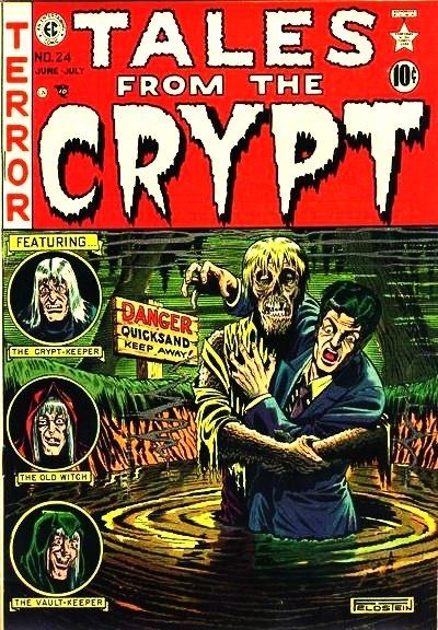
On a lighter note, we discussed in an earlier post the evidence that Davis looked through old EC horror comics for inspiration from time to time.  Seems to me there are enough elements in common between this Al Feldstein cover art and Davis's Quicksand Men to raise suspicions.


On the other hand, there is no need to go rummaging through old comics in search of inspiration for the basic gag in the Dynamite Guy portrait.  A plausible source can be found right under our noses, mere yards from the Mansion.


* And now, of course, one of the original 1969 Wicked Widow portraits from a Disneyland stretching gallery has surfaced.

••••••••••••••••••••••••••••••••••


Wednesday, February 2, 2011

Whistling Past the Graveyard: The Stretching Portraits

.
This will be the first in a series of three posts dealing with the stretching gallery portraits.  This first one will deal generally and more abstractly with the whole set, and the next two will look more particularly at the artwork itself.

I mentioned 'way back here that what we are frequently doing at Long-Forgotten is explaining jokes, which is usually a bad idea since the jokes are killed in the process.  But let's face it, the Mansion jokes are so familiar by now that for most of us they hardly even function as "jokes" in the usual sense.  We enjoy them in a different way, and no amount of annotation at this point is going to spoil them.

So let's get out the scalpel and have at it.

Jokes are serious business, ironically.  Every joke is based on irony, and every joke can therefore be explained by pointing to that irony.  I'm not exaggerating.  Even a third grader's fart jokes are explicable in this way.  Don't believe me?  With bathroom humor, the irony consists in the fact that we humans aspire to something beyond our animal natures, but our bodies constantly betray us, rudely reminding us that while we live here below we are very much animals.  We may speak of noble things and have eternity in our hearts (cf. Eccl 3:11), but we still have to take a dump a couple of times a day.  In fact, to be even minimally polite and civil, it is virtually required that we pretend that these animal functions don't even exist.  But they do, so opportunities for bathroom humor never end.

As for irony, I define it as a perceptible gap between appearance and reality.  All jokes, then, are based on the perception of this kind of gap.  You doubt it?  I dare ya, I double-dog dare ya, I triple-dog dare ya to post a joke in the Comments that cannot be explained convincingly as predicated on a gap between appearance and reality.  Remember though, explanations typically ruin jokes.

With that long preamble out of the way, let's take a look at the artwork in the stretching galleries.

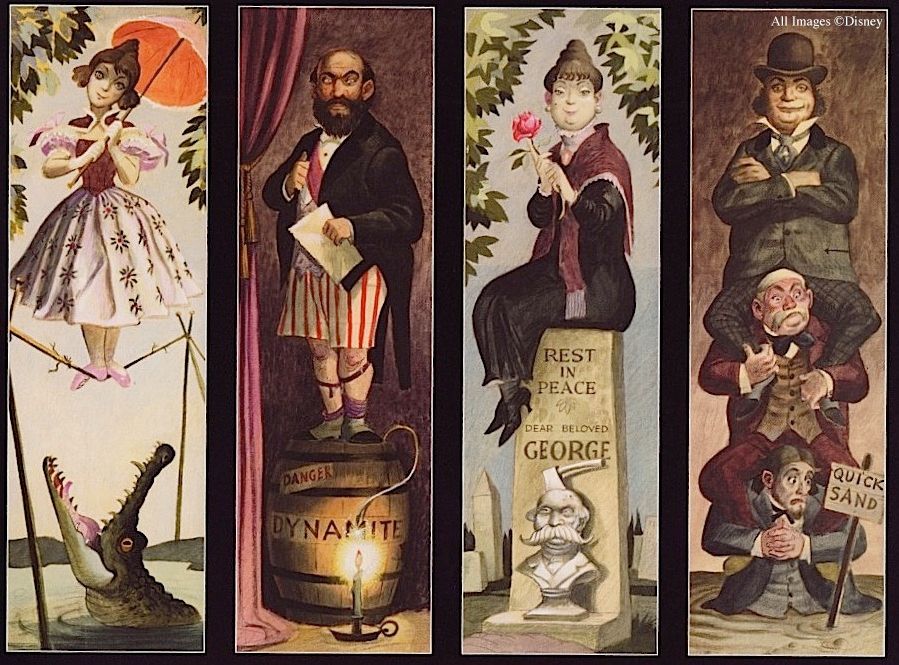
Marc Davis's four portraits are supposed to make people chuckle.  Very well then, they are jokes.  Where is the irony?  Or better, what is the irony?


For three of the four, the joke is clearly the same:  a normal, confident-looking person is revealed to be in imminent danger of sudden death.  (We'll deal with the exception presently.)  Why does the trio work so well as a set?  I think it's because they represent three classic strategies for denying the reality of death, and even though everyone knows they're false strategies, their popularity remains undiminished.  Ironically.

If you could have anything you wanted, what would it be?  Yeah, I know, world peace, blah blah blah; now cut the crap and tell me what you really want, as betrayed by your actions.  We can discuss and discuss, but sooner or later we're going to come around to these:

  • Beauty
  • Wealth
  • Power

Sneer all you want, you know you'd take 'em if you could get 'em.  If someone from Mars were to judge what is most important to humans, based on what they strive after most consistently, those might well be the top three answers.

I can imagine two objections.  First, are these three really separable?  Don't people want to be beautiful so they can get rich, etc.?  Admittedly, these goals often bleed into each other, with one of them pursued as a means to the others, but at the same time there are whole throngs of people who lust after one of those three as an end in itself.  Each one of them commands the ultimate allegiance of a sizable chunk of the populace.  Second, some of you might have other candidates that you think have a better claim to the Top Three.  I imagine that many would put "fame" on the short list, but here's the deal:  there are a lot of people who would not want to be famous, whereas far fewer people would actually choose not to be good-looking, or wealthy, or in a position to give orders and be obeyed.  So I'll stick with beauty, wealth, and power as the top three idols in the public square.  [Edit: Check out some interesting discussion about "love" in the Comments.]

And that's what you get here in the stretching gallery, before the stretch.  You've got a lovely young lady, representing beauty; a political figure of some kind, representing power; and a well-dressed businessman, representing wealth.

I admit up front that my interpretations of the Dynamite Guy and of the Quicksand Men are not self-evident, but I think they're correct.  The Dynamite Guy has got a sash, which hints at official position or official recognition, and he's clutching a Very Important piece of paper.  It is true that an early show script by X. Atencio refers to him as "Alexander Nitrokoff...an anarchist who came to us with a bang one night," but with all due respect, I think X misinterpreted Marc's painting.  Neither the sash, nor the formal, claw-hammer coat, nor the Very Important piece of paper suggest the identity of an anarchist.  To me, those clues point to a high-level diplomat or political figure of some kind.  As for the Quicksand Men, I note that they are well-dressed and well-groomed, but not too much so, as if they had no practical dealings with everyday affairs.  They come across to me as successful men of the world, as prosperous businessmen.

So anyway, the joke?  What people think are the most important things in life are in reality weak and ephemeral.  People act as if power, wealth, and the things that go with beauty will protect them from mortal ills, and yes, in most cases it may be conceded that they do help you to avoid the Grim Reaper for a season.  But only for a season.  Furthermore, there's no guarantee of even that much.  For all your money and/or power and/or physical charms, you may still perish in a moment, in a ridiculous moment, in an unheroic and an undignified moment.  We know this is true, but we ignore it best we can.

Whistling past the graveyard, it's called.

Marc Davis would probably have balked at this analysis.  I hear an irascible voice from beyond the grave, "They're just jokes, dammit.  JOKES.  I wasn't thinking of any of that...stuff!"  But as usual, we're not dealing with conscious thought but inarticulate artistic hunches.  Whether it's a symphony or a painting or a limerick, when someone hits the bulls-eye you know it, even though you may have a hard time defining the target in so many words.  Imagine if instead of the Quicksand Men you had a young lady with a train bearing down on her.  Somehow, the set as a whole would not have been as good.  You would have felt that you were seeing the same gag twice (with Alligator Girl), and the repetition would have been unwelcome, despite the fact that you ARE seeing the same basic joke three times as it is, and yet it feels very satisfactory.  I submit, then, that the threesome works because Davis's comic sensibilities intuitively settled on three classic vanities that people chase after in their attempts to avoid the reality of death.

What about the fourth portrait, the widow?  That one is different.  She's now been retconned as Constance, but the original joke remains intact.


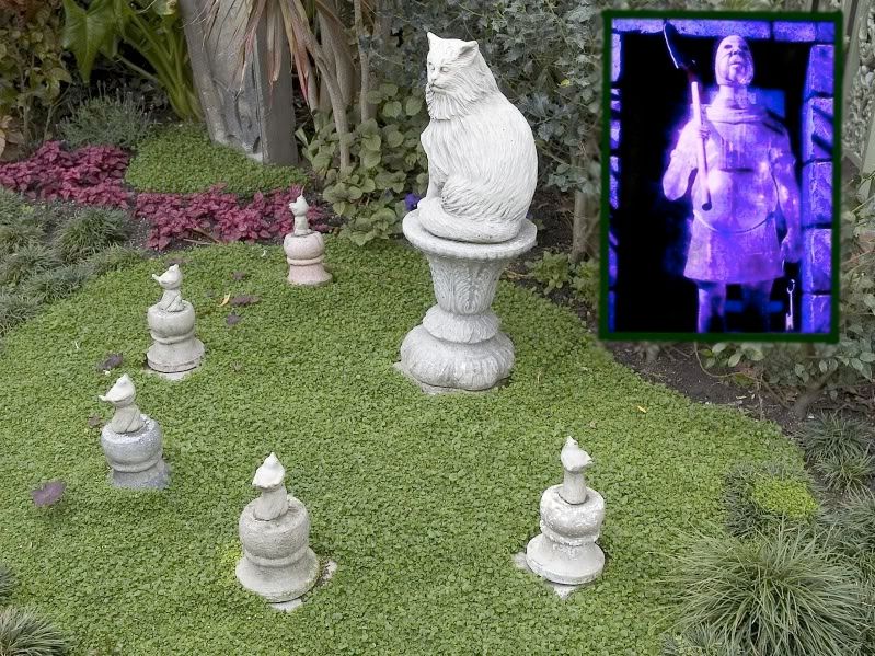
Instead of an unsuspecting victim of sudden death, she is herself the agent of sudden death for other unsuspecting victims.  And to judge by her portrait, she has evidently succeeded in this role.  She represents a more complex strategy for evading death, namely, forming a partnership with it.  The prize in this case is not wealth, or power, or beauty, but cunning, a cold-blooded, ruthless intelligence combined with a survivor mentality.  It's as old as the Bible:  "We have made a covenant with death, and with hell are we at agreement; when the overflowing scourge shall pass through, it shall not come upon us" (Isaiah 28:15).  Of course, this too is vanity.  In the end you find that the Reaper brooks no rivals, cuts no deals, honors no contracts.  You have been a dupe, a tool in the hands of something far colder and more ruthless than you, and all of your cleverness will not prevent you from following your victims into the grave.  As we saw in our discussion of the pet cemeteries, there are at least three places in the Mansion that illustrate this dynamic (Constance, the Executioner, and the Cat-and-bird set in the garden).


The widow portrait takes its place in the gallery quartet as a more interesting strategy, but a vain strategy nonetheless. "Your covenant with death shall be disannulled, and your agreement with hell shall not stand; when the overflowing scourge shall pass through, then ye shall be trodden down by it" (Isaiah 28:18).

I will agree with Mr. Davis's ghost about one thing:  the paintings should not be interpreted literally.  I mention it because there is a persistent tendency among some Mansionites to try to find a way to wrap a story around the depictions exactly as they are (beginning with X. Atencio's reading of the Dynamite Guy!), but to me any such effort is absurd on its face.  I don't know of any diplomats (or even anarchists) who stand around on TNT kegs in their underwear, or businessmen who go out into the swamp and form human totem poles.  These are jokes, and that's where they stop.  If you absolutely MUST carry the portraits beyond that threshold, then I suppose you can interpret them as allegories.  A sheltered young woman who behaved as if she were somehow immune from the dangers of life pays a steep price for her foolishness.  A crooked politician is assassinated in the middle of embarrassing circumstances ("caught with his pants down," get it?), robbing him of his dignity as well as his life.  A business enterprise goes south, ruining all partners in the venture, even those with little responsibility for the fiasco.  That sort of thing.  But in my opinion even this degree of literalism is unnecessary.  Even in the case of the widow (now Constance), you obviously cannot take things too literally.  You don't really suppose she commissioned a bust of George with a hatchet in his head for his gravestone, do you?

Long-Forgotten posts will be approximately one per month for awhile.  HBG2 is a busy boy.

.

Monday, June 7, 2010

There Goes the Bride

.
Updated May 16, 2020 and Jan 31, 2025

Let's wrap up our current tour of the attic.  Don't worry, we'll be back.

Consider the following scenario:

A razzle-dazzle new ghost is installed at the DL HM attic, with high expectations, but the effect is basically pretty simple, achieved simply by clever manipulation of light projection.  Alas, the figure is too close to the track for the effect to be truly convincing, and the Imagineers fiddle unsuccessfully with the new figure, trying to get it to look right...

Sounds like you-know-who, but of course I'm talking about Constance.  The only thing missing is the part where they give up and take it out.

Update: And of course, that finally happened in January of 2025. This post is now a history post.

There isn't much to say about how the Constance effect works.  It's the old "Leota effect," a projected movie on a white dummy.  The problem for many fans is that it looks like what it is, a two-dimensional projection.  The arms in particular are unconvincing.  There's evidence that the Imagineers are aware of the problem and have experimented with ways to improve the look.  Compare these two shots of the mannequin under regular lighting.


If anyone wants MY free advice, I'd say the secret is to go fuzzy.  Her arms should be nothing more than white, blurry shapes, just thick cloudy hoses.  You could sharpen up the hands and hatchet when the hatchet appears, but only for a second.  Murk it up, boys, murk it up.

By all counts, the WDW version looks and sounds better than the DL version.  Even in photos you can see the difference.  Here's DL Connie:


And here's WDW Connie:


(pic by Jeff Fillmore)

UPDATE May 16, 2020: Special thanks to Christopher Biggs and to Micechatter "whodudisfor bringing to our attention a Theme Park VFX video (called a "sizzle reel" in the industry), which features a short clip of the actual source video used at WDW, and thanks to Brandon Hardy for creating an extract of the bride portion:

The Haunted Mansion - Constance Source Footage Clip copy

Brandon Hardy

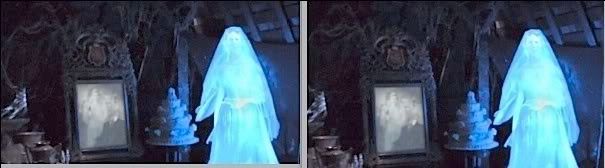
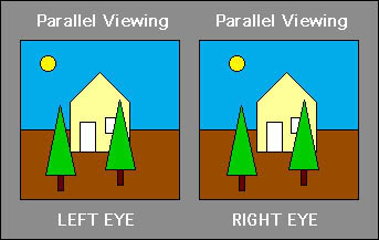
Nevertheless, we're still not at the "Gee whiz, how do they do that?" stage for anyone over 11.  Hate to sound harsh, but there it is.  Is she better than what she replaced?  For ease of comparison, here are three nice 3D's, showing the three basic bride types over the years.


Let's talk about something else.  Let's talk about the other razzle-dazzle effect that came into the attic with Connie: the wedding portraits.  Here the verdict is much more positive.  When they're working right, they are impressive, very much in the coveted "how do they do it?" category.


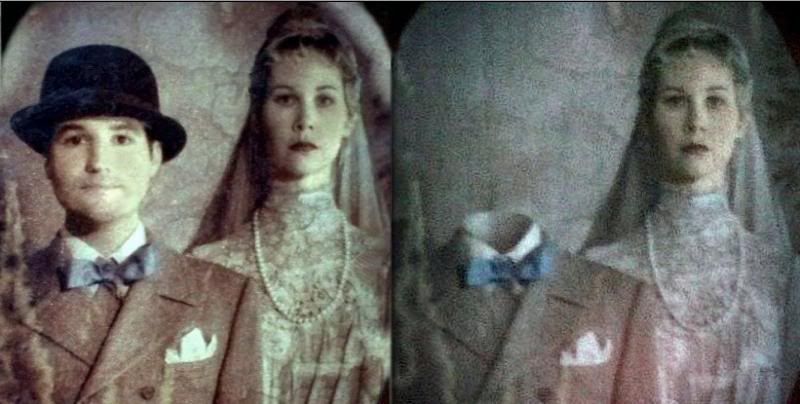
So how do they do it?  You may have noticed that when people don't know how a Mansion effect is achieved, and they want to sound like they do know, so as impress their friends, they mumble about "fiber optics" and "holograms" and sprinkle the word "digital" around like oregano on a pizza.  Most of the time they overshoot, spinning out elaborate explanations when the reality is some ridiculously simple trick.  Like so many other effects in the HM, this attic-portrait effect is essentially pretty simple.  You have a painting on a thin, translucent fabric, and another painting underneath it.  There's a spotlight on the front and a sort of light box behind.  Actually, it's a little more technical than that, but I'm going to spare you the details.  It's all digital fiber optics, and other things you wouldn't understand.  Anyway, when the light box is dark and the frontal spotlight is on, you see the front painting with the guy's head on.  When the spotlight goes out and the light box in back goes on, you see the headless version behind it.  That's because when the back one is lit up, you see it through the translucent front painting, which is now unlit and essentially invisible.  It's the old scrim trick, not different in principle from the ceiling in the stretching room.


You can most easily figure out how it works when it isn't working!  It is extremely important that the spotlight fade in and out in such perfect coordination with the fading in and out of the back lighting that you don't notice any difference in overall luminosity.  Sometimes they're out of whack, and you can notice the picture brightening and fading in synch with the disappearing head.  The following two shots are grabs from the same continuous video.  Note how the frame is illumined when Reginald's head is visible, but not when it isn't.  It's not supposed to be like that.


The other reason the effect can be figured out is because it's been done before, more or less.

Sherman, set the Wayback machine for Paris in the 1890's.

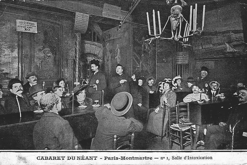
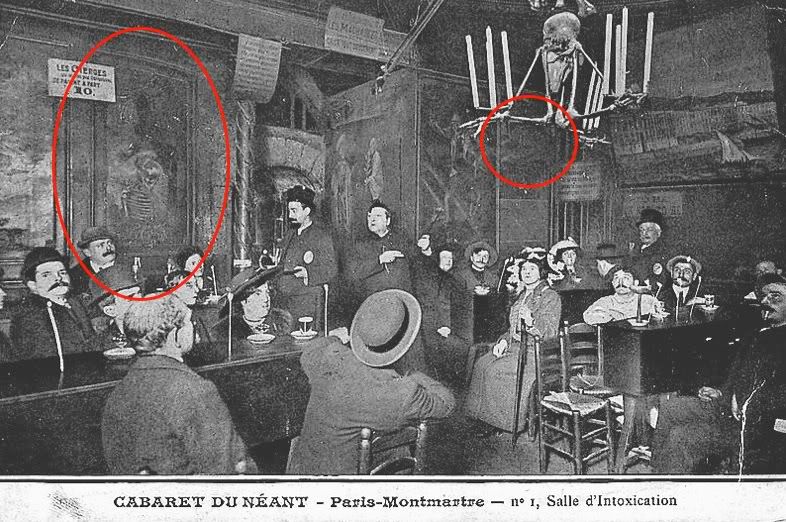
The Montmartre section of Paris saw the invention of the fully-themed nightclub during the late Victorian era, including costumed staff, elaborate decor, and theatrical floor shows.  Some of them had otherworldly themes and put on ghost shows.  One of the most successful was the Cabaret du Néant ("Tavern of Nothingness" or "Tavern of the Dead"), where the theme was death and decay.  In the first room, the waiters dressed as undertakers and you sat at tables that looked like coffins.  In the second room they had a first-rate magic stunt in which volunteers from the audience would stand in a coffin and turn into a skeleton (and back again; sorry, it's the law).  In yet a third room the volunteers would sit onstage while ghosts that they could not see (but the audience could) made them look like perfect fools.  By that point you were pretty drunk and thought this was the funniest thing you'd ever seen.  And I dunno, maybe it was.  We'll go back to the intriguing C du N sometime later, since it is undoubtedly a source of inspiration for the Haunted Mansion, but for now I want to point out a special effect in the first room, which room looked like this:


Like the chandelier?  Anyway, the walls were covered with normal-looking paintings that changed before your eyes into gruesome scenes.  Sounds familiar, doesn't it?  You would think such a subtle effect would not be picked up under the harsh lighting necessary for 1890's photography, but not so.  In the photo above, note the large painting on the left with a skeleton in it and another, smaller painting up in the right hand corner with nothing showing on it:


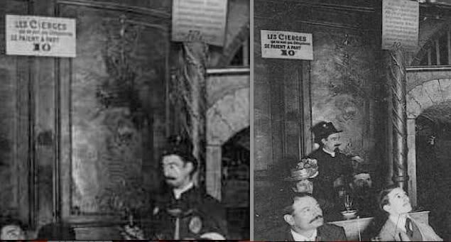
In other photos of the Cabaret, the skeleton in that left hand painting is halfway or nearly gone.


Conversely, in other photos the smaller painting has a skull in it.  Here's a side-by-side:


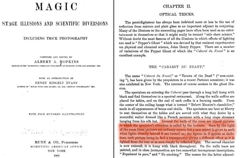
You're looking at the direct predecessors to the changing portraits in the Haunted Mansion, kids.  But how did they do it back then?  The gullible masses may have been baffled, but not Albert A. Hopkins.  No, siree.

"Around the walls of the room are placed pictures to which the spectator's attention is called by the lecturer.  Seen by the light of the room these pictures are ordinary scenes, but a new aspect is given to each when the lights directly behind it are turned on; the figures in it appear as skeletons, each picture being in fact a transparency giving a different effect as it is lighted from the rear or as seen simply by reflected light."


The main difference between this effect and the HM wedding portraits is that the Cabaret du Néant pictures were evidently paintings on both sides of the same thin cloth, while the Disney version uses two separate paintings on top of each other and more sophisticated lighting so as to make use of the scrim trick.  Still and all, the similarities are greater than the differences. [Edit: I now think Hopkins got it wrong.]

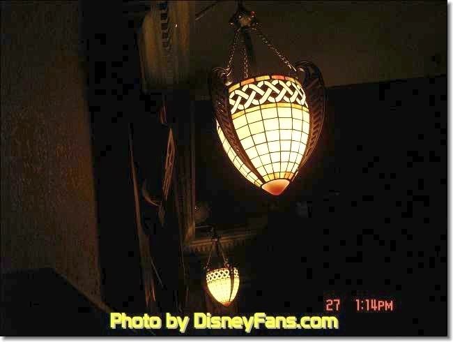
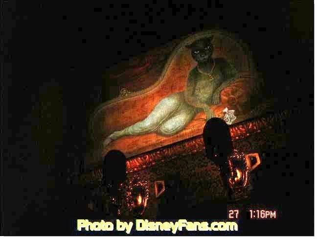
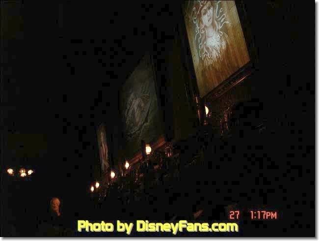
There's an interesting footnote with regard to these changing attic portraits.  They were installed in May 2006, but more than a year before that the pictures in the changing portrait hall were replaced with fancy new ones with a more impressive lightning-flash effect.  These work the same way the attic portraits work, with two layers and backlighting.  That was in January 2005.  A few months before that, something very weird happened in the portrait hall that is little-remembered today because it didn't last long.  One day in August 2004, the stretch room doors opened and guests found themselves in a noticeably lighter portrait hall, with out-of-place looking Art Nouveau-style light fixtures by the doors, a more lurid, bright green EXIT sign over the chicken exit, and a row of light fixtures along the wall under the portraits, illuminating them.  As usual, Allen Huffmann at Disneyfans (an invaluable resource) got some photos.


Everyone thought these abominations had something to do with "safety" and muttered unkind things about Disney lawyers and OSHA inspectors.  When the EXIT signs returned to sane levels and the goofy lights were gone, the whole business was quickly forgotten.

I don't think the mounted lights under the portraits had anything to do with safety.  I mean, come on, were people bumping into the wall?  What I think the Imagineers were doing was experimenting with frontal illumination for the hallway portraits.  If the lighting could be successfully controlled so that the front could gradually come up while the backlighting went down, these paintings could have been as sophisticated as the wedding portraits.  If this surmise is correct, the experiment must have failed.  The changing portraits have no special frontal illumination.  This means that in order for the back-side portrait to be visible, it has to be very light and the front portrait much darker, so that backlighting alone can do the job.  It's a cruder effect.  That's why the changing portraits in every case flash to a secondary image that is all white.


(pic by Photomatt)